

Your website is your most valuable digital asset, but its effectiveness hinges on staying current. An outdated design doesn't just look stale; it actively undermines user engagement, search engine rankings, and ultimately, your bottom line. Sticking to what worked two years ago means falling behind competitors who are adapting to new user expectations. This is why understanding and implementing modern website design trends is not a luxury, but a strategic necessity for growth.
This guide moves beyond surface-level buzzwords to deliver a practical roadmap for small to mid-sized businesses, marketers, and entrepreneurs. We will break down the 10 most impactful trends shaping the web in 2025, from the rise of AI-driven personalization and immersive 3D graphics to the critical importance of an accessibility-first approach. A crucial aspect of contemporary web design is understanding how to improve website conversions by optimizing user experience and engagement, a theme we'll touch on throughout this roundup.
For each trend, you won't just see a definition. You will get:
- Real-world examples of the trend in action.
- Actionable implementation tips tailored for practical use.
- CMS-specific notes for WordPress, Shopify, and Webflow.
- Measurable impact considerations to help you justify the investment.
Our goal is to equip you with the knowledge to build a website that not only captures attention but also drives tangible business results. Let’s dive into the trends that will define digital success this year.
1. Dark Mode Design
Dark mode, also known as a dark theme or night mode, is a user interface (UI) design that uses a dark color scheme as its primary background. Instead of the default black text on a white screen, it inverts the palette to display light-colored text, icons, and graphical elements on a dark background. This approach has rapidly evolved from a niche feature to a user expectation, making it one of the most persistent website design trends today.
It offers significant benefits, including reduced eye strain in low-light environments, improved battery life on devices with OLED or AMOLED screens (where black pixels are turned off), and a sleek, modern aesthetic that makes content stand out. Major platforms like Apple, Google, and Twitter/X have successfully integrated dark mode, setting a new standard for user experience.

How to Implement Dark Mode Effectively
Implementing dark mode is more than just inverting colors; it requires careful consideration of contrast, readability, and brand identity.
- Prioritize Accessibility: Don't use pure black (
#000000) for backgrounds and pure white (#FFFFFF) for text. This high contrast can cause eye strain. Instead, opt for a dark gray background (like#121212) and off-white text to soften the visual impact. Ensure your text meets a minimum WCAG AA contrast ratio of 4.5:1. - Automate with CSS: Use the
prefers-color-schememedia query in your CSS. This automatically detects the user's system-level preference (light or dark) and applies the corresponding theme, creating a seamless experience without requiring manual input. - Use CSS Variables: Define your color palette using CSS variables (custom properties). This makes it incredibly easy to switch between light and dark themes by simply updating the variable values within the media query, keeping your code clean and manageable.
- Test Visuals Thoroughly: Check how your images, videos, and logos appear in dark mode. Some graphics, especially those with transparent backgrounds, may need adjustments or alternate versions to look good on a dark background.
By offering a dark mode toggle, you empower users to customize their experience, demonstrating a commitment to user-centric design and accessibility.
2. Minimalist and Clean Design
Minimalist and clean design, often described as "less is more," is a timeless approach that focuses on simplicity and functionality. This design philosophy strips away non-essential elements, using abundant whitespace, clean typography, and a limited color palette to direct user attention to the most important content. By reducing visual clutter, it creates a calm, focused, and intuitive user experience, making it a powerful and enduring choice among website design trends.
This approach improves loading speeds, enhances readability, and makes navigation feel effortless. It prioritizes clarity over decoration, ensuring that every element on the page serves a specific purpose. Companies like Apple, Stripe, and Medium have masterfully used minimalism to create elegant, user-centric platforms that feel both sophisticated and incredibly easy to use.

How to Implement Minimalist Design Effectively
Adopting a minimalist aesthetic requires a strategic and disciplined approach to ensure the design remains functional and engaging, not empty or boring. For a deeper dive into the specific aesthetics, exploring minimalist web design principles can provide further insights.
- Embrace Whitespace: Use negative space (or whitespace) intentionally to create separation between elements, guide the user's eye, and improve comprehension. It’s not empty space; it’s a powerful tool for establishing hierarchy and focus.
- Limit Your Color Palette: Stick to a simple color scheme, often monochromatic or with just one or two accent colors. This creates a cohesive and visually calming experience while making key calls-to-action stand out.
- Focus on Typography: With fewer visual elements, typography becomes critical. Choose a clean, legible font and establish a clear typographic hierarchy (headings, subheadings, body text) to structure content and guide the user.
- Use High-Impact Visuals: Every image or graphic must be purposeful and high-quality. A single, compelling photograph or a simple, meaningful icon is more effective than a dozen decorative ones. Ensure every visual element adds value to the content.
By focusing on the essentials, minimalist design helps you communicate your core message more effectively, creating a frictionless path for your users to follow.
3. Micro-interactions and Animation
Micro-interactions are small, contained moments that happen when a user interacts with a website. These purposeful animations provide immediate visual feedback, guide the user, and make the interface feel more alive and responsive. From a simple button hover effect to a satisfying "like" animation, these details are a crucial component of modern website design trends, transforming a static page into an engaging, dynamic experience.
They serve a vital purpose by acknowledging user actions, preventing errors, and communicating system status. A well-executed micro-interaction feels intuitive and rewarding, enhancing usability and creating a sense of craftsmanship and polish. Platforms like Slack, Figma, and Stripe use them effectively to make their interfaces feel both functional and delightful, solidifying their place as a standard for high-quality user experience.
How to Implement Micro-interactions and Animation Effectively
Effective implementation is about purpose and subtlety. Animations should support the user's journey, not interrupt it.
- Keep Them Purposeful and Brief: Animations should be fast and have a clear function, like confirming an action or revealing new options. Aim for a duration between 200 and 500 milliseconds to avoid making the user wait.
- Provide Accessibility Support: Respect user preferences by implementing the
prefers-reduced-motionCSS media query. This allows you to disable or simplify animations for users who are sensitive to motion, ensuring an inclusive experience. - Use CSS for Performance: Whenever possible, use CSS
transitionsandanimationsover JavaScript-based animations. They are hardware-accelerated and run more smoothly, especially on less powerful devices, without blocking the browser's main thread. - Guide, Don't Distract: Use motion to draw attention to important elements or guide the user's eye through a workflow. For example, an animated loading state for a form submission reassures the user that the system is working, reducing uncertainty.
4. Responsive and Mobile-First Design
Mobile-first design is a strategic approach that prioritizes designing for the smallest screen first and then progressively enhancing the experience for larger devices like tablets and desktops. This methodology flips the traditional desktop-first model on its head, recognizing that mobile traffic now dominates the internet. It ensures a seamless user experience across all devices, a non-negotiable factor in today's digital landscape and a cornerstone of modern website design trends.
This approach addresses the core needs of mobile users by focusing on essential content and functionality from the outset. By starting with the most constrained environment, designers and developers are forced to prioritize, resulting in a cleaner, faster, and more focused user experience for everyone. Industry giants like Google have cemented its importance by switching to mobile-first indexing, meaning they predominantly use the mobile version of a site for ranking and indexing.
How to Implement Mobile-First Design Effectively
Adopting a mobile-first strategy requires a shift in mindset and a clear technical plan. It's about more than just making a site look good on a phone; it's about optimizing the entire user journey.
- Design for Mobile First: Start your wireframes and mockups with the mobile layout. This forces you to focus on the most critical content and user actions, establishing a strong foundation before scaling up to larger, more complex layouts for tablets and desktops.
- Use CSS Media Queries Strategically: Implement
min-widthmedia queries to add complexity as the screen size increases. This "progressive enhancement" approach is more efficient and aligns perfectly with the mobile-first philosophy, ensuring a baseline experience that works everywhere. - Prioritize Touch-Friendly Interactions: Ensure all interactive elements like buttons and links are large enough to be easily tapped. A minimum target size of 44×44 pixels is a common best practice to prevent user frustration and improve usability on touchscreens.
- Optimize Images and Assets: Use responsive image techniques, such as the
srcsetattribute in HTML. This allows the browser to load the most appropriate image size based on the user's screen resolution and device, significantly improving page load times on mobile connections.
By building from the ground up, this approach guarantees a high-quality, performant experience for the majority of your users. For a deeper dive into the core concepts, learn more about responsive design principles.
5. Neumorphism (Soft UI) & Glassmorphism (Frosted Glass Effect)
Moving beyond traditional flat design, neumorphism and glassmorphism offer sophisticated ways to create depth and hierarchy in user interfaces. Neumorphism, or "soft UI," creates the illusion that elements like buttons and cards are extruded from or pushed into the background. It uses subtle inner and outer shadows to create a soft, plastic-like, and tactile appearance.
Glassmorphism, in contrast, mimics the look of frosted glass. It uses a combination of transparency, blur, and a subtle border to make UI elements appear as if they are floating over a colorful background. This layered effect is prominent in modern operating systems like Apple’s iOS and Windows 11, making it one of the more artistic website design trends for creating a sense of space and focus.
How to Implement Neumorphism & Glassmorphism Effectively
Both styles require a delicate touch to ensure they are beautiful and functional, not just decorative.
- Ensure High Accessibility: The low-contrast nature of neumorphism can be an accessibility challenge. Ensure all interactive elements have secondary indicators (like icons or bold text) and that text meets WCAG AA contrast ratios (4.5:1). For glassmorphism, make sure text placed on blurred backgrounds is clearly legible.
- Use CSS Strategically: For neumorphism, use multiple
box-shadowproperties to create the soft inner and outer shadows. For glassmorphism, thebackdrop-filter: blur(Xpx);property is key. Always include vendor prefixes and provide a solid color fallback for unsupported browsers. - Combine with Solid Elements: These styles work best when used selectively for key UI components like sidebars, cards, or modal windows. Pair them with solid, high-contrast elements and bold accent colors to guide the user's eye and create a clear visual hierarchy.
- Optimize for Performance: Both blur effects and complex shadows can be resource-intensive. Test your design's performance across different devices and browsers. Optimize shadow layers and limit the use of
backdrop-filterto essential areas to ensure a smooth user experience.
6. Bold Typography and Variable Fonts
Bold, expressive typography has moved beyond a supporting role to become a central design element. Large-scale type and dynamic variable fonts are now used as primary visual components to grab attention, establish a strong brand identity, and guide the user's eye. This approach treats text not just as information, but as a powerful graphic element, making it a key component of modern website design trends.
This trend allows designers to create visually impactful layouts that are both artistic and functional. It helps establish a clear hierarchy, communicates a brand's personality, and improves readability when executed correctly. Companies like Stripe and Medium use bold headlines to create immediate focus, while creative agencies and font foundries like Pangram Pangram build entire experiences around expressive typography.
How to Implement Bold Typography and Variable Fonts
Using typography as a core design feature requires a balance between aesthetic appeal and user experience. It's about making a statement without sacrificing clarity or performance.
- Embrace Variable Fonts: A single variable font file contains multiple styles (weight, width, slant), which can significantly reduce HTTP requests and improve site speed compared to loading numerous static font files. This also allows for fluid, responsive typographic transitions.
- Limit Your Typefaces: Stick to a maximum of two or three font families to maintain a clean, professional look. Strategically pairing a bold, expressive font for headlines with a clean, readable sans-serif for body copy creates an effective hierarchy.
- Prioritize Readability and Accessibility: Ensure your typography is legible across all devices, especially on mobile screens. Test your font choices against various backgrounds and use tools to check that your text meets a minimum WCAG AA contrast ratio of 4.5:1.
- Optimize for Performance: Use the
font-display: swap;CSS property to prevent text from being invisible while the font file is loading. This ensures content is accessible to users immediately, improving the perceived performance of your site. If you're using WordPress, you can explore various methods for customization. Learn more about how to change fonts on onenine.com.
7. Immersive Scroll Experiences and Parallax
Immersive scroll experiences transform a website from a static page into a dynamic, interactive narrative. This technique uses scroll-triggered animations, parallax effects, and section-based storytelling to create a journey that unfolds as the user scrolls. Rather than simply moving down a page, users feel like they are interacting with the content, making it one of the most engaging website design trends for storytelling and product showcases.
This approach offers significant benefits by capturing user attention, increasing time on page, and creating memorable brand interactions. It turns passive browsing into an active experience, guiding users through a compelling story or product features. Major brands like Apple and Spotify use these immersive scrolls to launch new products and campaigns, demonstrating their power to captivate and inform an audience.
How to Implement Immersive Scroll Experiences Effectively
Creating a smooth and meaningful scroll experience requires a balance of creativity and technical performance. The goal is to enhance the message, not distract from it.
- Keep Animations Purposeful: Every animation should serve a purpose, whether it's to reveal information, guide the user's eye, or illustrate a key benefit. Avoid adding motion for its own sake, as this can feel gimmicky and detract from the core content.
- Prioritize Performance: Use the
Intersection Observer APIto trigger animations only when elements enter the viewport, saving system resources. For movement, rely on performant CSS properties liketransformandopacityinstead of less efficient ones liketoporleft, which can cause lag. - Respect User Preferences: Always implement support for the
prefers-reduced-motionmedia query. This accessibility feature allows users who are sensitive to motion to opt out of animations, providing them with a static, more comfortable experience. - Test on All Devices: Immersive experiences can be resource-intensive. Test your website extensively across various devices and network conditions to ensure animations are smooth and run at a consistent 60 frames per second. An experience that stutters or lags will frustrate users and defeat its purpose.
8. AI and Dynamic Content Personalization
Artificial intelligence (AI) and machine learning are transforming the web from a static, one-size-fits-all medium into a dynamic, personalized experience. This approach involves using algorithms to analyze user behavior, demographics, and interaction history in real-time. Based on this data, the website's content, layout, and product recommendations are automatically adjusted to match each visitor's individual needs and preferences.
This level of personalization creates a highly engaging and relevant user journey, which is a significant factor in modern website design trends. By showing users exactly what they are looking for, sometimes before they even know it themselves, businesses can dramatically boost conversion rates and foster long-term loyalty. Giants like Netflix, Amazon, and Spotify have perfected this model, and now AI-powered tools are making it accessible to businesses of all sizes.
How to Implement AI and Dynamic Content Effectively
Effective personalization balances advanced technology with user trust and privacy. The goal is to be helpful, not intrusive, by delivering value in exchange for user data.
- Start with Simple Segmentation: You don't need a complex AI from day one. Begin by personalizing content based on basic data like location, traffic source, or past purchases. For example, a Shopify store can use an app to show returning visitors products related to their previous browsing history.
- Prioritize Privacy and Transparency: Be clear about what data you collect and how you use it. Implement a robust consent management platform and ensure you are compliant with regulations like GDPR and CCPA. Users are more willing to share data when they trust your brand and understand the benefit.
- A/B Test Your Personalization Rules: Use A/B testing to validate your personalization strategies. Test different product recommendations, headlines, or calls-to-action for specific user segments to measure what drives the most engagement and conversions.
- Provide User Controls: Empower users by giving them control over their personalization settings. Allowing visitors to adjust their preferences or opt out builds trust and improves the overall experience. A graceful fallback to a non-personalized version of your site is essential for new visitors or those who opt out.
9. 3D Graphics and WebGL Integration
The integration of 3D graphics and WebGL (Web Graphics Library) is transforming the web from a flat, two-dimensional space into an immersive, interactive environment. This technology allows complex 3D models and scenes to render directly in a web browser without plugins, creating dynamic experiences that capture user attention and improve engagement. This powerful capability makes it one of the most exciting website design trends for product visualization and digital storytelling.
From configurable car models on sites like BMW to interactive product views on Apple’s website, 3D elements allow users to explore products from every angle, fostering a deeper connection and boosting purchasing confidence. This trend moves beyond simple visuals to create memorable, hands-on digital interactions that drive conversions and set brands apart.
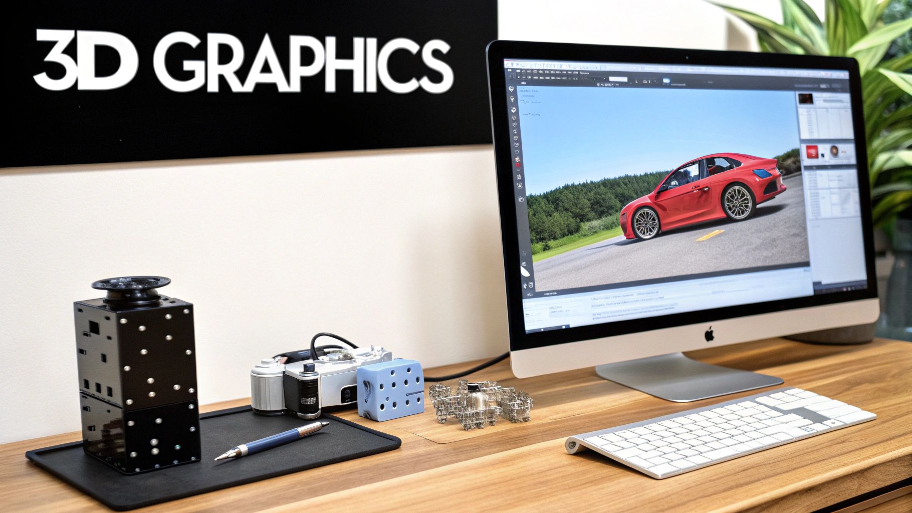
How to Implement 3D Graphics Effectively
Bringing 3D to your website requires a balance between visual impact and performance. It’s crucial to ensure these experiences are accessible and don't alienate users on less powerful devices.
- Optimize Models for the Web: Performance is key. Keep 3D model files small, ideally under 10MB per asset, to ensure fast load times. Use the glTF/GLB format, which is designed for efficient transmission of 3D scenes and models.
- Implement Progressive Enhancement: Don't let your site break for users with older browsers or devices. Provide a static image or a simpler interactive element as a fallback for browsers that do not support WebGL.
- Prioritize Mobile Performance: Test your 3D graphics extensively on various mobile devices. Implement Level of Detail (LOD) techniques, which load simpler versions of a model when it's far away and more detailed versions as the user gets closer.
- Lazy Load 3D Assets: Only load 3D elements when they are about to enter the user's viewport. This prevents large assets from slowing down the initial page load, especially for content that appears further down the page.
By thoughtfully integrating 3D elements, you can create a highly engaging and informative user experience that showcases products in a way static images never could.
10. Ethical Design and an Accessibility-First Approach
Ethical design moves beyond aesthetics to prioritize user well-being, transparency, and inclusivity. It means designing with a conscience, actively avoiding deceptive "dark patterns," protecting user privacy, and ensuring equal access for all. An accessibility-first approach is a core component, making a commitment to build experiences that people with disabilities can use effectively. This human-centric mindset is becoming a non-negotiable part of modern website design trends.
This approach builds profound user trust and expands your audience. When users feel respected and safe, they are more likely to engage with your brand. Companies like Microsoft and the BBC have championed inclusive design principles, demonstrating that creating accessible products leads to better experiences for everyone. An accessible website isn't just a legal or moral imperative; it's a strategic advantage that unlocks a wider market and strengthens brand reputation.
How to Implement Ethical and Accessible Design
Integrating accessibility from the start is more efficient and effective than trying to add it later. It requires a fundamental shift in how you plan, design, and build digital products.
- Use Semantic HTML: Structure your content with proper HTML tags (e.g.,
<nav>,<main>,<h1>,<button>). This provides a clear, logical structure that screen readers and other assistive technologies rely on to interpret the page. - Ensure Sufficient Contrast: Text must be clearly legible against its background. Use tools like WAVE or Lighthouse to check that your color combinations meet the minimum WCAG AA contrast ratio of 4.5:1 for normal text.
- Prioritize Keyboard Navigation: Ensure every interactive element, including links, buttons, and form fields, can be accessed and operated using only the keyboard. This is critical for users with motor disabilities who cannot use a mouse.
- Provide Descriptive Alt Text: Write meaningful alternative text for all functional images. This allows users of screen readers to understand the content and purpose of the visual elements on your site. For a comprehensive guide, check out this website accessibility checklist.
- Conduct Regular Audits: Regularly test your website using both automated tools and manual testing with real users who have disabilities. This combination helps catch issues that automated checkers might miss, ensuring a genuinely usable experience.
Top 10 Website Design Trends Comparison
| Pattern | Implementation Complexity 🔄 | Resources & Performance ⚡ | Expected Outcomes ⭐📊 | Ideal Use Cases 💡 | Key Advantages ⭐ | Key Risks/Accessibility 📊 |
|---|---|---|---|---|---|---|
| Dark Mode Design | Medium — theming, contrast planning; toggle logic 🔄 | Low–Medium — CSS vars; battery savings on OLED ⚡ | Better low-light comfort; higher engagement; battery savings ⭐📊 | Apps, OS UI, night-time content consumption 💡 | Modern aesthetic; reduced eye strain; accessibility for light-sensitive users ⭐ | Contrast/readability issues; extra testing; separate themes may be needed 📊 |
| Minimalist & Clean Design | Low–Medium — careful layout & typography decisions 🔄 | Low — fewer assets, faster loads, simpler maintenance ⚡ | Faster load times; clearer focus; professional appearance ⭐📊 | Corporate sites, blogs, SaaS landing pages, mobile-first projects 💡 | Improved usability; lower dev/maintenance cost; responsive by default ⭐ | Can feel bland; hard to present complex data; limited creative expression 📊 |
| Micro-interactions & Animation | Medium–High — timing, coordination, accessibility support 🔄 | Medium — JS/CSS + perf tuning; animate sparingly ⚡ | Improved perceived responsiveness; better engagement and guidance ⭐📊 | Product UIs, onboarding, forms, interactive controls 💡 | Immediate feedback, polished feel, guides user actions ⭐ | Can distract or annoy; performance cost; motion accessibility concerns 📊 |
| Responsive & Mobile-First Design | Medium — breakpoints, progressive enhancement planning 🔄 | Low–Medium — CSS frameworks, device testing; optimized assets ⚡ | Broader reach; better SEO; improved mobile performance ⭐📊 | All public websites, e‑commerce, news, apps where mobile matters 💡 | Future-proof; improved accessibility and SEO; consistent UX ⭐ | Extensive cross-device testing; different desktop expectations; touch vs mouse issues 📊 |
| Neumorphism & Glassmorphism | High — complex shadow/blur systems and fallbacks 🔄 | Medium–High — GPU-heavy effects, backdrop-filter costs ⚡ | Premium, layered depth; aesthetic novelty but possible readability issues ⭐📊 | Luxury brands, dashboards, overlays, modals (use sparingly) 💡 | Tactile, modern visuals; subtle depth without clutter ⭐ | Low contrast/accessibility; performance hit; browser support and trend risk 📊 |
| Bold Typography & Variable Fonts | Low–Medium — font loading, pairing, responsive type 🔄 | Low–Medium — web fonts, licensing; variable fonts save size ⚡ | Strong brand presence; clear hierarchy; better readability when well-tuned ⭐📊 | Editorial sites, marketing pages, brand systems, hero sections 💡 | High visual impact; reduced payload with variable fonts; clear hierarchy ⭐ | Font loading performance; pairing complexity; licensing considerations 📊 |
| Immersive Scroll & Parallax | High — scroll syncing, performance and timing challenges 🔄 | High — heavy JS/media; needs optimization for 60fps ⚡ | Highly engaging storytelling; longer time on page; memorable experiences ⭐📊 | Campaign pages, portfolios, product reveals, storytelling sites 💡 | Emotional engagement; guided narratives; premium feel ⭐ | Performance, motion sickness, mobile complexity, accessibility concerns 📊 |
| AI & Dynamic Personalization | High — data pipelines, ML models, integration effort 🔄 | High — data infra, realtime processing, analytics stack ⚡ | Higher conversions/retention; tailored UX; data-driven improvements ⭐📊 | E‑commerce, media platforms, recommendation systems, large-scale sites 💡 | Scalable personalization; measurable ROI; improved engagement ⭐ | Privacy/GDPR risk, bias, cost, requires data and expertise 📊 |
| 3D Graphics & WebGL Integration | High — 3D dev skills, rendering pipelines, LOD strategies 🔄 | High — GPU use, large assets; mobile optimization required ⚡ | Immersive product visualization; better demos and conversions ⭐📊 | Product configurators, AR/VR experiences, automotive, gaming 💡 | Differentiation; realistic previews; AR integration possibilities ⭐ | Heavy performance overhead; large file sizes; mobile/browser compatibility 📊 |
| Ethical Design & Accessibility‑First | Medium — audits, semantic markup, inclusive patterns 🔄 | Medium — testing tools, expert resources, ongoing maintenance ⚡ | Legal compliance; wider audience reach; improved UX and SEO ⭐📊 | Government, public services, enterprises, any inclusive product 💡 | Expanded market reach; reduced legal risk; better brand trust ⭐ | Initial cost and education; continuous testing and upkeep required 📊 |
Bringing It All Together: Your Next Steps
We've explored a dynamic landscape of modern website design trends, moving from the engaging subtlety of micro-interactions to the bold statement of oversized typography. We've seen how trends like Dark Mode and Neumorphism redefine visual aesthetics, while AI-driven personalization and immersive 3D graphics are pushing the boundaries of user experience. Yet, the most crucial takeaway isn't simply knowing what these trends are; it's understanding the "why" behind them.
Each trend we discussed serves a strategic purpose. A mobile-first design isn’t just a checklist item; it’s a commitment to meeting the majority of your audience where they are. An accessibility-first approach isn't just about compliance; it's about expanding your market reach and building a brand that values every single user. These aren't fleeting fads but reflections of evolving user expectations and technological capabilities.
The central theme connecting these powerful concepts is a relentless focus on the user. The best designs don't just look good-they feel intuitive, solve problems, and create a seamless bridge between a user's need and a business's solution. Your website is no longer a static digital brochure; it's your most powerful sales tool, your primary brand ambassador, and a dynamic engine for growth.
Turning Inspiration into Action
Feeling inspired is one thing, but implementing these ideas is where the real work begins. The path forward can feel overwhelming, especially when balancing a budget, technical constraints, and brand identity. To make this process manageable, here are your actionable next steps:
-
Conduct a Strategic Audit: Before chasing the newest trend, evaluate your current website. Use analytics to identify where users drop off, which pages have low engagement, and what your mobile experience is truly like. This data-driven approach will reveal which trends can solve your most pressing problems. For example, high bounce rates on mobile might prioritize a shift to a responsive, mobile-first framework.
-
Align Trends with Brand & Audience: Not every trend is right for every business. A minimalist design might perfectly suit a high-end B2B service, but a brand targeting a younger, creative audience might benefit more from bold typography and immersive scrolling. Ask yourself: "Does this trend align with my brand's personality and serve my target customer's needs?"
-
Prioritize for Impact: You don't need to implement everything at once. Create a phased roadmap based on potential ROI. For many SMBs, starting with accessibility improvements and ensuring a flawless mobile-first design will deliver the most significant and immediate returns. These foundational elements enhance user experience for everyone and improve SEO, making them a smart initial investment.
-
Prototype and Test: Before committing to a full-scale redesign, use tools like Figma or Adobe XD to prototype how a new trend might look and feel. Conduct A/B tests on smaller elements, like adding subtle micro-interactions to a key call-to-action button, to measure their impact on conversion rates before a wider rollout.
Ultimately, mastering these website design trends means seeing them not as decorations but as strategic tools. When chosen wisely and implemented with care, they can transform your digital presence from a simple online listing into a memorable, high-performing experience that captivates visitors and converts them into loyal customers.
Navigating the complexities of modern web design can be challenging, but you don't have to do it alone. At OneNine, we specialize in translating cutting-edge website design trends into tangible business results, creating websites that are as strategic as they are beautiful. If you're ready to build a powerful digital presence that drives growth, let's connect and discuss how we can bring your vision to life.


