

Why Mobile Website Testing Changed Everything
The mobile revolution dramatically changed how businesses operate online. Many organizations were caught unprepared by the rapid shift in user behavior, forcing them to adapt quickly. This transition wasn't simply about resizing websites; it required a complete overhaul of mobile website testing strategies. Those who recognized this early thrived, while others struggled. Why was mobile website testing so vital in this shift?
One key reason was the change in user expectations. Users accustomed to seamless desktop experiences now expected the same functionality and performance on their mobile devices. Websites needed testing not just for responsiveness, but also for usability, speed, and overall user experience. For instance, a website might look perfect on a desktop but have tiny, unusable buttons on a mobile screen.
Additionally, mobile device adoption fundamentally changed digital interactions. As of April 2025, almost 60% (59.7%) of global website traffic originates from mobile devices. This marks a significant increase from a decade ago when mobile traffic only accounted for about a third of all web traffic. This shift compels organizations to invest in mobile website testing to ensure compatibility, usability, and performance across various devices, browsers, and operating systems. You can find more statistics at: Mobile Device Website Traffic Statistics. This surge in mobile usage made mobile website testing essential for survival.
The Impact of Neglecting Mobile Testing
Companies that neglected mobile testing faced consequences. Mobile devices presented new challenges, including screen size variations, different operating systems, and varying network conditions. Ignoring these factors led to poor user experiences, resulting in lower engagement, higher bounce rates, and decreased conversions. Businesses lost potential customers and revenue simply because their websites weren't mobile-friendly.
The Shift to Mobile-First
The rise of mobile forced a mobile-first approach. This meant designing websites with mobile users as the top priority, not as an afterthought. This required significant investment in mobile website testing for a flawless mobile experience. Learn more here: How to Make Website Mobile Friendly. This proactive strategy helped businesses stay ahead of the curve and capitalize on the growing mobile audience. Organizations embracing the mobile-first mentality were better positioned to succeed. They understood that mobile was becoming the primary way users interacted with their brands.

Testing Strategies That Actually Move The Needle

Effective mobile website testing is more than just seeing if your site appears on a phone. It's about understanding the real user experience. This means thinking about how people interact with your site on different mobile devices. Consider factors like screen sizes, operating systems, and network conditions.
Prioritizing Testing Efforts
Testing every single aspect of a mobile website is rarely feasible. Time and resources are often limited. That's why prioritizing your mobile website testing is key. Focus on the most important user flows and functionalities. Also, consider the devices and operating systems your target audience uses most. This targeted approach makes your testing more impactful.
Identifying Key Device Combinations
Knowing your audience's device preferences is crucial. Analyzing your website analytics can provide valuable data on the devices and operating systems your visitors use. This data helps you prioritize which devices to test. For instance, if many of your visitors use iPhones, focus your testing on different iPhone models and iOS versions.
This increased focus on mobile has driven investment in testing. By 2025, 79% of organizations plan to spend more on mobile app testing. 72% plan to grow their testing teams. This shows how important thorough testing is for both user experience and business success. You can find more statistics here: Mobile App Testing Statistics. But remember, investing in the right strategies is as important as increasing your budget.
Simulating Real-World Conditions
Testing under real-world conditions is essential. This helps uncover hidden issues. Factors like network connectivity, location, and varying network speeds can significantly impact the user experience. By simulating these conditions during testing, you can identify performance bottlenecks and usability issues that might not show up in a controlled environment. This ensures your website works well in diverse situations.
Frameworks For Effective Mobile Testing
A structured mobile website testing strategy is vital. A well-defined framework keeps your testing organized and ensures thorough coverage. This might include:
- Device Compatibility Testing: Check how your website looks and functions on different screen sizes and resolutions.
- Performance Testing: Measure your website's loading speed and performance under various network conditions.
- Usability Testing: Evaluate the user experience and look for any navigation or interaction problems.
- Security Testing: Make sure your website is secure and protected from vulnerabilities.
By using these strategies, you can provide a seamless and enjoyable experience for all users. No matter their device or location. This will lead to happier users, more conversions, and a stronger online presence.
Building Your Mobile Testing Foundation That Scales
Building a scalable mobile website testing framework isn't about dreams; it's about strategy and action. This means creating realistic testing environments and finding the right balance between manual and automated testing. Also, building maintainable test suites is crucial for long-term success. These suites need to catch real problems without becoming a maintenance nightmare.
Establishing a Realistic Testing Environment
First, figure out which devices and operating systems your target audience uses. Prioritize testing on these platforms. For example, if your analytics show most of your users are on iPhones, focus your mobile website testing on various iPhone models and iOS versions. This targeted approach ensures you're focusing on the most important user experiences.
Next, simulate real-world network conditions. Don't assume everyone has a perfect connection. Test your website's performance on different network speeds like 3G, 4G, 5G, and Wi-Fi. This shows you how your website performs under pressure and helps identify potential bottlenecks. This type of testing is especially important for apps, as users spend more time in them than on mobile websites, according to sources like VWO. It's still essential for website testing, though.
You might find this interesting: How to master mobile-first design.
Balancing Manual and Automated Testing
Automated testing is great for repetitive tasks and regression testing, but manual testing is still essential. Human testers can find usability issues and edge cases that automated scripts might miss. A balanced approach using both methods provides the most comprehensive coverage.
Building Maintainable Test Suites
Organize your test cases logically. Group tests by functionality or user flows. This makes test maintenance simpler and helps pinpoint problems faster. A clear structure makes it easier to add new tests and change existing ones as your website changes.
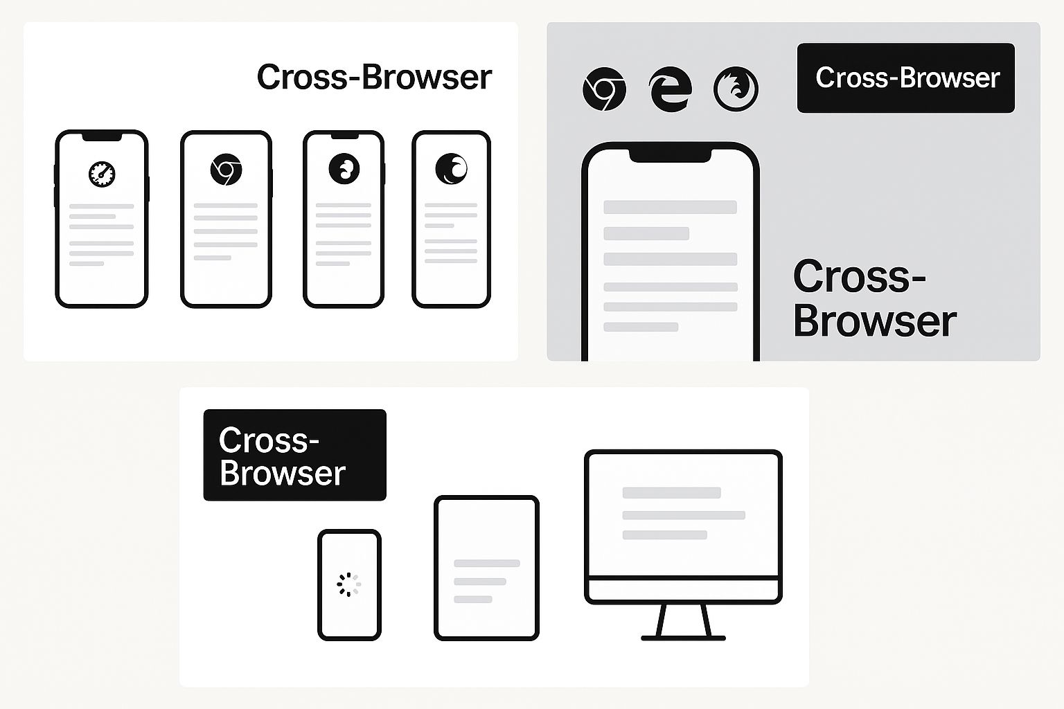
This infographic shows how complex cross-browser compatibility can be on mobile devices, highlighting how a webpage can display differently across various browsers and operating systems. The main takeaway is that mobile website testing needs to cover numerous device and browser combinations to ensure a consistent user experience.
To help visualize the differences between various mobile testing frameworks, take a look at the following table:
The table below, "Mobile Testing Framework Components Comparison," compares different mobile testing framework approaches. It illustrates manual vs. automated testing ratios, resource needs, and effectiveness for various project types.
| Framework Type | Manual Testing % | Automation % | Setup Time | Maintenance Effort | Best For |
|---|---|---|---|---|---|
| Manual | 100 | 0 | Low | Low | Small projects, exploratory testing |
| Automated (Appium/Selenium) | 20 | 80 | High | Medium | Large projects, regression testing |
| Hybrid | 50 | 50 | Medium | Medium | Medium-sized projects, combination of exploratory and regression |
The table highlights how choosing the right framework depends on project size, resources, and testing goals. For smaller projects, manual testing might be sufficient. Larger projects benefit from automation, while a hybrid approach suits projects somewhere in between.
Integrating Testing into the Development Workflow
Integrate mobile website testing into your development process. This might mean including automated tests in your continuous integration/continuous deployment (CI/CD) pipeline. Early and frequent testing finds problems early in the development cycle, making them cheaper and easier to fix.
Tracking Results and Driving Improvements
Track metrics that matter. Don't just count bugs. Focus on things like load times, error rates, and user engagement. These metrics give you valuable insights into the user experience and pinpoint areas for improvement. By analyzing these metrics, you can show the value of your testing and justify continued investment in mobile website testing.
Resource Allocation and Timeline Management
Allocate resources effectively. Mobile website testing requires time, budget, and expertise. Make sure you have enough resources to support your testing efforts. This might involve hiring dedicated testers or investing in testing tools like Appium or Selenium. Realistic timelines are just as important. Don't try to test everything at once. Prioritize essential tests and create a strategic testing schedule.
Understanding Global Mobile Testing Realities
Your users access your website from all over the world and under various conditions. Therefore, your mobile website testing shouldn't assume everyone has the same experience. Mobile usage differs significantly between regions, affecting preferred devices and network infrastructure. This has a direct impact on how users interact with your website.
Device Fragmentation and Regional Preferences
Different regions prefer different mobile devices. Some brands might be popular in Asia, while others dominate in Europe. Screen sizes, operating systems, and even processing power can vary widely. This device fragmentation requires a thorough testing strategy. You need to ensure your site works on the devices most common in your target markets.
Network conditions also play a crucial role. Developed countries often have strong 4G and 5G networks. However, many emerging economies still rely on 2G and 3G, or experience unreliable connectivity. Testing only on fast networks won't reveal the problems faced by users with slower connections. Simulating different network environments is essential.
Adapting to Emerging Economies
Cultural factors influence how people use mobile devices. Language settings, data usage preferences, and even commonly used apps differ by region. These factors can affect how users engage with your website. Good mobile website testing accounts for these cultural differences. This creates a positive experience for all users, no matter where they are.
The importance of mobile website testing increases in areas with high mobile internet use. As of 2025, Africa is projected to lead globally, with 69.13% of its internet traffic coming from mobile devices. This emphasizes the need to prioritize mobile compatibility and testing. Find more detailed statistics here. This data reveals just how important mobile access is in many regions.
Tailoring Your Strategy for Global Reach
International companies recognize these factors and adapt their mobile website testing strategies. They use techniques like geo-targeting and localization testing to find and fix region-specific problems. They also invest in testing infrastructure that accurately simulates different networks and devices.
Best Practices for Global Mobile Testing
For a truly global testing strategy, consider these best practices:
- Identify Key Markets: Use website analytics to see where your users are and what devices they're using.
- Prioritize Device Coverage: Focus your testing on the most popular devices and operating systems in each target market.
- Simulate Network Conditions: Test on various network speeds and connection types to mimic real-world conditions.
- Localize Content and Functionality: Test translated content and any region-specific features.
- Use Cloud-Based Testing Platforms: Cloud platforms like BrowserStack or Sauce Labs provide access to a wide range of devices and network settings.
A global approach to mobile website testing ensures a smooth experience for all users, no matter their location. This helps you reach a wider audience and maximize your website's impact. This results in better engagement, higher conversion rates, and a more successful online presence.
Choosing Mobile Testing Tools That Actually Work
The sheer number of mobile website testing tools available can feel overwhelming. Many make big promises, but it's important to look beyond the marketing hype. This section provides a practical guide to selecting effective tools, based on real-world feedback.
Key Criteria for Selecting Effective Tools
Before exploring specific tools, let's define some essential criteria for evaluation:
- Device Coverage: Does the tool support the devices and operating systems used by your target audience? This is fundamental.
- Automation Support: Can you automate repetitive tests to free up your team for exploratory testing?
- Integration Capabilities: Will the tool integrate smoothly into your existing workflow, or will it create additional complexity?
- Pricing Model: Is the pricing clear, predictable, and within your budget?
- User Experience: Is the tool user-friendly and easy to learn, or does it require extensive training?
These factors will help you choose tools that improve, rather than complicate, your testing process. Focusing on these criteria helps you select tools aligned with your needs and budget. This ensures a good return on investment.
Evaluating Popular Testing Platforms
To help you compare options, we've created the following table: "Mobile Testing Tools Feature Matrix". It summarizes key features, pricing, device coverage, and integration capabilities of popular mobile website testing tools.
Let’s look at some practical tools to evaluate different platforms.
| Tool Name | Device Coverage | Automation Support | Pricing Model | Key Features | Best Use Case |
|---|---|---|---|---|---|
| BrowserStack | Extensive (Real Devices & Browsers) | Yes (Selenium, Appium) | Subscription (Tiered) | Cross-Browser Testing, Visual Testing | Web & Mobile App Testing |
| Sauce Labs | Broad (Real & Virtual Devices) | Yes (Selenium, Appium) | Subscription (Usage-Based) | Parallel Testing, Test Analytics | Enterprise-Grade Testing |
| Firebase Test Lab | Android & iOS (Real & Virtual Devices) | Yes (Robo Test, Instrumentation Tests) | Pay-As-You-Go | Cloud-Based Infrastructure, Performance Monitoring | Mobile App Testing |
| AWS Device Farm | Android & iOS (Real Devices) | Yes (Appium, Calabash) | Pay-As-You-Go | Remote Access to Devices, Performance Reports | Mobile App Testing |
This table provides a quick overview to help you compare different platforms. Remember to choose based on your specific testing requirements.
Building a Sustainable Testing Toolkit
Selecting the right tools is just the first step. Building a sustainable mobile website testing toolkit requires ongoing effort:
- Prioritize Your Needs: Focus on essential features. Don't be distracted by unnecessary bells and whistles.
- Start Small, Scale Up: Begin with a few key tools and expand as your needs change. Avoid accumulating too many tools at once.
- Continuous Evaluation: Regularly review your tools. Remove any that are no longer useful.
- Training and Support: Ensure your team has the training and support needed to use the tools effectively.
- Community and Resources: Stay up-to-date by engaging with online communities and utilizing available resources.
A practical and adaptable toolkit will ensure your testing remains effective and aligned with your goals. Building a robust testing system, rather than just acquiring individual tools, will help you adapt to changing technologies.
Integrating Tools Into Your Workflow
Tool integration is essential for an efficient workflow. Fragmented tools diminish overall effectiveness. Make sure your tools integrate seamlessly with each other and your development environment. For example, consider integrating your mobile website testing tool with your CI/CD pipeline to automate testing during development. This creates a more streamlined process, saves time, and increases testing frequency.
Choosing the right mobile website testing tools is a crucial decision. By focusing on practicality, integration, and scalability, you can build a testing strategy that improves your website's performance across devices and enhances user experience. This leads to increased user engagement and higher conversions. This also helps you reach your target audience more effectively. Remember, the key is to make informed decisions that align with your needs and build a testing strategy that works for you.
Measuring Results And Proving Mobile Testing Value
Great mobile website testing isn't just about finding bugs; it's about demonstrating real business value. This means moving beyond vanity metrics, like the number of bugs found, and focusing on measurements that directly impact business outcomes. Think about how testing affects key performance indicators (KPIs) like conversion rates, bounce rates, and user engagement.
Establishing Meaningful Benchmarks
Before measuring the value of mobile website testing, establish clear benchmarks. Collect baseline data on key performance indicators before implementing any changes. For example, track your current bounce rate, average session duration, and conversion rates for mobile users. These initial metrics provide a starting point for measuring improvement and tracking how testing impacts these numbers.
Tracking Testing Efficiency
It's also important to track the efficiency of your testing process. Key metrics include the number of tests executed, the time taken to complete testing cycles, and the cost of testing activities. If automating some tests reduces testing time by 50%, that frees up valuable time for more strategic initiatives. Tracking these internal metrics highlights efficiency gains and helps optimize the testing process.
Communicating Results to Stakeholders
Communicating the value of your mobile website testing to stakeholders is essential. Present data clearly, concisely, and compellingly. Use visuals like charts and graphs to showcase the impact of testing on business KPIs. A graph showing a 10% increase in mobile conversions after testing-driven improvements demonstrates the return on investment (ROI). This data-driven reporting justifies continued investment and strengthens the case for more resources. Learn more in our article about website usability testing.
Analyzing Testing Data for Process Improvements
Data analysis is crucial for optimizing mobile website testing. By examining testing results, you can identify areas for improvement and refine strategies. If a specific bug frequently appears, adjust your development process to prevent it. Look for patterns in mobile user behavior to inform design and development decisions. This data-driven approach ensures testing is continually evolving and maximizing its impact, preventing problems rather than just reacting to them.
Demonstrating ROI and Justifying Investment
Proving the ROI of mobile website testing means connecting testing activities to financial outcomes. Track the cost of fixing bugs found during testing compared to the potential cost of those bugs impacting users. Fixing a critical bug that could lead to lost sales demonstrates clear financial value. Improved mobile user experience can lead to increased conversions and revenue, further strengthening the ROI case. Quantifying these financial benefits provides concrete evidence and justifies continued investment. This might involve calculating the cost of user churn due to a poor mobile experience and showing how testing mitigates this risk, aligning testing with business goals. You might be interested in: How to master website usability testing.
Maintaining Quality Standards as Your Testing Program Scales
As your organization grows, maintaining high-quality mobile website testing is critical. This involves robust processes, clear documentation, and effective training programs. Documenting procedures, creating a centralized knowledge base, and providing ongoing training ensures consistency and quality, even as your team expands. This structured approach keeps everyone aligned and empowers them to deliver consistent, high-quality results, proactively maintaining quality as your program scales.
Actionable Templates and Reporting Strategies
Standardized templates for reporting testing outcomes ensure consistency and simplify communication. Use templates outlining key metrics, identified issues, and recommendations for improvement. This makes it easier for stakeholders to understand testing results. A reporting dashboard providing a visual overview of key testing metrics and trends offers a real-time snapshot of testing performance and facilitates data-driven decision-making. By focusing on these strategies, you can move beyond just finding bugs and demonstrate the true value of mobile website testing, gaining stakeholder support, justifying investment, and contributing to overall business success.
Ready to elevate your website's performance and user experience? OneNine offers expert website management and development services, including comprehensive mobile optimization and testing. Visit OneNine today to learn how we can help you achieve your digital goals.


