

Why Mobile-Friendly Websites Drive Real Business Growth
Having a mobile-friendly website isn't just a nice extra anymore; it's essential for business success. It's not just about ticking a technical box, it's about opening your doors to the largest possible customer base. Think of your website as your online storefront. Would you design a physical store that's difficult to enter and navigate? Of course not! The same applies to your website in the mobile world.
The Mobile-First Reality and Its Impact on Business
The way people access the internet has changed dramatically. Mobile usage has exploded, and this trend is here to stay. By April 2025, mobile devices generated about 59.7% of all website traffic worldwide. This is a massive increase from roughly 35% in 2015. Find more detailed statistics here. What does this mean for your business? It means over half of your potential customers are likely visiting your website on their phones or tablets. If your site isn’t designed for these devices, you’re missing out on a huge opportunity.
How Mobile Optimization Boosts Engagement and Conversions
A positive mobile experience directly impacts how users interact with your website. When it's easy to navigate your site, find information, and complete tasks (like buying something or filling out a form), visitors are more likely to stay longer, browse more products or content, and ultimately, become paying customers. A seamless experience builds trust, much like a well-organized physical store instills confidence in shoppers. A smooth, efficient mobile website reassures users that your business is professional and trustworthy.
Beyond Conversions: The Long-Term Benefits of Mobile Optimization
Mobile optimization offers more than just a quick boost to sales. It also helps improve your search engine rankings. Google's mobile-first indexing means the mobile version of your website is the primary factor in determining where you appear in search results. A mobile-friendly site is crucial for online visibility. Higher rankings lead to more organic traffic, driving further business growth. Plus, a positive mobile experience encourages customer loyalty. Happy customers are more likely to return, make repeat purchases, and recommend your business to others.
What Mobile Users Actually Expect From Your Website
Understanding what mobile users want is crucial for creating a positive mobile experience that encourages conversions. It's not just about shrinking your desktop site. It's about catering to the unique needs of users on their mobile devices. This means considering how they interact with their phones, their limited patience for slow loading times, and their need for readily available information.
The Need For Speed and Seamless Navigation
Mobile users value speed. They're often on the go, using their devices in short bursts, and won't tolerate a slow website. This highlights the need for streamlined navigation. Users should quickly find what they're looking for without excessive zooming, pinching, or scrolling. Think thumb-friendly buttons and easy-to-use menus.

Content Accessibility and Readability on the Small Screen
Content needs to be easily digestible on a smaller screen. Large font sizes, clear headings, and short paragraphs are key for readability. Imagine trying to read a dense wall of text on your phone while walking – it’s not a pleasant experience. A mobile-friendly design improves readability and enhances the user experience.
Building Trust Through Mobile Optimization
A well-optimized mobile website demonstrates professionalism and builds trust. Just like a clean, organized store, a smooth, efficient mobile site shows users your business is credible. By 2025, 61% of users indicated a higher opinion of mobile-optimized websites. This impacts user engagement, affecting everything from SEO to advertising. Find more detailed statistics here. This makes mobile optimization a critical question for any business.
Mobile-First Design Is Key
You might be interested in: How to master mobile-first design. Neglecting mobile can lead to lost customers and lower search result visibility. Also, see: How to master website performance optimization for tips on improving website speed and usability, both essential for a mobile-friendly experience. By understanding and meeting mobile user expectations, you can create a mobile experience that not only attracts users but also keeps them coming back, leading to more conversions and long-term success.
Mastering Google's Mobile First Indexing For Better Rankings
Mobile-friendliness is essential for online success. Understanding mobile-first indexing, where Google primarily uses your website's mobile version for indexing and ranking, is key to higher rankings and visibility. A poor mobile site performance will likely hurt your search result rankings.
How Google Evaluates Mobile Websites
Google analyzes several factors when assessing mobile websites. Page speed is critical. Mobile users expect fast loading times. A slow site leads to frustration and high bounce rates, negatively impacting rankings. Google also prioritizes responsive design, which adapts to different screen sizes for a consistent user experience.
Optimizing Your Site for Mobile-First Indexing
To succeed in Google's mobile-first world, focus on key technical elements and content. Your mobile site should have the same content as your desktop version. Inconsistencies can confuse Google. Ensure your site's structure is easily crawlable and indexable by Googlebot. A clean sitemap and proper structured data can significantly improve crawlability.
Mobile Navigation and Usability
Consider your site navigation. Is it intuitive on a smaller screen? Mobile users often navigate with their thumbs, so large, clear buttons are essential. This improves usability and contributes to a positive user experience, influencing Google's ranking algorithm.
Avoiding Common Mobile SEO Mistakes
Many businesses make mistakes that hinder their mobile SEO. One common error is blocking JavaScript, CSS, and image files. These are vital for rendering a website correctly on mobile. Blocking them can prevent Google from understanding your site's content and functionality. Another mistake is using intrusive interstitials (pop-ups covering main content), disrupting the user experience.
By 2025, Google fully adopted mobile-first indexing. The mobile version is now the primary version for rankings. This emphasizes the importance of a seamless mobile experience. Ignoring mobile-first design can severely reduce visibility. Businesses must invest in mobile-responsive designs to remain competitive. Explore this topic further.

By understanding and addressing mobile optimization, you can position your website for success with Google’s mobile-first indexing, leading to better rankings, increased traffic, and improved business outcomes.
Choosing The Right Mobile Design Strategy For Your Business
Creating a mobile-friendly website means picking the right design strategy. This choice affects development time, cost, and the user experience. A wrong approach can waste resources and create a poor mobile presence. Let's look at the three main methods: responsive design, adaptive design, and separate mobile sites.
Responsive Design: One Size Fits All
Responsive design uses one codebase that adapts to different screen sizes. It's like a flexible container, reshaping to fit its contents. This simplifies development and maintenance, with only one website to manage. Google generally prefers this approach for SEO, which can boost your search rankings.
Adaptive Design: Tailored For Each Device
Adaptive design creates several fixed layouts for different screen sizes. Imagine tailoring a suit—each size has a unique pattern. This creates highly optimized experiences on different devices but increases development and maintenance costs. It’s best if your audience mainly uses specific devices and needs a very customized experience.
Separate Mobile Sites: A Dedicated Mobile Experience
A separate mobile site is a completely different website built for mobile devices. This offers flexibility but requires maintaining two sites, increasing complexity and cost. While once common, it’s often less ideal than responsive design due to SEO drawbacks and more maintenance.
To help you choose the best approach, let's compare them side by side:
To help you choose the best approach, let’s compare them side by side:
Mobile Design Approaches Comparison
A comprehensive comparison of responsive design, adaptive design, and separate mobile sites, showing their key features, benefits, drawbacks, and ideal use cases.
| Design Approach | Key Features | Benefits | Drawbacks | Best For |
|---|---|---|---|---|
| Responsive Design | Single codebase, adapts to all screen sizes | Easier to maintain, cost-effective, good for SEO | Can be less optimized for specific devices | Websites with broad audience and content |
| Adaptive Design | Multiple fixed layouts for different screen sizes | Highly optimized for target devices | More expensive to develop and maintain | Websites targeting specific devices and aiming for premium user experience |
| Separate Mobile Sites | Dedicated mobile website | High flexibility | Requires managing two sites, potential SEO drawbacks | Websites needing significantly different functionality on mobile vs. desktop (becoming less common) |
As the table shows, responsive design offers the simplest solution for most businesses, while adaptive design prioritizes a tailored experience for specific devices. Separate mobile sites are generally becoming less common due to the advantages of responsive design.
Below is a handy infographic to further understand mobile design best practices:
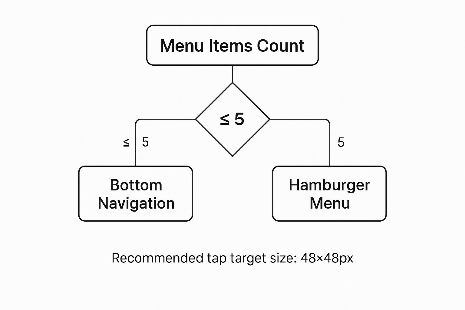
As you can see, bottom navigation works well for menus with five or fewer items. For larger menus, a hamburger menu is more user-friendly. Keeping tap targets at 48×48 pixels also improves usability. For more redesign planning resources, check out this website redesign checklist.
Choosing the best mobile design strategy means understanding these options and their impact on your business. Consider your budget, technical skills, and desired user experience to make the right choice for your mobile presence.
Step By Step Technical Implementation That Actually Works

Turning your website into a mobile-friendly experience involves a few key technical steps. This section offers a practical guide, walking you through essential implementations for optimal mobile performance. We'll cover everything from basic setup to more advanced techniques.
Setting the Foundation: Viewport Configuration
The first critical step is configuring the viewport. This essentially tells the browser how to display your website on different devices. Without the correct viewport meta tag, your site simply won't render properly on mobile screens.
This tag ensures your content scales correctly, eliminating the need for users to constantly zoom and scroll horizontally. Include <meta name="viewport" content="width=device-width, initial-scale=1"> in the <head> section of your site. This simple line of code makes a huge difference.
Implementing Responsive Grid Systems and Media Queries
Next, implement a responsive grid system. This allows your website layout to adapt to different screen sizes. Think of it as a flexible framework that rearranges elements based on the available screen real estate.
This dynamic approach ensures a consistent user experience across various devices. Combined with CSS media queries, you can further customize styles based on screen size, resolution, and even orientation.
- Grid Systems: Frameworks like Bootstrap and Foundation use columns and rows to structure your content, automatically adjusting to different screen widths.
- Media Queries: These allow you to apply different CSS rules based on device characteristics. For example, you could increase font size on smaller screens or hide certain elements entirely.
Optimizing Interactive Elements and Navigation
Making sure interactive elements work smoothly on mobile is essential. Buttons and links should be easily tappable with a finger. Avoid small, fiddly elements that can frustrate mobile users. A website redesign checklist can help you consider important design elements.
Navigation should also be intuitive and user-friendly on a smaller screen. Consider using a "hamburger menu" for larger navigation menus to keep the interface clean and uncluttered. This significantly improves usability and user satisfaction.
Advanced Techniques for Enhanced Mobile Experience
Beyond the basics, there are advanced techniques you can implement for even better mobile performance. Consider these strategies:
- Touch Navigation Optimization: Implement touch-friendly gestures like swiping and pinching for a more intuitive mobile experience.
- Form Usability: Simplify forms for mobile users. Reduce the number of fields, use clear labels, and disable autocorrect where it's not needed.
- Visual Hierarchy: Maintain a clear visual hierarchy on smaller screens. Ensure important information is readily accessible and stands out.
For additional insights into improving speed and usability, you might find this helpful: How to master website performance optimization. Implementing these strategies can greatly improve your website's mobile friendliness, leading to better user engagement, higher conversion rates, and improved search engine rankings. Remember, 58% of web traffic comes from mobile, so optimizing for these users is vital for online success.
Optimizing Mobile Performance For Maximum Impact
Creating a mobile-friendly website is an important first step. But optimizing its performance is how you really make it successful. Speed and usability are essential for a good mobile site. This section explains advanced techniques to improve both.
Speed Optimization: Essential For Mobile Success
Mobile users are often busy and don't have time for slow websites. 53% of mobile site visits are abandoned if a page takes more than three seconds to load. Page speed is key to keeping visitors and getting more conversions. Here are some helpful strategies:
-
Image Optimization: Compressing images reduces file sizes, which leads to faster loading. You can maintain image quality while significantly shrinking file size. Try using a tool like TinyPNG to compress your images.
-
Caching Strategies: Browser caching lets returning visitors load pages faster. It works by storing assets on their devices. This helps your server too, and improves the overall user experience.
-
Minify Code: Clean up your website's code. Removing extra characters from your HTML, CSS, and JavaScript files makes them smaller. Think of it like removing extra spaces and notes. This simple action can improve your site's loading speed.
Usability Enhancements: Engaging Mobile Users
A fast website is no good if it's hard to use. Mobile users expect a smooth and intuitive experience. Make sure your site is easy to navigate with a fingertip. Consider these points:
-
Intuitive Mobile Navigation: Create a navigation menu designed specifically for mobile. Use clear menus and buttons that are easy to tap. For some expert advice, check out this article on mobile navigation best practices.
-
Touch-Friendly Interfaces: All interactive elements should be big enough to tap easily. Make sure they're also spaced out enough to prevent accidental clicks. A good size for tap targets is 48×48 pixels.
-
Prioritize Content: Show the most important information first. Make it easy to find. Use clear headings and short paragraphs. This improves readability on small screens.
Analyzing and Improving Mobile Performance
Regularly check and improve your mobile site's performance. Looking at mobile analytics data tells you how users behave. You'll see information like bounce rates and time spent on page. This helps you find problems and areas to improve.
You can also use A/B testing. This lets you try out different designs to see what works best with your mobile audience. Testing your mobile site's performance is an ongoing process.
Use tools like Google's Mobile-Friendly Test and PageSpeed Insights to find areas for improvement. These tools give advice on technical aspects and user experience. By regularly using these strategies, you can ensure your mobile site performs well on any device and connection speed. This will improve user engagement and your business overall.
To help guide your optimization efforts, use the checklist below.
Before diving into the performance checklist, it's a good idea to familiarize yourself with some important terminologies and techniques.
Mobile Performance Optimization Checklist
A comprehensive checklist of performance optimization techniques with their impact on loading speed and user experience metrics
| Optimization Technique | Implementation Difficulty | Performance Impact | User Experience Benefit | Priority Level |
|---|---|---|---|---|
| Image Optimization | Easy | High | Improved load times, reduced data usage | High |
| Caching Strategies | Medium | High | Faster page loads for returning visitors | High |
| Minify Code | Medium | Moderate | Improved load times | Medium |
| Intuitive Mobile Navigation | Medium | Low | Enhanced user engagement, reduced bounce rate | High |
| Touch-Friendly Interfaces | Easy | Moderate | Improved usability, reduced frustration | High |
| Prioritize Content | Easy | Low | Improved readability, enhanced user engagement | High |
This checklist summarizes some of the most impactful mobile optimization strategies. By focusing on these areas, you can significantly improve both the speed and usability of your mobile site. This leads to happier visitors and better results for your business.
Testing and Measuring Your Mobile Success
Creating a mobile-friendly website is only the beginning. Real success comes from regularly measuring and improving its performance. This section offers a simple way to test your mobile site's effectiveness using both automated tools and hands-on testing.
Leveraging Automated Testing Tools
Several helpful tools can analyze your website's mobile-friendliness. Google's Mobile-Friendly Test is a great place to start. This free tool quickly checks your URL and finds any mobile usability issues. It gives a clear pass/fail result and shows specific areas to improve.
PageSpeed Insights, another free tool from Google, analyzes both your mobile and desktop site's performance. It provides detailed reports on loading speed and suggests improvements. This is important for finding problems affecting your site’s speed, a crucial factor in mobile user experience. For further guidance on optimizing your website's performance, consult this helpful Improve Performance Website Quality Assurance Checklist.
Browser developer tools are also useful for testing. They let you simulate different mobile devices and check your site’s responsiveness on various screens. These give a more detailed view of your site's appearance on different devices.
Manual Evaluation: The Human Touch
Automated tools offer great data, but manual testing is equally vital. Checking your website on actual physical devices lets you experience the site as your users would. This helps you find usability issues that automated tools might miss.
Check the navigation, button size, and text readability on different screen sizes. See how easy it is to do important things, like adding items to a cart or filling out a form. This direct approach can reveal key insights into the real user experience.
Tracking Mobile-Specific Metrics
Analyzing mobile-specific metrics is essential for measuring the success of your changes. Use analytics platforms like Google Analytics to track bounce rate, time on page, and conversion rates for mobile users. This data provides valuable insights into user behavior.
Look for patterns to find areas for improvement. A high bounce rate on certain mobile devices could mean a usability issue on that particular platform. Tracking these metrics helps you pinpoint areas for improvement and see the impact of your work.
A/B Testing and User Feedback
A/B testing is a great way to improve your mobile experience based on user actions. Try different versions of design elements, like call-to-action buttons, menus, or even content layouts. Comparing each version's performance helps you choose the most effective designs for your mobile users.
Gather user feedback directly through surveys, feedback forms, or user testing sessions. This feedback tells you what users like and dislike, so you can further refine your mobile experience.
Setting Up Monitoring Systems
After optimizing your mobile site, set up monitoring systems to ensure its continued performance. Regularly review performance data and fix any issues quickly. Continuous monitoring lets you prevent potential problems and maintain a positive mobile experience for your users. This ensures your website remains mobile-friendly over the long term.


