
Think of your website as your digital handshake. It’s often the very first time a potential customer interacts with your brand, and in that split second, they’re making a snap judgment about who you are.
Your Website Is Your Digital First Impression

You wouldn't show up to a big client meeting in a stained t-shirt, right? The same logic applies to your website. It’s your 24/7 storefront, and if it looks messy, outdated, or hard to navigate, people will assume the same about your business. A clean, modern, and professional site, on the other hand, immediately builds trust.
That initial judgment happens lightning-fast. Studies have found it takes a visitor just 50 milliseconds to form an opinion. And get this: 94% of those first impressions are based purely on design.
In fact, a whopping 75% of people admit they judge a company's credibility based on its website's visual design alone. If you're curious, you can explore more on how design impacts conversion rates.
It's Not Just About Looking Good
A killer website isn't just a pretty picture. True success lies in the sweet spot where aesthetics and functionality meet. A stunning site that’s a nightmare to use is like a fancy sports car with no engine—it looks cool, but it won't get you anywhere.
To make that powerful first impression, a few key elements need to work in harmony:
- Visual Appeal: This is all about your color palette, fonts, and images. Do they reflect your brand's personality? Do they look professional and consistent?
- Intuitive Navigation: Can someone find what they're looking for without having to think too hard? Menus and site structure should feel completely effortless.
- Clarity and Simplicity: Less is almost always more. A cluttered layout just confuses people. A clean design, however, guides their eyes right where you want them to go.
Your website is so much more than an online brochure. It's a living, breathing tool that shapes how people see you and what they do next. A strong first impression can turn a curious browser into a loyal customer.
When you start to see your website as a core business asset, you understand why its design matters so much. It’s not just another line item on a budget; it's an investment that builds instant trust and drives real, measurable results for your business.
How Great Design Shapes User Trust
Beyond that initial split-second judgment, your website's design is quietly working to either build or break a visitor's trust. This is where user experience (UX) enters the picture, and it’s about so much more than just looking good.
Think of a fantastic user experience like navigating a well-designed airport. The signs are clear, the layout makes sense, and you get from the curb to your gate without any stress. A great website should feel just like that—effortless and logical.
It’s not about flashy animations or a wild color palette. It’s about making your site feel intuitive and dependable. When visitors can find what they need without a struggle, when pages load instantly, and when every link works as expected, they start to trust you on a subconscious level. That positive feeling is what makes them comfortable enough to stick around, sign up, or make a purchase.
The Foundation of a Trustworthy Experience
A seamless user journey isn't an accident; it's built on a few core design principles. Each one is a crucial building block, and when they all come together, they create a structure that feels solid and reliable to your visitors. If even one of these elements is shaky, the whole experience can feel flimsy, sending potential customers clicking away in frustration.
Some of the most important components are:
- Intuitive Navigation: Your menus should be simple and predictable. Visitors should never have to guess where a link might take them.
- Clear Visual Hierarchy: The most important information needs to grab the eye first. Using size, color, and smart placement guides a user's attention exactly where you want it to go.
- Mobile Responsiveness: Your site absolutely must work perfectly on a smartphone. With so much traffic coming from mobile, a clunky, broken mobile site is a massive red flag.
A thoughtful design gives the user a sense of effortless control. When a website works exactly as they expect, it fosters a feeling of safety and credibility, making them more comfortable taking that next step with your business.
To better understand how these pieces fit together, let's break down the core elements that create a user-centric design.
Core Elements Of User-Centric Website Design
This table breaks down the essential components of a user-focused website design and explains their impact on the visitor's experience.
| Design Element | Description | Impact on User Experience |
|---|---|---|
| Simple Navigation | A clean, logical menu structure that makes it easy for users to find key pages like "Services," "About Us," and "Contact." | Reduces frustration and helps users find what they need quickly, making them feel in control and respected. |
| Mobile-First Design | Designing for the smallest screen first to ensure the core experience is seamless on phones, then adapting it for larger screens. | Guarantees a positive experience for the majority of users, preventing them from leaving due to a clunky mobile site. |
| Fast Load Speeds | Optimizing images, code, and server response times so that pages load in under 3 seconds. | Keeps users engaged and prevents them from "bouncing" away out of impatience. A fast site feels professional and reliable. |
| Readability | Using clear fonts, appropriate font sizes, and high-contrast text/background colors to make content easy to read. | Ensures your message gets across without causing eye strain, making your content accessible and enjoyable to consume. |
| Visual Hierarchy | Strategically using size, color, and placement to guide the user's eye to the most important elements on the page, like headlines or buttons. | Creates a clear path for the user to follow, making the page feel organized and easy to scan for information. |
Each of these elements contributes to a feeling of stability and professionalism, reinforcing the idea that your brand is one to be trusted.
From Frustration to Confidence
On the flip side, a poor user experience is the fastest way to demolish credibility. Broken links, confusing page layouts, and sluggish load times create friction. These aren't just minor annoyances; they're signals to the user that the business behind the website might be just as disorganized or unreliable.
The link between website design and customer psychology really shows its power here. You can learn more about how design influences user engagement on owdt.com. At the end of the day, understanding why website design is important means recognizing its ability to shape perceptions and build the kind of lasting trust that turns a first-time visitor into a loyal customer.
The Hidden Connection Between Design and SEO

Most people hear "SEO" and immediately think of keywords and backlinks. And sure, those are big pieces of the puzzle. But one of the most powerful—and most overlooked—factors is your website's design. The way your site is built and structured has a huge, direct impact on how well search engines like Google can find, understand, and rank your content.
Think of a search engine bot as a librarian trying to organize a massive library. If a new book comes in with a clear table of contents, logical chapters, and neat pages, the librarian can instantly figure out what it's about and put it on the right shelf for people to find. A well-designed website does the exact same thing for Google. It's the technical backbone of your visibility.
Without that solid structure, even the most brilliant content can end up lost in the digital stacks, never to be seen. This is why website design is important for so much more than just looking good.
How Design Directly Influences Rankings
A clean, strategic design isn't just for your human visitors; it’s a road map for search engine bots. These bots crawl your code to figure out what your site is about and how valuable your information is. Certain design elements send incredibly strong signals that can either boost your rankings or sink them.
Here are a few critical ways design and SEO are tied together:
- Logical Site Structure: An intuitive site layout with clear navigation acts like a family tree for your pages, showing crawlers how everything is related. This makes it a breeze for them to index your entire site.
- Clean Code: Bloated, messy code is like trying to read a book with half the words smudged out. It slows your site down and makes it hard for search engines to process. Efficient code is a hallmark of good design and a major win for SEO.
- Proper Heading Tags: Using headings (H1, H2, H3) correctly creates a clear outline for your content. It tells Google, "Hey, this part is the main idea, and these are the supporting points."
A website built with a logical structure is naturally friendly to both people and search engines. When you design for the user—creating a clear, fast, and accessible experience—you are automatically checking the technical boxes that Google rewards.
Mobile-First Design Is Non-Negotiable
Not too long ago, having a mobile-friendly site was a nice little bonus. Today, it’s a requirement to even be in the game. Google now primarily uses the mobile version of a website for its indexing and ranking, a shift known as mobile-first indexing. If your site is a mess on a smartphone, your rankings will take a hit everywhere, even on desktop.
This means responsive design is absolutely essential. Your site has to look and work perfectly on any screen size, period.
On top of that, site speed is a massive ranking factor, especially on mobile. Large images that haven't been optimized and clunky code are both design flaws that will kill your load times, sending visitors bouncing away and your rankings plummeting. If you want to dig deeper, our guide to SEO-friendly web design breaks down more advanced strategies. At the end of the day, creating a fast, mobile-centric experience is one of the smartest SEO moves you can make.
2. Turning Visitors Into Customers With Smart Design

A great-looking website is nice, but a website that actually turns visitors into paying customers? That’s what really moves the needle. This is where design stops being about just making things look good and starts acting like your best salesperson, working 24/7.
Think of your website's design like a helpful guide in a physical store. A good one doesn't just point you to the right aisle; they make the entire experience so easy and enjoyable that you naturally want to buy something.
Smart design is all about anticipating what a visitor needs and gently nudging them toward a desired action—whether that’s signing up for your newsletter, filling out a form, or hitting that "buy now" button. This is where the real value of website design hits your bottom line.
Guiding the User Journey With Clear Signals
The path from a curious browser to a committed customer isn't a giant leap. It’s a series of small, confident steps. Your website’s job is to lay out that path clearly, using a smart mix of psychology and simple, functional design.
To make this journey seamless, a few key elements need to work in harmony:
- Compelling Calls-to-Action (CTAs): Your buttons can't just be there; they need to pop. Using action-focused words ("Get Your Free Quote" instead of just "Submit") and colors that stand out from the background practically begs to be clicked.
- Focused Layouts: Clutter is the enemy of conversion. A messy page confuses the eye, but using white space strategically helps direct attention right where you want it—on a product benefit or a sign-up form.
- Trust Signals: People need to feel safe before they buy. Showcasing testimonials, customer reviews, and security badges (like SSL certificates) instantly builds credibility and tells visitors you’re a legitimate business they can trust.
A well-designed conversion path removes friction and doubt. By making the next step obvious, easy, and trustworthy, you dramatically increase the chances of a visitor taking the action you want them to take.
How Site Performance Tanks or Boosts Conversions
Visuals are only half the battle. The technical performance of your site is a huge piece of the conversion puzzle. A slow-loading, clunky website is a conversion killer. It creates frustration and kills any buying momentum a visitor might have had.
Speed isn't just a "nice-to-have" tech detail; it's a core part of a conversion-focused design.
The numbers don't lie. A page that loads in 2.4 seconds can have a conversion rate around 1.9%. But wait just a little longer, until 3.3 seconds, and that rate drops to 1.5%. On the flip side, an e-commerce store with an intuitive interface can see its conversion rates jump by as much as 200%. You can dig deeper into how website design affects conversion on lairedigital.com.
In the end, every single design choice—from the color of a button to your site’s loading speed—works together to build the momentum needed to win a new customer.
Building a Memorable Brand Through Consistent Design
Think of your website not as some isolated digital island, but as the capital city of your brand's online empire. It’s the central hub where customers, partners, and prospects go to figure out who you are and what you’re all about.
This is precisely why your website's design is so crucial for building a brand that actually sticks in people’s minds.
The secret sauce? Consistency.
When your logo, color palette, and typography show up the same way on every single page, you're creating a cohesive and predictable experience. That kind of repetition isn't boring—it's how you build recognition. Just think about the big brands; you can spot their colors and fonts from a mile away. That’s the power of consistent design.
This visual harmony goes beyond just looking professional. It’s a subtle storytelling tool, constantly reinforcing what your company stands for.
Crafting a Unique Brand Personality
The design style you choose sends a powerful message long before anyone reads a single word on your site. Different styles pull in different crowds and set completely different expectations.
- Minimalist & Modern: A clean, spacious layout with bold typography can signal efficiency and forward-thinking. This is perfect for a tech startup or a digital agency.
- Warm & Inviting: Using soft, earthy tones, friendly fonts, and authentic photos creates a feeling of comfort and trust. It's an ideal vibe for a local coffee shop or a wellness coach.
Your design is your brand's visual language. It makes abstract ideas like "trustworthy" or "innovative" feel tangible and real to your audience. This consistency builds familiarity, and familiarity is the bedrock of loyalty.
When you're trying to build a memorable brand, understanding the psychology of color in branding is a game-changer for sparking the right emotions. The colors you pick aren't just for decoration; they're strategic tools that carry meaning.
To keep everything aligned across all your marketing efforts, you need to write it all down. For a deeper look at this, check out our guide on how to create brand guidelines. Think of it as your brand’s rulebook, making sure every touchpoint—from your website to your social posts—feels undeniably you.
Why Your Website Must Be Responsive and Accessible
Your website has to work flawlessly for everyone, no matter what device they're using. This isn't just a nice-to-have feature anymore; it's the bare minimum. Two core principles make this happen: responsiveness and accessibility. Together, they ensure your digital door is open to all visitors, all the time.
Think of responsive design as creating a flexible layout that automatically adjusts to any screen. It's like water—it perfectly fills whatever container you pour it into, whether that's a massive desktop monitor, a tablet, or a smartphone. A site that isn't responsive looks clunky and is a nightmare to navigate on a phone, which instantly drives away a huge chunk of your potential audience.
Accessibility takes it a step further. It’s about building a website for people of all abilities, including those who rely on assistive technologies like screen readers to browse the internet.
Designing for Everyone Means More Growth
Making your site accessible isn't just about doing the right thing or ticking a compliance box; it's a savvy business move. A few simple changes can make a world of difference.
- Add Alt Text to Images: This gives a text description for every image, which is vital for users with visual impairments.
- Check Your Color Contrast: Using high contrast between text and its background helps people with low vision read your content easily.
- Enable Keyboard Navigation: Make sure every button, link, and form on your site can be used with just a keyboard, no mouse required.
This image really drives home the point, showing the dramatic performance gap between a poorly designed site and one that's built for its users.
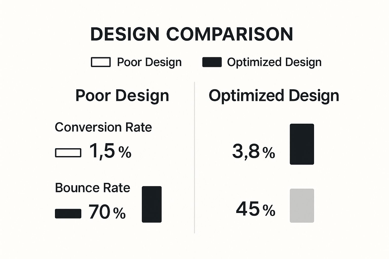
The numbers don't lie. A user-focused design can more than double your conversion rate and slash the number of visitors who bounce right off your site.
While both responsive and accessible design aim for a better user experience, they tackle different challenges. It's crucial to understand how they differ to implement both effectively.
Key Differences Between Responsive And Accessible Design
| Aspect | Responsive Design (For All Devices) | Accessible Design (For All Abilities) |
|---|---|---|
| Primary Goal | To ensure a consistent and usable experience across various screen sizes and devices (desktop, tablet, mobile). | To ensure that people with disabilities can perceive, understand, navigate, and interact with the website. |
| Key Techniques | Flexible grids, fluid images, and media queries to adjust the layout based on screen width. | Using semantic HTML (headings, lists), providing alt text for images, ensuring high color contrast, and enabling keyboard navigation. |
| Who It Helps | Everyone using a digital device, but especially the 59% of users browsing on mobile. | People with visual, auditory, motor, or cognitive impairments. |
| Example | A three-column layout on a desktop automatically stacks into a single-column layout on a smartphone. | A screen reader announcing an image's alt text ("A person smiling while using a laptop") to a visually impaired user. |
Understanding these distinctions helps you build a site that is truly universal—one that works just as well on a phone as it does for someone who can't use a mouse.
By making both responsive and accessible design a priority, you're not just reaching a wider audience. You're sending a clear message that your brand is modern, inclusive, and cares about every single user. This is a huge factor in building trust and securing your online presence for the future.
Ultimately, grasping why website design is important comes down to this: a truly great website leaves no one out. If you want to get into the nitty-gritty of creating these flexible layouts, you can explore some essential responsive design best practices. Building for every device and every person isn't just the future; it's how you win right now.
Common Questions We Hear About Web Design
It’s one thing to understand why good design is important, but it’s another to know where to start. Let’s tackle some of the most common questions people ask when they're ready to get serious about their website.
So, What's a Professional Website Going to Cost Me?
This is the big one, and the honest answer is: it depends. The price tag for a website can swing wildly. A simple site built on a solid template might cost a few thousand dollars, whereas a large, custom-built e-commerce site with all the bells and whistles can easily run into the tens of thousands or more.
The best way to think about it is as an investment, not just another line item on your budget. A great website that brings in customers, builds your brand, and climbs the search rankings pays for itself many times over. It’s all about the value it creates, not just the initial price.
Is Using a Website Template Cheating?
Not at all! Templates can be a fantastic way to get off the ground, especially if you're working with a smaller budget or need to get online fast. They give you a professional framework to start from.
The catch is that a fully custom design gives you something truly unique. It allows you to build an experience from the ground up that’s perfectly matched to your brand and how your customers think. Many businesses split the difference—they start with a great template and customize it heavily to make it their own, getting a unique feel without the cost of a full custom build.
The right answer really comes down to your budget, your timeline, and your goals. Whether you go with a template or a custom build, the mission is the same: create a great experience for your users.
How Often Do I Need to Redesign My Site?
The general rule of thumb is to plan for a major refresh or full redesign every 2-3 years. Technology moves fast, design trends change, and what worked for your customers a few years ago might not work today.
But here’s a better way to look at it: your website is never truly "done." Instead of waiting for a massive, disruptive overhaul, it’s much smarter to make small, consistent improvements over time. Use your analytics and customer feedback to tweak, test, and optimize continuously. This keeps your site fresh and performing at its best.
For more answers to common questions about building a strong digital presence, you can also check out Growth-Grid's FAQ page.
Ready to invest in a website that drives results? OneNine specializes in creating stunning, high-performance websites tailored to your business goals. Learn how we can help you today.


