

SEO-friendly web design is simply the practice of building websites that people and search engines can easily find, understand, and navigate. It’s where technical precision meets a user-first mindset, all to make your site more visible, incredibly fast, and accessible to everyone. Getting this right is the key to ranking higher in search results and pulling in that valuable organic traffic.
What Is SEO-Friendly Web Design And Why It Matters
Imagine your website is a brand-new library. If the signs are confusing, the books are disorganized, and the aisles are cluttered, people will get frustrated and walk right out. But if it's well-lit, with clear signage and a logical layout, visitors can easily find exactly what they're looking for.
SEO-friendly web design is the architectural plan for your digital library. It ensures that every element—from the structure of your pages to the speed at which they load—is built for both your human visitors and the search engine "librarians" (crawlers) that organize the internet.
It's about blending beautiful aesthetics with a rock-solid technical foundation. A gorgeous design might catch someone's eye, but it’s the clean code, logical navigation, and speedy performance underneath that allow Google to crawl and index your content effectively. Every design choice, big or small, plays a role in your ability to rank.
The Connection Between Design And Search Rankings
A stunning website that’s slow, clunky, or impossible to use on a phone is dead in the water. Search engines like Google are all about user experience. If someone lands on your page and immediately hits the "back" button (this is called a "bounce"), it tells Google your site wasn't helpful. Too many of those signals, and your rankings will suffer.
To put it another way, a great user experience is great SEO.
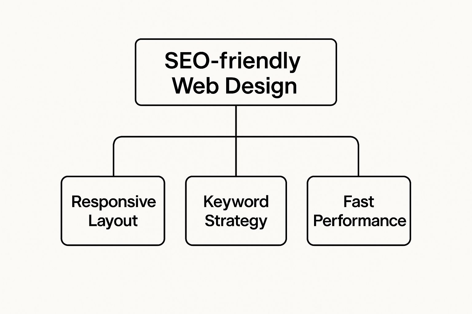
As you can see, things like responsive design, smart keyword use, and fast load times are non-negotiable. They are the pillars holding up your entire SEO strategy.
To make this even clearer, let's break down the core components.
Core Pillars Of SEO-Friendly Web Design
This table gives a quick snapshot of the essential elements that make a website truly SEO-friendly.
| Pillar | What It Is | Why It Matters for SEO |
|---|---|---|
| Site Speed & Performance | How quickly your website's content loads and becomes interactive for users. | Slow sites frustrate users and hurt rankings. Google's Core Web Vitals prioritize fast, stable pages. |
| Mobile-First Design | Designing your website for mobile devices first, then adapting it for larger screens. | The majority of web traffic is mobile. Google primarily uses the mobile version of a site for indexing and ranking. |
| Simple Navigation & URL Structure | An intuitive menu and clean, logical URLs that are easy for both users and crawlers to follow. | A clear structure helps search engines understand your site's hierarchy and helps users find what they need, reducing bounce rates. |
| Technical SEO Foundation | Behind-the-scenes elements like clean code, proper indexing controls, and structured data. | This is the "plumbing" of your site. It ensures search engines can crawl, understand, and rank your content without technical roadblocks. |
These pillars work together to create a seamless experience that satisfies both human visitors and search engine algorithms.
First Impressions Are Everything
You only get one chance to make a good first impression, and your website is often the first handshake. The link between design and trust is incredibly strong.
Staggering research shows that 94% of potential customers form their first opinion of a business based on its website design. What's more, 38% of visitors will abandon a website if they find the layout and content unappealing. You can dig deeper into how design shapes perception by checking out these web design statistics.
Ultimately, SEO-friendly web design isn't about choosing between a beautiful site and a high-ranking one—it’s about understanding they are one and the same. When you build with users and search engines in mind from the very beginning, you create a powerful, sustainable engine for growth.
Improve Site Speed And Performance
In a world of instant gratification, your website’s speed is the price of admission. It’s not just a feature anymore.
Imagine walking up to a brick-and-mortar store with a ridiculously long line just to get in the door. No matter how amazing the products are inside, you’d probably turn around and leave. A slow website creates that exact same feeling.
Online, this frustration is measured in milliseconds, and search engines like Google have noticed. They’ve made page speed a direct ranking factor because they know slow sites deliver a terrible user experience. A snappy, responsive site signals quality and respect for your visitor's time. A sluggish one sends them running straight to your competitors.
The impact of slow performance on your bottom line is staggering. Research shows a mere 1-second delay in page load time can cause a 7% drop in conversion rates. What's more, over half (53%) of mobile users will flat-out abandon a website if it takes longer than three seconds to load. This doesn't just lose you a potential customer; it actively harms your search rankings over time.
Diagnosing The Causes Of A Slow Website
Before you can fix a slow site, you have to play detective and figure out what’s holding it back. Several common issues can act like an anchor, dragging down your website's performance and frustrating visitors.
Think of it like a clogged pipe—it’s rarely one single thing, but a combination of small blockages that creates a major backup. On a website, these blockages often include:
- Oversized Image Files: This is a huge one. High-resolution images that haven't been properly compressed are a primary offender. Loading a massive, unoptimized photo is like trying to stream a 4K movie just to see a single thumbnail.
- Bloated Code: Clutter isn't just for closets. Unnecessary characters, comments, and sloppy formatting in your HTML, CSS, and JavaScript files add extra weight to your pages, forcing browsers to work harder and longer to display your site.
- Sluggish Server Response Time: Your web hosting matters. A slow or overloaded server can take ages to even start sending your website's files to the visitor's browser. This creates a bottleneck before your content even has a chance to load.
- Too Many HTTP Requests: Every single element on your page—every image, script, and stylesheet—requires a separate request to the server. Too many requests create a digital traffic jam, slowing everything to a crawl.
Thankfully, you don't have to guess. Free tools like Google PageSpeed Insights act as your diagnostic toolkit. They'll analyze your site and give you a detailed report card on what’s working and what’s holding you back, providing a clear roadmap for improvement.
An SEO-friendly web design prioritizes speed from day one. It isn't an afterthought or a "nice-to-have." It's a foundational element that influences everything from user satisfaction to your visibility on Google.
Key Strategies For A Faster Website
Once you know what’s slowing you down, you can start taking targeted action. Just a few key techniques can dramatically boost your site’s loading times, resulting in a much better user experience and stronger signals to search engines.
A faster website isn't just about technical wizardry; it's about making smart, efficient choices from the get-go. If you want to really get into the weeds, check out our complete guide on how to improve website loading speed.
For now, here are three powerful strategies you can implement right away:
-
Compress And Optimize Images
Never upload an image without first running it through a compression tool. This process shrinks the file size without a noticeable drop in visual quality. You should also serve images in modern formats like WebP, which provides far better compression than old-school JPEGs and PNGs. -
Enable Browser Caching
Caching tells a visitor's web browser to save static parts of your website (like your logo, CSS files, and certain scripts) on their own device. When they come back, their browser can load those files from its local memory instead of downloading them all over again. This makes return visits feel almost instant. -
Use A Content Delivery Network (CDN)
Imagine having copies of your website stored in data centers all over the world. That’s exactly what a CDN does. When someone visits your site, the CDN delivers your content from the server closest to their physical location. This dramatically reduces the distance the data has to travel, speeding up load times for your entire global audience.
Implement A Mobile-First Design Strategy
Not so long ago, we used to build beautiful, sprawling websites for big desktop monitors. Then, almost as an afterthought, we’d try to cram and shrink that massive design onto a tiny phone screen. That old method was called “graceful degradation,” and frankly, it’s obsolete.
Today, the script has completely flipped. Why? Because most of your audience is already in your pocket.
With the majority of global web traffic now coming from mobile devices, designing for the smallest screen first isn’t just a good idea—it’s a non-negotiable part of SEO-friendly web design.
This shift is so critical that Google now primarily uses the mobile version of a site for indexing and ranking. They call it mobile-first indexing. If your mobile site is clunky or broken, your search rankings will take a hit, no matter how slick your desktop version looks.
The Mobile-First Mindset Explained
Thinking mobile-first means you begin the design process on the most challenging canvas: the smartphone screen. You have to be ruthless, prioritizing only the absolute essential content and features a user needs to get things done.
Once you’ve nailed that core experience, you can then progressively add enhancements and features for larger screens like tablets and desktops.
Think of it like packing for a trip. A mobile-first approach is like packing a small backpack—you’re forced to choose only the most critical items. This discipline forces you to focus on clarity, simplicity, and speed, which are qualities that both people and search engines absolutely love.
The old way was like packing a giant suitcase and then trying to jam it into a tiny overhead bin. It rarely ends well.
How Google Sees Your Mobile Site
Google's crawlers now essentially put on "mobile-colored glasses" to view and index your pages. This diagram from Google themselves shows exactly how mobile-first indexing works.
The main takeaway here is that Googlebot now uses a smartphone user-agent to crawl the web. The version of your site it "sees"—and uses to judge your ranking—is the one built for mobile users.
This official policy change is precisely why a dedicated mobile strategy is so important. If your content is hidden behind a "click to expand" button, your text is too small, or your links are too close together on a phone, Google will notice and can rank your site lower.
A mobile-first approach isn't just about making a website that works on a phone. It's about designing an experience that is optimized for the context of a mobile user—someone who is often on the go, navigating with their thumb, and has zero patience for slow or confusing sites.
Actionable Steps For A Mobile-First Design
Adopting a mobile-first strategy is about more than just a responsive layout. It requires a genuine focus on the user’s real-world experience on a small, touch-based screen. If you're ready to go deeper, our guide covers the essential elements of a successful mobile-first design in full detail.
Here are the core principles to get you started:
- Prioritize Content Ruthlessly: Figure out the single most important action you want a user to take on each page. Make that the hero of your mobile view, and strip away anything that adds clutter or distraction.
- Design for Thumbs: People use their thumbs to get around on mobile sites. Make sure your key interactive elements—buttons, links, form fields—are large enough to be tapped easily. This is called optimizing touch targets, and it’s crucial for preventing frustrating mis-clicks.
- Embrace Responsive Grids: Use a flexible, grid-based layout that allows your content to fluidly resize and reflow to fit any screen. This ensures a consistent and readable experience on every device, without any of that annoying horizontal scrolling.
- Choose Readable Fonts: Pick web fonts that are crisp and clear on small, high-resolution screens. Pay close attention to font size, line height, and color contrast so people don't have to pinch and zoom just to read your content.
- Simplify Navigation: Those giant, multi-level desktop menus are a disaster on mobile. Swap them out for a simple navigation system, like the classic "hamburger" menu icon that reveals a clean, vertical list of links when tapped.
Master On-Page And Technical SEO Fundamentals

While a fast, mobile-friendly site gets all the attention, what’s going on behind the scenes is just as critical. Think of your website’s code and structure as its skeleton—if that framework isn't strong and logical, everything built on top of it will eventually crumble.
This is where on-page and technical SEO come in. They are the blueprints for building that solid skeleton. It’s not about gaming the system or stuffing keywords into every corner; it’s about creating clear signposts that guide search engine crawlers through your site so they understand what you’re all about.
When your site is structured well, you're essentially telling Google exactly what each page is about and how it all fits together. This clarity is a cornerstone of SEO-friendly web design and has a huge impact on how you get indexed and ranked.
Build a Foundation With Semantic HTML5
Imagine trying to read a book with no chapter titles, no page numbers, and no table of contents. You'd be completely lost. That’s what a website without proper semantic HTML feels like to a search engine crawler.
Semantic HTML5 tags are those crucial organizational markers. They wrap your content in code that explains what it is, giving search engines the context they need.
Instead of just using generic <div> tags for everything, you use specific, descriptive tags that make sense:
<header>: This is for the introductory content, like your site's logo and title.<nav>: This tag is meant to hold your main navigation links.<main>: Wraps around the main, unique content of the page.<article>: Perfect for self-contained pieces of content, like individual blog posts.<footer>: Contains the stuff you'd expect at the bottom—copyright info, contact details, and secondary links.
Using these tags correctly creates a clean, logical document that search engines can read and understand in a fraction of the time. The technologies that run your site, also known as your website's tech stack, play a big role in how well you can implement these technical SEO elements.
Organize Content With a Logical Heading Structure
Headings do a lot more than just make your text look bigger. They create a clear hierarchy for your content, which is essential for both your human readers and the search engine bots. They break down the page into scannable, digestible chunks.
Your heading structure should always follow a logical, descending order.
Think of it like an outline for an essay. The H1 is your main title. The H2s are your major sections, and the H3s are the sub-points within those sections. You should never skip a level—don't just jump from an H1 to an H3, because it breaks that logical flow.
Here’s a simple set of rules to live by:
- One
<h1>per page: This is your main page title. It should clearly state what the page is about and ideally contain your primary keyword. - Use
<h2>tags for main topics: These act as the major chapters of your page. - Use
<h3>through<h6>for sub-topics: These let you break down your main topics into smaller, more specific points.
This kind of organization helps search engines quickly grasp the structure and themes of your content, making it easier for them to see its relevance. Plus, this clean structure looks good, and that visual appeal builds trust. In fact, 75% of users admit to judging a company's credibility based on its website design alone.
Craft Clean URLs and an XML Sitemap
Your site's architecture isn't just about what's on the page; it also includes the URLs you use and the map you provide to search engines.
First off, your URLs need to be clean and descriptive. A good URL tells a user (and a search engine) what they’re about to see before they even click.
| Good URL Example | https://yourwebsite.com/services/web-design |
|---|---|
| Bad URL Example | https://yourwebsite.com/index.php?p=123&cat=4 |
Keep your URLs short, use hyphens to separate words, and include your main keyword if it fits naturally. It makes them easier to read, remember, and share.
Finally, you need to create and submit an XML sitemap. This is simply a file that lists all the important pages on your website, acting as a direct roadmap for search crawlers. It helps ensure that none of your pages get overlooked, especially if they aren't easy to find through your main navigation. Submitting your sitemap through Google Search Console is one of the first things you should do.
Enhance User Experience For Better SEO
Ultimately, user experience and SEO are trying to do the same thing: give people what they're looking for and make them want to stick around. When your site is a pleasure to use, visitors stay longer, and Google takes that as a very positive sign.
This is where Google’s Core Web Vitals come into play. Think of them as Google's way of measuring how a user actually feels when they land on your page. The three big ones are LCP, FID, and CLS, which measure speed, responsiveness, and visual stability.
It’s like walking into a coffee shop. A slow barista (long LCP) is frustrating. An order that takes forever to get started (high FID) makes you impatient. And if the tables keep wobbling and spilling your drink (bad CLS), you're not going to have a good time.
The goal is to hit specific targets for each: LCP should be under 2.5 seconds, FID under 100 ms, and a CLS score below 0.1. Nail these numbers, and you're not just making visitors happy—you're telling Google your site is a quality result.
Core Web Vitals Explained
So, what are these metrics really measuring? Here’s a simple table to break it down.
| Metric | What It Measures | Simple Goal |
|---|---|---|
| LCP | Largest Contentful Paint | Load your main content in under 2.5 seconds. |
| FID | First Input Delay | Respond to a user's click or tap in under 100ms. |
| CLS | Cumulative Layout Shift | Keep the page stable with a shift score below 0.1. |
These aren't just technical jargon; they directly translate to how fast and stable your site feels to a real person. But a great experience goes beyond just raw speed.
Monitoring Tools For Core Web Vitals
You don't have to guess how your site is performing. Google gives you the tools to see exactly what your users (and its crawlers) are seeing.
- Google PageSpeed Insights: This is your go-to for getting real-world performance data on LCP, FID, and CLS.
- Lighthouse Audits: Found right in your Chrome browser, this gives you a deep dive into performance, accessibility, and other best practices.
- Web Vitals Extension: A handy Chrome extension that gives you real-time feedback on the metrics as you browse your own site.
Using these tools regularly helps you spot and fix user experience problems before they start costing you traffic.
Qualitative User Experience Elements
Beyond the numbers, the "feel" of your site matters just as much.
- Intuitive Menus: Can visitors find what they need without thinking too hard? Your navigation should be a clear, simple guide.
- Prominent CTAs: Your calls-to-action should stand out. Use clear language ("Get Your Free Quote") and colors that pop.
- Accessible Design: Everyone should be able to use your site. This means legible text, high-contrast colors, and a layout that works for all users.
“Even small friction points can cause a bounce and signal to search engines that your site missed the mark.”
Think about it: a confusing menu is a dead end. Visitors who get stuck will just leave, which drives up your bounce rate and tells Google your page wasn't a good answer to their query.
On the other hand, a great user experience increases dwell time—the amount of time people spend on your site—which is a powerful signal of relevance to search engines. For more on getting the technical side right, check out our guide on website development best practices.
At its core, SEO-friendly design is all about the user. To learn more, exploring the user experience design fundamentals is a great next step.
Case Study Example
The proof is in the results. One retail client of ours managed to cut their LCP from 4.0s down to 2.2s. The result? A 18% jump in organic traffic over just three months.
They also streamlined their menus and made their buttons bigger and easier to tap on mobile, which dropped their bounce rate by 12%. It just goes to show that focusing on the user experience pays off.
- Audit your performance at least once a month and act on the Core Web Vitals data.
- Test your site on different phones, tablets, and browsers to find hidden problems.
- Listen to your customers. User feedback can point out frustrating issues you never would have found on your own.
Actionable UX Checklist
Ready to start improving? Here’s a simple checklist to get you going.
- Keep an eye on your Core Web Vitals in Google Search Console and PageSpeed Insights.
- Simplify your navigation so people can find your most important pages in two clicks or less.
- Make sure your CTAs use high-contrast colors and clear, action-oriented text.
- Run an accessibility audit to check for things like text legibility and color contrast.
Design for humans first and search engines will follow.
By smoothing out these little details, you reduce frustration, keep people on your site longer, and send all the right signals to Google. Just pick one issue to start with, monitor the results, and keep iterating. Small improvements really do add up over time.
Your SEO-Friendly Web Design Checklist
Alright, it’s time to put all this theory into practice. Think of this checklist as your game plan, whether you're launching a brand-new site or giving an old one a much-needed facelift.
I've broken it down to mirror the concepts we've already covered, giving you clear, actionable steps you can start working on right away. Let's make sure no critical detail of your SEO-friendly web design gets missed.
Performance and Speed
Let's be honest—a slow website is a dealbreaker. It's frustrating for users and a red flag for search engines. Nailing these tasks is the first step to a snappy, responsive experience that improves your Core Web Vitals and helps you climb the rankings.
- Compress All Images: Never upload an image straight from your camera or designer. Run every single one through a compression tool first to slash its file size without making it look pixelated.
- Enable Browser Caching: This is a simple server setting that tells a visitor's browser to save parts of your site, like your logo and CSS files. When they come back, the site loads almost instantly.
- Use a CDN: A Content Delivery Network (CDN) is a must if you have a global audience. It stores copies of your site on servers around the world, so visitors from any country get fast load times.
- Test Core Web Vitals: Make friends with Google PageSpeed Insights. Run your site through it regularly to check your LCP, INP, and CLS scores, and then actually implement its suggestions.
Mobile-First Design
Google now looks at the mobile version of your site first when deciding how to rank it. This means your site can't just work on a phone; it needs to be great. A responsive design is the bare minimum—a true mobile-first approach thinks about what someone on their phone actually needs.
- Verify Responsive Breakpoints: Don't just trust the simulator. Grab your phone, a tablet, and a friend's phone to see how your site really looks. Make sure nothing is broken, overlapping, or unreadable as the screen size changes.
- Check Touch Target Size: Are your buttons big enough to be easily tapped with a thumb? There's nothing more annoying than trying to hit a tiny link and missing.
- Simplify Mobile Navigation: A clean hamburger menu is often the best solution. Keep it simple and make it incredibly easy for users to find your most important pages.
An SEO-friendly web design audit isn't a "set it and forget it" task. This is an ongoing process. Revisit this checklist every quarter to stay on top of your game and adapt to what's new.
Technical SEO and UX
A technically sound website is one that search engines can easily crawl, understand, and index. Combine that with a great user experience (UX), and you have a winning formula for keeping visitors on your site longer.
- Enforce Heading Hierarchy: Every page needs one—and only one—H1 tag. After that, use H2s and H3s to create a logical, scannable outline for both users and search bots.
- Craft Clean URLs: Keep your URLs short, sweet, and descriptive. Use hyphens to separate words (e.g.,
yoursite.com/seo-friendly-designinstead ofyoursite.com/seofriendlydesign). - Check for Broken Links: A 404 error is a dead end for users and crawlers. Use a tool to scan your site for broken internal and external links, then fix them.
- Test Your CTAs: Your calls-to-action should be impossible to miss. Use clear, action-oriented text and high-contrast colors that guide the user to the next step.
Frequently Asked Questions
When you're trying to make a website that looks great and performs well in search, a lot of questions pop up. It’s a common challenge. Let's walk through some of the most frequent ones we hear from business owners and marketers.
What Are The Core Pillars Of SEO-Friendly Design?
Think of an SEO-friendly website as a well-built house. It needs a solid foundation made of four key pillars. First, there's site speed and performance—if your pages take too long to load, people will leave before they even see what you have to offer. Second is a mobile-first responsive layout, because let's face it, most people are browsing on their phones these days.
The third pillar is the nuts and bolts of on-page and technical SEO. This means having clean code, a logical structure with proper headings, and URLs that are easy for both people and search engines to understand. Finally, a great user experience (UX) ties it all together. When your site is easy to navigate and guides visitors effortlessly, they stick around longer, which sends a huge signal to Google that your site is a quality resource.
How Long Until I See SEO Gains After A Redesign?
This is the big question, and the honest answer is: it takes a little patience. After launching a redesigned site, search engines need time to explore all the changes you've made. This re-crawling and indexing process can take anywhere from two to six weeks.
You shouldn’t expect a sudden jump to the top of Google overnight. Instead, look for gradual, steady growth in your organic traffic and keyword rankings over the next one to three months. This gives Google time to see the improvements you’ve made to things like site speed and how users are interacting with the new design.
A redesign isn’t the finish line; it’s the new starting line. Ongoing content creation and technical check-ups are what really drive long-term SEO success.
Do I Need An Expert For Implementation?
It really depends on what you're trying to do and how comfortable you are with the technical side of things. Many of the basics are totally manageable on your own with a bit of guidance.
- DIY-Friendly Tasks: Things like compressing images to make them load faster, organizing your content with headings (H1, H2, H3), and writing compelling meta descriptions are great places to start.
- When to Call a Pro: For the heavier lifting, bringing in an expert is a wise move. Tasks like setting up a Content Delivery Network (CDN), implementing complex schema markup, or handling a major site migration are best left to a developer or SEO specialist who can make sure no costly mistakes are made.
How Often Should I Review My Website Design?
An SEO-friendly website is a living thing, not a one-and-done project. Search engine algorithms change constantly, and so do user expectations. A good habit is to perform a quarterly audit of your site.
During these check-ins, keep an eye on your Core Web Vitals, make sure your site still looks and works great on the latest mobile devices, and see if any new friction points have emerged for users. It’s also a smart idea to run a quick technical SEO check after any big design changes or content pushes, just to be sure everything is still optimized to rank well.
Ready to build a website that not only looks incredible but also climbs to the top of search results? At OneNine, we create custom, high-performance websites designed for growth. Let our team of experts handle the complexities of SEO-friendly web design so you can get back to what you do best. Get in touch with us today!


