
A website mockup is where a project's goals start to look like a real website. You take the structural bones of a wireframe and flesh them out with brand colors, typography, and actual imagery. From there, you adapt that high-fidelity design for different screen sizes and often build an interactive prototype to test how it all flows. It's the critical bridge between a great idea and the code that brings it to life.
Why a Great Mockup Is Your Most Valuable Asset
Tempted to skip the mockup phase? I’ve seen it happen, and it's one of the most expensive mistakes a team can make. A mockup isn't just a pretty picture; it's the master plan that gets everyone—from stakeholders to developers—on the same page before a single line of code is written. This visual alignment stops costly rework dead in its tracks, clarifies expectations, and makes sure the final product actually solves the right problems.
It's no longer enough to just show a static image. Today’s best mockups are interactive, letting stakeholders click around and feel how the website will work. This turns abstract concepts into a tangible experience they can understand and critique. A mockup isn't an optional artistic step; it's a strategic tool.
From Static Files to Interactive Blueprints
The way we create mockups has changed dramatically. Back in the early 2000s, we were handing developers static Photoshop files. This created a huge disconnect, and it's no wonder project failure rates were so high. By 2009, studies showed that over 24% of IT projects were failing outright, often because what was built didn't match what the client envisioned.
Then, responsive design became the standard after 2010. Suddenly, mockups had to show how a design would look on multiple screen sizes. Fast forward to today, with over 50% of global page views coming from mobile devices, a desktop-only mockup is completely off the table for any serious project. You can dig into more of these trends in these full web design statistics.
Aligning Teams and Reducing Risk
A well-crafted mockup becomes the single source of truth. It's the one document that ensures designers, developers, and clients are all picturing the exact same outcome.
- For Stakeholders: They see a clear, visual representation of their investment, which empowers them to give specific, actionable feedback early in the process.
- For Designers: This is our canvas—where we define the user experience and bring the visual identity to life.
- For Developers: It’s a precise guide for implementation. No more guessing about spacing, fonts, or colors. It's all there, which means fewer errors and less back-and-forth.
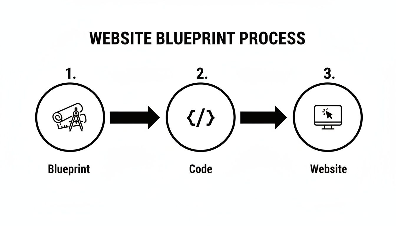
This diagram shows how a solid blueprint directly informs the code and, ultimately, the final website. It’s a simple but powerful workflow.
When you get right down to it, spending time on a detailed mockup pays for itself. It streamlines the entire development process, saves a ton of headaches, and helps you build a better product, faster.
Building Your Foundation: From Brief to Wireframe
Great website mockups don't just happen. They're built on a solid foundation that starts way before you even think about opening a design tool like Figma or Sketch. The absolute first step? Getting to grips with the why behind the project by digging into the creative brief.
Think of the brief as your treasure map. It holds all the clues: the business goals, who you're building this for, and what problems the website absolutely must solve. Your job is to turn those business needs into a visual, functional plan. If you skip this, you're not really designing—you're just making things look pretty.
Deconstructing the Project Brief
Before you draw a single box, put on your detective hat. You need to comb through that brief and pull out the core information that will steer every single design choice you make later on. A stunning mockup that misses the business goal is, at the end of the day, a failure.
I always start by zeroing in on these three pillars:
- The Main Goal: Is the site meant to generate leads, sell products, or just build brand hype? This one answer changes everything about the user's journey.
- The Target Audience: Are you designing for Gen Z gamers or for retired investors? The look, feel, and language will be completely different.
- The Key Actions: What are the top 3 to 5 things you want a visitor to do? This could be anything from signing up for a newsletter to getting a quote or buying a product.
Nailing these down ensures you aren't designing in a bubble. It gives every button, every section, and every page a clear purpose. This is also where understanding team roles becomes important; knowing the difference between a Web Developer vs Web Designer helps clarify who handles what as the project progresses.
From Ideas to Low-Fidelity Wireframes
Once you have that clarity, it's time to start wireframing. This is where you build the website's skeleton. The key here is to deliberately ignore all the shiny stuff—no colors, no fancy fonts, no images. Just pure structure.
A wireframe is all about layout, information hierarchy, and user flow. It’s function over form. Getting the blueprint right is the single most important step for creating a great user experience.
Think of it like building a house. You wouldn't be picking out curtains before the walls are even up, right? Low-fidelity wireframes are your architectural blueprints, showing where everything from the navigation to the footer will live.
This is the stage where you start sketching out the most important pages. I usually tackle them in this order:
- The Homepage: Your site's front door. How do you welcome users and point them in the right direction?
- Key Service/Product Pages: How will you show off features and benefits without overwhelming the user?
- The About Page: What’s the story here? How do you build trust and connect with the audience?
- The Final Conversion Point (e.g., Contact/Checkout): How can you make this last step as painless as possible?
If you want to go deeper on this, we have a complete guide that walks you through [https://onenine.com/how-to-create-website-wireframes/]. Getting the wireframe right is crucial because it ensures the user’s path is logical and intuitive long before you spend a single minute on detailed visuals.
Choosing Your Wireframing and Mockup Tool
With so many design tools out there, picking the right one can feel overwhelming. The truth is, there's no single "best" tool—it all depends on your team's workflow, budget, and what you're trying to accomplish. Are you a solo freelancer who needs an all-in-one solution, or a large team that needs robust collaboration features?
To help you decide, here’s a quick comparison of some of the most popular options on the market.
Choosing Your Wireframing and Mockup Tool
| Tool | Best For | Key Features | Pricing Model |
|---|---|---|---|
| Figma | Collaborative teams and all-in-one design systems. | Real-time collaboration, browser-based, robust prototyping, huge plugin library. | Freemium (Free tier available, paid plans for teams) |
| Sketch | Mac users focused on UI/UX design. | Vector editing, symbols for reusable components, strong plugin ecosystem. | Subscription (Paid annually) |
| Adobe XD | Teams invested in the Adobe Creative Cloud ecosystem. | Seamless integration with Photoshop & Illustrator, repeat grid, auto-animate. | Included with Creative Cloud subscription |
| Balsamiq | Rapid, low-fidelity wireframing and non-designers. | Hand-drawn, sketchy aesthetic to focus on structure, simple learning curve. | One-time purchase or subscription |
Ultimately, the best tool is the one that gets out of your way and lets you focus on the design. Many offer free trials, so I always recommend having your team test out a couple before committing. Don't get too caught up in the feature list; focus on which one feels most intuitive for your specific process.
Bringing the Design to Life with High-Fidelity Mockups
Alright, the architectural plans are approved. Now it’s time to be the interior designer. This is where we take the grayscale, skeletal wireframes and breathe life into them, transforming them into a high-fidelity mockup that looks and feels like a real, finished website.
This is the fun part, but it's also where critical decisions are made. Every color, font, and pixel placement works together to create a personality for the site. Think of it this way: your wireframe is the house frame, but the high-fidelity design is the paint on the walls, the style of the furniture, and the lighting that makes it feel like a home.
Creating a Cohesive Visual Identity
A strong visual identity is more than just aesthetics; it’s about building trust and making your brand memorable at a glance. It's the common thread that ties every single page together. This really boils down to three key elements.
First up, your color palette. Colors aren't just decorative; they trigger emotions and guide users. For that local service business we've been talking about, we might lean on a palette of trustworthy blues, with an energetic green for call-to-action buttons, all set against clean whites and grays. A good starting point is to nail down a primary color, a secondary one, and a distinct accent color that makes your key actions pop.
Next is typography. The fonts you select have a huge impact on readability and how your brand is perceived. A crisp, modern sans-serif like Inter or Poppins can communicate professionalism and clarity. On the other hand, a serif font like Lora might feel more traditional and established. I usually stick to a two-font rule: one for headings and a complementary one for body text. It keeps things clean and easy to read.
Finally, we have imagery and iconography. This is where you tell your brand's story visually. High-quality photos, custom illustrations, or a consistent set of icons make a world of difference. Please, avoid generic stock photos if you can—they can make a site feel cheap and impersonal. Investing in authentic visuals that connect with your audience is always worth it.
Structuring the Layout with Grids and Hierarchy
While the creative elements add personality, a solid structure ensures the design is clean, organized, and dead simple to navigate. This is where a grid system becomes your best friend. A grid acts as an invisible framework, guiding the alignment and placement of every element on the page.
I almost always start with a standard 12-column grid. It’s incredibly flexible. You can have a big, bold hero section that spans all 12 columns, and then, just below it, a section with three feature blocks where each one neatly takes up four columns. This creates a natural rhythm that helps people scan and absorb the content without even thinking about it.
Visual hierarchy is the art of arranging elements to show their order of importance. It’s how you tell the user’s eye where to look first, second, and third. A great mockup uses size, color, and placement to guide users toward the most important actions.
For example, your main call-to-action (CTA) button—say, "Get a Free Quote"—should be the most prominent thing in its section. You can make it stand out by using that bright accent color you chose, making it larger than other buttons, and giving it plenty of breathing room (negative space) so it grabs the user's attention.
Pulling It All Together with the Right Tools
To actually build these high-fidelity designs, you need the right software. It's crucial to discover the best mobile app mockup tools, as a lot of the best practices and tools carry over directly to web design. Industry-standard platforms like Figma and Adobe XD are built for exactly this kind of work. They make it easy to manage colors, set up font styles, and create reusable components to keep everything consistent.
A modern mockup isn't just a pretty picture anymore; it's a strategic tool designed for conversion. Research shows it takes only 0.05 seconds for someone to form an opinion about your website, and a massive 94% of first impressions are design-related. The visual choices you’re making right now directly influence whether a user sticks around or bounces. And don't forget content strategy within the design—companies with a blog section get 67% more monthly leads than those without one.
Ultimately, the high-fidelity mockup is the final visual blueprint for the project. It’s what everyone signs off on before it goes to the developers. If you’re looking for the right software for your workflow, check out our detailed guide on the best web design tools. Nailing this stage ensures that what you build isn't just beautiful, but is also precisely engineered to hit its goals.
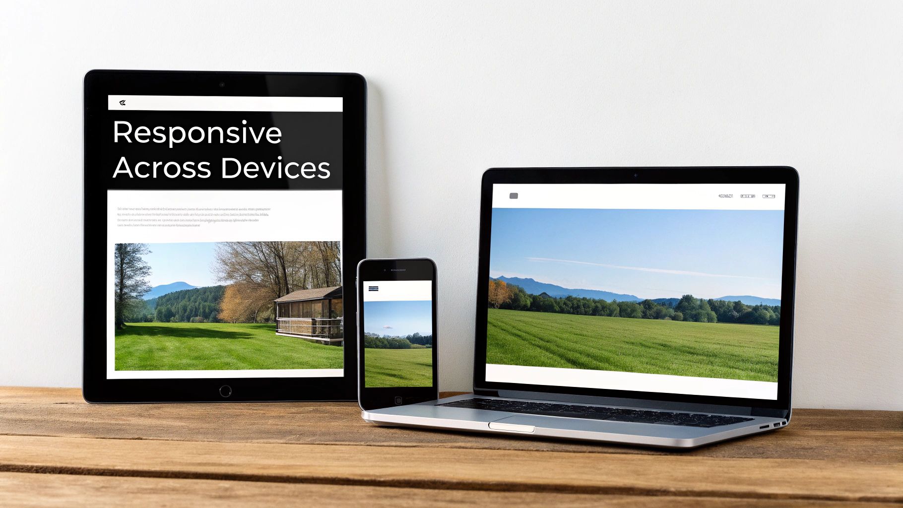
Ensuring Your Design Works on Every Screen
A beautiful desktop mockup is a great starting point, but let’s be honest, it’s only one piece of the puzzle. With over half of all web traffic now coming from mobile devices, a design that doesn’t adapt is a design that’s broken from the start. Creating responsive website mockups isn't some optional extra; it's absolutely fundamental.
This means you need to think beyond a single, static layout. The goal is to create distinct mockups for at least three key breakpoints: mobile, tablet, and desktop. Each version needs to feel seamless and intuitive, ensuring the site works beautifully no matter how someone is viewing it.
Adopting a Mobile-First Mindset
From my experience, the most effective way to tackle responsive design is with a mobile-first approach. This strategy completely flips the traditional process on its head. Instead of designing for a sprawling desktop screen and then trying to shrink it all down, you begin with the most constrained view: the mobile phone.
Starting small forces you to be ruthless with prioritization. You have to make tough calls about which content and features are absolutely essential for the user. This naturally leads to a cleaner, more focused experience. Once you’ve nailed the mobile layout, you can then progressively enhance the design for tablets and desktops, using the extra space to add secondary elements and richer layouts.
Key Considerations for Responsive Mockups
As you start adapting your high-fidelity design across different screen sizes, you'll run into a few common hurdles. The trick is to maintain brand consistency while optimizing the layout for each specific context.
Here are the critical areas you’ll need to focus on:
- Navigation: That big, horizontal desktop menu simply won't fit on a phone. For your mobile mockup, it will almost always need to collapse into a "hamburger" menu. Make sure the icon is obvious and the links inside are big enough for clumsy fingers to tap.
- Layout Stacking: Multi-column layouts that look amazing on a wide screen have to be reconfigured. Typically, columns will "stack" vertically on a phone. In our service business example, a three-column grid of services would become a single, easy-to-scroll column.
- Touch Targets: People use their thumbs on mobile, not a precise mouse cursor. Every button, link, and interactive element needs to be large enough to be tapped accurately. A good rule of thumb is to aim for a minimum touch target size of 44×44 pixels.
- Font Sizing: Readability is everything. You'll need to define different font sizes for your headings and body copy across mobile, tablet, and desktop to ensure the text is always comfortable to read.
By thoughtfully working through these points, you ensure the user experience doesn't get worse on smaller screens—it just adapts. For a deeper dive, our guide on responsive design principles covers these concepts in much more detail.
A Practical Responsive Mockup Example
Let's bring this back to our local service business website. We've got the desktop mockup done, so now it's time to think about how key sections will change on a mobile screen.
Your mobile mockup isn’t a lesser version of the desktop design—it's the most focused version. By solving for the smallest screen first, you ensure the core user journey is rock-solid.
Here’s how that transformation might play out:
- Hero Section: On desktop, we have a headline, subheading, and a "Get a Free Quote" button alongside a nice image. On mobile, that image might stack under the text, or we might use a cropped, mobile-friendly version as a background. The headline and call-to-action button stay right at the top, front and center.
- Services Grid: The desktop’s three-column layout becomes a single column on the phone. Each service block stacks neatly on top of the next, so the user can just scroll down to see the icon, title, and description for each one.
- Contact Form: That two-column form layout—with name and email on one side and the message on the other—gets simplified. On mobile, each form field should stack vertically and take up the full width of the screen. This makes typing on a small keyboard so much easier.
Creating these responsive versions in your mockup is non-negotiable. It shows your clients and developers exactly how the site should behave, leaving nothing to chance. This proactive step saves a ton of headaches down the line and ensures the final coded website gives every single visitor a great experience.
Testing Prototypes and Preparing for Handoff
So you’ve got a set of gorgeous, high-fidelity mockups. They look picture-perfect, like the finished website. But here's the thing: a static image only tells you what the site looks like, not how it works. To really know if your design is a success, you need to see it in motion. This is where prototyping comes in, turning your beautiful pictures into a tangible, interactive experience.
A prototype is essentially a clickable version of your mockups. It links your screens together to simulate the real user journey. Someone can click the "Services" button in the nav bar and actually land on the services page mockup. This step is non-negotiable—it lets you gather real, meaningful feedback and run usability tests before a single line of code is written. You can catch confusing navigation or broken user flows when it's still easy (and cheap) to fix.
From Mockup to Clickable Prototype
Modern design tools like Figma and Adobe XD make this process incredibly simple. You’re basically drawing interactive areas, or "hotspots," over your mockups and linking them to other pages or elements. For instance, you’d link the main call-to-action button on the homepage directly to the contact page mockup.
You’re not trying to build a fully functional website here. The goal is to demonstrate the primary user paths and get a feel for the flow.
Focus your efforts on these key journeys:
- Main Navigation: Can someone move smoothly between the homepage, about page, and services? Is it intuitive?
- Conversion Funnel: What are the exact steps someone takes to fill out a contact form or add a product to their cart? Walk through it click by click.
- Key Interactions: Show how dropdown menus, image carousels, or accordion sections will actually behave when a user interacts with them.
Putting a clickable prototype in front of stakeholders is a game-changer. It eliminates all the guesswork and allows them to give specific, actionable feedback like, "This button felt like it should take me here instead."
Preparing for a Seamless Developer Handoff
Once the prototype is tested and the design gets the final thumbs-up, your focus shifts to one of the most critical stages: the developer handoff. A bad handoff can unravel a great design, leading to misinterpretations, delays, and a final product that just doesn't match what was approved. A great handoff bridges the gap between design and code perfectly.
It’s worth noting that how teams create mockups and prepare them is changing. By 2025, it's expected that around 93% of web designers will have integrated AI into their workflows, with 58% using it to generate original visuals. For technical leaders, this is huge—92% say AI is critical for website innovation. But the transition isn't always smooth, as 73% of organizations still report integration challenges.
This is why a hybrid approach often works best. AI can generate ideas and options quickly, but a human designer must refine the final mockups for brand consistency, accessibility, and a clean developer handoff. You can read more about how AI is shaping website innovation from Digital Silk.
To ensure a smooth transition, your handoff package has to be meticulously organized and complete.
Your handoff file isn't just a collection of screens; it's a complete instruction manual for the developer. The more organized and detailed it is, the faster and more accurately your vision will be brought to life.
A developer shouldn't have to guess a single thing. Every color, font size, spacing value, and interaction needs to be clearly communicated.
The Essential Handoff Checklist
To make sure nothing gets lost in translation, a well-organized file is absolutely essential. Most design tools have built-in "inspect" modes that show developers CSS properties and let them export assets, but your file structure is what truly makes their job easier.
Here’s a checklist for what a great handoff file should include:
- A Clean and Organized File: Group layers logically and name everything clearly (e.g., "Button – Primary – Default"). Create separate pages in your file for different site sections and device breakpoints.
- A Simple Style Guide: Dedicate a frame or page to document all your design tokens. This means your color palette with hex codes, typography styles (H1, H2, body text with font, size, and weight specified), and icon sets.
- Exportable Assets: Make sure all images, icons, and logos are marked for export. Best practice is to provide SVGs for icons and logos, and optimized web formats like WebP or JPG for images.
- Interaction Notes: Never assume a developer will know how an animation should work. Add notes or even record a short video clip demonstrating any complex hover effects, transitions, or animations.
This level of detailed preparation ensures the final, coded website is a pixel-perfect match for the approved mockup. It will save you countless hours of back-and-forth and set your project up for a successful launch.
Common Questions About Website Mockups
Even with the best process in place, questions are bound to pop up when you're creating website mockups. Diving into a design project can feel like a lot, but a few key clarifications can make the whole thing run smoother.
Here are a few of the most common questions I get from clients and designers who are just starting out. My goal is to clear up any confusion so you can get back to creating great work.
What Is the Difference Between Wireframe, Mockup, and Prototype?
This one comes up all the time, and for good reason. People often use these terms interchangeably, but they're actually three very different stages of the design process. Nailing the terminology is the first step to clear communication with your team and stakeholders.
I find it helps to think of it like building a house:
- Wireframe: This is your blueprint. It’s a simple, black-and-white sketch that focuses entirely on structure, layout, and how a user will move through the site. It’s all about function, not form. It answers the question, "Where does everything go?"
- Mockup: This is the interior design rendering. It’s a static but visually detailed image that adds the branding—colors, fonts, and actual images—to the wireframe's structure. It shows what the final product will look like, but you can't click on anything. It answers, "What will it look like?"
- Prototype: This is the interactive model home. You link the mockups together to create a clickable simulation of the website. It allows you to test the user flow and interactions before a single line of code is written. It answers, "How will it work?"
Each step builds on the one before it, taking you from an abstract plan to something that feels like a real, working website.
How Many Revisions Should I Expect or Offer?
This is a big one. The number of revisions can make or break a project's timeline and budget. While there’s no single magic number, a solid industry standard is to offer two to three rounds of revisions for each major deliverable (like wireframes and then again for high-fidelity mockups).
This approach encourages everyone to provide thoughtful, consolidated feedback. The first round is usually for the big, foundational changes. The next one or two are for dialing in the smaller details. The most important thing is to define this number in your contract or scope of work right from the start. It sets clear expectations and prevents the dreaded "endless feedback loop."
Setting a limit on revisions isn’t about being difficult—it’s about creating a structured process that respects everyone’s time and keeps the project on track. Clear boundaries prevent scope creep and keep frustrations at bay.
When you establish this from day one, you build a partnership based on clarity and mutual respect.
How Do I Present a Mockup to a Client Effectively?
Presenting a mockup is so much more than just showing off a pretty picture. You're telling the story of how this design solves a problem. Whatever you do, don't just email a JPEG with the subject line, "Thoughts?" You have to guide the conversation.
Here's a simple framework that works every time:
- Start with the 'Why'. Kick things off by quickly recapping the project goals and user needs you all agreed on. This immediately frames your design as a strategic solution, not just an artistic exercise.
- Walk Through a User Journey. Don't just show them the homepage and stop. Take them on a tour. Show them how a new customer would find a key service, learn about it, and get in touch.
- Explain Your Decisions. As you present, connect your choices back to the goals. Explain why the main call-to-action button is bright orange or why the contact form is placed where it is. "We made this button prominent to help drive more quote requests, which was one of our primary goals."
When you guide the presentation, you help the client see the strategy behind the visuals. This almost always leads to better, more constructive feedback because they understand the thinking that went into the design.
Building a website that gets real results takes skill and experience, from the first mockup all the way through launch and beyond. If you need a partner to manage your site with professional care, OneNine provides expert design, development, and maintenance services to ensure your online presence is always at its best. Find out more at https://onenine.com.


