

Your homepage is the digital front door to your business. It’s not just another page; it’s the primary touchpoint where potential customers decide whether to stay and explore or leave and never come back. Getting this first impression right is non-negotiable, as compelling research on why users don't return shows that a poor initial experience can permanently drive away nearly half of your visitors. A well-crafted homepage serves as a powerful engine for engagement, guiding users, building trust, and ultimately driving conversions.
This is where a clear understanding of homepage design best practices becomes a critical business asset. A great homepage instantly communicates who you are, what you do, and why it matters to your audience. It anticipates user needs, answers key questions, and provides a clear, frictionless path to the next step. Without a strategic design, you risk confusing visitors, losing credibility, and missing out on valuable opportunities to connect with your target market.
This guide moves beyond generic advice to provide a comprehensive roundup of actionable strategies. We will break down ten essential components of a high-performing homepage, from crafting a clear value proposition to ensuring mobile-first responsiveness and accessibility. You will learn not just what to do, but how and why each element contributes to a better user experience and stronger business results. Each practice is designed to be a practical, implementable step toward transforming your homepage from a simple landing page into your most effective marketing tool. Get ready to build a homepage that works as hard as you do.
1. Clear Value Proposition Above the Fold
A clear value proposition above the fold is a concise headline and subheadline that tells visitors exactly what your business offers and why it matters—all without scrolling. This statement must communicate the core benefit within 5–10 seconds and answer, “What does this company do and why should I use it?”

What It Is and Why It Works
A value proposition sits at the very top of your homepage and highlights your unique selling point. It works by focusing visitor attention on benefits instead of features, reducing confusion and bounce rates.
A strong headline above the fold captures visitor attention within three seconds and sets the stage for engagement.
Examples of Success
- Slack
“Where work happens” clearly signals a collaborative workspace. - Dropbox
Instant visual + “Secure cloud storage for your files” nails the benefit. - Mailchimp
“Turn clicks into customers” focuses on the outcome, not the tool. - Asana
“Teamwork that works” succinctly conveys productivity gains.
Learn more about Clear Value Proposition Above the Fold on domain.com
Actionable Tips
- Use benefit-focused language over feature lists.
- Keep your main headline to 6–10 words maximum for clarity.
- Run A/B tests on headlines to find which message drives conversions.
- Ensure your value proposition remains visible on all device sizes.
- Support the statement with relevant imagery or video that illustrates the promise.
When and Why to Use It
Implement this practice immediately when launching or redesigning a homepage to align with homepage design best practices. It guides new visitors toward your core message, boosts engagement, and increases click-throughs on calls to action. Tailoring your value proposition for your audience—SMBs, entrepreneurs, or marketing leads—builds trust and drives results.
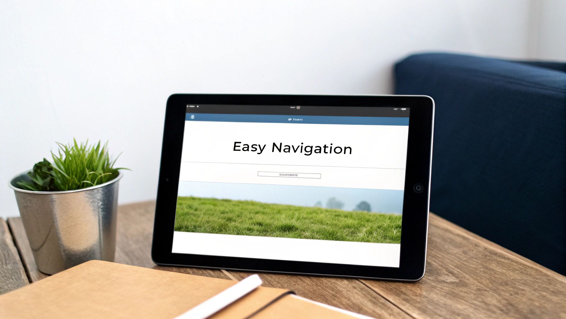
2. Intuitive Navigation Structure
An intuitive navigation structure is a logical and consistent menu system that helps visitors find information quickly and without confusion. Primary navigation should be easy to locate and typically includes 5-7 main categories representing your site's most important sections, reducing user friction and excessive clicking.
What It Is and Why It Works
Intuitive navigation acts as a roadmap for your website, guiding users to their desired destination. It works by organizing information based on familiar user expectations and mental models, which builds trust and encourages exploration.
A well-structured navigation system can reduce bounce rates by making information accessible within three clicks.
Examples of Success
- Apple
Its clean horizontal navigation with minimal, high-level categories makes finding product information effortless. - Amazon
Uses a comprehensive mega-menu with intelligent categorization to manage its massive inventory. - Medium
Employs minimalist navigation with contextual menus that appear as needed, keeping the interface clean. - TechCrunch
Organizes vast amounts of content with a clear, multi-level category system that is easy to browse.
Learn more about Intuitive Navigation Structure on domain.com
Actionable Tips
- Use familiar labels like “About,” “Services,” and “Contact” that users immediately understand.
- Follow the three-click rule, ensuring users can find any page in three clicks or fewer.
- Implement sticky navigation that remains visible as users scroll down long pages.
- Visually highlight the user’s current page in the navigation menu to provide context.
- Test your navigation with actual users to identify and resolve any points of confusion.
When and Why to Use It
A clear navigation system is fundamental to all homepage design best practices and should be a priority for any new or redesigned website. It directly impacts user experience, SEO, and conversion rates by making your site accessible and easy to use. For businesses with multiple products, services, or content categories, a logical navigation structure prevents overwhelm and guides entrepreneurs and marketing leads efficiently through the sales funnel.
3. Strong Call-to-Action (CTA) Buttons
A strong Call-to-Action (CTA) is a button or link that prompts visitors to take a specific, desired action. It serves as the primary conversion driver on a homepage, guiding users from passive browsing to active engagement. An effective CTA uses action-oriented language, contrasting colors, and strategic placement to stand out and clearly communicate what happens next.

What It Is and Why It Works
A CTA is a directive designed to generate an immediate response. It works by creating a clear, frictionless path for users to follow, whether that’s signing up, making a purchase, or learning more. Well-designed CTAs reduce decision fatigue and guide visitors toward your most important conversion goals.
A CTA with a contrasting color is one of the most effective ways to boost click-through rates and direct user attention.
Examples of Success
- Spotify
“Get Spotify Free” in a vibrant green clearly states the offer and draws the eye. - Netflix
“Start Your Free Month” is prominently placed and focuses on a time-bound, risk-free benefit. - Airbnb
The simple “Explore” button encourages discovery and has a clear visual hierarchy. - Canva
“Create a Design” is direct, action-focused, and stands out with a bold color.
Learn more about Strong Call-to-Action (CTA) Buttons on domain.com
Actionable Tips
- Use power words like "Get," "Start," "Discover," or "Claim."
- Ensure button text states the outcome, such as "Get My Free Trial" instead of "Submit."
- Limit each section to one primary CTA to avoid overwhelming visitors.
- Place CTAs where users naturally look, like directly after your value proposition.
- Test button colors that contrast with your brand palette and background.
- Ensure buttons are at least 44×44 pixels on mobile for easy tapping.
When and Why to Use It
Implement strong CTAs on any homepage to directly influence conversion rates. This is a fundamental element of effective homepage design best practices. Use primary CTAs for your main goal (e.g., “Start Trial”) and secondary CTAs for lower-commitment actions (e.g., “Learn More”). Clear CTAs are essential for turning visitor interest into measurable business outcomes, such as generating leads, driving sales, or growing your email list.
4. Fast Loading Speed and Performance
Fast loading speed and performance ensure your homepage appears on a visitor’s screen almost instantly. Websites should aim to load in under 3 seconds, with optimal performance closer to 1-2 seconds, as this directly impacts user experience, SEO rankings, and conversion rates. Speed is a foundational element of effective design.
What It Is and Why It Works
Loading speed measures the time it takes for all content on your homepage to render for a user. It works because modern users expect immediate access to information; delays cause frustration and lead to high bounce rates. A faster site keeps visitors engaged and signals quality to search engines like Google.
Studies show a one-second delay in page load time can result in a 7% reduction in conversions.
Examples of Success
- Amazon
The site is optimized for sub-second load times, understanding that every millisecond counts for e-commerce sales. - Google Search
Its minimalist design is a masterclass in speed, delivering results almost instantaneously. - The New York Times
Uses a progressive loading approach, showing key text first while other elements load in the background. - Basecamp
Maintains consistently fast load times, which supports its brand promise of efficiency and simplicity.
Actionable Tips
- Use tools like Google PageSpeed Insights to regularly audit your site’s performance.
- Compress images using modern formats like WebP without sacrificing quality.
- Implement critical CSS inline in your site’s
<head>to render above-the-fold content faster. - Defer non-critical JavaScript to prevent it from blocking the initial page render.
- Enable GZIP compression on your server to reduce the size of your HTML, CSS, and JavaScript files.
- Monitor your Core Web Vitals (LCP, FID, CLS) to understand real-world user experience.
When and Why to Use It
Prioritize loading speed from the very beginning of any web design project and continue monitoring it indefinitely. This practice is crucial for homepage design best practices because it directly affects your ability to retain visitors and rank in search results. For businesses targeting mobile users, entrepreneurs, or SMBs, a fast, accessible homepage is non-negotiable for building credibility and maximizing conversions.
5. Mobile-First Responsive Design
With over 60% of all web traffic originating from mobile devices, a mobile-first approach is no longer optional. It ensures an optimal user experience across every screen size by designing for the smallest screen first and then progressively enhancing the layout for larger devices like tablets and desktops. This strategy forces a focus on core content and functionality from the start.
What It Is and Why It Works
Mobile-first design prioritizes the mobile experience, treating it as the baseline rather than an afterthought. This method works because it forces you to simplify, focusing only on essential elements and calls to action. This streamlined approach often leads to a cleaner, faster-loading, and more effective design on all platforms, not just mobile.
Popularized by UX expert Luke Wroblewski, the mobile-first strategy addresses the constraints of smaller screens head-on, improving usability and performance for the majority of users.
Examples of Success
- Shopify Stores
Product pages are built to be highly responsive, ensuring a seamless shopping experience on any device. - Bootstrap Framework
This industry-standard framework is built on a mobile-first grid system, making responsive development accessible. - Medium
Its content-focused, single-column layout excels on mobile, providing a clean and distraction-free reading experience. - Tailwind CSS
A utility-first framework that encourages a mobile-first workflow by default, simplifying responsive styling.
Actionable Tips
- Use the viewport meta tag (
<meta name='viewport' content='width=device-width, initial-scale=1.0'>) to ensure proper rendering. - Design with touch-friendly tap targets of at least 48×48 pixels to prevent accidental clicks.
- Optimize images using the
srcsetattribute to serve different resolutions based on screen size. - Test on actual devices, not just emulators, to catch real-world performance and rendering issues.
- Eliminate horizontal scrolling at all costs to avoid a frustrating user experience.
When and Why to Use It
Incorporate mobile-first principles into any new website launch or redesign. As a cornerstone of modern homepage design best practices, it aligns directly with Google's mobile-first indexing, which can positively impact your SEO rankings. This approach guarantees that your homepage is accessible and effective for the largest segment of your audience, building trust and driving conversions from users on the go.
6. Visual Hierarchy and Whitespace
Visual hierarchy is the practice of arranging homepage elements to guide user attention intentionally through size, color, contrast, and spacing. Combined with whitespace (negative space), it creates a clear, uncluttered design that directs users through your message logically and prevents visual overload.

What It Is and Why It Works
Visual hierarchy tells visitors where to look first, second, and third by making important elements stand out. Whitespace complements this by giving content room to breathe, improving readability and comprehension. This combination reduces cognitive load, allowing users to process information effortlessly and focus on key actions.
Effective use of whitespace can increase user comprehension by up to 20%, making your message more impactful.
Examples of Success
- Apple
A masterclass in minimalism, using generous whitespace to focus all attention on product imagery and key headlines. - Stripe
Uses clean spacing and a clear visual progression to guide users through complex information without feeling overwhelmed. - Google
Its homepage is the ultimate example of focused design, using whitespace to eliminate all distractions from the primary search function. - Basecamp
Effectively organizes a large amount of information into digestible sections with a clear and logical hierarchy.
Actionable Tips
- Use size, weight, and color to assign priority to headlines, buttons, and key messages.
- Increase whitespace around important elements like CTAs to draw the eye toward them.
- Create breathing room between content sections with at least 60–80px of vertical space.
- Limit your primary color palette to 2-3 colors to maintain a clean and focused design.
- Align all elements to a consistent grid system to create a sense of order and balance.
When and Why to Use It
Implement a strong visual hierarchy from the very beginning of your design process. This principle is fundamental to homepage design best practices because it directly controls user flow and focus. It is essential for homepages that need to communicate multiple pieces of information without confusing the visitor, ensuring your most important messages are seen and acted upon first. A well-structured layout builds user confidence and simplifies the journey from visitor to customer.
7. Social Proof and Trust Signals
Social proof leverages human psychology to build credibility on your homepage. Trust signals—like customer testimonials, user reviews, case studies, and trust badges—reduce perceived risk and encourage action. When first-time visitors see proof that others trust your brand, they feel more confident engaging or converting.
What It Is and Why It Works
Social proof and trust signals are elements on your homepage that validate your offering through real-world endorsements. They work by tapping into the principle of consensus: people assume the actions of others reflect correct behavior.
“Featuring genuine user feedback and recognizable logos turns skepticism into confidence in under five seconds.”
Examples of Success
- Slack
“Used by 750,000+ teams” highlights scale and community trust. - Airbnb
Rotating host and guest testimonials showcase authentic experiences. - Trustpilot
Prominent star ratings and aggregated review scores drive credibility. - Salesforce
Customer logos and linked case studies demonstrate enterprise adoption. - G2 Crowd
Detailed user reviews and ratings offer transparent feedback on features.
Actionable Tips
- Include specific metrics or dollar figures in testimonials.
- Use customer photos or short video clips for authenticity.
- Rotate 3–5 testimonials every quarter to keep content fresh.
- Display names, titles, and company logos alongside quotes.
- Position trust signals near primary CTAs for maximum impact.
- Add recognized certifications and security badges to reduce friction.
When and Why to Use It
Apply social proof immediately during a homepage launch or redesign to align with homepage design best practices. Use this approach when targeting skeptical audiences or high-consideration purchases. Trust signals reinforce your value proposition, shorten decision cycles, and boost click-through rates on calls to action. By regularly updating reviews and statistics, you maintain relevance and improve conversion over time.
8. Consistent Branding and Visual Identity
Consistent branding and visual identity extend beyond just a logo. It involves a cohesive use of color palettes, typography, imagery style, and tone of voice across your homepage. This consistency ensures every element feels like it belongs to a single, trustworthy brand, setting the visual tone for the entire user experience.
What It Is and Why It Works
A consistent visual identity is the deliberate application of your brand’s design elements across every part of your homepage. It works by building brand recognition and fostering trust. When visitors see predictable design patterns, they feel more comfortable and perceive your business as more professional and reliable.
Consistent branding reduces cognitive load, allowing users to focus on your message instead of trying to make sense of a chaotic design.
Examples of Success
- Apple
Minimalist white space and consistent, high-quality product photography reinforce its premium brand. - Netflix
Its iconic bold typography and dark mode aesthetic create a cinematic, immersive feel. - Mailchimp
A playful, quirky brand personality is evident in its unique illustrations and friendly tone. - Tesla
The minimalist, futuristic design language mirrors the innovative nature of its products.
Learn more about Consistent Branding and Visual Identity on domain.com
Actionable Tips
- Create a comprehensive brand guidelines document to ensure everyone is on the same page.
- Establish a clear typographic scale and hierarchy for headings, subheadings, and body text.
- Define your color palette usage for primary, secondary, and accent colors.
- Maintain a consistent tone of voice in all copy, from headlines to button text.
- Use consistent imagery styles, whether it's photography with a specific filter or a unique illustration style.
When and Why to Use It
Implementing a consistent visual identity is a fundamental part of homepage design best practices and should be established from day one. It is especially critical during a website launch or redesign to build immediate brand recognition. For businesses targeting specific audiences like SMBs or entrepreneurs, a strong, consistent identity projects stability and professionalism, which is crucial for building trust and encouraging conversions.
9. Compelling Hero Section Design
A compelling hero section is the first major visual element users see on your homepage. It grabs attention immediately with a powerful combination of a headline, subheadline, background imagery or video, and a primary call to action. An effective hero section must communicate your core value and drive user action within the first five seconds.
What It Is and Why It Works
The hero section sits "above the fold" and sets the entire tone for your brand experience. It works by creating an immediate emotional connection and visual anchor, guiding visitors toward the most important action you want them to take. It's your digital first impression and a critical component of modern homepage design best practices.
An impactful hero section can reduce bounce rates by immediately showing visitors they have landed in the right place.
Examples of Success
- Slack
Uses bold, clean visuals with a clear value proposition and a prominent CTA. - Intercom
Often features a video hero with animated elements to demonstrate the product in action. - Asana
Achieves cohesive messaging by perfectly aligning its compelling visuals with its headline. - Dropbox
Engages users with animation and interactive elements that simplify a complex service.
For deeper insights into creating impactful first impressions, explore dedicated hero section design principles to master this craft.
Actionable Tips
- Use high-quality images or videos that represent your brand’s values and resonate with your audience.
- Ensure text is readable over backgrounds by using a color overlay or contrast adjustments.
- Optimize image sizes using formats like WebP and keep video files under 10MB to ensure fast load times.
- Test your hero section on mobile devices, as certain effects like
background-attachment: fixedmay not work correctly. - Include a subtle scroll indicator if the page extends significantly below the fold to encourage exploration.
When and Why to Use It
Implement a strong hero section on any homepage to capture attention and direct user flow from the moment they arrive. It is essential for businesses that need to communicate a specific value proposition quickly, such as SaaS companies, e-commerce stores, and service providers. A well-designed hero streamlines the user journey, boosts conversions on your primary CTA, and solidifies brand identity.
10. Accessibility and Inclusive Design
Accessible homepages ensure all users, including those with disabilities, can access and interact with your content. This practice involves using proper HTML, ensuring keyboard navigation, providing sufficient color contrast, and making your site compatible with screen readers, adhering to standards like the Web Content Accessibility Guidelines (WCAG).
What It Is and Why It Works
Inclusive design is a methodology that enables people with diverse characteristics to use your product in a variety of different environments. It works by removing barriers, ensuring your homepage serves the widest possible audience, which not only broadens your market reach but also enhances overall user experience for everyone.
An accessible design is a better design. By focusing on inclusivity, you improve usability, SEO, and legal compliance simultaneously.
Examples of Success
- BBC
A long-standing leader in digital accessibility, the BBC's homepage meets high WCAG standards, making it a model for inclusive media. - Apple
Demonstrates a strong focus on accessibility with features like VoiceOver and clear, high-contrast layouts. - Microsoft
Pioneers inclusive design, ensuring their digital properties are usable by people with a wide range of abilities. - Government Websites (e.g., GOV.UK)
Legally required to meet WCAG 2.1 AA compliance, offering clear, simple navigation for all citizens.
Learn more about Web Content Accessibility Guidelines on w3.org
Actionable Tips
- Use a contrast checker like WebAIM to ensure text-to-background color ratios meet at least a 4.5:1 standard.
- Write descriptive alt text for all images that convey their meaning and context.
- Ensure all interactive elements, like menus and buttons, are fully operable with a keyboard.
- Use semantic HTML (e.g.,
<nav>,<main>,<h1>) to give your page a logical structure for screen readers. - Label all form fields clearly and associate them with their respective inputs.
- Test your homepage using a screen reader like NVDA or JAWS to identify usability issues.
When and Why to Use It
Implementing accessibility is a fundamental aspect of modern homepage design best practices and should be integrated from the very start of any project. It is not just a feature but a core requirement for building a responsible, effective, and legally compliant online presence. An inclusive homepage builds brand trust, improves SEO rankings by making content machine-readable, and opens your business to millions of potential customers you might otherwise exclude.
10-Point Homepage Design Comparison
| Item | 🔄 Implementation Complexity | ⚡ Resource Requirements | ⭐ Expected Outcomes | 💡 Ideal Use Cases | 📊 Key Advantages |
|---|---|---|---|---|---|
| Clear Value Proposition Above the Fold | 🔄 Low–Medium — concise copy + basic design; requires A/B testing | ⚡ Low — copywriter, designer, testing tools | ⭐ High — faster comprehension, lower bounce, higher conversions | 💡 New visitors, homepage, primary landing pages | 📊 Immediate clarity, trust, conversion lift |
| Intuitive Navigation Structure | 🔄 Medium — IA planning, taxonomy and testing; hard to restructure later | ⚡ Medium — IA/UX designer, dev effort, user testing | ⭐ High — improved findability, engagement, SEO | 💡 Content-heavy sites, e‑commerce, large catalogs | 📊 Reduced friction, longer sessions, fewer support requests |
| Strong Call-to-Action (CTA) Buttons | 🔄 Low — design & copy work; iterative A/B testing recommended | ⚡ Low — designer, analytics, A/B tools | ⭐ High — direct conversion increases, measurable impact | 💡 Conversion-focused pages, signup and checkout flows | 📊 Clear next steps, measurable conversion lift |
| Fast Loading Speed and Performance | 🔄 High — technical optimizations, monitoring, trade-offs with design | ⚡ High — developers, CDN/hosting, performance tools | ⭐ High — better SEO, lower bounce, higher revenue | 💡 High-traffic sites, mobile audiences, e‑commerce | 📊 Faster UX, SEO gains, lower infrastructure costs |
| Mobile-First Responsive Design | 🔄 Medium — mobile-first patterns, responsive breakpoints, testing | ⚡ Medium — designers, devs, device testing | ⭐ High — improved mobile UX and indexing, higher engagement | 💡 Mobile-heavy audiences, retailers, publishers | 📊 Broader reach, consistent cross-device experience |
| Visual Hierarchy and Whitespace | 🔄 Medium — disciplined design system and iterative refinement | ⚡ Low–Medium — senior designer time, style guide | ⭐ High — better readability, comprehension, engagement | 💡 Brand sites, SaaS, content-rich pages | 📊 Reduced cognitive load, professional appearance |
| Social Proof and Trust Signals | 🔄 Low–Medium — collect, verify and position authentic proof | ⚡ Medium — customer outreach, legal review, design | ⭐ High — increased credibility and conversion uplift | 💡 New brands, high-consideration purchases, B2B | 📊 Builds trust, reduces purchase anxiety, differentiation |
| Consistent Branding and Visual Identity | 🔄 Medium — brand strategy, guidelines, enforcement | ⚡ Medium — brand team, design system, component library | ⭐ High — stronger recognition and user confidence | 💡 Companies scaling, multi-channel experiences | 📊 Improved recall, streamlined decisions, cohesive UX |
| Compelling Hero Section Design | 🔄 Medium — high-quality media, copy, and performance tuning | ⚡ Medium–High — photography/video, designer, dev optimization | ⭐ High — immediate engagement and stronger first impression | 💡 Product launches, marketing campaigns, landing pages | 📊 Emotional impact, higher engagement when optimized |
| Accessibility and Inclusive Design | 🔄 High — WCAG compliance, semantic markup, keyboard support | ⚡ Medium — dev training, accessibility tools, testing with assistive tech | ⭐ High — legal compliance, wider audience, better SEO | 💡 Public sector, regulated industries, large-audience sites | 📊 Inclusivity, reduced legal risk, improved UX for all |
Ready to Transform Your Homepage?
We’ve covered 10 homepage design best practices that guide visitors effortlessly toward your main offer. Each tip emphasizes clarity, speed, trust, and accessibility.
From a clear value proposition above the fold to strong CTAs and inclusive design, these practices work in concert. Real examples show how small tweaks drive measurable improvements.
A concise hero section with a bold headline and supporting subtext can boost click rates. Pair that with a fast loading experience to keep prospects engaged.
Intuitive navigation and a mobile-first layout make your site usable from any device. Each touchpoint reinforces familiarity and reduces bounce rates.
Consistent branding and social proof build credibility instantly. A cohesive visual identity across your homepage fosters trust and invites deeper exploration.
Whitespace and visual hierarchy highlight key messages without clutter. Accessibility features ensure all users can interact with your content smoothly.
Key Takeaways
-
Clear Value Proposition Above the Fold
Make your headline and subheadline crystal clear, showing exactly what problem you solve. -
Intuitive Navigation Structure
Use straightforward labels and logical grouping so visitors find what they need in two clicks or fewer. -
Strong Call-to-Action (CTA) Buttons
Craft action-oriented text and contrasting colors to draw the eye immediately. -
Fast Loading Speed and Performance
Compress images, enable lazy loading, and leverage browser caching for under two-second load times. -
Mobile-First Responsive Design
Design on a phone screen first, then scale up to desktop to guarantee smooth cross-device experiences. -
Visual Hierarchy and Whitespace
Use size, color, and spacing to guide attention and reduce cognitive load. -
Social Proof and Trust Signals
Embed customer testimonials, partner logos, or security badges to build instant credibility. -
Consistent Branding and Visual Identity
Keep fonts, colors, and tone uniform so your homepage feels like a natural extension of your brand. -
Compelling Hero Section Design
Pair a striking background image or video with a clear headline that speaks directly to your audience. -
Accessibility and Inclusive Design
Follow WCAG guidelines, use alt text, and ensure keyboard navigation for all users.
Actionable Next Steps
-
Audit Your Current Homepage
Map out where each best practice is already in place and identify gaps. -
Prioritize High-Impact Changes
Start with improvements that affect first impressions: hero section, load speed, and CTAs. -
Test, Measure, and Iterate
Use A/B testing tools and analytics to refine each element based on real user behavior.
Why Mastering These Best Practices Matters
Implementing these homepage design best practices turns casual visitors into loyal customers. A well-crafted homepage boosts conversions, enhances brand reputation, and maximizes the return on your marketing investment.
By focusing on clarity, performance, and inclusivity, you not only meet user expectations but exceed them. Every element you optimize—from social proof to responsive layouts—contributes to a stronger digital presence and sustained growth.
Now take that first step and transform your digital front door with confidence.
Ready for a seamless homepage revamp? Partner with OneNine to implement these homepage design best practices quickly and effectively. Discover how our experts can simplify your website management and drive real results on OneNine.


