

In a crowded online space, your website is your digital storefront. But what truly makes a design stand out? It's not just about flashy graphics or trendy animations. The best sites seamlessly merge beautiful aesthetics with intuitive functionality, creating an experience that guides visitors and achieves business goals. Truly good web design examples are masterclasses in strategy, combining smart layout, clear navigation, and powerful branding into a cohesive whole.
This article moves beyond a simple gallery of pretty pictures. We will dissect 7 standout websites, from inspiration hubs like Awwwards to practical resources like TemplateMonster and Smashing Magazine. For each one, we'll analyze the specific tactics that make them effective, breaking down their layout, user flow, and strategic choices. A truly great website goes beyond aesthetics, focusing on aspects like strong calls to action and a positive user journey, which are critically influenced by a solid landing page experience.
Our goal is to give you actionable insights and replicable methods. You’ll find direct links and screenshots for every example, helping you uncover the practical strategies needed to elevate your own web presence. Let's dive in and see what makes these designs work so well.
1. OneNine: The Agency Model of Clarity and Conversion
OneNine's website is a prime example of a service-based business practicing what it preaches. As a website management and development agency, its own digital storefront serves as its most powerful case study. The design immediately communicates professionalism and expertise, using a clean layout, a high-contrast color palette, and purposeful typography to build trust from the moment a potential client lands on the page.
What makes OneNine one of the good web design examples is its unwavering focus on user journey and conversion. It avoids industry jargon, instead using clear, benefit-driven language to explain its services. The user experience is seamless, guiding visitors from understanding the agency's value proposition to taking the next step, whether that's exploring their work or requesting a quote.
Strategic Analysis & Actionable Takeaways
OneNine's design excels by prioritizing clarity over complexity. This approach is highly effective for any B2B company aiming to convert visitors into leads.
Key Insight: The homepage acts as a funnel. The above-the-fold section presents a clear value proposition ("Websites that work, for a price that makes sense") and a single, prominent call-to-action (CTA). As users scroll, they are met with social proof (client logos), a breakdown of services, and more CTAs, each strategically placed to capture interest at different stages of consideration.
Actionable Takeaway: Map your user’s journey on your homepage. Start with a compelling headline and primary CTA. Follow up with trust-building elements like testimonials or client logos, then detail your services with clear benefits before presenting another CTA. Don't make the user hunt for the next step.
Replicable Strategies
Here are a few specific tactics from OneNine you can apply to your own site:
- Simplify Your Navigation: OneNine uses a simple, five-item main navigation menu. This reduces cognitive load and makes it easy for users to find exactly what they need without feeling overwhelmed.
- High-Contrast CTAs: The bright orange call-to-action buttons stand out against the site's black-and-white background, drawing the eye and encouraging clicks. This is a fundamental principle of conversion-centered design.
- Use “How It Works” Sections: The step-by-step process explanation demystifies their service, making it feel accessible and transparent. This builds confidence and answers key user questions proactively.
2. Awwwards: The Inspiration Hub for Digital Excellence
Awwwards isn't a single website example; it's a curated gallery of the world's best. As a professional web design and development competition body, its platform is a meta-example of good web design, showcasing award-winning sites. It serves as an essential resource for designers, developers, and marketers seeking inspiration and a benchmark for what's possible on the web. The platform's own design is clean and immersive, prioritizing the incredible work it features.
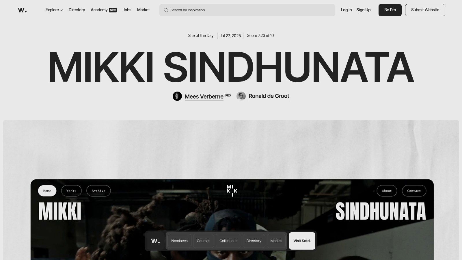
What makes Awwwards one of the best sources for good web design examples is its rigorous, community-driven evaluation process. Each featured "Site of the Day" is scored on design, usability, creativity, and content by an international jury of experts. This ensures a consistent stream of high-quality, innovative, and technically impressive projects, providing a living library of cutting-edge trends and best practices. While some content requires a paid plan, the core inspirational gallery is freely accessible.
Strategic Analysis & Actionable Takeaways
Awwwards thrives by functioning as a high-authority curator. Its value lies not just in the content it shows, but in the quality-control process behind it. This builds immense trust and makes it the go-to source for top-tier inspiration.
Key Insight: The platform masterfully balances inspiration with education. It doesn't just display beautiful sites; it breaks them down. By providing jury scores and linking to the creators, Awwwards transforms passive viewing into an active learning experience, allowing users to analyze what makes a design successful.
Actionable Takeaway: Don't just show your work; explain why it's great. Whether you're building a portfolio or a case study, add context. Detail the challenge, your solution, and the results. This positions you as a strategic expert, not just a technician.
Replicable Strategies
Here are a few specific tactics from Awwwards you can apply to your own site:
- Leverage Expert Curation: If you aggregate content, emphasize the quality and expertise behind your selection process. This builds authority and makes your platform a trusted resource, not just another directory.
- Create Immersive Visual Galleries: Awwwards uses large, high-quality visuals and videos to let the featured designs speak for themselves. Prioritize visual fidelity when showcasing portfolio work to make a powerful first impression.
- Incorporate Social Proof and Awards: The entire premise of Awwwards is built on the prestige of its awards. On your own site, prominently display any awards, certifications, or positive client ratings to build credibility instantly.
3. TemplateMonster: A Marketplace Masterclass in Choice Architecture
TemplateMonster showcases how to manage a massive digital inventory without overwhelming the user. As a marketplace with tens of thousands of website templates, themes, and plugins, its design challenge is to make discovery easy and intuitive. It succeeds by using a powerful combination of categorization, filtering, and visual previews, turning a potentially chaotic library into a structured, user-friendly resource.
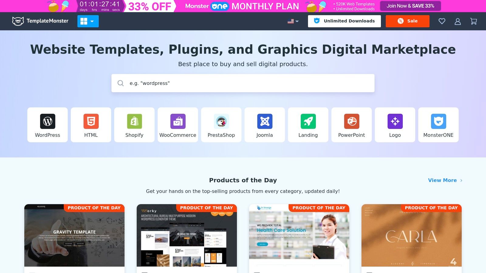
What makes TemplateMonster one of the good web design examples is its masterful use of choice architecture. It understands that users arrive with different needs, some knowing exactly what they want (a specific WordPress theme for a restaurant) and others just exploring. The interface caters to both, with clear top-level categories and deep, granular filters that help users narrow down the vast selection to find the perfect fit for their project. The inclusion of live demos for every template is a critical feature, allowing for a "try before you buy" experience that builds confidence and reduces purchase friction.
Strategic Analysis & Actionable Takeaways
TemplateMonster's success lies in its ability to present an enormous catalog in a digestible way, guiding users toward a purchase decision. This is a crucial lesson for any e-commerce or marketplace website.
Key Insight: The design prioritizes user empowerment through robust filtering and search. Instead of a single, curated path, it provides the tools for users to create their own journey. The "Topics" filter, for instance, allows users to shop by industry (e.g., "Medical," "Fashion," "Real Estate"), which is a far more intuitive approach for most business owners than browsing by technical specifications alone.
Actionable Takeaway: If your site offers a wide range of products or services, invest in a powerful filtering system. Think about how your customers search. Do they search by feature, by price, by use case, or by industry? Provide multiple paths to discovery to cater to different user mindsets.
Replicable Strategies
Here are a few specific tactics from TemplateMonster you can apply to your own site:
- Offer Multiple Purchase Models: TemplateMonster offers both individual template purchases and a MonsterONE subscription for unlimited access. This caters to one-off buyers and high-volume users like agencies, maximizing market reach.
- Leverage Live Demos: Allowing users to interact with a live version of a product is incredibly powerful for digital goods. It answers questions visually and demonstrates the product's value far more effectively than static images.
- Provide Comprehensive Product Pages: Each template page includes a feature list, reviews, version history, and support details. This transparency is key to building trust and is one of the essential website design best practices for success.
4. Creative Market: Curating Inspiration and Community
Creative Market is an online marketplace where design meets commerce, and its own platform is a masterclass in organizing a vast, user-generated library. It provides a space for independent creators to sell digital assets like fonts, graphics, and website templates. The site’s design successfully tackles a major challenge: making millions of unique items feel browsable, searchable, and discoverable, rather than overwhelming.
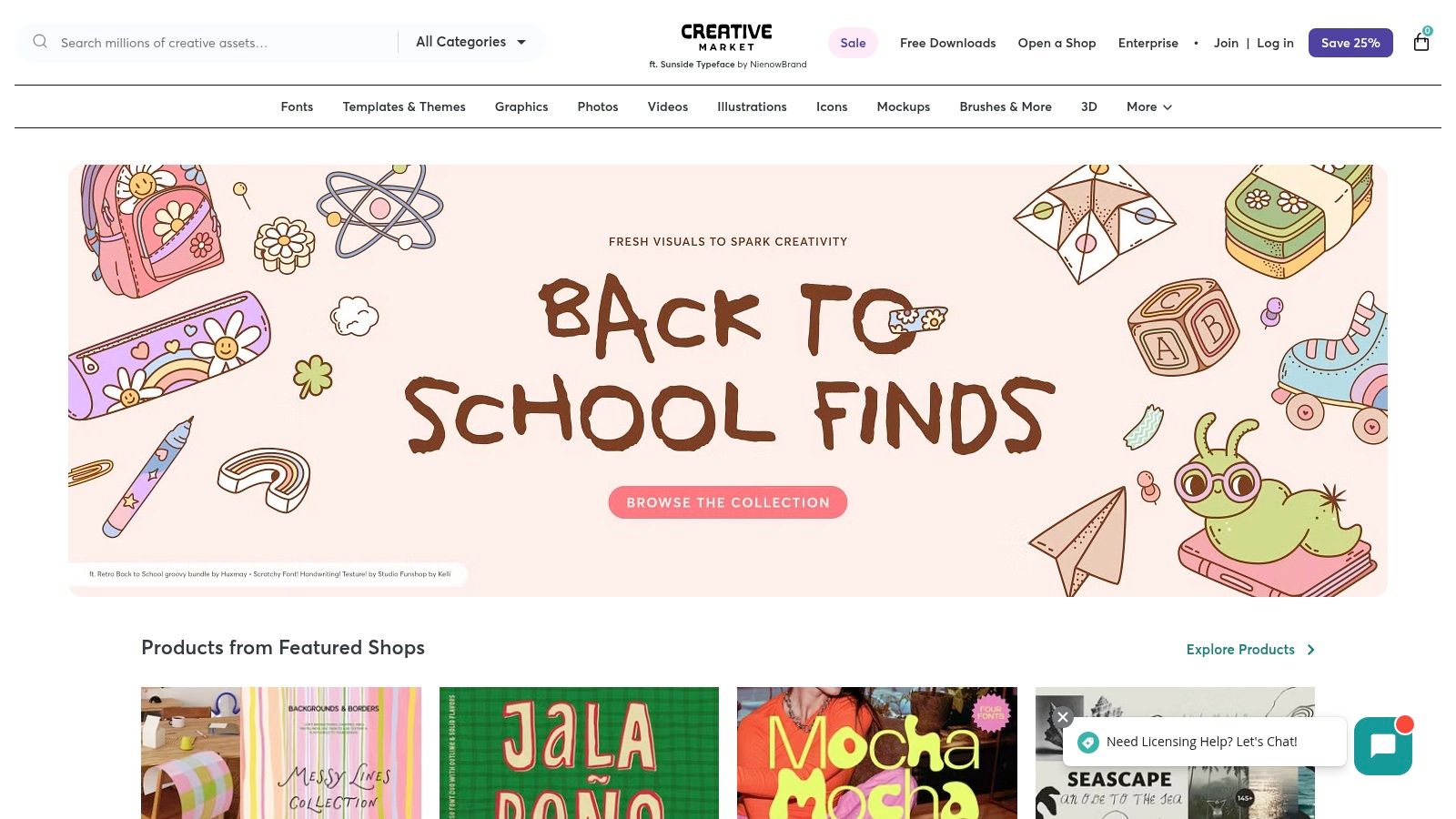
What elevates Creative Market into the ranks of good web design examples is its ability to balance a powerful e-commerce engine with a strong sense of community and aesthetic appeal. The user experience feels less like a sterile digital warehouse and more like browsing a curated art fair. This is achieved through large, beautiful product visuals, a clean grid layout, and features that highlight the creators behind the products, fostering a connection between buyer and seller.
Strategic Analysis & Actionable Takeaways
Creative Market's design excels by transforming a potentially chaotic marketplace into an inspiring and highly functional discovery tool. This approach is invaluable for any platform managing large, visually-driven inventories.
Key Insight: The platform uses a powerful combination of categorization, filtering, and curated collections to guide users. Instead of relying solely on a search bar, it offers multiple pathways to discovery. Users can explore by asset type (e.g., "Fonts," "Templates"), browse trending items, or dive into themed collections, which simplifies choice and sparks inspiration.
Actionable Takeaway: Don't force users down a single path. If your site has a large inventory, provide multiple discovery methods. Implement robust filtering options, create curated "best of" collections, and use high-quality visuals to let the products themselves guide the user experience.
Replicable Strategies
Here are a few specific tactics from Creative Market you can apply to your own e-commerce or portfolio site:
- Implement Advanced Filtering: Creative Market’s sidebar filters are incredibly detailed, allowing users to narrow down millions of items by price, file type, software compatibility, and properties. This granular control is essential for user satisfaction on large platforms.
- Showcase the Creator: Each product page prominently features the creator's profile, shop, and other items. This builds trust and encourages users to explore more work from designers they like, increasing customer loyalty and time on site.
- Use Visuals as the Primary Hook: The site relies on large, high-quality preview images for each asset. For any visually-oriented product, from fashion to digital goods, letting the imagery do the talking is far more effective than long blocks of text.
5. FreeCodeCamp: Designing for Education and Usability
FreeCodeCamp's platform demonstrates that powerful, educational content doesn't require a complex or flashy design. As a non-profit dedicated to teaching people to code for free, its website is engineered for one primary goal: facilitating learning. The design prioritizes clarity, accessibility, and function over form, ensuring that users can immediately find and start their educational journey without any friction. It's a testament to user-centric design where the interface serves the content, not the other way around.
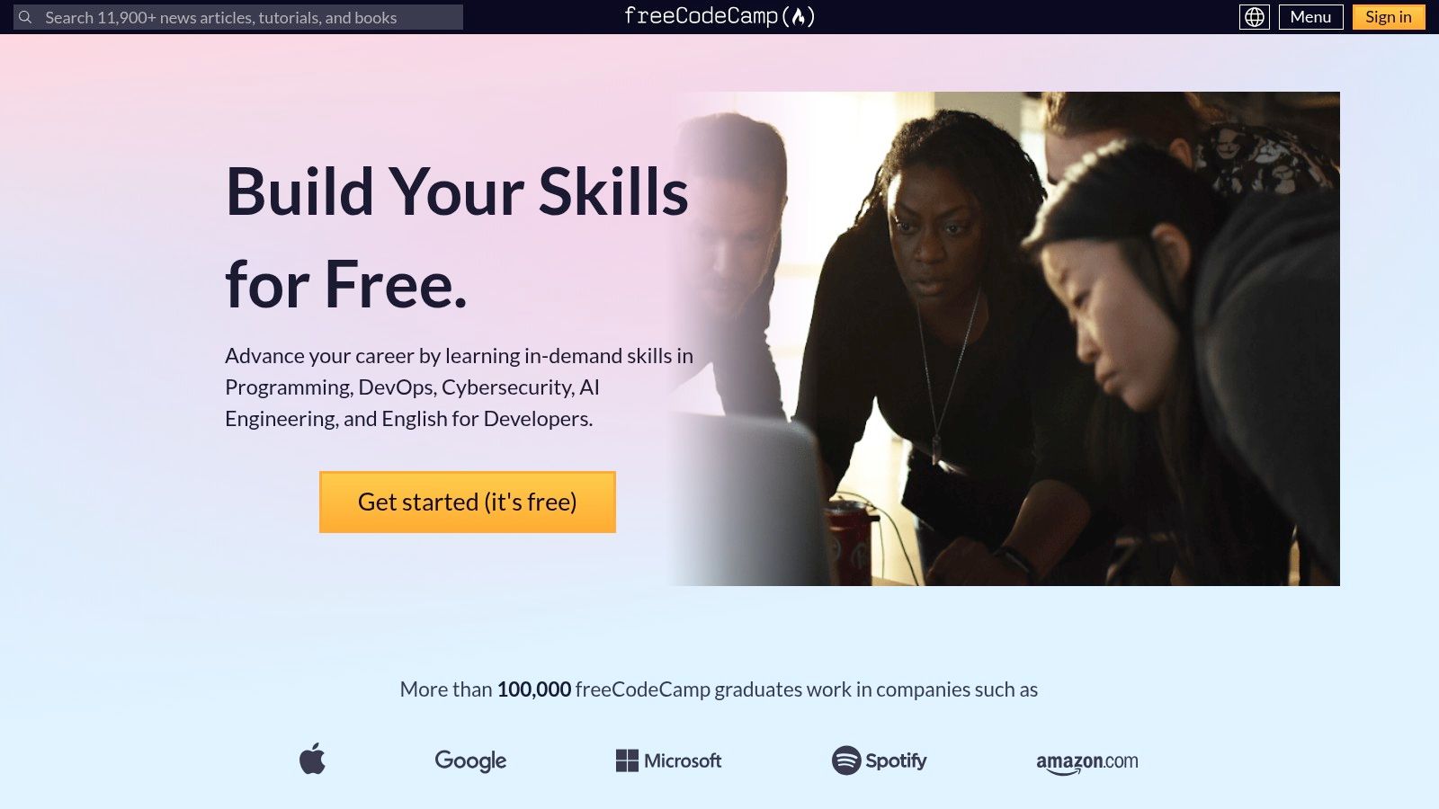
What makes FreeCodeCamp one of the truly good web design examples is its masterful execution of a task-oriented interface. The entire experience is built to remove barriers. From the moment you land on the site, the core offering is clear, and access to the comprehensive curriculum is just a click away, with no fees or hidden costs. This approach builds instant trust and empowers users to focus on learning rather than navigating a confusing system.
Strategic Analysis & Actionable Takeaways
FreeCodeCamp's design success lies in its ruthless focus on the user's primary goal: learning to code. Every element is optimized to support this, creating an intuitive and motivating educational environment.
Key Insight: The platform's layout acts as a clear, structured curriculum map. Users are presented with a logical progression of courses, from foundational HTML and CSS to advanced JavaScript and Python. This linear path gives learners a sense of direction and accomplishment as they complete each module and project, which is a powerful motivator for a self-paced platform.
Actionable Takeaway: If your website offers a service or product with multiple steps or components, present it as a clear, linear path. Guide users from step one to completion using a structured layout. This reduces overwhelm and makes complex offerings feel manageable and achievable.
Replicable Strategies
Here are a few specific tactics from FreeCodeCamp you can apply to your own site:
- Zero-Friction Onboarding: The most prominent CTA is "Get started (it's free)." This simple, benefit-driven call-to-action removes all sign-up anxiety. Consider how you can reduce friction for your primary conversion goal.
- Task-Focused Dashboard: The curriculum is presented as a list of expandable certifications. This dashboard-style layout allows users to see the entire learning path at a glance and track their progress easily.
- In-App Consistency: The learning environment itself, with its three-panel layout (instructions, code editor, preview), is a model of consistency and usability. It keeps learners in a focused state without needing to switch between different windows or applications.
6. Smashing Magazine: Designing for Information Density and Community
Smashing Magazine is an institution in the web development and design world, and its own website is a testament to its expertise. As an online publication with a massive library of content, its primary design challenge is information architecture. The site masterfully organizes thousands of articles, tutorials, and resources into a clean, scannable, and engaging format, proving that content-heavy sites don't have to be overwhelming.
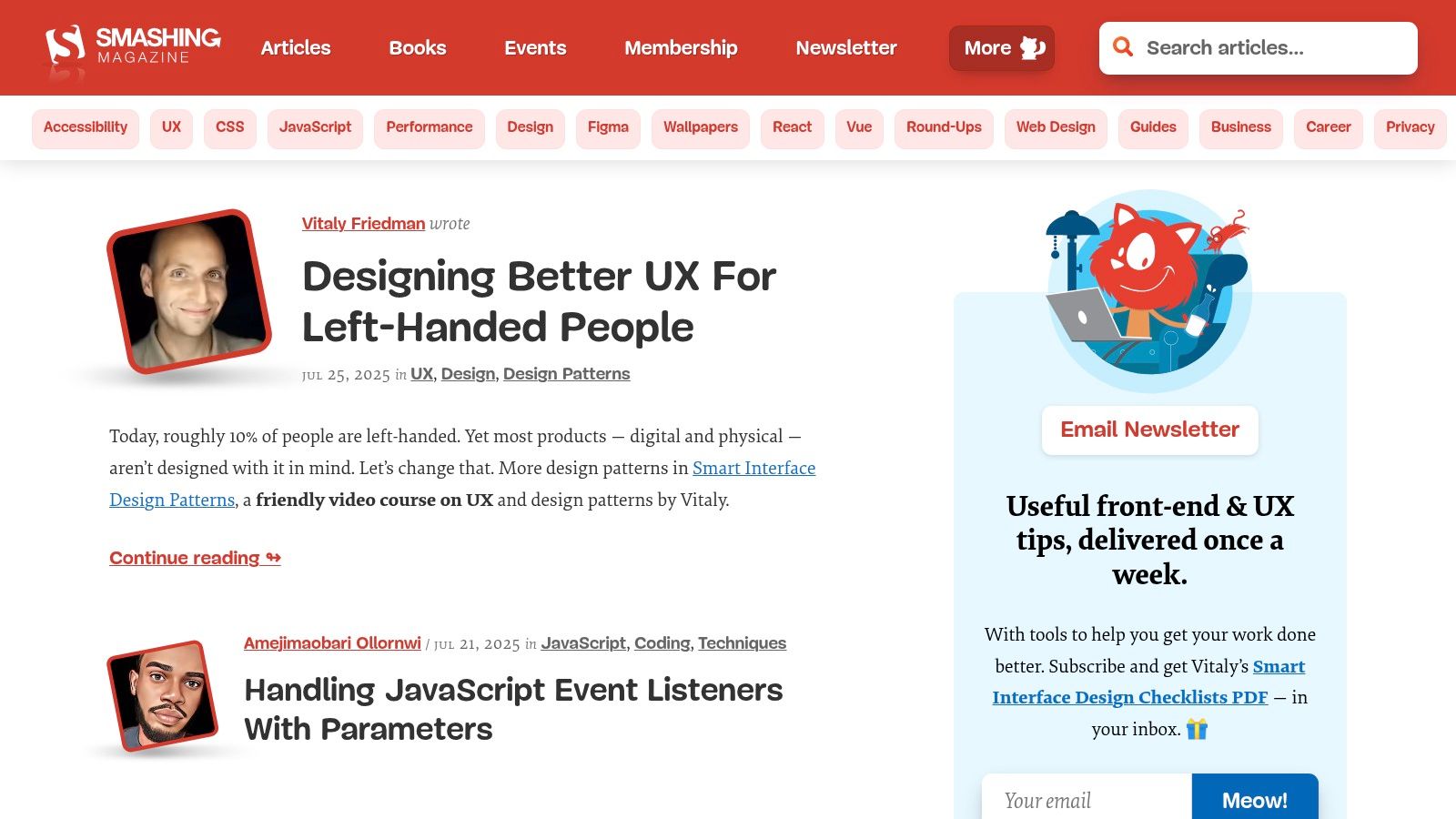
What elevates Smashing Magazine into the category of good web design examples is its commitment to readability and user control. It employs a distinctive yet highly legible typography and a card-based layout that makes browsing topics intuitive. The design respects the user's time by providing clear article summaries, author information, and reading time estimates, allowing visitors to quickly find the high-quality content they need. While much of the content is free, a premium membership is required for access to exclusive guides and ebooks.
Strategic Analysis & Actionable Takeaways
Smashing Magazine's design successfully serves two types of users: those who browse for new ideas and those who search for specific solutions. This dual-purpose functionality is built into its DNA, making it a valuable model for any content-driven platform.
Key Insight: The website uses a powerful tagging and categorization system that is visible to the user. Each article card clearly displays its category (e.g., "CSS," "JavaScript," "UX"), which not only helps with discoverability but also reinforces the site's authority across a wide range of topics. This structured approach is essential for any platform aiming to become a go-to resource.
Actionable Takeaway: Don't hide your content structure. Use visible tags, categories, and filters to empower users to navigate your content library on their own terms. This turns a simple blog or resource center into a powerful, searchable knowledge base.
Replicable Strategies
Here are a few specific tactics from Smashing Magazine you can apply to your own content-heavy site:
- Provide Multiple Navigation Paths: Besides the main navigation bar, Smashing Magazine offers robust search functionality, topic-based landing pages, and "Latest Articles" sections. This gives users multiple ways to find what they're looking for.
- Prioritize Readability: The article pages use a single-column layout with generous white space and large, clear fonts. This minimizes distractions and creates an excellent reading experience, which is crucial for retaining visitors on long-form content.
- Integrate Community and Commerce Seamlessly: The site blends its free articles with calls to join its membership, attend conferences, or buy books without being intrusive. This is a great example of how to commercialize a content platform while still providing immense value, a principle that aligns well with developing a strong content strategy. To build a similar foundation, you can learn more about crafting a website content strategy template.
7. CSS Zen Garden: The Masterclass in Style Separation
CSS Zen Garden isn't a traditional business website; it's a legendary web design project that serves a single, powerful purpose: to demonstrate the immense capability of Cascading Style Sheets (CSS). It accomplishes this by taking one identical HTML file and allowing designers from around the world to apply completely different CSS stylesheets to it. The result is a breathtaking collection of designs, all built on the exact same structural foundation, proving that content and presentation can be truly separate.
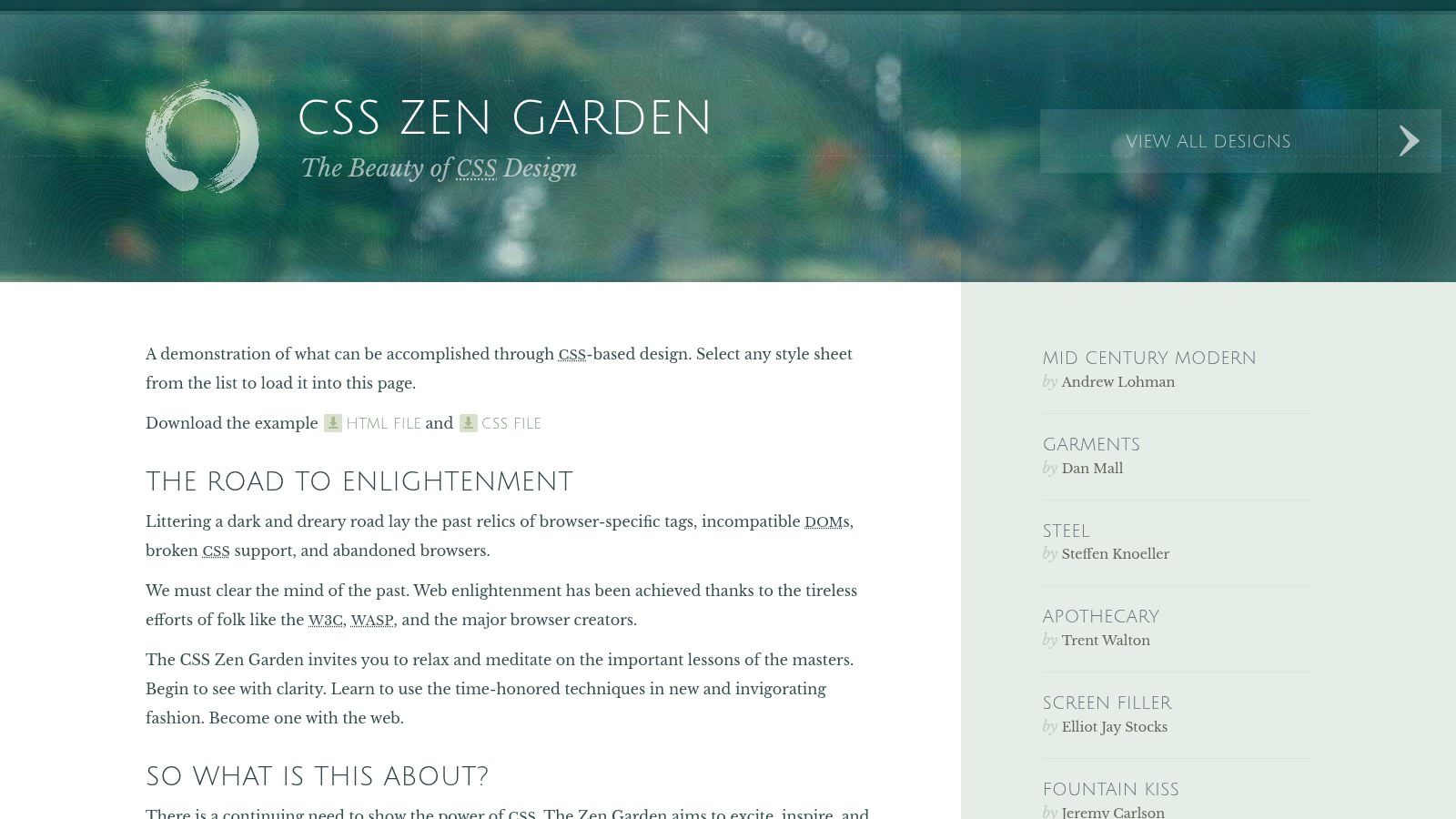
What makes CSS Zen Garden one of the most enduring good web design examples is its core lesson in flexibility and accessibility. It teaches a fundamental principle: a well-structured document can be styled in infinite ways without ever touching the underlying content. This concept is crucial for creating websites that are maintainable, accessible to users with disabilities, and adaptable to future design trends. The platform is completely free to access and explore.
Strategic Analysis & Actionable Takeaways
CSS Zen Garden excels by isolating one variable, design, to illustrate the power of CSS. This makes it an invaluable educational tool for developers and a source of endless inspiration for designers.
Key Insight: The project's genius lies in its constraint. By keeping the HTML static, it forces a focus on pure CSS creativity. It shows that you don't always need to rebuild a site's structure to achieve a dramatic visual overhaul. This highlights the importance of semantic HTML, where the code describes the content's meaning, not its appearance.
Actionable Takeaway: Prioritize a clean, semantic HTML structure for your website. When your content is logically organized with proper tags (
<nav>,<main>,<article>, etc.), redesigns become faster and less expensive. You can completely change your site's look and feel primarily by editing the CSS, minimizing the need for a full development overhaul.
Replicable Strategies
Here are a few specific tactics from CSS Zen Garden you can apply to your own site:
- Separate Content from Presentation: Build your site with the core principle that HTML is for content and structure, while CSS is for visual styling. This separation makes your site easier to maintain and update in the long run.
- Embrace Creative Constraints: The project shows that limitations can fuel creativity. When faced with a design challenge, consider what you can achieve by changing only the visual layer before resorting to structural changes.
- Explore Different Visual Themes: Use the site as inspiration. See how vastly different moods, from corporate to artistic, can be achieved with color, typography, and layout alone, all while using the same navigation links. For more on this, check out these website navigation best practices.
Top 7 Good Web Design Examples Comparison
| Service | 🔄 Implementation Complexity | ⚡ Resource Requirements | 📊 Expected Outcomes | 💡 Ideal Use Cases | ⭐ Key Advantages |
|---|---|---|---|---|---|
| OneNine | Medium to high – custom development and management | Requires professional expertise, ongoing management | Highly reliable sites with fast load times and strong security | Businesses needing tailored website management and development | Comprehensive all-in-one service, transparent pricing, rapid support |
| Awwwards | Low – browsing and evaluation platform | Minimal (mostly browsing) | Inspiration from top-tier, award-winning designs | Designers seeking inspiration and advanced design ideas | Curated, high-quality design showcases with community input |
| TemplateMonster | Low to medium – template purchase and setup | Moderate – template selection and some customization | Professional-looking websites with moderate customization | Users wanting ready-made templates for quick deployment | Large variety of templates, live demos, subscription options |
| Creative Market | Low to medium – purchase of diverse assets | Moderate – selection and integration of assets | Unique, handcrafted design elements and assets | Designers seeking unique design resources and assets | Support for independent creators, wide asset diversity |
| FreeCodeCamp | Medium – self-paced learning with projects | Low cost (free) but time-intensive | Practical web design skills and certifications | Beginners and self-learners wanting free, hands-on education | Completely free, project-based learning, certifications |
| Smashing Magazine | Low – reading articles and tutorials | Minimal (requires subscription for premium) | Enhanced knowledge of trends and best practices | Web professionals seeking expert articles and community resources | High-quality, well-researched content, workshops |
| CSS Zen Garden | Low – exploration and learning through examples | Very low – free access | Deeper understanding of CSS capabilities and design principles | Learners exploring CSS design impact and experimentation | Free, clear CSS demonstrations, learning resource |
Turning Inspiration into Your Next Great Website
We’ve journeyed through a curated collection of good web design examples, each offering a unique masterclass in digital strategy. From the high-conversion clarity of a specialized agency to the boundless inspiration found on platforms like Awwwards and the educational depth of Smashing Magazine, a powerful theme emerges: effective design is never just about aesthetics. It is a strategic discipline focused on solving problems for both the user and the business.
The most crucial takeaway is to move beyond simply admiring a design and start analyzing its purpose. Every layout, color choice, and font selection you've seen was a deliberate decision. These choices were made to guide the user, communicate a brand's value, and ultimately, drive a specific action, whether that's making a purchase, learning a new skill, or getting in touch.
From Analysis to Action: Your Design Blueprint
As you prepare to build or redesign your own website, use these insights as a strategic toolkit. Don't aim to copy these examples piece by piece. Instead, deconstruct their success and apply the underlying principles to your unique business goals and audience needs.
To start, ask yourself these critical questions:
- What is the single most important action I want a visitor to take? Like the focused CTA on the OneNine site, your design should guide users toward this primary conversion goal.
- How can my design build trust and credibility? Look at how resources like FreeCodeCamp and Smashing Magazine use clean layouts and authoritative content to establish themselves as experts.
- What user experience will best serve my audience? Consider the intuitive navigation and filtering systems seen on marketplaces like TemplateMonster and Creative Market. They reduce friction and help users find what they need fast.
- How can I showcase my brand's unique personality? The experimental nature of CSS Zen Garden proves that you can be creative and memorable while still adhering to solid structural principles. To help you envision your own possibilities and gather ideas, consider exploring various creative portfolio website examples to see how others in your field are standing out.
Choosing the Right Tools and Path Forward
The examples we've reviewed highlight different paths to a great website. Your choice depends on your resources, timeline, and technical skill. Marketplaces and template sites offer speed and affordability, while educational resources empower you to take a more hands-on approach. However, for a truly bespoke solution that aligns perfectly with your business strategy, partnering with a professional agency is often the most effective route.
Ultimately, the best good web design examples are the ones that successfully merge strategic goals with user-centric execution. Use this inspiration to create a website that not only looks impressive but also functions as a powerful engine for your business growth.
Ready to turn your inspiration into a high-performing website that drives real results? The experts at OneNine specialize in creating custom web designs that are not just beautiful, but are strategically engineered to convert visitors into customers. Contact OneNine today to build a website that becomes your most valuable business asset.


