

Navigating the Future of Web Design
Website navigation directly impacts user engagement and conversions. This listicle presents 10 website navigation best practices to enhance user experience and drive business results. Learn how intuitive structures, mobile responsiveness, clear labels, and strategic search functionality can transform your website. Implementing these website navigation best practices will create a seamless user journey, improving customer satisfaction and boosting your bottom line.
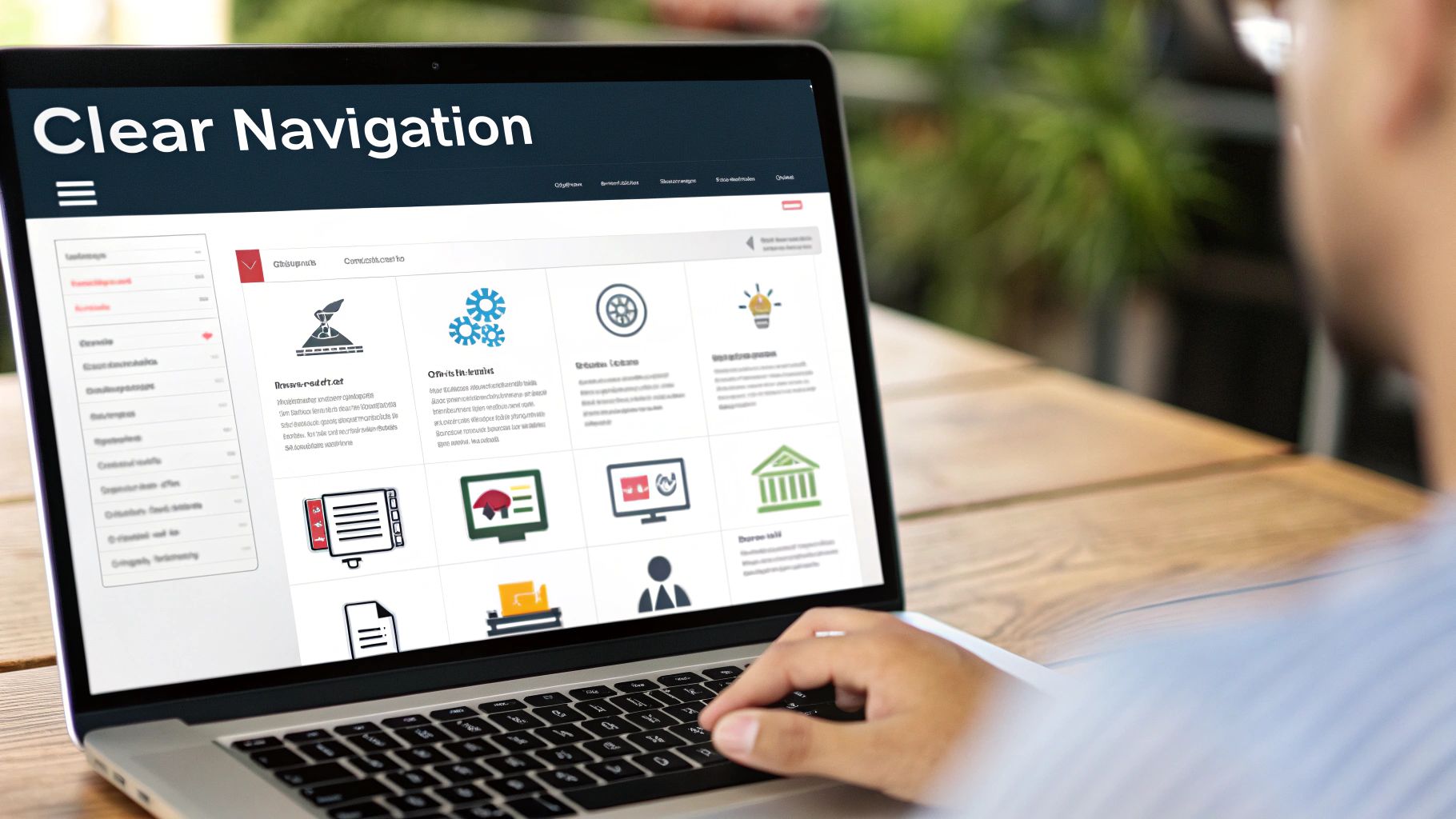
1. Intuitive and Consistent Navigation Structure
A cornerstone of website navigation best practices is establishing an intuitive and consistent navigation structure. This means designing your website so users can effortlessly find what they're looking for without any confusion. Consistency ensures that navigation elements behave predictably across all pages, reducing cognitive load and creating a smoother, more enjoyable user experience. This predictable behavior builds trust and encourages users to explore your website further.
A well-structured website starts with a solid plan. Understanding how to create wireframes can significantly improve your website's overall user experience by providing a blueprint for intuitive navigation. As explained in the How to Create Wireframes: Essential Guide from Bookmarkify, wireframing helps you visualize the layout and navigation flow before development begins.
This approach relies on several key features: predictable placement of navigation elements (users always know where to look), consistent design patterns across all pages (buttons, menus, and other interactive elements look and function the same), logical organization of content categories (information is grouped in a way that makes sense to users), and a clear visual hierarchy (important elements stand out, guiding the user's eye). Learn more about Intuitive and Consistent Navigation Structure
Think of industry giants like Apple.com, which maintains consistent global navigation across all its pages with clearly defined product categories. Amazon uses a persistent navigation bar with predictable dropdown behavior, allowing users to easily browse its vast product catalog. Similarly, Netflix provides a simple, consistent navigation structure that works seamlessly across different devices. These companies prioritize intuitive navigation, understanding its impact on user satisfaction and business success.
Why is this so crucial for website navigation best practices? Because a confusing or inconsistent navigation structure can lead to frustration, high bounce rates, and ultimately, lost customers. A well-designed navigation system, however, fosters a positive user experience, encourages engagement, and strengthens brand perception. This is particularly important for SMBs, entrepreneurs, marketers, business owners, agencies, CEOs, CMOs, and heads of marketing who are striving to build a strong online presence and convert website visitors into loyal customers.
Pros:
- Reduces cognitive load for users: Visitors can find what they need quickly and easily.
- Improves overall user experience: A seamless navigation contributes to a positive and enjoyable website visit.
- Decreases bounce rates: Users are less likely to leave your site if they can easily find what they're looking for.
- Enhances brand perception: A well-designed navigation system reflects professionalism and attention to detail.
Cons:
- May require significant planning and user testing: Implementing a truly intuitive navigation structure requires upfront investment.
- Can be challenging to maintain as websites grow: As your website expands, maintaining consistency can become more complex.
- Might limit creative design options: Adhering to established conventions might restrict certain design choices.
Tips for Implementing Intuitive and Consistent Navigation:
- Follow established web conventions for navigation placement: Users have come to expect certain navigation elements in specific locations.
- Use card sorting exercises to determine logical content groupings: This technique helps you understand how users naturally categorize information.
- Test your navigation with real users to ensure it's intuitive: User testing provides valuable feedback and insights.
- Keep primary navigation to 7±2 items to avoid overwhelming users: Limiting the number of top-level navigation items helps prevent cognitive overload.
By prioritizing intuitive and consistent navigation, you'll be well on your way to creating a website that is both user-friendly and effective in achieving your business goals.
2. Mobile-First Responsive Navigation
In today's mobile-centric world, ensuring your website navigation is easily accessible on smaller screens is paramount for a positive user experience. This is where mobile-first responsive navigation comes into play, representing one of the most crucial website navigation best practices. This approach prioritizes designing navigation systems that work seamlessly on small screens first, and then progressively enhances the functionality and features for larger screens like tablets and desktops. This ensures a smooth user experience across all devices while catering to the ever-growing mobile user base, which is critical for SMBs, entrepreneurs, marketers, business owners, agencies, CEOs, CMOs, and heads of marketing alike.
Mobile-first responsive navigation is essential for maximizing engagement and conversions as it directly impacts how easily visitors can find the information they need. By prioritizing mobile, you ensure that your core audience can easily navigate your website, regardless of their device.
Here’s how it works:
- Focus on Essential Navigation Elements: Designing for mobile first forces you to prioritize the most important navigation elements, resulting in a cleaner and more focused user experience. Less is often more on a small screen.
- Scalability: The design starts with the constraints of a mobile screen and then scales up to larger displays, ensuring adaptability.
- Responsive Design Principles: This approach relies heavily on responsive web design principles, using techniques like CSS media queries to adapt the navigation layout based on screen size.
Key Features:
- Hamburger Menus for Small Screens: This iconic three-lined icon acts as a compact container for navigation options on smaller screens, decluttering the interface.
- Expandable and Collapsible Options: Within the hamburger menu, sub-menus and additional options can be expanded and collapsed as needed, maintaining a clean layout.
- Touch-Friendly Tap Targets: Buttons and links need to be large enough for easy tapping on touchscreens. A minimum size of 44×44 pixels is recommended for comfortable interaction.
- Progressive Enhancement for Larger Screens: As the screen size increases, more navigation options can be displayed, transitioning from the hamburger menu to a full navigation bar, for example.
Pros:
- Ensures Usability on All Device Types: Provides a consistent experience regardless of screen size.
- Prioritizes the Growing Mobile User Segment: Caters to the dominant platform for web browsing.
- Helps Focus on Essential Navigation Elements: Streamlines the user experience by prioritizing key navigation options.
- Can Improve Page Load Speeds on Mobile Devices: Simpler mobile-first designs often lead to faster loading times.
Cons:
- Hamburger Menus Can Hide Important Navigation Options: Key elements might be tucked away, requiring an extra tap.
- May Require More Complex JavaScript Implementation: Implementing expandable menus and other interactive features can add complexity to the code.
- Can be Challenging to Maintain Feature Parity Across Devices: Ensuring consistent functionality across all screen sizes requires careful planning and testing.
Examples of Successful Implementation:
- Etsy: Etsy effectively transitions from a hamburger menu on smaller screens to a prominent bottom navigation bar on larger mobile devices, offering easy access to key features.
- The Guardian: The Guardian showcases a responsive navigation approach that adapts seamlessly across a wide range of devices, providing a consistent and user-friendly experience.
- Starbucks: Starbucks uses a mobile-optimized menu that adapts to different screen sizes, offering a streamlined experience for ordering and browsing on mobile.
Actionable Tips:
- Test Navigation on Multiple Devices and Screen Sizes: Rigorous testing is vital to ensure a smooth experience for everyone.
- Consider Using Bottom Navigation for Mobile Interfaces: Bottom navigation is becoming increasingly popular for mobile, placing key actions within easy thumb reach.
- Ensure Touch Targets are Large Enough (Minimum 44×44 pixels): This improves usability on touchscreens.
- Use CSS Media Queries to Adapt Navigation based on Screen Size: This allows for dynamic layout adjustments.
- Consider Progressive Disclosure Techniques for Complex Navigation: Gradually revealing navigation options as needed can prevent overwhelming users.
Popularized By:
The mobile-first approach was popularized by Luke Wroblewski, while responsive web design is credited to Ethan Marcotte. Google's mobile-first indexing initiative further cemented the importance of prioritizing mobile experiences.
By implementing mobile-first responsive navigation, you can significantly improve user engagement, reduce bounce rates, and enhance the overall effectiveness of your website. This approach is no longer optional but a necessity for any business looking to thrive in the mobile age.
3. Clear Visual Hierarchy
Visual hierarchy is crucial for effective website navigation. It's the art and science of arranging and styling navigation elements to signal their importance and how they relate to one another. A clear visual hierarchy makes it easy for users to quickly grasp their options and decide where to go next, contributing significantly to a positive user experience. This is a critical best practice for website navigation, ensuring your visitors can easily find what they're looking for and engage with your content. This is particularly important for SMBs, entrepreneurs, marketers, business owners, agencies, CEOs, CMOs, and heads of marketing looking to optimize their website performance and achieve business goals.
Here's how it works: Our brains naturally prioritize certain visual elements over others based on characteristics like size, color, contrast, and spacing. By strategically manipulating these characteristics, you can guide your users' attention to the most important navigation elements first, then secondary options, and so on. This organized approach reduces cognitive load and eliminates guesswork, streamlining the user journey.
Features of Effective Visual Hierarchy:
- Size Differentiation: Primary navigation items (like "Home," "About Us," "Services") should be visually larger or more prominent than secondary navigation items (like subcategories within "Services").
- Color Contrast: Use contrasting colors to highlight key elements and calls to action within your navigation. This can draw attention to important sections or promotions.
- Whitespace: Strategic use of whitespace helps group related navigation items and separate unrelated ones, creating visual breathing room and improving readability.
- Typography: Font choices, sizes, and weights can also communicate importance. For example, using a bold typeface for main categories and a lighter weight for subcategories reinforces the hierarchy.
Pros:
- Guides User Attention: Leads users to the most important navigation elements first.
- Reduces Confusion: Eliminates ambiguity about where to click.
- Improves UX and Usability: Contributes to a smoother, more intuitive navigation experience.
- Reinforces Brand Identity: Visual hierarchy can be used to express your brand personality through consistent design elements.
Cons:
- Design Expertise: Implementing effective visual hierarchy often requires design skills and knowledge of visual communication principles.
- Responsiveness Challenges: Maintaining consistent visual hierarchy across various screen sizes (desktop, mobile, tablet) can be technically challenging.
- Aesthetics vs. Functionality: Balancing visual appeal with practical usability can sometimes require compromises.
Examples of Successful Implementation:
- Airbnb: Airbnb excels at distinguishing between primary and secondary navigation using size and placement. Their primary navigation is prominently displayed at the top, while secondary options appear contextually based on user selections.
- The New York Times: The New York Times effectively leverages typographic hierarchy in its navigation, using different font weights and sizes to establish clear distinctions between sections and subsections.
- Mailchimp: Mailchimp showcases skillful use of color and whitespace in its navigation, creating a clean and organized user experience.
Actionable Tips:
- Use Size, Color, and Contrast Strategically: Employ these elements to signal importance and create focal points.
- Group Related Items Visually: Use whitespace and visual cues to group related navigation links.
- Ensure Sufficient Contrast: Ensure adequate contrast between text and background for accessibility, particularly for users with visual impairments. Test with colorblindness simulators.
- Hover/Active States: Provide visual feedback when users interact with navigation elements through hover and active states (e.g., color changes, underlines).
Influential Design Principles:
Visual hierarchy is rooted in Gestalt principles of visual perception, Edward Tufte's work on information design, and contemporary guidelines like Google's Material Design. These principles emphasize the importance of visual organization for effective communication.
By incorporating clear visual hierarchy into your website navigation, you can significantly improve the user experience, making it easier for visitors to find their way around and engage with your content. This directly translates to improved website performance and contributes to achieving your business objectives.
4. Descriptive and Concise Labels
Clear and concise navigation labels are crucial for effective website navigation best practices. They act as signposts, guiding users to the information they seek. Descriptive labels tell users exactly what they'll find when they click, while conciseness ensures they can quickly scan and understand their options. This combination of clarity and brevity builds user confidence and reduces frustration, leading to a smoother and more enjoyable browsing experience. This is a cornerstone of good website navigation and directly impacts user engagement and conversion rates.
This approach works by leveraging "information scent"—the cues that users pick up to predict where a link will lead them. A well-written label acts as a strong scent, giving users the confidence to click and explore. Without clear labels, users are left guessing, leading to wasted time and potential abandonment.
Features of Effective Labels:
- Clear, jargon-free terminology: Use language that everyone understands, avoiding internal jargon or technical terms your audience may not be familiar with.
- Action-oriented wording (when appropriate): For interactive elements, consider using action verbs like "Shop Now," "Get Started," or "Download."
- Consistent labeling patterns: Maintain a uniform style and voice throughout your navigation. If you use sentence case in one label, use it in all of them.
- Avoid vague terms: Steer clear of generic phrases like "Click Here" or "Learn More," as these provide no context about the destination.
Pros:
- Improves information scent for users: Makes it easier for users to predict what lies behind a link.
- Reduces cognitive load: Users can quickly scan and understand their options without having to decipher complex labels.
- Helps users quickly find what they're looking for: Leads to a more efficient and satisfying user experience.
- Improves accessibility and search engine optimization: Clear labels benefit both users with disabilities using screen readers and search engine crawlers understanding your site structure.
Cons:
- May require additional user testing to validate terminology: Ensuring your chosen labels resonate with your target audience may require user research.
- Can be challenging to keep concise for complex offerings: Finding the right balance between descriptive and concise can be difficult for websites with many products or services.
- Industry-specific terminology might need explanation: If you must use industry-specific terms, consider providing brief explanations or tooltips.
Examples of Successful Implementation:
- Zappos: Uses clear category labels like "Women," "Men," "Kids."
- Slack: Employs descriptive navigation with labels like "Product," "Solutions," "Resources."
- Mayo Clinic: Features patient-focused navigation with labels like "Symptoms," "Diseases & Conditions."
Actionable Tips:
- Limit navigation labels to 1-3 words when possible.
- Use terms your users would use (not internal jargon).
- Test labels with users through card sorting exercises.
- Consider including icons alongside text for added clarity.
- Verify through analytics that users are finding what they expect. Analyze click-through rates and bounce rates to see if your labels are performing as intended.
Popularized By:
The importance of clear and concise navigation labels has been championed by influential figures in the field of user experience, including information architecture pioneer Louis Rosenfeld, content strategist Kristina Halvorson, and the Nielsen Norman Group's usability research.
Why This Deserves Its Place in the List:
Descriptive and concise labels are fundamental to effective website navigation. They bridge the gap between user intent and website content, directly impacting user satisfaction, conversion rates, and overall website success. For SMBs, entrepreneurs, marketers, and CEOs alike, understanding and implementing this best practice is critical for building a user-friendly and effective online presence. By making it easy for users to find what they need, you pave the way for a positive user experience and ultimately, business growth.
5. Breadcrumb Navigation
Breadcrumb navigation is a key element of effective website navigation best practices, offering users a clear and efficient way to understand their location within your site and easily navigate to higher-level pages. Think of it like the trail of breadcrumbs Hansel and Gretel used – it provides a path back to where you started. This secondary navigation system visually represents the site's hierarchy, displaying a trail of clickable links that trace the user's path from the homepage to their current location. This is invaluable for businesses of all sizes, from SMBs to large corporations, helping to enhance user experience and improve site navigation.
How Breadcrumb Navigation Works:
Breadcrumb navigation typically appears as a horizontal list of links, often placed near the top of the page, below the main navigation menu. Each level in the hierarchy is represented by a clickable link, separated by a symbol like ">" or "/". The last item in the trail represents the current page and is usually not clickable. For instance, a breadcrumb trail on an e-commerce site might look like this: Home > Electronics > Laptops > Ultrabooks > Specific Laptop Model.
Examples of Successful Implementation:
- Amazon: Amazon masterfully uses breadcrumbs to guide users through its vast product catalog. This allows customers to quickly jump back to broader categories like "Electronics" or "Laptops" after delving into a specific product page.
- Microsoft Documentation: With a huge library of technical documentation, Microsoft relies heavily on breadcrumbs to provide context and enable users to easily navigate between different sections and related articles.
- IKEA: IKEA uses category-based breadcrumbs to help users easily browse their furniture and home goods offerings. You can readily move from "Living Room Furniture" to "Sofas" to "Sectional Sofas" and back, providing a smooth browsing experience.
Why Use Breadcrumb Navigation?
Breadcrumb navigation deserves its place in the list of website navigation best practices because it significantly enhances user experience and contributes to a more intuitive website structure. This is crucial for retaining visitors and driving conversions, a key goal for all businesses, from startups to established enterprises. Specifically, it:
- Reduces Clicks: Users can navigate back to higher-level pages with a single click, eliminating the need to use the "back" button repeatedly.
- Provides Context: Breadcrumbs instantly show users where they are within the website's structure, preventing disorientation and improving overall usability.
- Improves SEO: Search engines use breadcrumbs to understand the relationship between pages, improving your site's visibility in search results.
- Saves Space: Breadcrumbs are compact and occupy minimal screen real estate, leaving more room for primary content.
Pros and Cons:
Pros:
- Improved user experience and navigation
- Reduced bounce rates and increased time on site
- Better SEO performance
- Space-saving design
Cons:
- Less effective for websites with flat hierarchies
- Can be redundant on mobile devices with limited space
- May confuse users if implemented inconsistently
Actionable Tips for Implementation:
- Clear Separators: Use visually distinct separators like ">" or "/" between breadcrumb levels.
- Single Line: Keep breadcrumbs on a single line whenever possible to maintain a clean layout.
- Clickable Levels: Make all levels except the current page clickable links.
- Mobile Optimization: Consider truncating long breadcrumb paths on mobile devices to avoid clutter.
- Consistent Placement: Position breadcrumbs consistently across all pages of your site.
Popularized By:
Breadcrumb navigation's effectiveness has been substantiated by usability research conducted by experts like Jakob Nielsen. Its widespread adoption on e-commerce platforms and inclusion in accessibility guidelines like WCAG further solidifies its importance as a website navigation best practice. By following these tips and considering the pros and cons, you can leverage breadcrumb navigation to create a more user-friendly and efficient website experience for your audience, ultimately contributing to your business goals.
6. Search Functionality
Search functionality is a critical component of effective website navigation. It empowers users to find precisely what they're looking for without having to click through multiple pages or menus. Instead of relying solely on your website's hierarchical structure, users can directly input keywords or phrases to locate specific content. This is especially valuable for content-rich websites, e-commerce platforms, and knowledge bases where users often have specific goals in mind. For these sites, a well-implemented search feature complements traditional navigation and significantly improves user experience.

A robust search function goes beyond a simple search box. Features like autocomplete (type-ahead suggestions), filtering and sorting options for search results, typo correction (error tolerance), and advanced search capabilities (for complex sites) greatly enhance the user experience. For instance, imagine a user searching for "blue running shoes size 10." A basic search might return any result with those words, while an advanced search with filters allows users to refine their search based on specific criteria. This level of control streamlines the search process and ensures users find exactly what they need quickly.
Examples of successful search implementation include Amazon's robust product search, complete with filtering options and personalized suggestions; Google Drive's unified search across different document types; and Sephora's product search featuring autocomplete and visually appealing results. These examples showcase the versatility of search functionality across different platforms and highlight its importance in driving user engagement and conversions.
Pros of Effective Search Functionality:
- Direct Content Access: Users bypass complex navigation and reach desired content quickly.
- Supports Goal-Oriented Users: Caters to users who know exactly what they want.
- Reduced Navigation Steps: Streamlines information retrieval, saving users time and effort.
- Valuable Search Analytics: Captures user search queries to improve content strategy and identify user needs.
Cons of Poor Search Implementation:
- Technical Overhead: Requires ongoing development, implementation, and maintenance.
- Potential for User Frustration: A poorly implemented search function can lead to negative user experiences.
- Navigation Bypass: Users might rely solely on search and miss crucial information presented through primary navigation.
Tips for Implementing Effective Search:
- Prominent Placement: Place the search bar prominently in the header area, typically using a magnifying glass icon for universal recognition.
- Autocomplete/Type-ahead: Implement autocomplete to guide users and provide suggestions as they type.
- Relevance-Based Results: Display the most relevant results first based on the user's search query.
- Zero-Result Messaging: Provide helpful messaging for zero-result searches, suggesting alternative search terms or related content.
- Search Analytics Analysis: Regularly analyze search queries to improve content strategy, identify gaps in content, and refine website navigation.
Learn more about Search Functionality
Search functionality deserves its place on this list of website navigation best practices due to its direct impact on user experience. In today's fast-paced digital landscape, users expect quick and efficient access to information. A robust search feature caters to this need, enhancing user satisfaction and driving engagement. The rise of search-centric platforms like Google, along with the availability of powerful search implementation tools like Elasticsearch and Algolia, and thought leadership in the field, like Peter Morville's work on search user experience, underscores the essential role of search in modern website navigation. This focus on search-first approaches reinforces its importance for SMBs, entrepreneurs, marketers, and business owners looking to optimize their website's usability and achieve their business goals.
7. Sticky Navigation
Sticky navigation, also known as fixed navigation, is a design pattern where the main navigation menu remains visible at the top of the screen even as the user scrolls down the page. This persistent visibility ensures that key navigation options are always readily accessible, eliminating the frustration of having to scroll back to the top to move to a different section or page. This is particularly beneficial for longer pages with substantial content, making it easier for users to explore your website and find what they're looking for.

Sticky navigation often utilizes a condensed or simplified version of the main navigation menu displayed at the top of the page. This helps conserve valuable screen real estate, especially on mobile devices. Features like smooth transitions between the standard header and the sticky state, and maintaining consistent branding and functionality throughout the scrolling experience are crucial for seamless user experience.
Why Sticky Navigation Deserves Its Place Among Website Navigation Best Practices:
For SMBs, entrepreneurs, marketers, and agency professionals alike, sticky navigation offers a powerful tool for improving website usability and achieving business objectives. Its ability to enhance user experience translates to increased engagement and potentially higher conversion rates. By facilitating easy exploration of your website's content and offerings, sticky navigation can contribute significantly to achieving your business goals. It's particularly valuable for e-commerce platforms, single-page applications, and content-heavy sites like news organizations and blogs, mirroring their widespread adoption in these areas.
Pros:
- Constant Access to Navigation: Users can navigate to any section of your website at any time, without having to scroll back up.
- Improved Navigation Efficiency: Streamlines the navigation process, especially on long pages, enabling users to quickly find the information they need.
- Increased Page Engagement and Conversions: By making it easier for users to browse and explore, sticky navigation can contribute to higher engagement and ultimately, better conversion rates.
Cons:
- Screen Real Estate: Sticky navigation occupies space at the top of the screen, which can be problematic on mobile devices.
- Potential for Distraction: If not implemented carefully, it can obscure content or become visually distracting.
- Performance Impact: Poorly optimized sticky navigation can negatively impact website performance.
Examples of Successful Implementations:
- Apple: Utilizes a condensed sticky navigation bar on product pages, providing access to key product information and purchase options.
- Medium: Employs a minimalist sticky header containing essential actions like search and sign-in.
- Shopify: Features persistent navigation in its admin interface, ensuring easy access to key functionalities for managing online stores.
Actionable Tips for Implementation:
- Condense: Simplify the navigation menu when it becomes sticky to save space.
- Avoid Obstruction: Ensure the sticky element doesn't overlap or cover important content.
- Cross-Device Testing: Test thoroughly on various screen sizes and devices to ensure responsiveness and proper behavior.
- Smooth Transitions: Implement smooth transitions between the standard header and the sticky state for a polished user experience.
- Transparency: Consider a slightly transparent sticky navigation bar to maintain context and prevent complete obstruction of underlying content.
By following these best practices, you can effectively leverage sticky navigation to enhance your website's usability and contribute to achieving your business objectives. This seemingly small design element can make a significant difference in user experience, engagement, and ultimately, your bottom line.
8. Accessibility-Focused Navigation
Accessibility-focused navigation is a crucial element of website navigation best practices. It ensures that everyone, including individuals with disabilities, can easily explore and interact with your website. This approach goes beyond simply making a website usable; it fosters inclusivity and provides equal access to information and services for all users. This is paramount for SMBs, entrepreneurs, marketers, agencies, CEOs, CMOs, and heads of marketing seeking to reach the widest possible audience and provide a positive user experience for everyone.
Accessibility-focused navigation relies on several key features working in concert:
- Keyboard Navigability: Users who cannot use a mouse rely on keyboard navigation. A logical tab order, clear focus indicators (visual cues showing where the keyboard focus is), and the ability to interact with all elements via the keyboard are essential.
- ARIA Landmarks and Labels: ARIA (Accessible Rich Internet Applications) attributes provide additional information about the function and purpose of website elements to assistive technologies like screen readers. Landmarks define sections of the page (e.g., navigation, main content, footer), while labels connect interactive elements with their descriptive text.
- Proper Semantic HTML Structure: Using HTML elements for their intended purpose (e.g.,
<nav>for navigation,<article>for main content) provides a foundation for accessibility. Screen readers use this semantic structure to understand and convey the page's organization to users. - Sufficient Color Contrast: Ensuring adequate contrast between text and background colors is crucial for users with low vision or color blindness.
- Skip Navigation Links: These hidden links are visible when a keyboard user tabs through the page and allow them to bypass repetitive navigation sections and jump directly to the main content.
Why is this a best practice?
Building an accessible website offers numerous advantages:
- Improved Usability for All: While primarily benefiting users with disabilities, many accessibility features, like clear keyboard navigation and logical page structure, also improve the experience for all users.
- Legal Compliance: Accessibility is often a legal requirement. In the US, the Americans with Disabilities Act (ADA) and Section 508 mandate accessibility for websites in certain contexts. Globally, the Web Content Accessibility Guidelines (WCAG) provide internationally recognized standards.
- Enhanced SEO: Many accessibility best practices, such as proper semantic HTML and descriptive alt text for images, align with SEO best practices, leading to potential improvements in search engine rankings.
- Wider Reach and Inclusivity: By making your website accessible, you expand your potential audience to include people with disabilities, demonstrating your commitment to inclusivity and social responsibility.
Examples of Success:
- Gov.uk: The UK government website is a benchmark for accessibility, featuring clear navigation, keyboard accessibility, and excellent use of ARIA attributes.
- BBC: The BBC is committed to providing accessible content across its platforms, demonstrating how accessibility can be integrated into a large and complex website.
- Target.com: Target has implemented accessible dropdown menus, showing how accessibility can be incorporated into common e-commerce features.
Actionable Tips:
- Include 'skip to content' links: Place these links at the beginning of your HTML to allow keyboard users to bypass navigation.
- Ensure all navigation is accessible via keyboard alone: Test thoroughly to ensure every interactive element can be reached and activated using only the keyboard.
- Use proper ARIA roles and landmarks: This provides critical information to assistive technologies.
- Test with screen readers: Use screen readers like NVDA (free), JAWS, or VoiceOver (built into macOS and iOS) to experience your website from the perspective of a screen reader user.
- Maintain focus visibility: Ensure the keyboard focus indicator is clearly visible.
- Follow WCAG 2.1 AA standards at minimum: WCAG provides a comprehensive set of guidelines for web accessibility.
Pros and Cons:
Pros:
- Makes websites usable for people with disabilities.
- Improves usability for all users.
- Helps comply with legal requirements (ADA, Section 508, WCAG).
- Often improves SEO.
Cons:
- Requires additional development effort.
- May constrain some design choices.
- Needs ongoing testing with assistive technologies.
Popularized By:
- W3C Web Accessibility Initiative (WAI)
- WebAIM (Web Accessibility In Mind)
- The A11Y Project
By prioritizing accessibility-focused navigation, you are not just ticking a box; you're investing in a more inclusive, user-friendly, and ultimately more successful website. This approach is not just a best practice; it's a fundamental principle for building a website that works for everyone.
9. Progressive Disclosure in Navigation
Progressive disclosure is a key website navigation best practice that streamlines the user experience by presenting information in a hierarchical manner. It simplifies complex interfaces by initially showing only the most important options and revealing further details as the user interacts with the navigation. This approach minimizes cognitive overload, making it easier for visitors to find what they need without feeling overwhelmed. This is especially crucial for SMBs, entrepreneurs, marketers, business owners, agencies, CEOs, CMOs, and heads of marketing who want to create websites that are both engaging and easy to navigate.
How it Works:
Progressive disclosure works by breaking down complex navigation structures into manageable layers. The top level displays the main categories or sections of your website. When a user interacts with one of these categories, either by clicking or hovering, the next level of navigation is revealed, showcasing subcategories or related items. This process can continue with additional layers, offering a granular navigation experience without cluttering the initial view.
Features of Progressive Disclosure in Navigation:
- Dropdown menus and mega menus: These are the most common implementation, allowing subcategories and related items to appear when hovering over or clicking a main category.
- Expandable/collapsible sections: These sections can be toggled to reveal or hide content within a page, allowing users to explore deeper into specific topics as needed.
- Layered navigation with primary and secondary levels: This involves a clear hierarchy of navigation levels, with primary navigation leading to secondary and potentially tertiary levels.
- Context-sensitive navigation: This type of navigation adapts based on the user's current location within the website, presenting the most relevant options at each stage.
Benefits of Using Progressive Disclosure:
- Reduces cognitive overload: By showing only essential information upfront, users aren't bombarded with too many choices, leading to a smoother, more enjoyable experience.
- Allows for complex site structures without cluttered navigation: Websites with extensive content can utilize progressive disclosure to maintain a clean and organized navigation structure.
- Improves focus on primary tasks and content: By minimizing distractions in the navigation, users can concentrate on the core content and calls to action.
- Can accommodate both novice and expert users: New users can easily navigate the basic structure, while experienced users can quickly access deeper levels of information.
Examples of Successful Implementation:
- Amazon: The department dropdown menu expands to reveal a wide array of subcategories, making it easy to browse through their vast product catalog.
- Microsoft's Office 365 ribbon interface: The ribbon organizes related functions into groups, revealing specific tools only when the relevant tab is selected.
- Facebook's settings menu: The settings menu uses progressive levels to organize a large number of options without overwhelming the user.
Pros and Cons:
Pros: As mentioned above, the benefits include reduced cognitive overload, accommodating complex site structures, improved focus, and catering to both novice and expert users.
Cons: Hidden options may be overlooked if the disclosure mechanism is not intuitive. Poorly implemented progressive disclosure can also increase interaction cost, requiring too many clicks or steps to reach desired information. Inconsistent disclosure patterns can also confuse users.
Actionable Tips for Implementation:
- Prioritize frequent tasks in the main navigation: Make the most common actions easily accessible.
- Use consistent interaction patterns for expanding options: Stick to familiar patterns like hover or click for expanding elements.
- Provide clear visual feedback for expandable elements: Use clear indicators like arrows or plus/minus icons to signal expandable sections.
- Test with users to ensure findability of important items: User testing is crucial to validate the effectiveness of your progressive disclosure implementation.
- Consider hover states on desktop and tap actions on mobile: Design interactions that are appropriate for each device.
Why Progressive Disclosure Deserves a Place in the List:
In today’s digital landscape, where users are constantly bombarded with information, progressive disclosure stands as a crucial website navigation best practice. By simplifying complex structures and prioritizing essential information, it enhances user experience and contributes significantly to a website's success. This approach helps businesses, marketers, and website owners of all types achieve their goals by providing a seamless and intuitive navigation experience. This is especially important for achieving better engagement and ultimately, conversions.
10. Data-Driven Navigation Optimization
In today's digital landscape, relying on guesswork for website navigation is a recipe for disaster. Effective navigation is the backbone of a positive user experience, directly impacting conversion rates and user satisfaction. That's why data-driven navigation optimization earns its place as a crucial best practice. This method uses analytics, user testing, and behavior tracking to continuously refine and improve your website's navigation structure. Instead of relying on assumptions, data-driven optimization ensures your navigation evolves based on how real users interact with your site. Learn more about Data-Driven Navigation Optimization
How it Works:
Data-driven navigation optimization leverages a variety of tools and techniques to gather insights into user behavior. This includes:
- A/B testing of navigation elements: Experiment with different versions of menus, labels, and calls-to-action to see which performs best.
- Heatmap and click tracking: Visualize where users are clicking (or not clicking) on your pages to identify areas of interest and potential navigation bottlenecks.
- User session recordings: Watch recordings of real user sessions to understand how they navigate your site, where they get stuck, and what they're looking for.
- Conversion funnel analysis: Track user progress through key conversion funnels to pinpoint drop-off points and optimize navigation for better flow.
- Search query analysis: Analyze what users are searching for on your site to understand their intent and improve navigation findability.
Examples of Success:
Companies like Booking.com, Netflix, and Spotify are prime examples of data-driven navigation optimization in action. Booking.com constantly experiments with navigation elements through A/B testing, while Netflix utilizes algorithms to personalize navigation based on user viewing history. Spotify's navigation design process is heavily informed by data analysis, ensuring a seamless user experience.
Actionable Tips for Implementation:
- Establish clear KPIs: Define what constitutes navigation success (e.g., increased click-through rates, reduced bounce rates, improved conversion rates).
- Set up proper tracking: Implement analytics tools and configure tracking before making any changes to your navigation.
- Test one change at a time: Isolate the effects of each navigation change by testing them individually.
- Balance quantitative data with qualitative user feedback: Combine data analysis with user feedback from surveys, interviews, and usability testing for a holistic understanding.
- Document everything: Maintain a record of navigation changes, their impact, and the rationale behind them for future reference and institutional knowledge.
- Use segmentation: Analyze navigation patterns for different user groups (e.g., demographics, behavior) to personalize the experience.
Pros:
- Evidence-based decisions: Move away from guesswork and make informed decisions based on concrete data.
- Uncover hidden patterns: Reveal unexpected user behavior patterns that can lead to valuable insights.
- Improved performance: Significantly improve conversion rates, user satisfaction, and overall website effectiveness.
- Continuous improvement: Gain ongoing insights as user behavior evolves, allowing for continuous optimization.
Cons:
- Investment required: Requires investment in analytics tools and expertise to effectively implement.
- Potential disruption: Testing can temporarily disrupt user experience if not carefully managed.
- Local optimization: Focusing solely on data-driven optimization can sometimes lead to local improvements at the expense of global cohesion.
When and Why to Use This Approach:
Data-driven navigation optimization is essential for any business serious about maximizing website performance. It's particularly valuable for:
- E-commerce businesses: Optimize navigation to improve product discovery and increase sales.
- Content-heavy websites: Ensure users can easily find the information they're looking for.
- Businesses with complex navigation: Simplify complex navigation structures based on user behavior.
For SMBs, entrepreneurs, marketers, business owners, agencies, CEOs, CMOs, and heads of marketing, embracing data-driven navigation optimization is no longer optional—it's a necessity for staying competitive and achieving online success.
10-Point Navigation Strategy Comparison
| Strategy (💡) | Implementation Complexity (🔄) | Resource Requirements (⚡) | Expected Outcomes (📊) | Ideal Use Cases (💡) | Key Advantages (⭐) |
|---|---|---|---|---|---|
| Intuitive and Consistent Navigation Structure | Medium – requires planning & user testing | Moderate – design and iterative user research | Improved UX, reduced bounce rates | Sites needing clear, consistent navigation | Enhances brand perception and minimizes cognitive load |
| Mobile-First Responsive Navigation | High – multi-device optimization needed | High – extensive testing across devices | Optimized mobile experience, faster load times | High mobile-traffic websites | Prioritizes mobile usability and essential content access |
| Clear Visual Hierarchy | Medium – demands design expertise | Moderate – focused design effort and testing | Guides users’ attention; reduces confusion | Content-rich & design-focused sites | Clarifies primary options and reinforces brand identity |
| Descriptive and Concise Labels | Low – simple text adjustments | Low – minimal testing and refinement | Enhances scanning and findability | All websites, especially content-based | Boosts accessibility and improves SEO |
| Breadcrumb Navigation | Low – easy to implement | Low – minimal code additions | Provides context; improves navigation efficiency | Hierarchical websites | Clearly shows location and reduces navigation steps |
| Search Functionality | High – technically demanding | High – requires advanced search technologies | Direct access to specific content | Content-rich or e-commerce sites | Empowers user search and provides actionable analytics |
| Sticky Navigation | Medium – design adjustments for fixed elements | Moderate – additional coding for persistent nav | Constant access to navigation options | Long-scroll or content-heavy pages | Increases engagement with always-visible navigation |
| Accessibility-Focused Navigation | High – requires compliance and robust testing | High – extensive audits and development effort | Inclusive, compliant user experience | Public-facing and government websites | Ensures legal compliance and enhanced overall usability |
| Progressive Disclosure in Navigation | Medium – involves layered interactions | Moderate – needs iterative testing and fine-tuning | Reduces clutter; focuses on key tasks | Complex, feature-rich sites | Minimizes cognitive overload while revealing advanced options |
| Data-Driven Navigation Optimization | High – continuous experimentation required | Very high – investment in analytics tools and expertise | Ongoing improvements based on user data | Dynamic, high-traffic websites | Enables data-backed decision making and user behavior insights |
Charting a Course for User Success
Mastering website navigation best practices is crucial for online success. From intuitive structures and mobile responsiveness to clear labels and robust search functionality, each element plays a vital role in shaping the user experience. Remember the key takeaways: keep navigation consistent, prioritize accessibility, and leverage data to optimize your approach. By implementing these website navigation best practices, you create a user-centered experience that boosts engagement, drives conversions, and strengthens your brand.
Effective navigation empowers your audience to effortlessly find what they need, leading to increased time spent on your site, higher conversion rates, and a stronger brand reputation. This translates directly to a better bottom line for your business, whether you’re an SMB, a growing agency, or a leading enterprise. Don't just build a website, create a seamless journey for your users.
Ready to elevate your website navigation and unlock its full potential? OneNine specializes in creating custom, high-performing websites that prioritize website navigation best practices and deliver exceptional user experiences. Visit OneNine today to learn how we can help you chart a course for online success.


