

The Evolution of Website Design: Shaping Today's Digital Experience
Websites have come a long way since the early days of the internet. What started as simple text-based pages has grown into rich, interactive experiences that engage users across devices. Understanding this evolution helps explain how we arrived at current best practices in website design.
From Static Pages to Dynamic Experiences
The 1990s marked the beginning of website design with basic HTML coding producing plain, static pages. Picture black text on gray backgrounds, centered layouts, and minimal images – the focus was purely on getting information online. Tables and frames were the main tools for organizing content, with little thought given to visual appeal or user engagement. Learn more about the history of web design. As internet connections improved, websites began incorporating more dynamic elements.
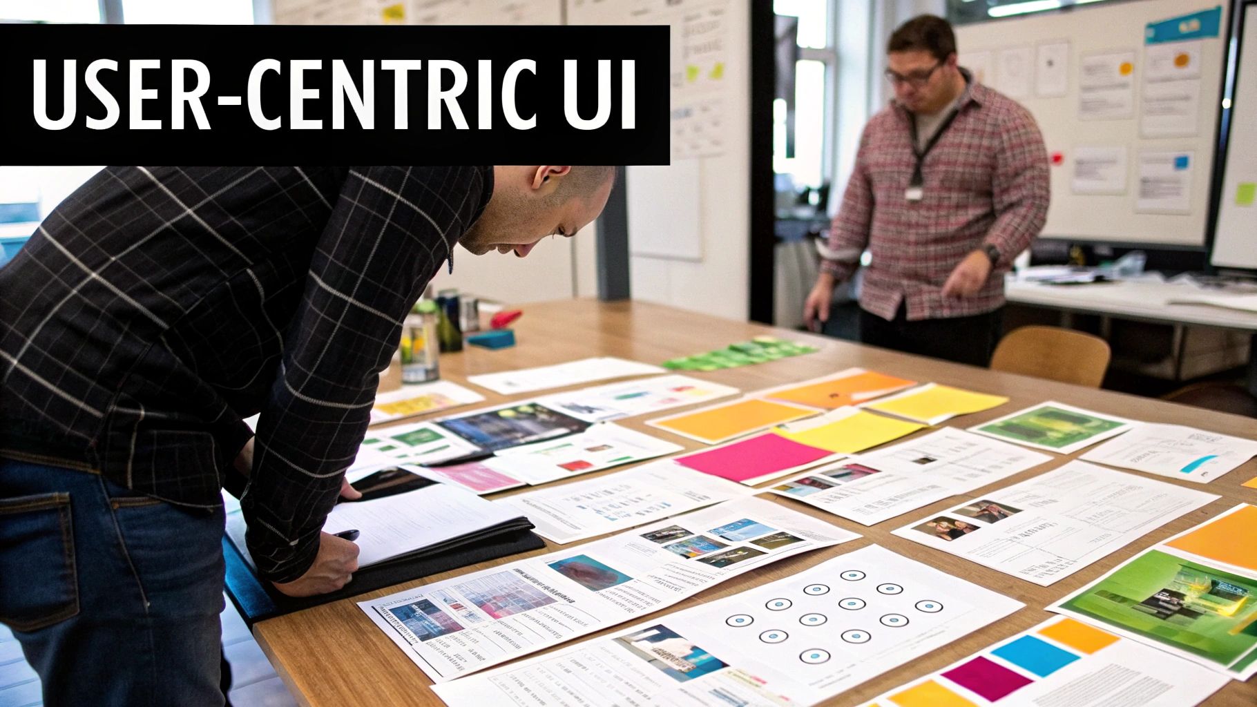
The Rise of User-Centric Design
A major shift occurred when designers started putting users first. The goal was no longer just having a website – it needed to be engaging and easy to navigate. This meant carefully considering how people interact with websites and what makes them stay longer. Clear navigation and intuitive layouts became essential for keeping visitors on the page.
Modern Website Design Best Practices
Today's websites need to excel in three key areas: performance, accessibility, and mobile design. Good design means creating sites that work well for everyone, load quickly, and adapt seamlessly to any screen size.
Key elements of modern website design include:
- Mobile-First Design: Building for phones and tablets first ensures sites work well everywhere
- Universal Access: Making content available to users of all abilities
- Speed and Performance: Quick loading times keep visitors engaged and help with search rankings
At OneNine, we apply these principles to build websites that look great and deliver results for our clients. We focus on creating experiences that work well for real users while helping businesses meet their goals.
Mastering User-Centric Navigation for Maximum Impact
A well-designed navigation system is key to keeping visitors on your website. Just like a library needs clear signs to help people find books, your website needs intuitive navigation to guide users to what they're looking for. When navigation is confusing, visitors quickly leave in frustration. Let's explore how to create navigation that truly works for your users.
Understanding User Mental Models
The first step is getting inside your visitors' heads. User mental models show how people expect websites to work based on their past experiences. For example, most people look for contact information in the footer or on a dedicated contact page. When you align your navigation with these common expectations, visitors can find what they need without thinking twice.
Creating Intuitive Menu Structures
Your menu needs to be simple and logical. Group related pages together under clear categories that make sense to visitors. Use plain language in your menu labels – avoid internal jargon your users won't understand. For example, instead of "Solutions," try "Products and Services." These small changes make a big difference in helping visitors understand your site.
Implementing Clear Hierarchies
For websites with lots of content, showing clear relationships between pages is crucial. Use breadcrumbs to show visitors where they are and how to get back to previous pages – like leaving a trail to follow back home. Visual hierarchy through thoughtful use of font sizes, colors and spacing helps visitors scan the page and find important information quickly.
Research shows that navigation matters more than ever. 94% of people say easy navigation is their most-wanted website feature. This directly impacts whether visitors stay, return, and take action on your site. View full navigation research and statistics. The key is creating navigation that feels natural and helps visitors accomplish their goals without friction.
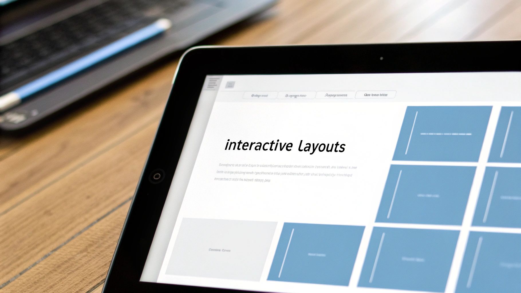
Creating Powerful Visual Experiences That Convert
After nailing your site's navigation, the next essential piece is compelling visuals. Smart choices about images, colors, and layout work together to create an experience that both looks great and drives results. When your website is visually appealing, visitors stay longer and are more likely to take action.
The Power of Visual Hierarchy
Think of visual hierarchy as creating a roadmap for your visitors' attention. By using different font sizes, contrasting colors, and strategic white space, you naturally guide people through your content. For example, visitors will first notice a large headline, then move to smaller subheadings, and finally read the body text. This clear structure helps people quickly understand what matters most on each page.
Color Psychology and Branding
Colors do more than just look pretty – they spark emotions and shape behavior. When you understand color psychology, you can set the right mood and strengthen your brand. Blue often makes people feel trust and stability, while green suggests growth and nature. Using consistent colors across your website builds recognition. Just remember that colors can mean different things in different cultures.
Multimedia Engagement and Its Impact
Adding images and videos makes your content more engaging and easier to digest. But there's a balance – while visuals are important, they shouldn't slow down your site. Using lazy loading and optimizing file sizes keeps your pages running smoothly. The numbers back this up: 94% of first impressions come down to design, and people spend 88% more time on sites with video and audio elements. Learn more about website engagement statistics.
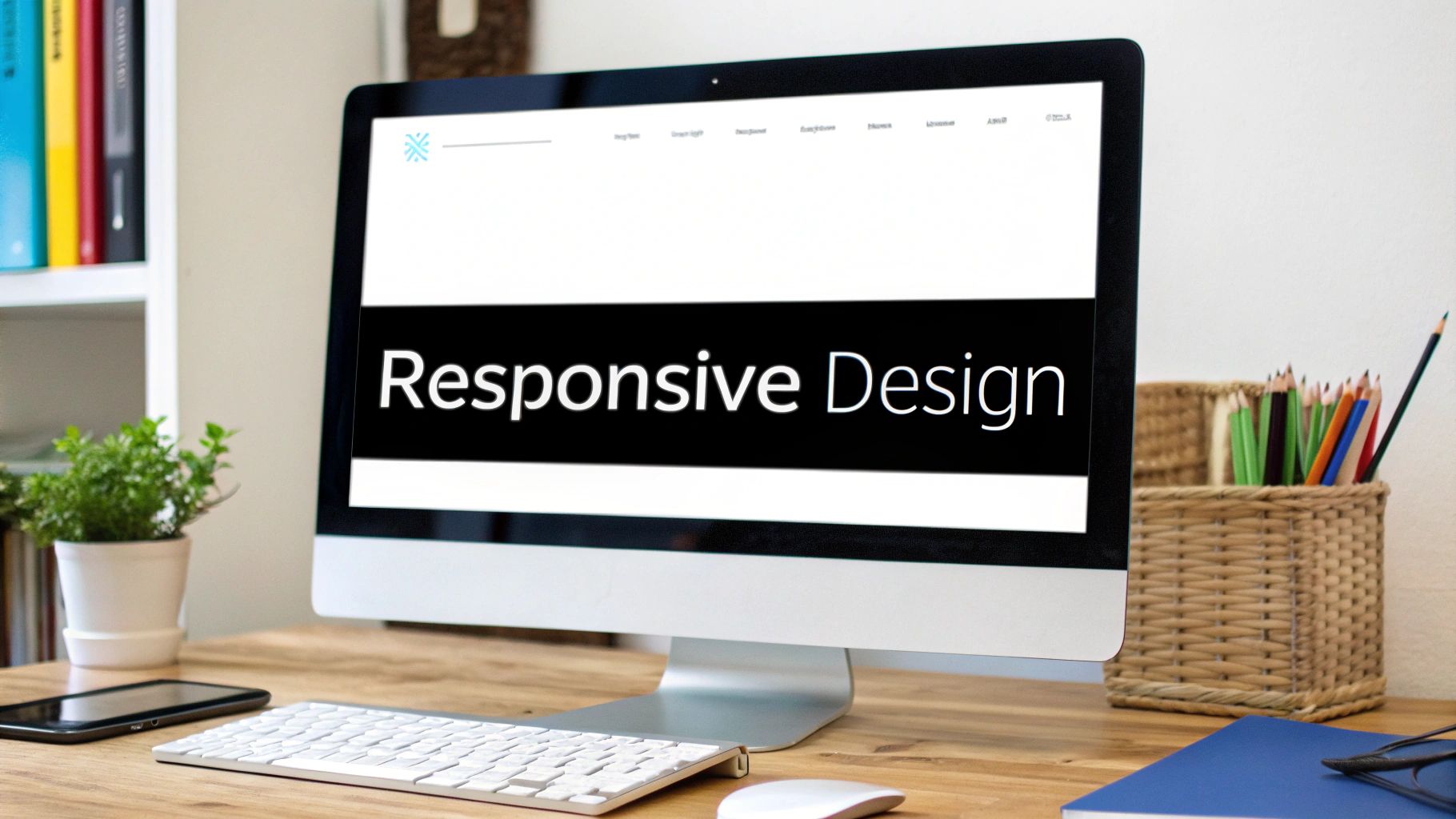
Responsive Design: Adapting to Every Screen
With most people browsing on phones and tablets, responsive design is a must-have. Your website needs to work perfectly across all screen sizes. This means creating flexible layouts that automatically adjust while maintaining a consistent experience whether someone visits on desktop, tablet, or phone. Regular testing across devices ensures everything works as intended.
Layout and Conversion Goals
Your layout should make it easy for visitors to take action, whether that's making a purchase, filling out a form, or signing up for updates. Strategic placement of buttons, clear forms, and appealing product displays guide people toward converting. Testing different layouts and watching how people interact helps optimize your design for better results. At OneNine, we help businesses put these design principles into practice. By focusing on both user experience and strategic visuals, we create websites that attract visitors and turn them into customers.
Optimizing Performance for the Modern Web
A beautiful website means little if users leave before it loads. Website speed directly impacts both user satisfaction and search rankings, making performance optimization essential for any successful web project.
Image Optimization: Balancing Quality and Speed
Images can make or break your site's loading speed. Just as flipping through a photo album becomes frustrating when pages stick together, users quickly abandon sites with slow-loading images. The solution lies in smart compression – reducing file sizes while maintaining visual quality. Tools like TinyPNG can shrink image files by 40-70% without noticeable quality loss. For even better results, newer formats like WebP offer superior compression while preserving image clarity.
Code Efficiency: Streamlining the Backend
Clean code is the foundation of a fast website. Think of it like organizing a closet – removing unnecessary items makes everything work better. Key optimization techniques include:
- Minimizing HTTP requests
- Reducing CSS and JavaScript file sizes through minification
- Using code splitting to load only what's needed
- Removing unused code and duplicate functions
Caching Strategies: Storing Data for Faster Access
Caching works like keeping frequently used items within easy reach. When browsers save website data locally, they can display pages much faster on repeat visits. Three main caching approaches work together:
- Browser caching for local storage
- Server-side caching to reduce database calls
- Content delivery networks (CDNs) to serve files from locations closer to users
Measuring and Improving Core Web Vitals
Google's Core Web Vitals help measure real user experience. These metrics focus on three key aspects:
- Largest Contentful Paint (LCP): How quickly main content loads
- First Input Delay (FID): How fast the page becomes interactive
- Cumulative Layout Shift (CLS): How stable elements remain while loading
Tools like Google PageSpeed Insights analyze these metrics and suggest specific improvements. Regular testing and optimization of these factors leads to better rankings and happier users.
Building Mobile-First Experiences That Drive Results
Having covered performance optimization, let's explore another essential aspect of modern web design – creating great mobile experiences. With most people now accessing the internet through phones and tablets, delivering a smooth mobile experience isn't optional. It needs to be a core focus from day one of the design process.
Responsive Design: Beyond the Basics
While responsive design is essential, it involves more than just adjusting layouts at different screen sizes. We need to carefully consider how content works across devices. For instance, that stunning full-width hero image on desktop might crowd out important content on mobile. The key is thoughtfully adapting elements like images, text flow, and spacing to maintain a great experience regardless of screen size.
Touch-Optimized Interfaces: Designing for Fingers, Not Mice
Mobile users tap and swipe with their fingers rather than clicking with a mouse. This means buttons, links and other interactive elements need enough space for easy tapping. A good rule to follow is making touch targets at least 44 x 44 pixels. You'll also want adequate spacing between clickable items to prevent accidental taps. These small details make a big difference in how natural and frustration-free your mobile interface feels.
Prioritizing Mobile Content: Less Can Be More
While desktop sites can support rich, detailed content, mobile requires a more focused approach. Mobile users often want to quickly find specific information while on the go. Put the most important content first and consider using expandable sections to tuck away secondary details. This helps visitors efficiently access what they need without endless scrolling.
Mobile Navigation: Finding the Right Path
Clear navigation is crucial for helping mobile users find their way around. The hamburger menu is a popular choice for organizing navigation links in a compact format. Make sure menu items are logically grouped and clearly labeled. Including a prominent search bar also helps users quickly locate specific content instead of hunting through menus.
Consistent Performance Across Devices
A great mobile experience requires consistently fast performance across devices. This means optimizing images and code for quick loading over mobile connections. Using responsive images and lazy loading helps minimize page weight and keep things snappy. Regular testing on different devices and network speeds helps catch and fix performance issues early. By focusing on these mobile-first principles, you'll create experiences that work beautifully for today's mobile-first users.
Testing and Optimization: From Good to Outstanding

A well-designed website is just the beginning. Like tending a garden, your website needs consistent care and attention to thrive. Regular testing and optimization help ensure it stays fresh, effective, and in tune with what your users need.
The Power of A/B Testing
A/B testing gives you clear data about what works best on your website. By showing two different versions of a page to separate groups of visitors, you can see which one performs better. For instance, you might test different button colors, headline text, or image layouts to find what your visitors respond to most. This takes the guesswork out of design decisions and lets real user behavior guide improvements.
User Research: Understanding Your Audience
Good design starts with knowing your users. Through user research, you learn exactly how people interact with your website, what they're looking for, and where they get stuck. This includes watching people use your site, conducting surveys, and having one-on-one conversations. The insights you gain help shape design choices that truly serve your visitors' needs.
Gathering Feedback: Listening to Your Users
Your users are your best source of improvement ideas. Simple feedback forms, social media comments, and customer service conversations can reveal what's working and what isn't. For example, if multiple users mention having trouble finding your contact information, that's a clear signal to make it more prominent. This ongoing feedback loop keeps your website aligned with user needs.
Accessibility and Cross-Browser Compatibility Testing
Your website should work well for everyone. Accessibility testing makes sure people with disabilities can use your site effectively, including those who rely on screen readers or keyboard navigation. Cross-browser testing confirms your site works smoothly across different browsers and devices. These checks help create an inclusive experience that serves all visitors.
Ongoing Performance Optimization: Staying Ahead of the Curve
Speed and reliability matter more than ever. Regular checks of your website's loading times, uptime, and Core Web Vitals help catch and fix problems before they impact users. This means keeping up with performance best practices and making adjustments as needed. Quick loading times and smooth operation keep visitors engaged and coming back.
At OneNine, we put continuous improvement at the heart of our work. We help clients build websites that not only look great but also deliver outstanding results through careful testing and optimization. Learn more about how OneNine can help optimize your website.


