

In today's competitive online space, your website serves as the central hub for your brand. It's often the first point of contact for potential customers, making its design and functionality critical to your success. But building a site that not only looks good but also performs exceptionally requires a deliberate approach. The difference between a website that converts and one that falters often comes down to adhering to a core set of proven principles.
This guide provides a definitive blueprint, moving beyond generic advice to offer a deep dive into the most impactful best practices for web design. We will explore ten fundamental areas, from creating a seamless user experience and optimizing for lightning-fast load times to ensuring your site is accessible to all users and perfectly tuned for search engines. Each practice is broken down into actionable steps, giving you a clear roadmap to implementation.
Whether you're launching a new digital presence or overhauling an existing one, mastering these concepts is non-negotiable for achieving your business objectives. You will learn how to build a website that is intuitive, engaging, and technically sound, creating a powerful asset that drives growth, builds trust, and delivers a superior user experience. This isn't just a checklist; it's a strategic framework for digital excellence.
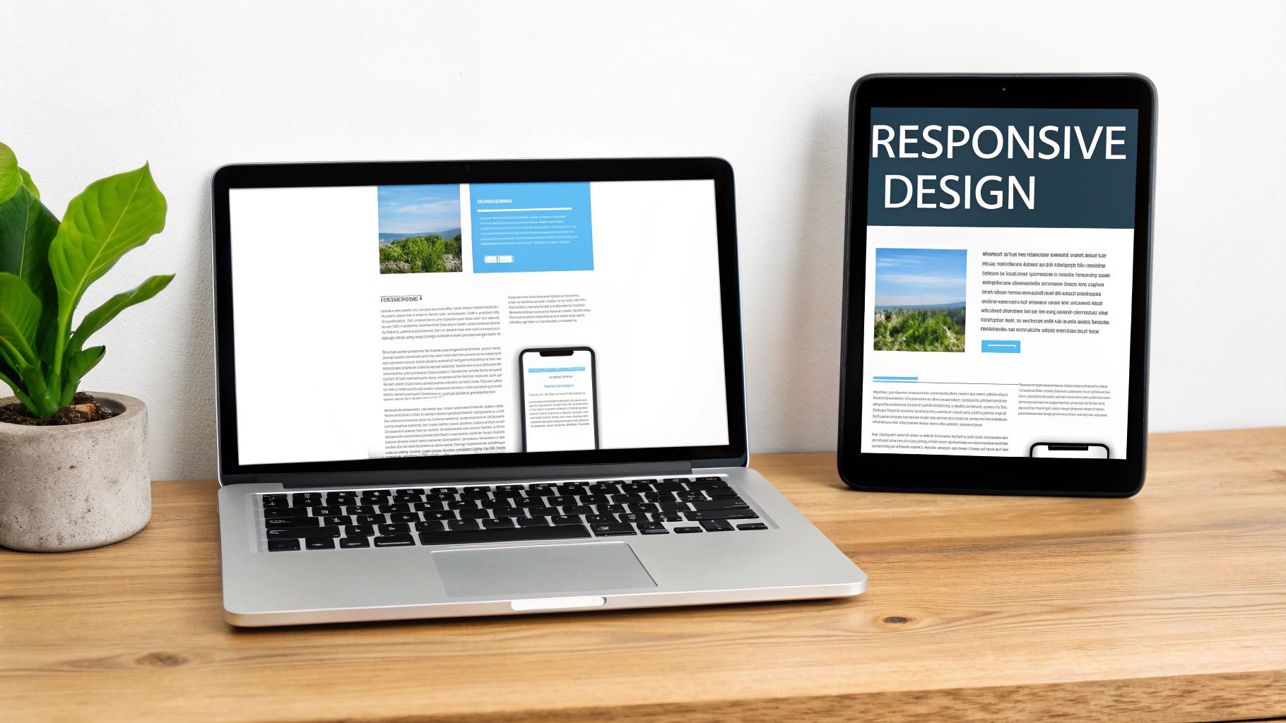
1. Responsive Web Design
Responsive web design is an essential approach that ensures your website provides an optimal viewing and interaction experience across a wide range of devices. Coined by Ethan Marcotte, this methodology uses flexible grids, fluid layouts, and CSS media queries to automatically adapt the content and structure to fit any screen size, from a large desktop monitor to a smartphone. The core principle is simple: create one website that works everywhere, eliminating the need for separate mobile and desktop versions.
Why It's a Best Practice
In today's mobile-centric world, more than half of all web traffic comes from mobile devices. A non-responsive site forces users to constantly pinch, zoom, and scroll, leading to frustration and high bounce rates. Implementing responsive design is one of the foundational best practices for web design because it directly impacts user experience, SEO rankings (Google prioritizes mobile-friendly sites), and conversion rates. A seamless experience, regardless of device, builds trust and keeps visitors engaged.
Actionable Implementation Tips
To effectively implement responsive design, follow these key strategies:
- Adopt a Mobile-First Approach: Start by designing for the smallest screen first, then scale up. This popular methodology, advocated by Luke Wroblewski, prioritizes core content and functionality, leading to a leaner, faster experience on all devices.
- Use Modern CSS for Layouts: Leverage powerful tools like CSS Flexbox and Grid. They provide incredible flexibility for creating complex, fluid layouts that adapt intelligently to different screen sizes without complicated code.
- Optimize Images: Use the
srcsetattribute in your HTML to serve different image sizes based on the user's screen resolution and size. This prevents small devices from downloading unnecessarily large image files, which significantly improves page load times. - Test on Real Devices: While browser developer tools are useful for quick checks, nothing beats testing on actual smartphones and tablets. This helps you identify and fix touch-specific issues and performance bottlenecks that emulators might miss.
For a deeper understanding of ensuring your website adapts seamlessly across all devices, explore these 9 Responsive Design Best Practices. This resource provides a comprehensive look into modern techniques and strategies.
2. User-Centered Design (UCD)
User-Centered Design (UCD) is an iterative design philosophy that places the user at the absolute center of every decision. Popularized by pioneers like Donald Norman and Jakob Nielsen, this methodology focuses on understanding user needs, behaviors, and goals through research and feedback. Instead of building a website based on assumptions or internal preferences, UCD ensures the final product is both highly usable and genuinely valuable to its intended audience.

Why It's a Best Practice
Adopting a user-centered approach is one of the most impactful best practices for web design because it shifts the focus from "what we want to build" to "what users need to accomplish." This leads to products that are intuitive, efficient, and enjoyable to use, like Apple's seamless product interfaces or Amazon's one-click purchasing system. By deeply understanding your users, you can reduce development waste, increase user satisfaction and loyalty, and significantly boost conversion rates.
Actionable Implementation Tips
To effectively integrate User-Centered Design into your workflow, follow these proven strategies:
- Conduct User Research Early and Often: Begin with user interviews, surveys, and competitive analysis to understand user pain points and goals before you write a single line of code.
- Create Detailed User Personas: Develop fictional characters based on real user data. These personas should represent your key audience segments and guide your design decisions throughout the project.
- Use A/B Testing to Validate Decisions: Don't guess which design is better; test it. Use A/B testing to compare different layouts, calls-to-action, or content variations and let real user behavior determine the winner.
- Implement User Feedback Loops: After launch, provide easy ways for users to give feedback, such as surveys or contact forms. Use this input to make continuous, data-driven improvements to the user experience. For web design projects adopting agile methodologies, learning how to write good user stories can further enhance your user-centered approach.
For a more comprehensive look at how this methodology shapes digital products, you can explore what user experience design entails on onenine.com.
3. Fast Loading Times and Performance Optimization
Fast loading times and performance optimization are the practice of ensuring your website's pages load quickly and efficiently. Popularized by web performance experts like Steve Souders, this discipline involves minimizing file sizes, optimizing images, reducing server response times, and using technical strategies to deliver content to users as rapidly as possible. The goal is to create an almost instantaneous experience, ideally keeping load times under three seconds.

Why It's a Best Practice
In an era of short attention spans, website speed is a critical factor for user retention and conversion. Slow-loading pages lead to high bounce rates, as users will abandon a site that doesn't load almost immediately. Performance is one of the most crucial best practices for web design because it directly impacts user experience, SEO (Google's Core Web Vitals heavily favor fast sites), and revenue. For example, Amazon found that every 100ms delay costs them 1% in sales, while Pinterest reduced load times by 40% and saw sign-ups increase by 15%.
Actionable Implementation Tips
To significantly improve your website's performance, focus on these key strategies:
- Audit and Measure Performance: Use free tools like Google PageSpeed Insights and GTmetrix to analyze your site's current speed. These reports provide a baseline and offer specific recommendations for improvement.
- Optimize Your Images: Compress images and serve them in modern formats like WebP. Implementing responsive images with the
srcsetattribute ensures that users on small devices don't download unnecessarily large files. - Leverage Browser Caching and Compression: Enable gzip compression on your server to reduce the size of files sent to the browser. Configure browser caching so that repeat visitors don't have to re-download static assets like logos, CSS, and JavaScript.
- Use a Content Delivery Network (CDN): A CDN stores copies of your static assets on servers around the world. This ensures that content is delivered to users from a location geographically closer to them, dramatically reducing latency and speeding up load times.
For a more detailed guide on speeding up your website, you can learn more about how to improve website loading speed on onenine.com. This resource offers additional techniques to help you achieve optimal performance.
4. Intuitive Navigation Design
Intuitive navigation design is the art of creating a logical, predictable, and easy-to-use pathway for users to find information on your website. Championed by user experience pioneers like Steve Krug, this approach focuses on clarity and simplicity, ensuring visitors can move through your site effortlessly without having to think about where to go next. An effective navigation system uses familiar patterns and a clear hierarchy to guide users to their destination quickly and efficiently.

Why It's a Best Practice
Poor navigation is a primary source of user frustration and a direct cause of high bounce rates. If visitors can't find what they are looking for, they will leave. Implementing intuitive navigation is one of the most critical best practices for web design because it forms the backbone of the user experience. It reduces friction, builds user confidence, and directly influences how long visitors stay on your site. Clear navigation also helps search engines crawl and understand your site's structure, which can positively impact SEO.
Actionable Implementation Tips
To design a navigation system that is both user-friendly and effective, follow these key strategies:
- Use Familiar Patterns: Stick to conventional navigation layouts that users already understand, such as a horizontal bar at the top for desktops or a hamburger menu for mobile. Amazon’s mega menu, for instance, effectively organizes a vast number of product categories in a predictable way.
- Keep It Simple and Consistent: Limit the number of main menu items to avoid overwhelming users. Ensure your navigation bar appears in the same location on every page to provide a consistent and reliable experience.
- Provide Visual Feedback: Clearly indicate which page the user is currently on by using visual cues like a different color, bold text, or an underline. This helps users orient themselves within your site's structure.
- Ensure Mobile Navigation is Thumb-Friendly: On mobile devices, design navigation with tappable areas that are large enough and spaced adequately to prevent accidental clicks. Place key navigation elements within easy reach of a user's thumb.
5. Consistent Visual Design and Branding
Consistent visual design is the practice of maintaining uniformity in design elements, patterns, and brand identity across every page of your website. This principle, championed by design legends like Massimo Vignelli and Paul Rand, ensures that elements such as colors, typography, imagery, and spacing are applied cohesively. The result is a seamless and predictable user interface that strengthens brand recognition and reduces cognitive load, making it easier for users to navigate and understand your content.
Why It's a Best Practice
A lack of consistency can make a website feel disjointed, unprofessional, and confusing, which quickly erodes user trust. When visitors encounter a familiar layout and predictable interactions, they can focus on the content rather than trying to learn how your site works. Implementing this is one of the most critical best practices for web design because it directly builds brand equity, improves usability, and creates a polished, reliable user experience. Apple's website, for instance, uses a consistent minimalist aesthetic and typography that is instantly recognizable and reinforces its premium brand identity.
Actionable Implementation Tips
To achieve and maintain visual consistency, consider these strategies:
- Develop a Comprehensive Style Guide: Create a central document that outlines all visual rules, including your color palette, typography scales, spacing guidelines, icon styles, and component designs. This guide serves as the single source of truth for your entire team.
- Establish Clear Brand Guidelines: Before design begins, it is essential to define your brand’s core identity. To ensure a cohesive and memorable online presence, learning how to create strong brand guidelines is an indispensable step.
- Use a Design System or Component Library: Build a collection of reusable UI components (buttons, forms, navigation bars) that can be deployed across the site. Methodologies like Brad Frost's Atomic Design provide a structured approach to building these systems.
- Conduct Regular Audits: Periodically review your website to identify and correct any inconsistencies that have emerged over time. This ensures the design remains unified as the site evolves.
For more insights into how a cohesive visual strategy can elevate your presence, you can learn more about improving brand awareness.
6. Accessibility and Inclusive Design
Accessibility and inclusive design are practices centered on creating websites that are usable by everyone, regardless of their abilities or disabilities. This approach ensures that all users have equal access to information and functionality. It involves adhering to established standards like the Web Content Accessibility Guidelines (WCAG), using proper semantic markup, and considering the diverse needs of users from the very beginning of the design process.
Why It's a Best Practice
An inaccessible website excludes a significant portion of the population, including individuals with visual, auditory, motor, or cognitive impairments. Implementing accessibility is one of the most critical best practices for web design because it demonstrates social responsibility, expands your audience, and improves the overall user experience for all visitors. Furthermore, it enhances SEO, as many accessibility practices, like semantic HTML and alt text, overlap with search engine optimization techniques. It also mitigates the legal risks associated with non-compliance.
Actionable Implementation Tips
To build a more accessible and inclusive website, integrate these strategies:
- Use Semantic HTML: Structure your content with proper HTML elements like
<nav>,<main>,<article>, and<button>instead of relying solely on generic<div>and<span>tags. This provides essential context for screen readers and other assistive technologies. - Ensure Keyboard Navigability: All interactive elements, including links, buttons, and form fields, must be fully operable using only a keyboard. Users should be able to navigate through the site using the Tab key in a logical order.
- Check Color Contrast: Maintain a minimum color contrast ratio of 4.5:1 for normal text and 3:1 for large text, as recommended by WCAG. This ensures readability for users with low vision or color blindness.
- Provide Text Alternatives: Add descriptive alt text to all meaningful images and provide captions or transcripts for video and audio content. This allows users who cannot perceive visual or auditory information to understand the content.
- Test with Accessibility Tools: Regularly audit your site using tools like WAVE, axe DevTools, or by testing with actual screen readers. This helps you catch and fix accessibility barriers that might otherwise go unnoticed.
7. Mobile-First Design Approach
A mobile-first design approach is a strategy that flips the traditional design process on its head. Instead of designing for a large desktop screen and then trying to shrink it down, you start with the smallest screen first and progressively enhance the design for larger devices. Popularized by tech leader Luke Wroblewski, this methodology forces you to prioritize essential content and functionality, resulting in a cleaner, more focused, and performance-optimized experience for all users.
Why It's a Best Practice
With mobile devices now accounting for the majority of global web traffic, designing for them as an afterthought is no longer viable. A mobile-first strategy is one of the most critical best practices for web design because it directly addresses the constraints and opportunities of the mobile context, such as smaller screens, touch-based interactions, and varying network speeds. This approach naturally leads to faster load times and a more intuitive user interface, which improves user satisfaction, reduces bounce rates, and positively impacts SEO, as search engines favor sites optimized for mobile users.
Actionable Implementation Tips
To effectively implement a mobile-first design, shift your mindset and follow these key strategies:
- Prioritize Content Ruthlessly: Start by identifying the absolute core content and calls-to-action a user needs on a small screen. Use techniques like progressive disclosure to hide secondary information until it’s needed, keeping the interface uncluttered.
- Design for Touch: Ensure all interactive elements like buttons and links are designed as large touch targets. The recommended minimum size is 44×44 pixels to prevent user frustration from accidental taps.
- Use
min-widthMedia Queries: Build your CSS by starting with base styles for mobile and then usingmin-widthmedia queries to add complexity and adjust layouts as the screen size increases. This is more efficient than overriding desktop styles for mobile. - Test on Real Mobile Devices: While browser emulators are helpful, nothing replaces testing on actual smartphones and tablets. This allows you to accurately gauge performance, check touch target accuracy, and ensure the experience feels natural on a physical device.
For a detailed guide on this powerful methodology, review Luke Wroblewski's original book and posts on the topic, which laid the foundation for modern web development.
8. Clear Call-to-Action (CTA) Design
A clear Call-to-Action (CTA) is the strategic design and placement of elements, like buttons and links, that guide users toward a specific, desired action. It serves as a signpost telling your visitors what to do next, whether it's making a purchase, signing up for a newsletter, or downloading a resource. Effective CTAs combine compelling copy, contrasting colors, and strategic placement to capture attention and drive conversions.
Why It's a Best Practice
Your website exists to achieve a business goal, and CTAs are the primary mechanism for achieving it. Without a clear, compelling CTA, visitors are left to wander aimlessly, resulting in missed opportunities and high bounce rates. Implementing strong CTA design is one of the most crucial best practices for web design because it directly bridges the gap between user interest and business conversion. A well-designed CTA, like Dropbox’s simple "Sign up for free" or Netflix's high-contrast "Join Free for a Month," transforms passive visitors into active customers.
Actionable Implementation Tips
To design CTAs that effectively convert, apply these key strategies:
- Use Strong, Action-Oriented Verbs: Start your CTA copy with powerful verbs that communicate a clear benefit. Instead of "Submit," use words like "Get Your Free Quote," "Start Your Trial," or "Download Now" to create a sense of immediate value.
- Create Visual Contrast: Your CTA button must stand out from the rest of the page. Use a bold, contrasting color that draws the eye and surround it with ample white space to prevent it from getting lost in the design.
- Strategic Placement: Ensure your most important CTAs are visible "above the fold" on all devices, meaning users don't have to scroll to see them. Placing them logically at the end of a section that explains value is also highly effective.
- A/B Test Everything: Don't assume you know what works best. Continuously test different versions of your CTA copy, colors, sizes, and placements using platforms like Unbounce or Optimizely to find the combination that yields the highest conversion rate.
For a deeper look into crafting CTAs that drive results, check out this guide on 16 Best Call-to-Action Examples to see how top brands do it.
9. Clean and Minimalist Layout
A clean and minimalist layout is a design philosophy that champions simplicity by removing unnecessary elements. Inspired by principles from industrial designers like Dieter Rams, this approach emphasizes white space, clear typography, and a focused color palette to create an elegant and uncluttered user interface. The goal is to prioritize content and functionality, making it easier for users to find information and complete their desired actions without distraction.
Why It's a Best Practice
In an age of information overload, a minimalist design cuts through the noise. By reducing visual clutter, you lower the cognitive load on your users, allowing them to focus on what truly matters: your message, your product, or your call to action. This is one of the most effective best practices for web design because it improves usability, enhances readability, and often leads to faster page load times. Websites like Apple and Stripe use minimalism to communicate sophistication, professionalism, and trustworthiness.
Actionable Implementation Tips
To effectively implement a clean and minimalist layout, focus on deliberate choices:
- Use White Space Strategically: Don't view white space (or negative space) as empty; see it as an active element. Use it to group related content, create a visual hierarchy, and guide the user's eye through the page.
- Limit Your Color Palette: Stick to a simple color scheme, often just two or three primary colors plus neutrals. This creates a cohesive and professional look while preventing colors from competing for attention.
- Choose Simple, Readable Fonts: Select a clean and highly legible typeface for your body text. While decorative fonts can be used sparingly for headlines, readability should always be the priority for the main content.
- Remove Non-Essential Elements: Critically evaluate every element on the page. If it doesn't serve a clear purpose or support a user goal, remove it. This includes unnecessary social media icons, decorative graphics, and excessive text.
10. Search Engine Optimization (SEO) Integration
Search Engine Optimization (SEO) integration is the practice of embedding SEO principles directly into the fabric of your web design and development process. It's not an afterthought but a foundational strategy that ensures your site is built to be understood and favored by search engines like Google. This approach considers technical elements like site structure and speed, alongside user experience and content hierarchy, to maximize organic visibility from day one.
Why It's a Best Practice
A beautifully designed website is ineffective if no one can find it. Integrating SEO from the start is one of the most critical best practices for web design because it directly impacts your site's ability to attract qualified traffic. Search engines are the primary source of website traffic for most businesses, and a well-optimized site ranks higher, leading to more visibility, leads, and sales. It ensures that your design choices also support your marketing goals, creating a powerful, cohesive digital presence.
Actionable Implementation Tips
To effectively integrate SEO into your web design, focus on these core strategies:
- Implement a Logical Heading Structure: Use a single
H1tag for the main page title, followed byH2andH3tags to organize content logically. This creates a clear hierarchy that helps both users and search engines understand the importance and relationship of your content. - Optimize Images: Use descriptive, keyword-relevant file names (e.g.,
modern-blue-sofa.jpg) and always include concise alt text. This not only helps search engines index your images but also improves accessibility for visually impaired users. - Prioritize Page Speed: A fast-loading website is crucial for both user experience and SEO. Optimize images, leverage browser caching, and minify CSS and JavaScript to improve your Core Web Vitals scores, which are a key ranking factor.
- Create an XML Sitemap: Generate an XML sitemap, which is a file that lists all your important pages, and submit it to Google Search Console. This helps search engines discover and crawl your content more efficiently.
For a deeper dive into making your website more visible to search engines, review this guide on Technical SEO Best Practices. Moz provides expert insights that are invaluable for any business owner or marketer.
Top 10 Web Design Practices Comparison
| Aspect | Responsive Web Design | User-Centered Design (UCD) | Fast Loading & Performance Optimization | Intuitive Navigation Design | Consistent Visual Design & Branding | Accessibility & Inclusive Design | Mobile-First Design Approach | Clear Call-to-Action (CTA) Design | Clean and Minimalist Layout | SEO Integration |
|---|---|---|---|---|---|---|---|---|---|---|
| Implementation Complexity 🔄 | Moderate to high; requires CSS grids, media queries | High; extensive user research and iterative testing | High; technical optimization and monitoring needed | Moderate; designing logical hierarchies and menus | Moderate; establishing and maintaining style guides | High; semantic markup and accessibility compliance | Moderate; starts from mobile constraints | Moderate; needs strategic copy and placement | Moderate; simplifying without losing content | High; ongoing SEO best practices implementation |
| Resource Requirements ⚡ | Medium; skilled frontend devs and testing devices | High; time and budget for research and testing | Medium to high; tools, CDN setup, and audits | Medium; usability testing and design expertise | Medium; design system tools and documentation | Medium to high; specialized testing tools | Medium; focus on mobile devices and network constraints | Medium; copywriters, designers, and A/B testing | Low to medium; focus on design and content pruning | Medium; SEO experts and technical implementation |
| Expected Outcomes 📊 | ⭐⭐⭐ Improved UX across devices; better SEO ranking | ⭐⭐⭐ Higher user satisfaction, engagement, and fewer issues | ⭐⭐⭐ Faster load times, higher conversions, lower costs | ⭐⭐⭐ Easier site navigation, longer user sessions | ⭐⭐⭐ Strong brand identity, consistent UX | ⭐⭐⭐ Broadened user reach, legal compliance | ⭐⭐⭐ Better mobile experience and SEO benefits | ⭐⭐⭐ Increased conversions and user guidance | ⭐⭐⭐ Cleaner UX, faster loads, timeless appeal | ⭐⭐⭐ Increased organic traffic and search rankings |
| Ideal Use Cases 💡 | Websites needing device adaptability | Projects prioritizing usability and user research | Sites where speed and performance are critical | Large or complex sites needing clear navigation | Brands requiring strong visual identity | All sites targeting inclusive audiences | Projects prioritizing mobile users | Marketing and e-commerce sites focused on conversion | Content-focused sites or brands emphasizing clarity | Any site aiming for higher search visibility |
| Key Advantages ⭐ | Single codebase for all devices; SEO friendly | Reduced costs via early issue detection; better UX | Lower bounce rates; faster interactions; reduced costs | Reduced frustration; better SEO; user retention | Professional look; easier maintenance; trust | Legal compliance; improved usability; social value | Focus on essential content; future-proof design | Clear user direction; measurable impact | Enhanced focus; faster performance; professional | Sustainable traffic growth; trust and credibility |
| Tips 💡 | Mobile-first approach; test on real devices | Early & frequent research; accessibility from start | Use tools like PageSpeed Insights; optimize images | Use familiar patterns; test with real users | Develop and audit style guides; train team | Use semantic HTML; test with screen readers | Start at 320px; use progressive enhancement | Use action verbs; A/B test colors and placement | Use whitespace; limit colors; remove non-essentials | Use keyword-rich titles; implement proper headers |
Bringing It All Together for Digital Success
Navigating the landscape of modern web design can feel like piecing together a complex puzzle. We've explored ten distinct yet interconnected pieces, from the foundational necessity of Responsive and Mobile-First Design to the crucial nuances of Accessibility and User-Centered Design. Each element is more than just a box to check; it’s a vital component of a holistic strategy aimed at creating a powerful, effective digital presence.
The journey doesn't end after launching your site. The most successful websites are not static brochures but dynamic, evolving platforms. Mastering the best practices for web design is an ongoing commitment to understanding and serving your audience. It's about recognizing that fast loading times are not just a technical metric but a sign of respect for your visitor's time. It's about seeing intuitive navigation not as a mere sitemap but as a guided journey that leads users effortlessly to what they need.
From Principles to Performance
The true value of these principles is realized when they work in harmony.
- A Clean and Minimalist Layout directly supports Fast Loading Times, as fewer elements mean less data to load.
- SEO Integration is amplified by strong Accessibility, as search engines favor websites that are well-structured and usable for everyone.
- A Consistent Visual Design strengthens your brand identity and works hand-in-hand with Clear Call-to-Action (CTA) Design to build trust and guide user behavior.
Think of your website as your digital storefront, your primary sales tool, and your most dedicated brand ambassador, all rolled into one. A visitor who arrives to find a slow, confusing, or broken experience is like a potential customer walking into a cluttered, disorganized shop. They will likely turn around and leave, taking their business to a competitor whose digital space is welcoming and efficient.
Your Actionable Roadmap Forward
So, where do you go from here? The first step is to conduct a frank and thorough audit of your current website using the principles we've discussed as your guide.
- Analyze Your Performance: Use tools like Google PageSpeed Insights to test your loading times. Are you meeting the sub-two-second standard?
- Test Your Responsiveness: Don't just resize your browser window. Test your site on actual mobile devices (both iOS and Android) to see how it truly performs.
- Evaluate User Flow: Ask a colleague or even a friend who is unfamiliar with your site to complete a key task, like finding a specific product or filling out a contact form. Watch where they struggle; these are your friction points.
- Check for Accessibility: Use an automated tool like WAVE or Lighthouse to get a baseline report on accessibility issues. This is a starting point for creating a more inclusive experience.
Implementing these best practices for web design is not just about avoiding mistakes; it's a strategic investment in your business's future. It’s about building a digital asset that generates leads, nurtures customer relationships, and drives tangible growth. By prioritizing the user experience, you create a virtuous cycle: a great experience leads to higher engagement, which improves your SEO, which brings in more visitors, giving you more opportunities to delight your audience. It is the definitive path to turning your website from a simple online presence into a powerful engine for success.
Implementing these principles can be a complex endeavor, but you don't have to do it alone. The team at OneNine specializes in designing, developing, and managing high-performance websites built on these core best practices. If you're ready to transform your website into a powerful asset that drives results, get in touch with OneNine to see how we can help bring your vision to life.


