

Your website is your most powerful digital asset, acting as your 24/7 salesperson, brand ambassador, and lead generation engine. In today's competitive landscape, simply having a website isn't enough; it must be fast, intuitive, secure, and built to convert visitors into customers. Failing to adhere to modern design principles doesn't just create a poor user experience, it actively costs you business, sending potential customers directly to competitors who get it right.
This guide cuts through the noise to deliver a prioritized, actionable roundup of the most critical best practices for web design. It’s specifically tailored for small to medium-sized businesses (SMBs), marketers, and entrepreneurs who need to see a direct return on their digital investment. We will move beyond generic advice and dive into the practical implementation details that make a tangible difference in your site's performance and bottom line.
You will learn how to implement foundational concepts that separate an average website from a great one. We will cover ten essential pillars, including mobile-first responsive design, page speed optimization, intuitive navigation, and strong visual hierarchy. We'll also explore SEO-friendly architecture and accessibility compliance, ensuring your site reaches the widest possible audience. To fully leverage your digital presence, understanding the array of essential marketing tools available can help integrate your website seamlessly into a broader strategy. Whether you're building on WordPress, Shopify, or Webflow, these core principles will equip you to create a high-performing website that drives sustainable growth. Let's begin.
1. Mobile-First Responsive Design
Mobile-first responsive design is no longer a trend; it's a foundational standard in modern web development. This approach flips the traditional design process on its head. Instead of designing for a large desktop screen and then trying to shrink everything down for smaller devices, you start with the most constrained view: the mobile phone. By designing for mobile first, you force yourself to prioritize the most essential content and functionality, creating a focused and user-friendly experience.

The "why" is simple: over 60% of all internet traffic now comes from mobile devices. If your site isn't optimized for this majority, you're actively turning away customers. Furthermore, Google’s mobile-first indexing means the mobile version of your site is the primary one it uses for ranking and indexing. A poor mobile experience directly hurts your SEO, making this one of the most critical best practices in web design.
How to Implement a Mobile-First Strategy
Implementing this strategy involves both a shift in mindset and specific technical practices. Start by identifying the core user journeys and key information your mobile visitors need. This isn't about removing features, but rather about presenting them in a more streamlined way. For a deeper dive into the methodology, you can explore more about the mobile-first approach.
Actionable Tips:
- Prioritize Content: On a small screen, you must decide what is most important. Start your design by arranging only the essential elements, such as a primary call-to-action (CTA), key product information, or contact details.
- Use Flexible Grids: Build your layout on a fluid grid system (using percentages instead of fixed pixels) that allows elements to resize and reflow gracefully as the screen size changes.
- Optimize for Touch: Design for fingers, not cursors. This means larger buttons, adequate spacing between tappable elements to prevent accidental clicks, and avoiding hover-based interactions.
- Test on Real Devices: Browser emulators are helpful, but nothing beats testing on actual iPhones and Android devices. This helps you catch performance issues and interaction quirks you might otherwise miss.
- Leverage CSS Media Queries: These are the technical backbone of responsive design, allowing you to apply different CSS styles based on the device's screen size, orientation, and resolution.
2. Page Speed and Performance Optimization
In web design, speed isn't just a feature; it's a fundamental requirement. Page speed and performance optimization is the practice of making your website load as quickly as possible. This directly impacts user experience, SEO rankings, and conversion rates, as studies show that 40% of users will abandon a website that takes more than three seconds to load. For a small business, a fast website can be a significant competitive advantage.

The "why" is backed by powerful data. Amazon famously reported a 1% revenue increase for every 100ms of speed improvement, while Walmart saw conversions improve by 2% for every one-second improvement. Google also uses page speed, specifically its Core Web Vitals, as a ranking factor. A slow site not only frustrates visitors but also tells search engines that your user experience is poor, hurting your visibility. This makes performance a critical component of the best practices in web design.
How to Implement Performance Optimization
Implementing a performance-first mindset involves a series of technical checks and ongoing maintenance. The goal is to reduce the amount of data the browser has to download and process to render your page. This includes optimizing images, code, and the way your server delivers content. To get started, you can get a comprehensive overview of website performance optimization.
Actionable Tips:
- Benchmark Your Speed: Use free tools like Google PageSpeed Insights and GTmetrix to analyze your site's current performance and get specific recommendations.
- Compress Images: Large image files are a primary cause of slow load times. Use tools like TinyPNG or plugins like WP Rocket to compress images without a noticeable loss in quality.
- Leverage Browser Caching: Instruct browsers to store static files (like your logo, CSS, and JavaScript) locally so they don't have to be re-downloaded on every subsequent visit.
- Minimize Code: Reduce the size of your HTML, CSS, and JavaScript files by removing unnecessary characters, spaces, and comments, a process known as minification.
- Use a Content Delivery Network (CDN): A CDN stores copies of your site's assets on servers around the world, delivering them to users from the geographically closest location for faster access.
- Monitor Core Web Vitals: Pay close attention to Google's key performance metrics: Largest Contentful Paint (LCP), First Input Delay (FID), and Cumulative Layout Shift (CLS).
3. Clear and Intuitive Navigation
Navigation is the roadmap to your website. If users can't find what they're looking for quickly and easily, they won't stick around. Clear and intuitive navigation is a cornerstone of a positive user experience, guiding visitors to their desired destinations, reducing bounce rates, and ultimately supporting business goals. Think of it as the digital equivalent of clear signage in a physical store; without it, customers get lost and leave.
The "why" is rooted in user psychology. As UX pioneer Steve Krug stated, "Don't make me think." Users expect to find information where they anticipate it to be. A confusing or cluttered navigation menu forces them to expend mental energy just figuring out how to get around, creating friction and frustration. For businesses, this translates directly to lost opportunities, as poor navigation is a leading cause for site abandonment. This is why it's a critical element in any conversation about best practices in web design.
How to Implement Clear Navigation
Building an intuitive navigation system starts with understanding your user's goals and structuring your site's content logically. Your main menu should act as a high-level summary of what your site offers. For complex sites, like Shopify stores with numerous product categories or content-heavy WordPress blogs, a well-organized structure is not just helpful; it's essential for conversion.
Actionable Tips:
- Limit Menu Items: Stick to a maximum of 5-7 top-level navigation items. This avoids overwhelming users with too many choices, a concept known as the paradox of choice.
- Use Descriptive Labels: Avoid jargon or vague terms. Use clear, predictable labels that accurately describe the linked page's content. For example, use "Services" instead of "What We Do."
- Implement a Search Bar: For websites with a large amount of content (over 100 pages), a prominent and effective search bar is a necessity.
- Design for Mobile: Ensure your mobile navigation (often a "hamburger" menu) is easy to find, tap, and close. The menu should be just as functional as its desktop counterpart.
- Provide User Orientation: Highlight the user's current page in the navigation menu. This simple visual cue helps them understand where they are within your site's structure.
- Maintain Consistency: Your navigation menu should appear in the same location with the same options on every page of your site (with logical exceptions like a checkout process).
4. Strong Visual Hierarchy and Content Structure
Visual hierarchy is the principle of arranging elements to show their order of importance. A strong hierarchy guides the user's attention through the page in a deliberate way, making it easy to understand information and find what they are looking for. By strategically using size, color, contrast, and spacing, you tell users what to look at first, second, and third, which is a cornerstone of effective web design.
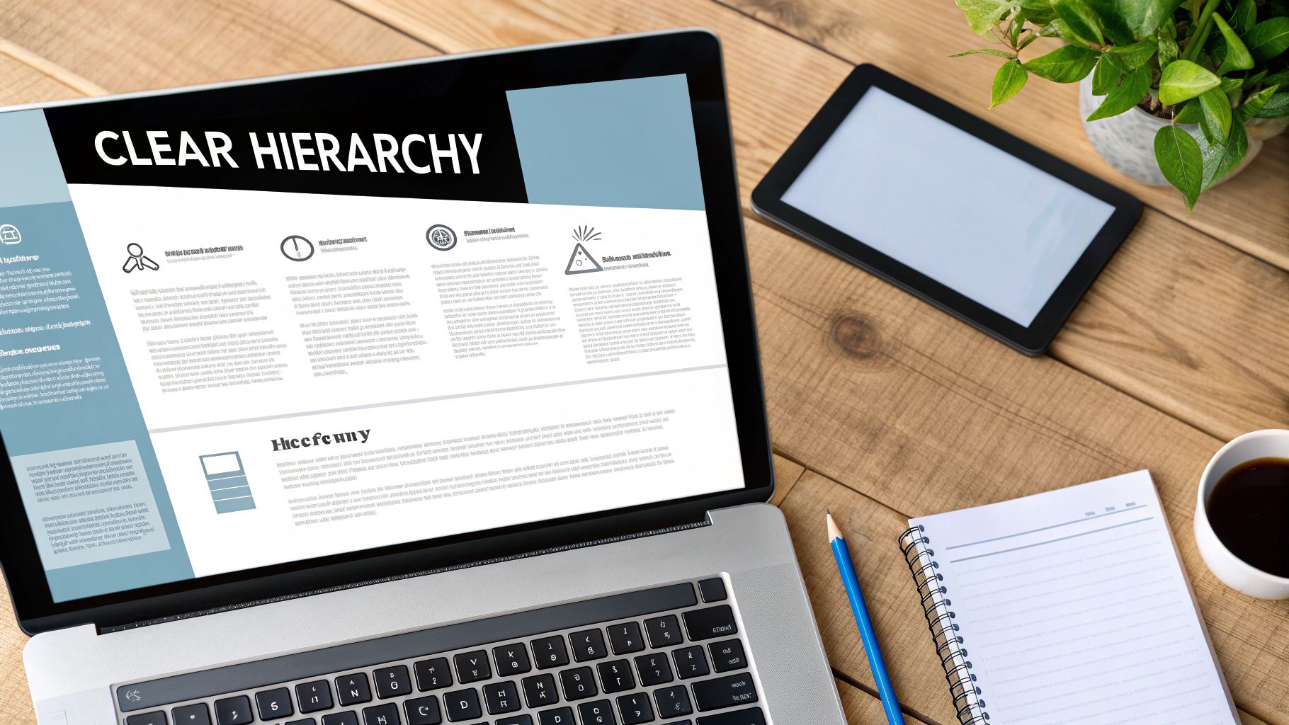
The "why" is rooted in human psychology: our brains are wired to find patterns and prioritize visual information. A website with a clear hierarchy feels intuitive and professional, immediately communicating your value proposition and building trust. For an SMB, this means a visitor can instantly grasp what you offer and what action to take next, significantly boosting usability and conversion rates. Without it, users are met with a wall of disorganized content, leading to confusion and high bounce rates.
How to Implement a Strong Visual Hierarchy
Implementing a strong hierarchy involves more than just making your headline bigger. It requires a thoughtful approach to every element on the page. To effectively guide your users' eyes and ensure readability, mastering the principles of layout design is essential. Companies like Stripe and Notion are excellent examples, using clean typography and generous whitespace to direct focus to key features and calls-to-action.
Actionable Tips:
- Establish a Heading Structure: Use a single
<h1>for your main page title. Follow a logical sequence with<h2>,<h3>, etc., to organize sub-sections. Never skip heading levels. - Leverage Size and Scale: The most important elements, like your primary headline or CTA, should be the largest. Less critical information should be scaled down accordingly.
- Use Color and Contrast: Create a clear focal point by using a bright, contrasting color for your main CTA buttons. Ensure text meets a minimum 3:1 contrast ratio against its background for readability.
- Embrace Whitespace: Use generous padding and margins to separate distinct content sections. This "breathing room" prevents cognitive overload and helps users process information.
- Limit Typeface Variety: Stick to two or three complementary font families. Using too many fonts creates visual chaos and undermines your hierarchy.
5. Fast and Accessible Forms
Forms are the digital handshakes of your website; they are where a visitor becomes a lead or a customer. Yet, poorly designed forms are a major source of user frustration and a primary reason for abandoned carts and lost leads. Creating fast and accessible forms means designing them to be as simple, intuitive, and effortless as possible for every user to complete. This is a critical practice for any business that relies on lead generation, e-commerce checkouts, or user signups.
The "why" is tied directly to your bottom line. Every unnecessary field you add increases friction and cognitive load, which in turn decreases your conversion rate. The Baymard Institute found that a complicated checkout process is a direct cause for 17% of cart abandonments. For SMBs using tools like Shopify for checkout or Gravity Forms in WordPress for lead capture, optimizing these forms is one of the highest-impact changes you can make. This is a foundational element of effective, conversion-focused web design.
How to Implement Better Form Design
Implementation focuses on two core principles: simplicity and clarity. Start by auditing your existing forms. Question every single field: is this information absolutely necessary right now? Often, you can collect additional data later in the customer journey. Progressive disclosure, a technique popularized by platforms like Slack during signup, only asks for essential information upfront and requests more as needed.
Actionable Tips:
- Minimize Fields: The golden rule of form design is to only ask for what you truly need. Conduct A/B tests to find the sweet spot between gathering necessary data and maximizing completions.
- Use a Single-Column Layout: On both desktop and mobile, single-column forms are easier for users to scan and complete. They create a clear, linear path to submission.
- Implement Inline Validation: Provide real-time feedback as a user fills out a field. A green checkmark for a valid email or a red error message for an incorrect format prevents frustration when they hit "submit."
- Provide Clear Error Messages: Don't just say "Invalid Input." Explain why it's invalid and how to fix it. For example, "Password must be at least 8 characters long."
- Leverage Autofill and Correct Input Types: Use HTML attributes like
type="email"ortype="tel"to bring up the correct mobile keyboard. Enable browser autofill for common fields like names and addresses to speed up the process. - Ensure Accessibility: Use proper
<label>tags for every input field so screen readers can announce them correctly. Ensure there is sufficient color contrast and that the form can be navigated and submitted using only a keyboard.
6. SEO-Friendly Architecture and Markup
Great web design is pointless if no one can find your site. SEO-friendly architecture is the practice of designing and developing your website in a way that makes it easy for search engines like Google to crawl, understand, and index your content. This isn't just a technical task for developers; it's a core component of effective web design that directly impacts your visibility, organic traffic, and ultimately, your revenue.
The "why" is clear: a well-structured site ranks higher. When search engine bots can easily navigate your site map, understand your page hierarchy through proper headings, and interpret your content with semantic HTML, they reward you with better placement in search results. For SMBs, this is a critical, cost-effective way to compete against larger players. Modern platforms like Webflow and Shopify have robust built-in SEO tools, while WordPress plugins like Yoast SEO make implementation straightforward.
How to Implement SEO-Friendly Architecture
Building an SEO-friendly foundation starts during the initial design and development phases. It involves creating a logical site structure that flows from broad categories to specific pages, much like a pyramid. This hierarchy should be reflected in your URLs, navigation menus, and internal linking strategy. For more in-depth guidance, Google’s own Search Engine Optimization (SEO) Starter Guide is an essential resource.
Actionable Tips:
- Use Semantic HTML: Structure content with proper tags like
<header>,<nav>,<main>, and<article>. Always use a single<h1>tag for the main page title and structure subheadings logically with<h2>,<h3>, etc. - Implement Structured Data (Schema): Add schema markup to your pages to help search engines understand specific content types like products, reviews, or events. This can result in "rich snippets" in search results, boosting your click-through rate.
- Optimize URLs and Meta Tags: Create clean, readable URLs that describe the page content. Write unique, compelling title tags and meta descriptions for every page to encourage clicks from search results.
- Prioritize Internal Linking: Link relevant pages within your website using descriptive anchor text. This helps distribute link equity and shows search engines how your content is related.
- Optimize Images: Use descriptive file names and always include alt text for your images. This not only helps with image search rankings but is also a crucial accessibility practice.
7. Consistent Branding and Visual Design System
A consistent visual identity is the backbone of a trustworthy brand, and a design system is the tool that makes it achievable. It's a collection of reusable components, guided by clear standards, that can be assembled to build any number of applications. For a small business, this isn't about complex corporate rules; it's about creating a unified, professional experience that builds customer confidence and differentiates you from competitors.
The "why" is rooted in efficiency and trust. A strong design system ensures that every button, form, and color on your website feels intentionally placed and familiar. This predictability makes your site easier to use and reinforces your brand identity at every touchpoint. For entrepreneurs and marketers, this consistency is a key part of the best practices in web design because it streamlines development and ensures every new page or feature launch feels like a natural extension of your brand, not an afterthought.
How to Implement a Visual Design System
Even a simple design system can have a massive impact. Start by documenting the fundamentals: your logo usage, color palette, and typography. This "brand guide" becomes the single source of truth for anyone working on your website, whether they're on WordPress, Shopify, or a custom-built platform. As you grow, you can expand this into a full component library. For inspiration, look at how industry leaders like Shopify have built their own systems, such as their comprehensive Polaris design system.
Actionable Tips:
- Start with the Basics: Document your primary and secondary colors, font families and sizes, and logo variations. This simple step prevents inconsistencies from creeping in.
- Create a Component Library: Even a small one helps. Define what your standard button, input field, and hyperlink looks like. Tools like Figma or Sketch are excellent for managing these.
- Establish Naming Conventions: Create a clear and logical naming system for colors (e.g.,
primary-blue-500), spacing units, and components to ensure everyone on your team is speaking the same language. - Focus on Accessibility: Build accessibility standards directly into your components. Specify color contrast ratios and keyboard navigation behavior from the very beginning.
- Audit for Compliance: Regularly review your live website to ensure it aligns with your design system. This helps catch and correct deviations before they multiply.
8. Accessibility (WCAG Compliance)
Web accessibility means designing your website so that it's usable by everyone, including people with disabilities. This isn't just a niche concern or a legal checkbox; it's a core component of inclusive design that expands your audience and improves the user experience for all visitors. For any business, embracing accessibility opens your doors to more customers, reduces legal risks, and builds a reputation for social responsibility.
The "why" is rooted in both ethics and business sense. Approximately 16% of the global population lives with a significant disability. Ignoring accessibility means you are actively excluding a massive segment of potential customers. The Web Content Accessibility Guidelines (WCAG) provide a universal standard for this, and aiming for at least AA compliance is a crucial best practice in web design. Following these standards not only helps users with disabilities but also improves overall site usability and SEO.
How to Implement Web Accessibility
Integrating accessibility requires a proactive approach from the very start of the design process. It involves understanding how people with different disabilities navigate the web, such as using screen readers, keyboard-only navigation, or voice commands. You can leverage powerful tools like WebAIM's WAVE or Deque's axe DevTools to audit your site and identify specific issues that need to be addressed.
Actionable Tips:
- Provide Alt Text for Images: Every informative image must have a descriptive
altattribute that conveys its meaning to screen reader users. For decorative images, use an empty alt attribute (alt=""). - Ensure Sufficient Color Contrast: Text and background colors must have enough contrast to be readable for users with low vision. A contrast ratio of at least 4.5:1 for normal text is the standard.
- Enable Keyboard Navigation: All interactive elements, including links, buttons, and form fields, must be fully accessible and operable using only a keyboard. Ensure there is a visible focus indicator.
- Use Proper Heading Structures: Use HTML headings (
<h1>,<h2>, etc.) in a logical, hierarchical order. This helps screen reader users understand the page structure and navigate content efficiently. - Add Captions and Transcripts: All video content should include synchronized captions, and providing a full transcript is also highly recommended for both accessibility and SEO benefits.
9. Trust Signals and Security Implementation
Trust signals are visual and informational cues that convince visitors your website is legitimate, secure, and credible. These elements, such as SSL certificates, security badges, customer reviews, and clear privacy policies, are essential for building user confidence. In an online world where skepticism is high, failing to establish trust is a guaranteed way to lose potential customers before they even consider converting.
For e-commerce and lead generation sites, trust signals directly impact your bottom line. They work by reducing friction and anxiety, especially at critical moments like checkout or when a user is asked to submit personal information. A professionally designed site that clearly prioritizes security is a fundamental aspect of the best practices in web design, as it assures users their data is safe, which in turn encourages them to complete a purchase or fill out a form.
How to Implement Trust and Security
Implementing trust signals goes beyond just adding a few icons. It requires a comprehensive approach that integrates security measures with transparent communication. Start by securing your site with an SSL certificate (HTTPS), which is now a baseline expectation for all websites. From there, strategically place visual trust indicators near calls-to-action and forms. For a complete overview of protecting your digital assets, you can review this in-depth guide to website security best practices.
Actionable Tips:
- Install an SSL Certificate: This is non-negotiable. An SSL certificate enables HTTPS, encrypts data between the user's browser and your server, and displays the padlock icon in the address bar.
- Display Trust Badges: Prominently feature security seals (like Norton or McAfee) and accepted payment logos (like Visa or PayPal) on checkout and payment pages.
- Showcase Social Proof: Feature authentic customer testimonials, case studies, and user reviews. Real-world validation is one of the most powerful trust builders.
- Be Transparent: Make your contact information, privacy policy, and terms of service easy to find. An accessible "About Us" page also helps humanize your brand.
- Maintain a Professional Design: Avoid spammy elements like excessive pop-ups, flashing ads, or poor grammar. A clean, modern design inherently feels more trustworthy.
10. Clear Call-to-Action (CTA) and Conversion Optimization
A website can have a beautiful design and perfect performance, but without a clear Call-to-Action (CTA), it fails at its primary job: converting visitors into customers. Conversion optimization is the art and science of guiding users toward a specific goal, whether it's making a purchase, signing up for a newsletter, or requesting a demo. Effective CTAs act as signposts, telling users exactly what to do next and removing any friction or hesitation from the process.

The "why" is tied directly to your business goals. A strategically placed and well-designed CTA is the final step in a user's journey and the trigger for revenue. For small businesses, this is one of the most impactful best practices in web design because it directly correlates design choices with measurable outcomes like sales and leads. Optimizing your CTAs is a continuous process of testing and refinement, turning your website into a powerful conversion machine.
How to Implement and Optimize CTAs
Effective implementation goes beyond just creating a button. It involves a deep understanding of user psychology, design principles, and data analysis. Start by defining the single most important action you want a user to take on each page. This focus prevents confusion and directs attention to what matters most. For comprehensive strategies on testing and optimization, resources from platforms like Unbounce offer valuable insights.
Actionable Tips:
- Use Strong, Action-Oriented Copy: Ditch vague phrases like "Submit" or "Click Here." Instead, use specific, benefit-driven text like "Get Your Free Quote" or "Start My Free Trial."
- Create Visual Contrast: Your CTA button must stand out. Use a color that contrasts sharply with the background and surrounding elements to draw the user's eye.
- Strategic Placement: Place your primary CTA "above the fold" so it's visible without scrolling. It's also effective to repeat the CTA further down the page for longer content.
- Make It Tappable: For mobile users, ensure CTAs are at least 44×44 pixels. This provides a large enough target for fingers and prevents frustrating mis-taps.
- A/B Test Everything: Don't guess what works best. Continuously test different versions of your CTA's color, text, size, and placement to find the highest-performing combination.
Top 10 Web Design Best Practices Comparison
| Item | Implementation Complexity 🔄 | Resource Requirements ⚡ | Expected Outcomes ⭐📊 | Ideal Use Cases 💡 | Key Advantages ⭐ |
|---|---|---|---|---|---|
| Mobile-First Responsive Design | Medium — responsive CSS, progressive enhancement, multi-device testing | Low–Moderate — developers, responsive frameworks, device testing | ⭐ Improved mobile UX & SEO; 📊 higher mobile conversions | Mobile-heavy audiences, SMB ecommerce, landing pages | Consistent cross-device experience; SEO-friendly |
| Page Speed and Performance Optimization | High — server tuning, build pipeline, asset optimization | Moderate–High — DevOps, CDN costs, monitoring tools | ⭐ Faster load times; 📊 reduced bounce and revenue uplift | High-traffic sites, ecommerce, media-heavy sites | Lower bounce, better rankings, cost savings on bandwidth |
| Clear and Intuitive Navigation | Low–Medium — information architecture and usability testing | Low — UX design, light development and QA | ⭐ Better findability; 📊 increased pages/session and retention | Content-rich sites, catalogs, service websites | Faster discovery, improved internal linking and SEO |
| Strong Visual Hierarchy and Content Structure | Medium — design system and consistent typographic scale | Moderate — designers, content editors, QA | ⭐ Improved comprehension; 📊 higher engagement and conversions | Landing pages, product pages, storytelling sites | Clear messaging, reduced cognitive load, polished appearance |
| Fast and Accessible Forms | Medium — validation, accessibility, progressive enhancement | Low–Moderate — frontend dev, UX testing, analytics | ⭐ Higher completion rates; 📊 improved lead and checkout conversions | Signups, checkout flows, lead-generation forms | Increased conversions, inclusive access, fewer errors |
| SEO-Friendly Architecture and Markup | Medium — semantic HTML, structured data, URL strategy | Moderate — SEO specialist, dev time, content work | ⭐ Better organic visibility; 📊 sustainable traffic growth | Content sites, ecommerce catalogs, SMBs seeking organic growth | Improved crawlability, rich snippets, long-term traffic gains |
| Consistent Branding and Visual Design System | High (initial) — component library and documentation | High upfront — designers, tooling (Figma), dev integration | ⭐ Cohesive brand presence; 📊 faster feature rollout and consistency | Growing brands, multi-channel businesses, product platforms | Scalable design, faster development, stronger brand recognition |
| Accessibility (WCAG Compliance) | Medium–High — audits, ARIA, keyboard/focus management | Moderate — accessibility experts, testing tools, user testing | ⭐ Broader audience reach; 📊 reduced legal risk and better UX | Public services, ecommerce, sites targeting inclusivity | Legal compliance, improved usability for all users |
| Trust Signals and Security Implementation | Medium — HTTPS, policies, secure payment integrations; PCI can add complexity | Moderate — SSL, monitoring, compliance tools, payment providers | ⭐ Increased conversion and trust; 📊 reduced fraud and chargebacks | Ecommerce, payment-enabled sites, lead capture platforms | Customer confidence, data protection, SEO benefit from HTTPS |
| Clear Call-to-Action (CTA) and Conversion Optimization | Low–Medium — design, copy, A/B testing cycles | Low — CRO tools, analytics, iterative testing | ⭐ Direct revenue uplift; 📊 measurable conversion improvements | Landing pages, marketing campaigns, product pages | Clear user paths, easy to test and optimize for ROI |
Bringing It All Together for a Winning Website
You've just navigated a comprehensive roadmap detailing the essential pillars of modern, effective web design. We’ve moved beyond vague concepts and dived into the actionable strategies that separate a functional website from a high-performing digital asset. From the non-negotiable foundation of mobile-first responsive design to the critical details of page speed optimization and WCAG accessibility, each point we've covered is a vital component in a much larger machine.
Implementing these best practices in web design is not about checking boxes on a one-time project list. It’s about adopting a continuous mindset of improvement, iteration, and user-centric development. Your website is a living, breathing extension of your brand, and it requires ongoing attention to thrive. The digital landscape evolves rapidly; user expectations shift, search engine algorithms are updated, and new technologies emerge. A "set it and forget it" approach is a surefire way to fall behind.
Your Actionable Path Forward
So, where do you begin? Trying to tackle everything at once can be overwhelming. Instead, focus on a prioritized, strategic approach.
- Start with an Audit: Begin by evaluating your current website against the core principles we've discussed. Use tools like Google's PageSpeed Insights to test performance, run an accessibility checker to identify immediate issues, and simply navigate your own site on a mobile device. Where are the most significant points of friction?
- Prioritize for Impact: You can't fix everything overnight. Identify the "low-hanging fruit" that will deliver the most significant impact on user experience and your business goals. Is your navigation confusing? Are your forms too long? Are your CTAs buried or unclear? Start there. A clear visual hierarchy and intuitive navigation are often the quickest wins.
- Embrace the Data: Your analytics are your guide. Dive into your user behavior data to understand where visitors are dropping off, which pages have high bounce rates, and how users are interacting with your key conversion points. Data provides the "why" behind performance issues and illuminates the path to effective solutions.
The True Value of Exceptional Web Design
Mastering these concepts is about more than just having a "pretty" website. It's about building a powerful engine for business growth. A well-designed website directly impacts your bottom line by:
- Building Trust and Credibility: A secure, professional, and easy-to-use site tells customers you are a trustworthy business. Elements like clear trust signals and consistent branding are foundational to this.
- Increasing Conversions: By optimizing your CTAs, streamlining forms, and creating clear user pathways, you remove friction and make it easier for visitors to become customers.
- Enhancing Brand Perception: Your website is often the first interaction a potential customer has with your brand. A fast, accessible, and seamless experience leaves a lasting positive impression.
- Improving SEO and Visibility: A site built on a solid, SEO-friendly architecture with optimized performance is rewarded by search engines, driving more organic traffic to your digital doorstep.
Ultimately, a commitment to these best practices in web design is an investment in your customer's experience and, by extension, your business's future success. It transforms your website from a simple online brochure into your most valuable marketing asset and a reliable engine for growth.
Implementing these strategies correctly requires expertise and ongoing effort. At OneNine, we specialize in designing, building, and managing high-performance websites that incorporate all these best practices from the ground up, so you can focus on running your business. Ready to turn your website into a true competitive advantage? Contact OneNine today to see how we can help.


