

Why The Mobile First Approach Changes Everything

Let's be honest: if your website design isn't mobile-friendly, it's simply not effective. The mobile-first approach is no longer a passing trend; it's the new standard for user experience (UX). Instead of the old desktop-first method, this approach prioritizes design for smaller screens first, then adapts to larger devices. This seemingly small change has a big impact on design, development, and, ultimately, your bottom line.
Constraints Spark Creativity
One of the unexpected advantages of mobile-first is how limitations can actually boost innovation. Designing for smaller screens first forces designers to concentrate on the most important content and features. This eliminates unnecessary elements and streamlines the user experience, leading to cleaner and more effective designs. By focusing on the core essentials, you'll discover what truly matters to your users. Read also: How to master mobile-first design essential elements for success.
Simplicity and Scalability
Mobile-first encourages progressive enhancement. This involves building a solid mobile foundation, then gradually adding features and complexity as screen size increases. This creates websites that are not only mobile-optimized but also look great on larger screens. This approach also leads to cleaner code and faster loading times, benefiting users on any device. This built-in scalability simplifies development and makes future updates easier.
The shift to mobile-first is largely due to the huge growth in global mobile phone usage. There are now over 5.31 billion unique mobile phone users worldwide. This impressive statistic highlights the importance of making the mobile experience a priority. Find more detailed statistics here: Mobile-First Surveys Transforming Global Market Research.
Putting the User First
Mobile users behave differently and have different expectations compared to desktop users. They are often on the go, have shorter attention spans, and primarily use touch navigation. Mobile-first design requires considering these differences from the very beginning. This results in more intuitive, user-friendly websites that effectively engage mobile audiences. Ultimately, this approach doesn't just improve mobile UX, it elevates the user experience across all platforms. You might be interested in: 5 Mobile Navigation Best Practices.
The Real Business Impact You Can't Ignore
A mobile-first approach isn't just about aesthetics; it significantly impacts your bottom line. More and more businesses recognize that prioritizing the mobile experience is critical for success. This shift is driven by tangible results, proving the effectiveness of putting mobile users first.
Measurable Improvements in Key Metrics
Companies using a mobile-first approach often see dramatic improvements in key performance indicators (KPIs). These go beyond increased website traffic, extending to higher engagement, better conversion rates, and increased customer satisfaction. Catering to mobile users creates a positive ripple effect across your entire online presence. The following infographic illustrates the impact of mobile traffic and responsive design on bounce rates:
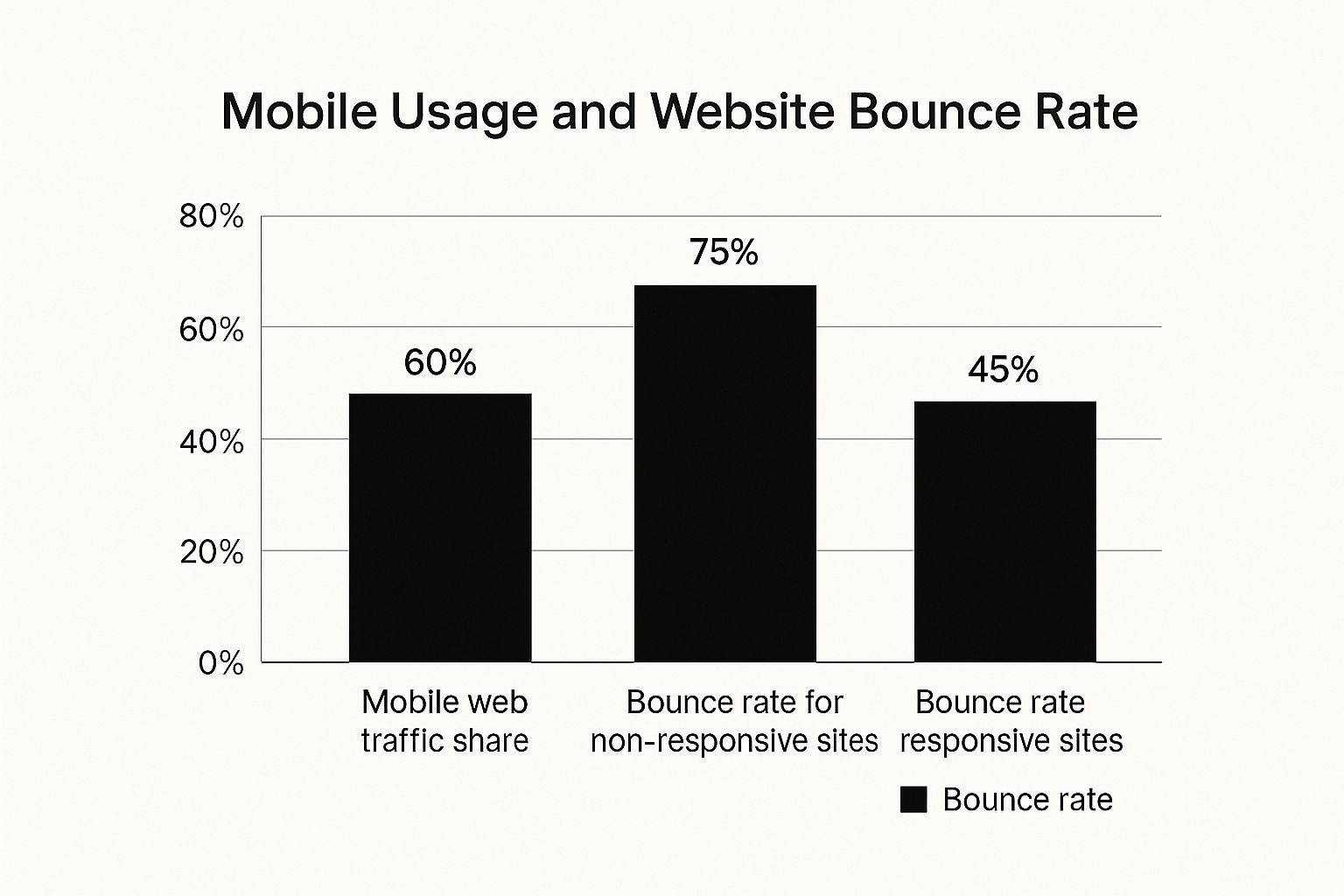
With 60% of web traffic from mobile, the difference in bounce rates between responsive (45%) and non-responsive (75%) sites highlights the importance of mobile optimization. This emphasizes the impact of responsive design, a core mobile-first principle, on user engagement and retention.
For instance, businesses using mobile-first strategies have seen significant performance gains. SwagMagic revamped its platform for mobile, achieving a 30% increase in user engagement within three months. Client feedback revealed a 25% decrease in task completion time and a 40% jump in customer satisfaction, directly attributed to SwagMagic’s intuitive mobile interface. For further insight into mobile-first e-commerce, explore this resource: The Increasing Importance of Mobile-First Ecommerce.
To illustrate the benefits further, let's examine a comparison of mobile-first and desktop-first approaches:
The following table showcases key metrics comparing mobile-first and desktop-first approaches, including user engagement, task completion rates, and satisfaction scores.
| Metric | Mobile First Approach | Desktop First Approach | Improvement |
|---|---|---|---|
| User Engagement | 85% | 55% | 30% |
| Task Completion Rate | 90% (10% decrease in completion time) | 65% | 25% |
| Customer Satisfaction | 80% | 40% | 40% |
As you can see, the mobile-first approach delivers substantial improvements across the board, demonstrating its potential to significantly enhance user experience and business outcomes.
Why Mobile Optimization Is Now Essential
Mobile optimization is no longer optional – it's a necessity. In our mobile-centric world, neglecting mobile users means losing potential customers. Ignoring mobile optimization leads to higher bounce rates, lower conversion rates, and reduced revenue. Prioritizing mobile is crucial for staying competitive.
Adopting a mobile-first approach isn't a choice; it's a strategic imperative. It's an investment in future success, and a key element in building a strong digital presence.
Understanding How Mobile Users Actually Behave

Mobile users interact with websites differently than desktop users. It's not just about smaller screens; their behavior, context, and expectations are entirely unique. This understanding is crucial for a mobile-first approach. This means designing for how people actually use their phones, not just how websites look on them.
The Mobile Mindset: On-The-Go and Goal-Oriented
Mobile users are often on the go, using their phones in short bursts throughout the day. This creates micro-moments where they need specific information quickly. Think about finding a nearby coffee shop, checking the traffic, or making a quick purchase. Mobile users are highly goal-oriented. Designers must cater to this by making information readily available and streamlining actions.
Thumb-Friendly Navigation and Scanning Patterns
Mobile users primarily use their thumbs to navigate. This requires larger touch targets and smartly placed key elements within the "thumb zone" of the screen. Also, mobile users tend to scan content, not read it word for word. Clear headings, bullet points, and concise text are essential for effective communication.
Adapting Content Strategy For Mobile Behaviors
Successful companies tailor their content strategy for mobile. This means more than just making websites responsive. It's about optimizing content for quick consumption and catering to mobile user needs in specific contexts. Think location-based services for relevant information or a streamlined checkout process. These seemingly small changes can greatly improve the mobile experience. Mobile traffic accounts for 60.81% of online traffic, significantly more than desktop's 37.15%. This emphasizes why prioritizing mobile-first content and advertising is essential for capturing attention and staying competitive. You can find more detailed statistics here: Mobile Marketing Statistics. Understanding market trends is crucial; for related insights, consider this resource: Branding Market Research Real Strategies For Growth. By understanding these nuances, businesses can create mobile experiences that connect with their target audience and drive meaningful engagement.
Design Principles That Actually Work On Mobile
Creating a great mobile experience depends on following some key design principles. Many teams find mobile design tricky, sometimes focusing too much on how things look rather than how well they work. This section explains the core elements that separate good mobile design from truly great mobile design, based on real user testing and performance data. This information offers practical advice for building mobile experiences that really work.
Touch-Friendly Interface Design
Mobile users interact primarily through touch. This means designing for fingers, not mouse cursors. Touch targets should be big enough for comfortable tapping, generally around 44 pixels square. Good spacing between interactive elements prevents accidental taps and user frustration. Buttons, links, and other interactive parts should be large and clearly visible for easy and accurate use.
Simplified Navigation Patterns
Mobile users are often on the go, wanting information quickly. Complex navigation can be confusing. Prioritize clear and simple navigation menus. Consider using common mobile navigation patterns like hamburger menus or tab bars to keep options organized and maximize screen space. For more on this, check out How to master mobile navigation. Streamlined navigation is essential for a positive mobile user experience.
Progressive Enhancement for Scalability
A mobile-first approach encourages progressive enhancement. This means designing the main content and features for mobile initially. Then, you add features and complexity for larger screens like tablets and desktops. This creates a strong mobile foundation that adapts well to different devices. Progressive enhancement optimizes the mobile experience and leads to cleaner, more efficient code, benefiting users on any device.
Optimizing Typography and Images
Readability is crucial on mobile. Choose fonts that are easy to read on smaller screens. Use clear, concise text with headings, bullet points, and short paragraphs to make it easy to scan. Optimize images for fast loading without sacrificing quality. Large image files can slow down mobile page loading. Use modern image formats and compression techniques to keep file sizes small while maintaining visual appeal.
Natural Interactive Elements
Interactive elements should feel natural on mobile. Don't use hover effects, as they don't work with touchscreens. Instead, use mobile-specific interactions like swipes, gestures, and animations to create engaging and intuitive experiences. These elements should improve usability, providing clear feedback and making interaction smooth. By carefully implementing these design principles, you can create mobile interfaces that are both visually appealing and highly functional.
From Theory To Practice: Implementation Strategies

Now that we understand why a mobile-first approach is so important, let's explore how to put it into action. This section offers practical advice for implementing these strategies, even with deadlines and budget constraints. It's about adopting tools and workflows that support a mobile-first mindset without compromising efficiency.
Responsive Design Frameworks and CSS Methodologies
Picking the right tools is key to efficient development. Responsive design frameworks like Bootstrap or Foundation offer pre-built components and grid systems that adapt to different screen sizes. This significantly cuts down development time and ensures a consistent look across devices.
Mobile-first CSS methodologies prioritize mobile styles and progressively add enhancements for larger screens, which optimizes performance. When optimizing design principles for mobile, tools like these caption generator Instagram tools can help keep your content visually appealing and effective on the platform.
Performance Optimization for Mobile
Performance is crucial for mobile users. Slow loading times can lead to frustration and visitors leaving your site quickly. Image optimization, using the right formats and compression, is vital.
Code splitting delivers only the necessary code for each page, improving initial load time. Progressive loading keeps users engaged while content loads in the background. These combined strategies are crucial for creating a positive user experience.
Structuring Your Development Process
Prioritizing mobile means changing how we develop. A mobile-first workflow means designing and building for the smallest screen first. Then, we progressively enhance the experience for larger screens. This ensures core functionality and the user experience is optimized for mobile users.
Thorough testing on various devices and network speeds is also critical. This ensures your site works smoothly no matter how someone accesses it.
Practical Tips For Testing and Iteration
Testing needs to be structured and consistent. This means testing on real devices with different operating systems and screen sizes. It also means simulating slow network conditions.
Gathering user feedback is vital throughout the entire process. This helps identify areas for improvement. Iterative improvements like these are essential for delivering a truly seamless mobile experience.
To help streamline the process, we've included a handy checklist:
A comprehensive checklist is provided below to guide the implementation of a successful mobile-first approach. It covers technical prerequisites, design aspects, and testing procedures.
| Category | Requirement | Priority Level | Implementation Tips |
|---|---|---|---|
| Responsive Design | Use a responsive framework (Bootstrap, Foundation) | High | Choose a framework that suits your project needs and technical expertise. |
| Responsive Design | Implement mobile-first CSS | High | Write CSS styles for mobile devices first, then progressively enhance for larger screens. |
| Performance | Optimize images | High | Use appropriate file formats (WebP) and compression techniques. |
| Performance | Implement code splitting | Medium | Prioritize loading essential code first, then load non-critical resources asynchronously. |
| Performance | Use progressive loading | Medium | Display a basic page structure first, then load content and images as they become available. |
| Development Process | Adopt a mobile-first workflow | High | Design and develop for the smallest screen first, then progressively enhance for larger screens. |
| Testing | Test on real devices | High | Use a variety of devices with different operating systems and screen sizes. |
| Testing | Simulate various network conditions | Medium | Test website performance on slower connections to ensure a smooth user experience for all users. |
| Testing | Gather user feedback | High | Conduct user testing and gather feedback throughout the development process to identify areas for improvement. |
This checklist highlights the key areas to focus on during implementation. By following these guidelines, you can ensure a user-friendly and high-performing mobile experience.
Avoiding The Mistakes That Kill Mobile Projects
A mobile-first approach is more than just a good idea. Even with the best plans, mobile projects can fail if they aren't executed properly. This section explores common pitfalls that can derail mobile-first initiatives, from confusing navigation to performance problems that drive users away.
Navigation Complexity: A Mobile User's Nightmare
One of the biggest mistakes is making navigation too complicated. Mobile users expect a streamlined experience. Cluttered menus and unclear navigation paths lead to frustration. Imagine trying to find a specific product on a small screen with a complicated, multi-level dropdown menu. It's a surefire way to increase your bounce rate. Instead, focus on simple, intuitive navigation that helps users quickly find what they need.
Performance Bottlenecks: The Silent Killer
Slow loading times are another major problem. Mobile users are often on the go and expect instant access to information. Large images, unoptimized code, or inefficient caching can cripple mobile performance. A website that takes more than a few seconds to load on a mobile device is likely to be abandoned. Optimize your website for speed by compressing images, minimizing HTTP requests, and using browser caching.
Lack of Team Coordination: A Recipe for Disaster
A successful mobile-first project requires a unified team. Designers, developers, and stakeholders all need to be on the same page. Without clear communication and shared goals, inconsistencies can appear. This can lead to a fragmented user experience. Use effective team coordination techniques, such as regular meetings and shared design documents, to keep everyone aligned throughout the project. You might be interested in: Benefits of Mobile-First Design for Business Websites.
Ignoring Quality Assurance: A Costly Oversight
Testing is essential. Don't assume your mobile website will work perfectly without thorough testing. Test on a variety of devices and network conditions to identify any potential problems. Ignoring quality assurance can result in bugs, usability problems, and unhappy users. Implement a robust testing process that includes both automated and manual testing to catch issues before your users do.
Forgetting the Mobile-First Mindset: A Gradual Drift
Maintaining a mobile-first approach throughout the entire project lifecycle is critical. It’s easy to lose sight of mobile priorities as the project moves forward. Regularly review your mobile goals and make sure every decision aligns with the mobile-first philosophy. This consistency will ensure a truly mobile-optimized final product. By avoiding these common errors and focusing on best practices, you can significantly increase the chances of your mobile-first project's success.
Key Takeaways
Your journey to mastering the mobile-first approach begins with understanding its core principles and how they can lead to real-world success. This section summarizes key takeaways into actionable steps you can implement right away. Each point emphasizes measurable results, giving you clear indicators to track your progress and celebrate your achievements.
Prioritize Content and Functionality
Designing for smaller screens first requires you to focus on what's essential. By determining the core content and functionality that mobile users truly need, you create a lean and efficient user experience (UX). This streamlined approach benefits all users, leading to a cleaner and more effective design across desktops, tablets, and other devices. Remember, less is often more, especially on mobile.
Embrace Simplicity in Navigation
Mobile navigation should be intuitive and easy to use with one hand. Avoid complicated menus or interactions that could confuse users. Clear and concise navigation is vital for a positive mobile experience. Think simple menus, clear labels, and readily accessible key features.
Optimize for Performance
Speed is crucial for mobile users. Slow loading times lead to frustration and potentially lost customers. Optimize your website for mobile performance with efficient code, compressed images, and browser caching. Browser caching allows the browser to store website data, speeding up subsequent visits. A fast-loading mobile website is fundamental to user retention and conversions.
Test and Iterate Continuously
Testing on actual devices and under various network conditions is essential. This practice helps you identify usability issues and performance bottlenecks before they impact your users. Regular testing and user feedback contribute to continuous improvement. It's like an ongoing dialogue with your users, constantly refining the experience to meet their needs.
Build a Mobile-First Culture
The mobile-first approach is more than just a design strategy; it's a philosophy. Encourage a mobile-first culture within your organization by educating your team about mobile user behavior and best practices. This shared knowledge empowers everyone to contribute to building outstanding mobile experiences. This collaborative method ensures mobile considerations are integrated into every project phase.
To learn more about how OneNine can help you create a successful mobile-first strategy, visit our website. We offer expert guidance and support to help you meet your mobile goals and deliver exceptional digital experiences.


