
Changing fonts in WordPress is easier than you might think. Whether you're using the built-in Customizer, a page builder, or a dedicated plugin, there's a method that fits your comfort level. For a quick, no-code update, the best place to start is usually under Appearance > Customize > Typography, where you can see your changes live.
Why Your WordPress Font Choice Matters
Before we get into the "how," let's talk about the "why." Your font choice is a huge part of your website's first impression—it's like a silent ambassador for your brand.
A sleek, modern font like Montserrat can signal innovation, while a classic serif like Garamond might suggest tradition and reliability. The right typography helps build a strong visual identity and makes your site feel polished and memorable. It’s a key piece of a cohesive company brand design.
Beyond branding, typography is the backbone of a good user experience (UX). If your text is a struggle to read, people will simply leave. Research has shown that even small tweaks, like optimizing line length to 50-75 characters, can dramatically improve readability. This is often the a-ha moment that convinces website owners to customize their fonts.
This decision tree gives you a great visual of how brand identity, user experience, and even performance goals all play a role in picking the right font.
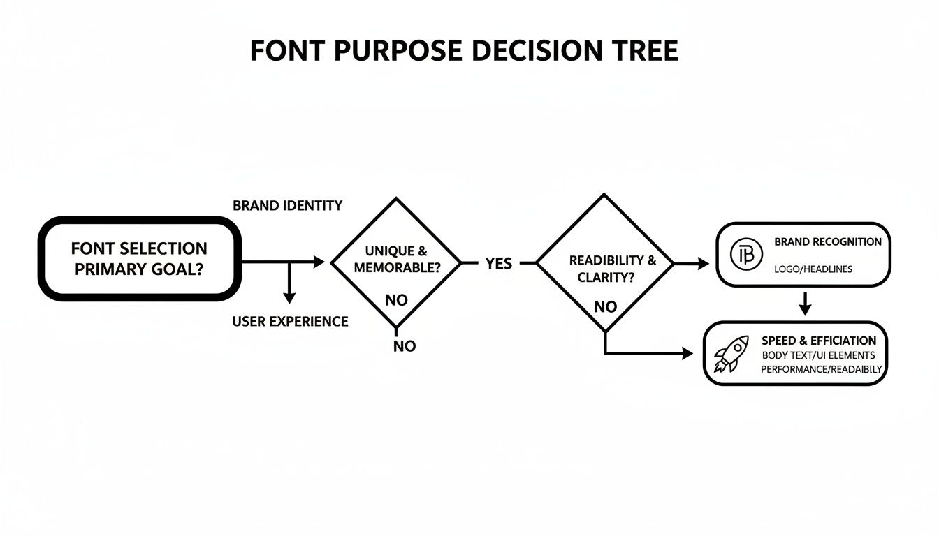
As you can see, your primary goal—whether it's strengthening your brand, making your content easier to read, or keeping your site fast—should steer your font selection.
Choosing Your Method
With that in mind, let's look at the four main ways to get the job done. Each has its pros and cons, depending on your needs and technical skills.
- The WordPress Customizer: Perfect for beginners who want to make quick adjustments supported directly by their theme.
- Page Builders (like Elementor or Divi): Gives you incredible control if you're already using one of these tools to build your site.
- Font Plugins: A fantastic middle ground. They let you add custom or Google Fonts without having to touch a single line of code.
- Manual Code: This is the advanced route. It offers the most control and the best performance, but it requires some technical know-how.
By the end of this guide, you’ll have a clear idea of which approach is the perfect fit for you.
1. Using the Built-In WordPress Customizer
For most people, the simplest and safest way to switch up your fonts is right inside WordPress itself, using the Customizer. If you're looking for a straightforward, code-free method that shows you a live preview as you work, this is your best first stop.
The great thing about this approach is that it’s built to work seamlessly with your theme. Most modern, well-built themes—think of popular ones like Astra, Kadence, or GeneratePress—come packed with powerful typography controls. You won't need to install extra plugins or worry about things breaking.
Finding Your Theme's Typography Settings
First things first, head to your WordPress dashboard. From the main menu, navigate to Appearance > Customize. This will launch the live Customizer, giving you a split-screen view with your website on the right and a control panel on the left.

Now, scan the left-hand panel for an option labeled Typography or something similar like Fonts. The exact location can differ slightly depending on your theme; sometimes it’s tucked away under a broader menu like "Global" or "General Settings." It’s usually pretty easy to spot.
Once you find it, you’ll likely see controls for different text elements across your site. This lets you get specific with your changes. Typically, you can customize:
- Body Text: This sets the font for all your main paragraphs and content.
- Headings (H1, H2, H3, etc.): You can often set one font for all headings or style each level individually for a more dynamic look.
- Buttons: Many themes give you the option to make your call-to-action buttons pop with a unique font.
- Menus and Navigation: You can also fine-tune the typography for your site's main menu.
Adjusting and Publishing Your New Fonts
When you select an element to edit, like "Headings," you’ll see the available controls. Look for a dropdown menu, usually called Font Family, which will list all the fonts you can use. Most themes integrate the entire Google Fonts library, giving you hundreds of high-quality options to choose from.
My Go-To Tip: For a classic, professional look, create a clear contrast between your headlines and body text. I often pair a strong, clean sans-serif like Poppins or Lato for headings with an easy-to-read serif font like Merriweather or Lora for the main content. This pairing is a tried-and-true winner.
But it doesn't stop at just picking a font. The Customizer gives you much more control. You can also adjust:
- Font Weight: Make your text bolder or lighter (from "Thin 100" to "Black 900").
- Font Size: Set different sizes for desktop, tablet, and mobile screens to ensure perfect readability everywhere.
- Line Height & Letter Spacing: Tweak these settings to improve legibility and give your text some breathing room.
The best part is watching the live preview update instantly with every little tweak you make. This immediate feedback loop takes all the guesswork out of the process.
Once you’ve dialed in the perfect look, just hit the blue Publish button at the top of the panel. And just like that, your new typography is live for the world to see.
Getting Full Control With Page Builders
If you’re already using a page builder like Elementor or Divi to build your site, then you’re in luck. You already have a sophisticated set of typography tools right at your fingertips. These builders blow past the basic theme settings, giving you pixel-perfect control over every single text element on your page.
This is the go-to method for designers and site owners who want to get into the nitty-gritty of their typography without touching a line of code. Unlike the theme Customizer, which usually applies sweeping changes across the board, page builders let you manage fonts at both a global and an individual level. This dual approach is fantastic for keeping your branding consistent while still making room for creative, one-off adjustments.

Establishing Global Font Styles
The smartest way to start is by setting up your global fonts. Think of this as creating the typography style guide for your entire website. In Elementor, you’ll find this in the Site Settings panel. If you’re a Divi user, these options are neatly integrated into the Theme Customizer.
From here, you can lock in the default font family, size, weight, and color for all your core text elements:
- Body Text (your main paragraphs)
- Headings (from H1 down to H6)
- Links
- Buttons
Setting these styles globally is a massive time-saver. It ensures that every new text widget or heading you drag onto a page automatically inherits the right look, keeping your design cohesive and professional.
Overriding Fonts for Specific Elements
Of course, the real magic of a page builder is knowing when—and how—to break the rules you just set. Let's say you're building a landing page and want a specific call-to-action button to really pop with a different font. This is where individual styling comes into play.
Just click on any text block, headline, or button within the builder’s editor. A settings panel will appear with a Style or Design tab, where you'll find all the typography controls. Any change you make here will override the global settings for that specific element only. This gives you the creative freedom to add visual flair and emphasize key messages wherever you need to.
I do this all the time. A common scenario is designing a homepage where the main headline needs to make a huge impact. I'll edit that headline widget directly, giving it a unique, attention-grabbing font, while all the other text on the page sticks to the clean, consistent global styles I've already defined.
Uploading Your Own Custom Fonts
What happens when your brand uses a font that isn’t in the Google Fonts library? This is another area where page builders really shine. Both Elementor and Divi come with built-in Custom Font uploaders, which means you don't need to hunt for another plugin to do the job.
This feature lets you upload your own font files (like .woff2, .woff, or .ttf) straight into your WordPress media library. Once uploaded, they become available in the builder's font selection menu, just like any other font. You can then assign your unique brand font to any element, ensuring your site is perfectly aligned with your brand identity.
This level of control is precisely why so many people choose page builders. In fact, data shows that 53% of WordPress sites are moderately customized, with typography being a major part of that. Themes like Hello Elementor, used on over 15,000 sites, are designed from the ground up to give users this freedom through a builder. You can discover more WordPress customization trends to see how popular themes are evolving.
Adding Custom Fonts with a Plugin
When your theme's built-in options don't have what you need and a page builder seems like too much, a dedicated font plugin hits that perfect sweet spot. It's my go-to recommendation for anyone who wants more creative control than the Customizer offers but isn't ready to start editing theme files like functions.php.
Plugins essentially bridge the gap, giving you an easy way to upload your own font files or tap into massive libraries like Google Fonts. This approach gives you the flexibility to get a truly custom look that lines up perfectly with your brand identity.
Choosing and Installing a Font Plugin
First things first, you need to pick the right tool. Two of the most trusted and popular options out there are Custom Fonts and Use Any Font. Both are fantastic for uploading your own font files—the ones you might have purchased or downloaded in formats like .woff2, .woff, or .ttf.
Once you've made your choice, installing it is simple. If you've never done this before, our guide on how to install plugins in WordPress will get you up and running in minutes. After you activate it, the plugin will add its own settings page to your dashboard, usually under "Appearance" or as a new menu item.
Uploading and Assigning Your New Fonts
Now for the fun part. Inside the plugin's settings, you'll find a straightforward interface for uploading your font files. You'll just need to give your font a name (something descriptive like "Brand Headline Font") and then upload the files you have. Most good plugins will ask for a few different file formats to make sure your font works on every browser, with .woff2 being the most critical for modern web performance.
The real beauty of this method is getting total control without the complexity. A solid plugin lets you upload a font once and then apply it to specific elements across your entire site. You can simply tell it, "Make all my H2 headings use this font," and it writes all the necessary CSS for you behind the scenes.
With your font uploaded, it's time to put it to work. The plugin will usually hook into the WordPress Customizer and add a new typography section. From there, you can pick your new font from a dropdown list and assign it to different parts of your site, such as:
- Headings (H1, H2, H3, etc.)
- Body Text (your main paragraphs)
- Blockquotes, links, and other specific elements
This process has gotten even smoother with recent WordPress updates. For example, the Gutenberg block editor, which is now used on 81.2% of sites, got a huge upgrade with the Font Library in WordPress 6.5. This feature integrates Google Fonts directly into the core experience, showing a clear move toward making font management easier for everyone. You can dig deeper into how WordPress is handling typography by checking out the latest WordPress statistics from WPZOOM.
Ultimately, a plugin gives you the best of both worlds: a gateway to an unlimited selection of fonts managed through a simple, user-friendly interface.
Manually Adding Fonts with Custom Code
If you’re comfortable with code and want total control over your website's typography, this is the way to go. Manually adding fonts is the cleanest, most performance-friendly method out there, completely bypassing plugins and theme options. It might sound a bit technical, but once you get the hang of it, you’ll appreciate how lean and efficient it is.
The whole process boils down to working with two files: functions.php and style.css. You'll find both inside your child theme's folder. I can't stress this enough—always use a child theme for these kinds of edits. If you modify the parent theme directly, your hard work will be erased the next time the theme updates. It’s a tough lesson many of us have learned the hard way.
Enqueuing Your Font Files
First things first, you need to "enqueue" your fonts. This is the official WordPress method for adding scripts and stylesheets, making sure everything loads in the right order and without conflicts. To do this, you’ll drop a small PHP snippet into your child theme’s functions.php file.
Let's imagine you want to use the "Poppins" font from Google Fonts. The code would look like this:
function onenine_enqueue_google_fonts() {
wp_enqueue_style( 'onenine-google-fonts', 'https://fonts.googleapis.com/css2?family=Poppins:wght@400;700&display=swap', false );
}
add_action( 'wp_enqueue_scripts', 'onenine_enqueue_google_fonts' );
This little function tells WordPress to grab the Google Fonts stylesheet, and the add_action hook makes sure it happens at the perfect moment during page load. It's a much smarter approach than just pasting a link tag into your header, which can slow things down. If you're curious about the right way to manage header assets, our guide on how to edit the header in WordPress dives deeper into this topic.
Applying Fonts with Custom CSS
With the font enqueued, your website is now aware of it, but it doesn't know where to apply it. That's a job for CSS. You can either add the rules directly to your child theme's style.css file or pop them into the Appearance > Customize > Additional CSS section for a quick test.
To make "Poppins" your new font for all headings, you’d add this simple CSS rule:
h1, h2, h3, h4, h5, h6 {
font-family: 'Poppins', sans-serif;
}
See the 'sans-serif' part at the end? That’s your fallback font. It’s a crucial safety net. If for some reason Poppins can’t load, the browser will use a default sans-serif font instead, ensuring your text is still perfectly readable.
Pro Tip: Fonts are more than just a design choice; they can be real performance killers if you're not careful. Unoptimized font files can easily bloat your page size, which is why over 50% of premium themes now focus on modern formats like WOFF2 and variable fonts to keep things fast.
Self-Hosting for Speed and Privacy
For those who want to squeeze out every last drop of performance and stay on the right side of privacy laws like GDPR, self-hosting fonts is the ultimate solution. This means you download the font files and serve them directly from your own server instead of relying on a third-party service like Google.
It takes a few more steps, but it's well worth it:
- Upload the Font Files: Get the
.woff2font files and upload them to a new folder in your child theme (a/fontsdirectory is a common choice). - Define with
@font-face: In yourstyle.css, you’ll need to declare the font using a@font-facerule to tell the browser where to find it. - Apply with CSS: From there, you just use
font-familyto apply it to your elements, exactly like we did before.
This approach eliminates external requests, giving you a nice little speed bump and complete ownership over your website's assets. It's a bit more work upfront, but the performance and privacy wins make it a smart move for any serious website.
Key Font Considerations: Performance and Licensing
Picking a new font for your WordPress site is about more than just looks. It's a technical choice that can directly affect your site's performance, how accessible it is, and even your legal compliance. Every custom font you add is another file your visitor's browser has to download, and if you're not careful, it can really bog things down.
Remember, every new font is a potential performance bottleneck. If you're serious about making sure your pages snap to attention, you'll want to explore some advanced website speed optimization strategies. This is where choosing the right font format becomes critical.

Optimizing for Speed and Performance
My go-to recommendation? Always use the WOFF2 (.woff2) font format. It has the best compression technology, which means the file sizes are smaller and your pages load faster. It's the modern standard for a reason—nearly every current browser supports it.
Another pro tip is to be ruthless about which font weights you load. If your design only calls for a regular and a bold style, don't load the entire font family from thin to extra-black. Each one of those weights is a separate file that adds to your page's load time. For a deeper dive into this, check out our ultimate guide to font loading optimization.
The classic debate: self-host your fonts or use a service like Google Fonts? Self-hosting can be faster since it cuts out calls to third-party servers, giving you full control. On the other hand, Google Fonts is incredibly easy to use but can sometimes raise privacy questions, especially under GDPR.
Understanding Font Licensing
This is a big one. Not every font you find online is free for commercial use. Before you fall in love with a typeface, you have to check its license to make sure you're not opening yourself up to legal issues down the road.
Here's the typical breakdown:
- Open Source Fonts: Think Google Fonts. These are almost always free to use for any project, personal or commercial.
- Paid/Commercial Fonts: These require you to buy a license. Pay close attention to the details—some licenses have restrictions on web usage or are priced based on your monthly traffic.
Always, always read the End User License Agreement (EULA). With WordPress now powering an incredible 43.2% of all websites, font usage is under a bigger microscope than ever. And since nearly 45% of themes are built specifically for customization, getting the licensing right is just part of being a responsible site owner.
A Few Final Questions
You've got questions, and I've got answers. Let's tackle a couple of the most common things people ask when they start changing fonts on their WordPress site.
What's the Best Font Format to Use?
Hands down, the best format is WOFF2 (.woff2). It’s the modern standard for a reason.
WOFF2 files have fantastic compression, which means they’re smaller and download much quicker. This translates directly to a faster-loading website for your visitors. Plus, it’s supported by every major browser out there, so you don’t have to worry about compatibility issues.
Will Adding New Fonts Slow Down My Website?
They certainly can. It’s easy to get carried away, but remember that every single font family and weight you add is another file someone has to download to see your site correctly.
My best advice? Be ruthless. Only load the specific font weights you're actually going to use. For most sites, that’s just regular (400) and bold (700). I often see people load an entire font family with nine different weights, which is a classic performance mistake that will bog down your site for no good reason.
If you stick to just what you need and use the WOFF2 format, you'll keep any performance hit to a bare minimum.
At OneNine, we live and breathe this stuff—from site speed to getting the design just right. If you're looking for a partner to make sure your website is fast, effective, and perfectly on-brand, we're here to help.


