

Your website's homepage is your most powerful tool for converting visitors into customers. It's the digital handshake, the storefront, and the brand statement all rolled into one critical first impression. In the few seconds a visitor spends deciding whether to stay or leave, your homepage must clearly and quickly answer three questions:
- What do you do?
- Why should I care?
- What should I do next?
Fail to answer these, and you lose a potential customer before they’ve even scrolled. Succeed, and you open the door to meaningful engagement and sustainable business growth. A well-designed homepage isn't just about aesthetics; it's a strategic asset that guides users, builds credibility, and directly impacts your bottom line. An effective design anticipates user needs and provides a clear, frictionless path to the information or actions they seek.
This guide breaks down the essential website homepage design best practices that separate high-performing sites from the rest. We will move beyond generic advice to provide actionable, specific strategies you can implement immediately. From crafting a compelling value proposition to optimizing for mobile users and leveraging powerful social proof, you will learn how to build trust, guide visitors, and drive conversions.
We will explore ten core principles, including intuitive navigation, strategic call-to-action placement, and the importance of page speed. By the end, you'll have a clear roadmap for transforming your homepage from a simple landing page into a highly effective conversion engine for your business. Let's get started.
1. Clear Value Proposition Above the Fold
The very first thing a visitor sees on your homepage, without scrolling, is known as the content "above the fold." This prime digital real estate is your single best opportunity to answer a visitor's most critical question: "Am I in the right place?" A powerful, clear value proposition placed here is one of the most crucial website homepage design best practices because it immediately communicates who you are, what you do, and why it matters to the user.
A strong value proposition consists of a concise headline, a supporting subheadline, a relevant visual, and a prominent call-to-action (CTA). It’s not about listing features; it's about articulating the primary benefit or problem you solve for your customers. Think of it as your 5-second elevator pitch. If a user can't grasp your core value in that time, they are likely to leave.

Why It's a Best Practice
Your homepage is your digital front door, and the above-the-fold area is the welcome mat. According to research from the Nielsen Norman Group, users spend about 80% of their time viewing information above the page fold. A clear value proposition in this space grabs attention, builds trust, and encourages visitors to explore further, directly impacting bounce rates and conversions.
How to Implement It
- Craft a Benefit-Driven Headline: Lead with the outcome, not the product. For example, instead of "We Sell Project Management Software," try "Finish Your Projects on Time, Every Time."
- Use a Descriptive Subheadline: Add 1-2 sentences that briefly explain what you offer, for whom, and why it’s different. This adds context to your bold headline.
- Include a Clear, Primary CTA: Don't confuse visitors with multiple choices. Use a single, action-oriented button like "Start Your Free Trial," "Get a Quote," or "Explore Our Services."
- Choose a Relevant Visual: Use a high-quality image, video, or illustration that shows your product in action or represents the positive outcome your customers will experience.
2. Intuitive Navigation Structure
If your value proposition convinces visitors to stay, your navigation is what guides them to where they need to go next. An intuitive navigation structure allows users to find information effortlessly, acting as a clear and reliable roadmap for your entire website. This is a fundamental aspect of website homepage design best practices because if users can't find what they're looking for quickly, they will get frustrated and leave, regardless of how great your content or products are.
A well-organized navigation menu typically includes 5-7 main categories that logically group your content based on user intent, not internal company jargon. It should be prominently placed, easy to read, and consistent across every page of your site. Think of it as the central nervous system of your website; it connects everything and makes it all work together seamlessly for the visitor.
Why It's a Best Practice
Clear navigation is the backbone of a good user experience. According to information architecture experts at the Nielsen Norman Group, users need to know where they are, where they've been, and where they can go. An intuitive menu reduces cognitive load, helps search engines understand your site structure, and directly supports user goals, which leads to higher engagement, longer session durations, and better conversion rates.
How to Implement It
- Organize Around User Intent: Structure your menu based on what your visitors are looking for. Essential items often include "Services," "Portfolio/Case Studies," "About," "Blog," and "Contact."
- Use Descriptive Labels: Avoid vague terms like "Solutions" or "Resources." Instead, use clear and specific labels like "Marketing Services" or "Customer Success Stories" so users know exactly what to expect.
- Keep It Simple: Limit your main navigation items to seven at most to avoid overwhelming visitors. If you have many categories, consider using a well-structured mega menu.
- Prioritize Mobile Navigation: Ensure your menu is easy to use on smaller screens. A "hamburger" icon is standard, and the menu items should be large enough to tap easily with a finger.
- Test Your Navigation: Use tools or conduct simple user tests to see if people can easily find key information. This feedback is invaluable for identifying and fixing points of confusion.
3. Social Proof and Testimonials
People trust other people more than they trust brands. Social proof is the psychological concept that people will conform to the actions of others under the assumption that those actions are the correct behavior. In web design, this translates to leveraging customer testimonials, case studies, client logos, and ratings to build credibility and trust. This is a critical website homepage design best practice because it provides third-party validation, showing potential customers that you deliver real results for businesses like theirs.
A well-placed testimonial or a row of recognizable client logos can do more to build confidence than paragraphs of your own marketing copy. It shifts the focus from what you say you can do to what you have proven you can do. For any business, but especially for service providers, demonstrating a track record of success is essential to converting hesitant visitors into confident leads.
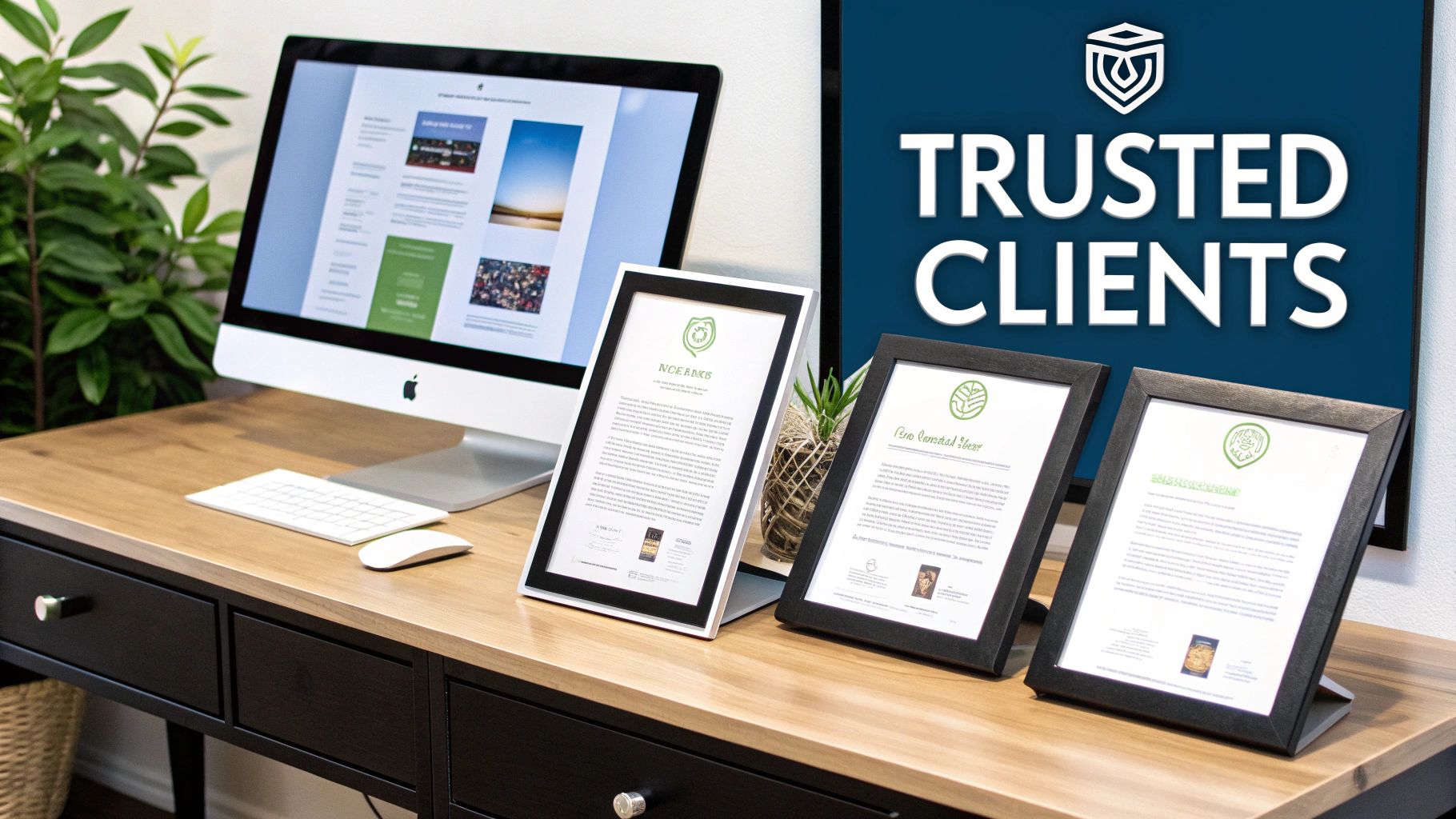
Why It's a Best Practice
Your homepage needs to quickly overcome a visitor's natural skepticism. According to research from BrightLocal, 79% of consumers trust online reviews as much as personal recommendations. By featuring authentic social proof, you immediately answer a visitor’s question: “Can I trust this company?” This builds instant credibility, reduces friction in the buying process, and validates your value proposition, directly influencing conversion rates.
How to Implement It
- Feature Specific, Result-Oriented Testimonials: Go beyond generic praise. A quote like "Their team helped us increase leads by 30% in just one quarter" is far more powerful than "They are great to work with."
- Display Recognizable Client Logos: If you've worked with well-known brands, showcase their logos in a "Trusted By" section. This borrows their credibility and builds your own.
- Use Video Testimonials: Video is highly engaging and feels more authentic than text. A short clip of a happy client sharing their experience can be incredibly persuasive.
- Integrate Third-Party Ratings: If you have strong ratings on platforms like Trustpilot, Google, or Capterra, embed a widget to display them in real-time.
4. Mobile-First Responsive Design
In today's digital landscape, more users will likely visit your homepage on a smartphone than on a desktop computer. Mobile-first responsive design is a crucial practice that prioritizes creating an optimal experience for mobile users first, then progressively enhancing the design for larger screens like tablets and desktops. This approach is one of the most vital website homepage design best practices because it ensures your site is accessible, functional, and beautiful for the majority of your audience.
A mobile-first strategy forces you to focus on the most essential content and features due to the limited screen space. This constraint often leads to a cleaner, more focused, and faster-loading design across all devices. By starting with mobile, you build a solid foundation that can be expanded upon, rather than trying to cram a complex desktop design onto a small screen, which often results in a poor user experience.
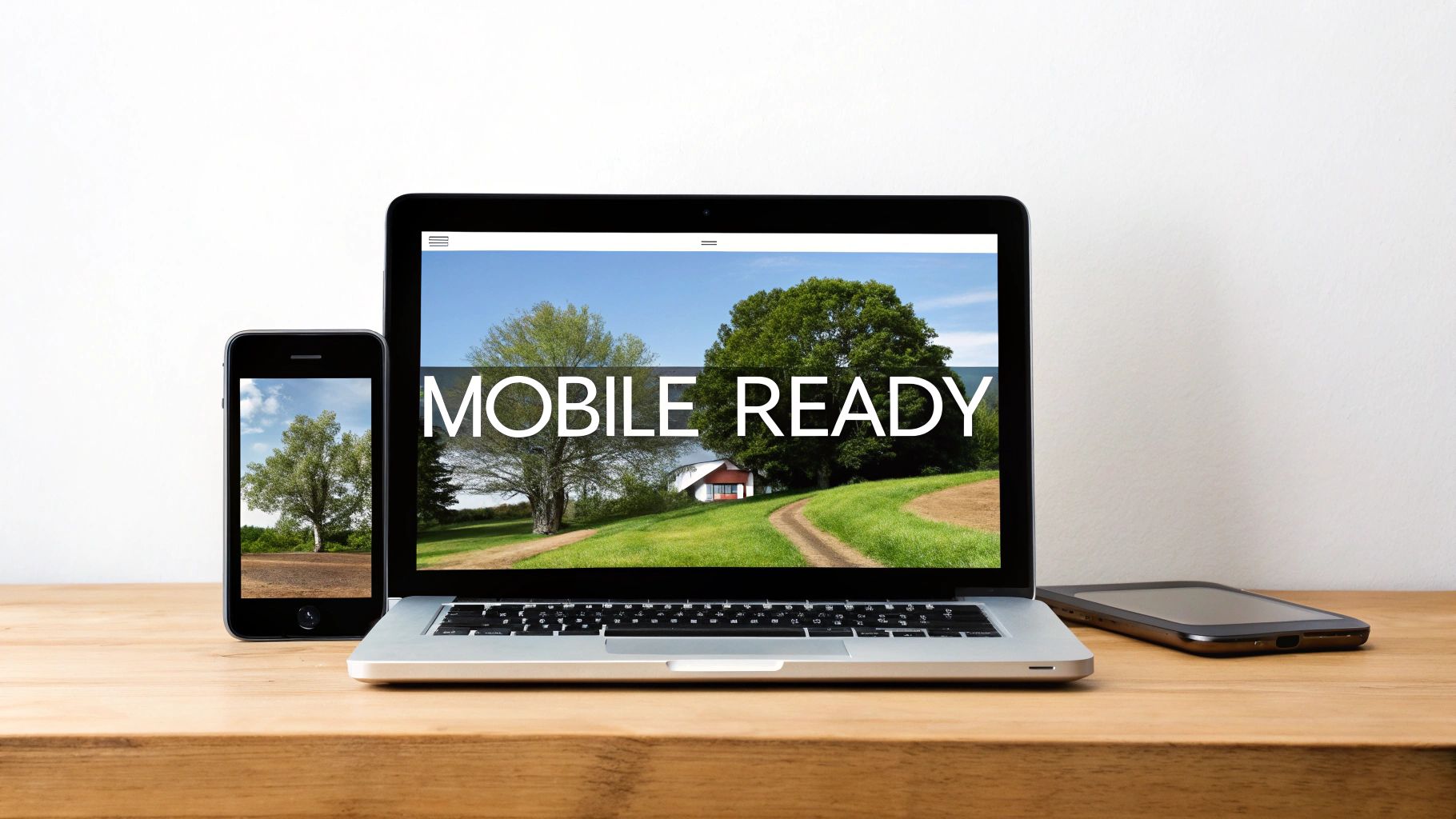
Why It's a Best Practice
With over 60% of all web traffic coming from mobile devices, a non-responsive homepage can alienate a massive portion of your potential customers. Furthermore, Google's mobile-first indexing means it primarily uses the mobile version of your site for ranking and indexing. A well-executed mobile-first design directly improves user experience, lowers bounce rates, and significantly boosts your SEO performance, making it an non-negotiable standard.
How to Implement It
- Design for Small Screens First: Start your design process by creating wireframes and mockups for the smallest mobile screen. This forces you to prioritize content and functionality.
- Optimize for Touch: Ensure all buttons, links, and interactive elements are large enough and spaced adequately to be easily tapped with a finger. The goal is to avoid frustrating "fat-finger" errors.
- Prioritize Performance: Mobile users expect speed. Compress images using modern formats like WebP, minimize code, and leverage browser caching to ensure your homepage loads quickly on mobile networks.
- Use a Responsive Framework: Employ CSS frameworks like Bootstrap or Tailwind CSS to build a responsive grid system that adapts smoothly to different viewport sizes.
- Test on Real Devices: While browser emulators are useful, nothing beats testing your homepage on a variety of actual smartphones and tablets to identify real-world usability issues.
5. Fast Page Load Speed and Performance
In the digital world, speed is not just a feature; it's a fundamental expectation. Page load speed, the time it takes for all content on your homepage to display, directly impacts user experience, conversion rates, and even your SEO rankings. This is one of the most critical website homepage design best practices because a slow homepage communicates poor quality and frustrates visitors before they even see your value proposition. The goal is to load your homepage in under three seconds.
Modern users have little patience for slow websites. A delay of just a few seconds can lead to a significant increase in your bounce rate as visitors abandon your site for a faster competitor. Fast performance, on the other hand, creates a seamless, professional experience that builds trust and keeps users engaged. Giants like Google and Amazon have built their empires on sub-second load times, proving that performance is directly tied to business success.
Why It's a Best Practice
Your homepage's performance sets the first impression of your brand's overall quality and efficiency. Google's Core Web Vitals have made page speed an explicit ranking factor, meaning a slow site will be penalized in search results. Studies consistently show that faster pages lead to higher engagement, better conversion rates, and increased visitor satisfaction. For a user, a fast website feels more reliable and professional.
How to Implement It
- Optimize Your Images: Compress all images using tools like TinyPNG and serve them in modern, efficient formats like WebP. Ensure images are properly sized and not larger than they need to be.
- Minimize Code: Minify your CSS, JavaScript, and HTML files to remove unnecessary characters and reduce file sizes. This can be done with various build tools or CMS plugins.
- Leverage Browser Caching: Configure your server to tell browsers to store static assets (like your logo, CSS, and JavaScript files) locally. This makes subsequent page loads nearly instant for returning visitors.
- Use a Content Delivery Network (CDN): A CDN stores copies of your website on servers around the world. It serves your homepage to visitors from the server closest to them, dramatically reducing latency.
- Reduce Third-Party Scripts: Audit scripts for analytics, chat widgets, and ads. Each one adds to your load time. Remove non-essentials or use methods to defer their loading until after the main content is visible.
If you find your website is loading too slow, using tools like Google PageSpeed Insights can help you diagnose the specific bottlenecks.
6. Strong Calls-to-Action (CTAs) Strategically Placed
A homepage can have a stunning design and compelling copy, but without clear, persuasive calls-to-action (CTAs), it fails at its primary job: guiding visitors to take the next step. CTAs are the signposts of your website, telling users exactly what you want them to do, whether it's starting a project, scheduling a consultation, or viewing your portfolio. This is a fundamental component of website homepage design best practices because it turns passive browsing into active engagement and conversion.
Effective CTAs are more than just buttons; they are the culmination of your value proposition, directing user intent toward a specific goal. They should be visually distinct, use action-oriented language, and be strategically placed throughout the page to capture users at different stages of their decision-making process. For example, a primary CTA like 'Start Your Website Project' might be placed above the fold, while a secondary one like 'View Our Work' caters to those still in the research phase.

Why It's a Best Practice
Your homepage exists to drive action, and CTAs are the mechanism for that action. Without them, even the most interested visitor may leave without converting simply because they weren't told what to do next. Strategically placed CTAs reduce friction, improve user flow, and directly impact your key business metrics. They bridge the gap between user interest and conversion, making them a non-negotiable element for a high-performing homepage.
How to Implement It
- Use Action-Oriented Verbs: Start your CTA copy with strong verbs. Instead of "Submit," use powerful phrases like "Get Your Free Quote," "Schedule a Strategy Call," or "Start Your Project."
- Create Visual Contrast: Your CTA buttons should stand out from the rest of the page. Use a bold, contrasting color that aligns with your brand palette but draws the eye immediately. Ensure there is plenty of white space around it.
- Place CTAs Strategically: Include a primary CTA above the fold and repeat it or use secondary CTAs after key sections of your homepage, such as after testimonials or a service description.
- Optimize for All Devices: Ensure your CTAs are large enough to be easily tapped on mobile screens. A button that is hard to press is a button that won't be pressed.
- Test and Refine: The most effective CTAs are discovered through testing. Experiment with different colors, copy, and placements to see what drives the most clicks. For more on this, exploring conversion rate optimization best practices can provide deeper insights.
7. Compelling Visuals and Brand Consistency
Visuals are processed by the human brain 60,000 times faster than text, making them a powerful tool for shaping a visitor's first impression. Strong visual design and brand consistency aren't just about making your homepage look good; they are about communicating your brand's personality, professionalism, and trustworthiness instantly. This is a critical website homepage design best practice because it establishes an immediate emotional connection and builds brand recognition.
This principle involves using high-quality images, video, and illustrations that align with your brand's identity, coupled with the consistent application of your brand's colors, fonts, and style. From the hero section to the footer, a cohesive visual language tells a unified story, making your brand more memorable and credible. It assures visitors that they are interacting with a polished, professional organization.
Why It's a Best Practice
First impressions are 94% design-related. A homepage with jarring visuals, inconsistent branding, or low-quality imagery can immediately signal a lack of credibility, causing users to bounce. Conversely, a visually compelling and consistent design, like that of Apple or Airbnb, builds trust, reinforces brand identity, and creates a more engaging user experience that encourages exploration and conversion.
How to Implement It
- Create a Brand Style Guide: Document your official colors, fonts, logo usage, spacing rules, and imagery style. This guide is your single source of truth for maintaining consistency.
- Invest in Original Visuals: Whenever possible, use professional, original photography and videography instead of generic stock photos. This showcases your actual team, products, or customers, creating a more authentic connection.
- Use Video to Boost Engagement: A well-produced hero video can quickly tell your brand story and has been shown to improve engagement and conversion rates significantly.
- Embrace Whitespace: Don't clutter your homepage. Use ample whitespace (negative space) to give design elements room to breathe, which improves readability and draws focus to key content.
- Ensure Visual Accessibility: Use color combinations that meet Web Content Accessibility Guidelines (WCAG) standards for contrast to ensure your design is usable for everyone.
8. Trust Signals and Security Indicators
In an online world where users are rightfully cautious, trust signals are the digital equivalent of a firm handshake and a reassuring smile. These elements communicate to visitors that your business is legitimate, secure, and trustworthy, which is a critical step in turning a visitor into a customer. This is one of the most essential website homepage design best practices because it directly addresses user anxiety and builds the confidence needed for them to take action, whether that's making a purchase or filling out a contact form.
Trust signals include everything from security badges (like SSL certificates) and privacy policy links to verified business credentials and money-back guarantees. They show that you operate transparently and prioritize user safety. For service businesses, these signals are especially critical for convincing decision-makers like SMB owners and CMOs that you are a credible and reliable partner worthy of their investment.
Why It's a Best Practice
First impressions are instant, and so are judgments about credibility. Without clear trust indicators, visitors may question the security of their data or the legitimacy of your business, leading to high bounce rates. By prominently displaying these signals, you remove friction from the user journey, reduce hesitation, and increase the likelihood of conversion. It’s a proactive way to answer a visitor’s unspoken question: "Can I trust this company?"
How to Implement It
- Display Security Badges: Ensure your site uses HTTPS, indicated by the padlock icon in the browser bar. Also, display logos from security providers like Norton or McAfee, especially near forms or checkout areas.
- Create a Professional Footer: Your footer should contain links to your Privacy Policy, Terms of Service, and a physical business address with contact information. This transparency is a powerful trust builder.
- Showcase Partnerships and Certifications: If you are a certified partner with well-known platforms like Shopify, WordPress, or Google, display their official badges. These third-party endorsements lend you credibility.
- Be Transparent with Guarantees: Clearly state any money-back guarantees, warranties, or satisfaction policies. This shows you stand behind your product or service.
- Prioritize Ongoing Security: A compromised website is the ultimate trust-breaker. Implementing continuous website security monitoring ensures these trust signals remain authentic and your customers stay protected.
9. Content Strategy with Scannable Copy
Most visitors don't read web pages; they scan them. Acknowledging this behavior is fundamental to effective homepage design. Your content strategy must prioritize scannability, using a clear visual hierarchy, concise copy, and descriptive headings. This approach ensures your key messages are absorbed quickly, even by visitors who are just skimming for information. A scannable content strategy is one of the most vital website homepage design best practices because it respects the user's time and delivers value efficiently.
Effective homepage copy balances persuasive, benefit-driven language with absolute clarity. It avoids jargon and speaks directly to the visitor's pain points, explaining exactly how your product or service provides a solution. For a busy small business owner, the goal isn't to be clever; it's to be understood instantly. If your core benefits aren't immediately clear, visitors will bounce before you have a chance to convert them.
Why It's a Best Practice
According to usability research pioneered by Jakob Nielsen, users often read in an F-shaped pattern, scanning headlines, subheadings, and the first few words of paragraphs. Structuring your content to align with this behavior makes your information far more accessible. Scannable copy reduces cognitive load, helps users find what they're looking for faster, and keeps them engaged, ultimately guiding them toward your desired call-to-action.
How to Implement It
- Write Value-Driven Headlines: Craft headlines and subheadings that convey a complete, compelling benefit on their own. Assume they are the only text a visitor might read.
- Keep Paragraphs Short: Limit paragraphs to a maximum of 2-3 sentences. On mobile, this often translates to just 1-2 sentences per paragraph to maintain readability.
- Use Bullet Points: Break up complex information, features, or benefits into easily digestible bulleted or numbered lists. This format is inherently scannable.
- Lead with Benefits, Not Features: Frame your copy around the user's outcome. Instead of "We Use a WordPress CMS," say "Publish Website Updates in Minutes."
- Speak Directly to Your Audience: Use the second person ("you" and "your") to create a direct conversation with the reader, making the content more personal and engaging.
- Avoid Industry Jargon: Write in plain, simple language that your target audience will understand immediately. If you're targeting SMBs, don't use developer-centric terminology.
10. Strategic Services/Features Section with Clear Differentiation
Once a visitor understands your value proposition, their next question is often, "What exactly do you offer?" A dedicated section that strategically showcases your core services or key product features provides an immediate answer. This is one of the most effective website homepage design best practices for guiding different user segments to the solutions that matter most to them, preventing them from having to dig through your navigation menu.
This section acts as a high-level overview of your primary offerings, designed to be scanned quickly. Instead of a dense list, it uses a visually organized layout, often a grid, where each service or feature is presented with a brief, benefit-oriented description and a representative icon or image. This approach helps visitors self-identify with the right solution, whether they are an entrepreneur needing a new website or a marketing agency looking for development support.
Why It's a Best Practice
A well-designed services section bridges the gap between your high-level value proposition and the detailed pages of your site. It reduces cognitive load by categorizing complex offerings into digestible chunks. For businesses with multiple target audiences, like HubSpot or Shopify, it allows each visitor to quickly find their own path, improving user experience and directing traffic to the most relevant conversion funnels.
How to Implement It
- Prioritize Your Offerings: Limit the section to your 3-6 most important services or features to avoid overwhelming the user. Focus on what generates the most revenue or demand.
- Use Consistent Visuals: Assign a unique, high-quality icon or illustration to each service. This creates visual separation and makes the information easier to scan and remember.
- Write Benefit-Focused Descriptions: For each service, write a single sentence that explains the outcome or benefit for the customer. For example, instead of "Ongoing Maintenance," try "Keep your website secure, fast, and up-to-date with our expert support."
- Link to Deeper Content: Each service block should be a gateway. Link it directly to the corresponding detailed service page, a relevant case study, or a specific call-to-action.
Top 10 Homepage Design Best Practices Comparison
| Component | Complexity 🔄 | Resources & Effort ⚡ | Expected Outcomes ⭐📊 | Ideal Use Cases 💡 | Key Advantages ⭐ |
|---|---|---|---|---|---|
| Clear Value Proposition Above the Fold | Low–Medium 🔄 — copy + hero design; needs iteration | Moderate ⚡ — copywriter, designer, A/B testing | ⭐ High relevance; 📊 reduces bounce, improves qualified leads | New visitors; homepage first impression; service positioning | Quickly communicates core offer and benefit |
| Intuitive Navigation Structure | Medium 🔄 — IA + UX design, testing | Moderate ⚡ — UX designer, front-end dev, user tests | ⭐ Better engagement; 📊 longer sessions, fewer support queries | Sites with multiple offerings or content hubs | Guides users to key pages; improves crawlability |
| Social Proof and Testimonials | Low–Medium 🔄 — collect assets, format for web | Low–Moderate ⚡ — outreach, design, CMS updates | ⭐ Strong trust boost; 📊 significant conversion uplift when authentic | B2B services; late-stage decision makers | Reduces perceived risk; shows proven results |
| Mobile-First Responsive Design | High 🔄 — design system + dev across breakpoints | High ⚡ — designer, front-end dev, QA on devices | ⭐ Improved UX; 📊 better SEO and mobile conversions | Majority-mobile audiences; SEO-focused sites | Ensures consistent experience across devices |
| Fast Page Load Speed and Performance | High 🔄 — optimization, monitoring, infra | High ⚡ — devs, performance tools, CDN/hosting costs | ⭐ Better rankings & UX; 📊 lower bounce and higher conversions | High-traffic sites; e‑commerce; mobile-heavy audiences | Directly impacts conversions and SEO |
| Strong CTAs Strategically Placed | Low–Medium 🔄 — design, copy, placement testing | Low ⚡ — designer, copywriter, CRO tools for testing | ⭐ Increases conversions; 📊 measurable uplift via A/B tests | Lead generation pages; service purchase flows | Guides visitor actions; easy to iterate and test |
| Compelling Visuals & Brand Consistency | Medium–High 🔄 — branding, asset production | Moderate–High ⚡ — photography/video, designer, brand guide | ⭐ Better first impressions; 📊 higher trust and shareability | Agencies, design-led brands, portfolio showcases | Strengthens recognition and perceived quality |
| Trust Signals & Security Indicators | Low–Medium 🔄 — add badges, docs, legal copy | Low–Moderate ⚡ — legal review, integrations, certificates | ⭐ Reduces risk perception; 📊 improves conversions from cautious users | New/unknown brands; enterprise or regulated clients | Builds legitimacy and compliance visibility |
| Content Strategy with Scannable Copy | Medium 🔄 — copywriting and editorial planning | Moderate ⚡ — copywriter, editor, UX writing tests | ⭐ Better comprehension; 📊 higher conversions and accessibility | Complex services that need clarity; SMB audiences | Improves clarity, retention, and actionability |
| Strategic Services/Features Section | Medium 🔄 — service framing, icons, links | Moderate ⚡ — product marketing, design, CMS pages | ⭐ Clarifies offerings; 📊 helps segment leads and SEO | Agencies with multiple service lines or packages | Helps visitors self-select relevant services |
Turning Best Practices into Business Results
We've journeyed through the ten foundational pillars of modern homepage design, from establishing a crystal-clear value proposition above the fold to crafting a scannable content strategy that respects your visitor's time. Each principle, whether it's optimizing for lightning-fast page speed or strategically placing compelling calls-to-action, serves a single, unified purpose: to transform your homepage from a static digital brochure into a dynamic, results-driven engine for your business.
Implementing these website homepage design best practices is not about blindly following a checklist. It's about adopting a user-centric philosophy. Your homepage is the digital handshake, the first impression, and the central hub of your online presence. Getting it right means building a foundation of trust and clarity that resonates through every subsequent click and interaction a visitor has with your brand.
From Principles to Performance
The true power of these practices is realized when they work in concert. A powerful CTA is ineffective if the page loads too slowly for anyone to see it. Authentic social proof loses its impact if it’s buried within a confusing navigation structure. Think of your homepage as a finely tuned machine where every component must function flawlessly for the whole system to perform at its peak.
The most critical takeaway is this: your homepage is a conversation with your ideal customer.
- Your Value Proposition: This is how you start the conversation, clearly stating who you are and what problem you solve.
- Intuitive Navigation: This is how you guide the conversation, making it effortless for users to find what they need.
- Social Proof and Trust Signals: This is how you build credibility in the conversation, showing them others have found value in what you offer.
- Compelling Visuals and CTAs: This is how you direct the conversation toward a meaningful outcome.
By consistently applying this conversational framework, you shift from just "designing a page" to "engineering an experience."
Your Actionable Path Forward
Mastering these concepts is not a one-and-done project but an ongoing commitment to improvement. The digital landscape, user expectations, and your own business goals will inevitably evolve. The key is to start now, with a clear and focused plan.
Begin with a simple audit of your current homepage. Go through the ten practices we've discussed and honestly assess where you stand.
- Identify Low-Hanging Fruit: What are the quickest wins? Perhaps your CTAs could be more prominent, or your testimonials could be moved to a more visible location.
- Tackle Technical Hurdles: Run a page speed test. Is your site truly mobile-first? Addressing technical issues like performance and responsiveness often yields the most significant immediate gains in user experience and SEO.
- Refine Your Message: Re-read your value proposition and core messaging. Does it still accurately reflect your brand and speak directly to your target audience's pain points?
Embracing these website homepage design best practices is an investment in the long-term health and success of your brand. It’s about building a digital front door that not only welcomes visitors but also intelligently guides them, builds their confidence, and ultimately converts them into loyal customers. The journey from a good homepage to a great one is paved with intentional, user-focused decisions. Start making those decisions today, and you will build a powerful asset that fuels your growth for years to come.
Ready to transform these principles into a high-performing homepage that drives real business results? At OneNine, we specialize in expert website management and development on WordPress, Shopify, and Webflow, turning design best practices into tangible growth for our clients. Let's build a homepage that works as hard as you do. Contact OneNine today!


