

In a crowded digital marketplace, a website is more than just an online brochure. It's your most powerful sales tool, brand ambassador, and customer service hub, working for you 24/7. But what separates a high-performing website from one that simply exists? The answer lies in a strategic application of good web design practices.
These principles aren't just about aesthetics; they are the functional foundation for a seamless user experience that builds trust, drives conversions, and grows your business. A website that loads slowly, is confusing to navigate, or doesn't work on a mobile phone isn't just a minor inconvenience, it's a direct obstacle to revenue. For small and medium-sized businesses, getting this right is non-negotiable for competing effectively.
This comprehensive roundup cuts through the noise to give you ten actionable, non-negotiable practices that every SMB and marketing leader should implement. We will move beyond vague advice and provide a clear blueprint covering everything from responsive design and accessibility to technical SEO and data-driven optimization. Each point is designed to give you a specific framework for creating a website that doesn't just look good, but performs exceptionally well. Let’s dive into the core components.
1. Responsive Web Design
Responsive web design is a fundamental practice that ensures your website provides an optimal viewing and interaction experience across a wide range of devices, from desktop monitors to tablets and mobile phones. This approach uses flexible grids, layouts, and images, combined with CSS media queries, to automatically adjust the content to fit the screen size it's being viewed on. For any business today, this isn't just a feature; it's a necessity, as a significant majority of web traffic now originates from mobile devices.
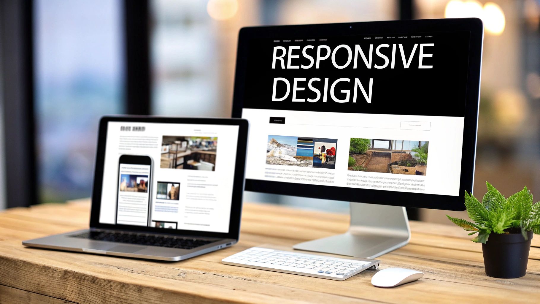
This method directly impacts user satisfaction and conversion rates. When a visitor has to pinch, zoom, or scroll horizontally to read your content on their phone, they are far more likely to leave. A responsive design eliminates these friction points, creating a seamless and user-friendly journey. Sites like Airbnb and Shopify are prime examples, offering a consistent and intuitive experience whether you’re booking a stay on a laptop or managing a store on a smartphone.
How to Implement Responsive Design
Here are some actionable tips for incorporating this crucial element into your good web design practices:
- Adopt a Mobile-First Approach: Start the design process with the smallest screen (mobile) and then scale up to larger screens like tablets and desktops. This forces you to prioritize essential content and functionality, leading to a cleaner, more focused user experience.
- Test on Real Devices: While browser developer tools are useful for emulation, they don't always capture the nuances of real-world device performance and touch interactions. Always test your site on actual smartphones and tablets.
- Implement Flexible Grids and Images: Use relative units like percentages for grid layouts instead of fixed units like pixels. For images, use the
srcsetattribute to serve different image sizes based on the user's screen resolution, which improves loading times. - Focus on Touch-Friendly Elements: Ensure buttons and links are large enough to be easily tapped on a mobile device. A minimum size of 48×48 pixels is a recommended standard for touch targets.
By prioritizing a responsive framework, you not only cater to the modern user but also align with Google's mobile-first indexing, which is a critical factor for SEO success. For more information, you can explore the foundational principles of responsive design.
2. Fast Page Load Speed
Fast page load speed refers to the time it takes for a website to fully display its content to a visitor. In today's digital landscape, speed is not a luxury; it's a critical component of user experience and business success. Research consistently shows that users have little patience for slow websites, with a significant percentage abandoning a site if it takes more than three seconds to load. For any business, this metric directly impacts user engagement, conversion rates, and search engine rankings.
This practice is one of the most impactful good web design practices because it has a tangible effect on revenue. Amazon famously calculated that every 100ms of latency cost them 1% in sales, while Pinterest reduced perceived wait times by 40% and saw a 15% increase in both sign-ups and search engine traffic. To understand the critical impact of loading speed on user experience and business outcomes, delve deeper into the importance of fast websites. A slow website frustrates users and signals poor quality to search engines like Google, which uses site speed as a key ranking factor.
How to Improve Page Load Speed
Here are several actionable tips for optimizing your website's performance:
- Audit and Measure Performance: Use tools like Google PageSpeed Insights and GTmetrix to analyze your site's current speed. These tools provide a detailed report with specific recommendations for improvement.
- Optimize Images: Large, uncompressed images are a common cause of slow load times. Use tools like TinyPNG or ImageOptim to compress image files without sacrificing quality. Also, serve images in next-gen formats like WebP.
- Leverage Browser Caching: Configure your server to tell browsers to store static files like CSS, JavaScript, and images locally. This way, return visitors don't have to re-download the entire site, leading to much faster load times.
- Use a Content Delivery Network (CDN): A CDN, such as Cloudflare, stores a cached version of your website on multiple servers around the world. It serves your content from the server closest to the user, significantly reducing latency.
- Minimize and Combine Code: Reduce the size of your CSS, JavaScript, and HTML files by removing unnecessary characters (minification). Also, combine multiple CSS or JavaScript files into a single file to reduce the number of HTTP requests.
By focusing on these performance optimizations, you create a better user experience that encourages visitors to stay longer and convert. For a deeper dive, explore these techniques on how to improve website loading speed.
3. Intuitive Navigation Architecture
Intuitive navigation architecture is the science of organizing and structuring your website’s content so users can easily find what they are looking for. A well-planned navigation system acts like a clear road map, guiding visitors through your site, reducing cognitive load, and significantly improving their overall experience. For any business, this is a critical component of good web design practices, as it directly influences bounce rates, session duration, and ultimately, conversion rates.
When users can't find information quickly, they become frustrated and are likely to leave. A logical navigation structure eliminates this friction, creating a seamless and satisfying user journey. Websites like Apple.com master this with clean, product-focused menus that guide users effortlessly. Similarly, Amazon's success relies heavily on its robust category and search-based navigation, which helps users sift through millions of products with ease.
How to Implement Intuitive Navigation
Here are some actionable tips for building a user-friendly navigation architecture into your web design:
- Keep It Simple: Limit your main navigation menu to a maximum of 5-7 top-level items. This prevents overwhelming users with too many choices, a principle popularized by usability experts like Steve Krug in his book Don't Make Me Think.
- Use Descriptive Labels: Avoid vague or clever labels like "Solutions" or "Resources." Instead, use clear, descriptive terms that reflect your user’s language and mental models, such as "Services for Small Businesses" or "Marketing Guides."
- Implement Breadcrumbs: A breadcrumb trail shows users their current location within the site's hierarchy. This is especially important for websites with deep content structures, as it provides a clear path back to previous pages.
- Ensure Consistency: Your main navigation should look and behave the same on every single page of your website. This consistency builds user confidence and makes your site feel predictable and reliable.
- Include a Search Function: For websites with a large amount of content (100+ pages), a prominent and effective search bar is non-negotiable. It provides a vital shortcut for users who know exactly what they're looking for.
4. Clear Call-to-Action (CTA) Design
A Call-to-Action (CTA) is a direct prompt on your website that guides users toward a desired action, such as 'Buy Now', 'Sign Up', or 'Schedule a Demo'. Effective CTA design is the cornerstone of conversion optimization, acting as the critical bridge between user engagement and achieving business goals. For business owners and marketing leaders, a well-designed CTA transforms passive visitors into active leads and customers.

This practice directly impacts your bottom line. An ambiguous, hidden, or unappealing CTA will be ignored, leaving potential revenue on the table. In contrast, a prominent, compelling CTA makes the next step obvious and easy for the user. Companies like Slack master this with their vibrant 'Get Started' buttons, while Netflix uses high-contrast CTAs to make playing content effortless. These elements are not just buttons; they are strategic tools that drive user behavior and are a key component of good web design practices.
How to Implement Clear CTA Design
Here are some actionable tips for creating CTAs that convert:
- Use Action-Oriented Verbs: Start your CTA copy with strong, clear verbs that tell the user exactly what will happen. Use words like 'Get', 'Discover', 'Join', or 'Start' instead of passive phrases.
- Prioritize Visual Hierarchy: Make your primary CTA stand out using a contrasting color that aligns with your brand identity. It should be one of the most noticeable elements on the page. For a deeper dive into how design directly impacts conversion rates, explore practical landing page design best practices that actually boost conversions.
- Optimize for Touch: Ensure your CTA buttons are large enough for easy tapping on mobile devices. A minimum size of 44×44 pixels is a widely accepted standard to avoid user frustration.
- A/B Test Everything: Don't assume you know what works best. Continuously test different versions of your CTA's copy, color, size, and placement to identify the highest-performing combination. Even small changes can lead to significant increases in conversion rates.
5. Accessibility Compliance (WCAG/ADA)
Web accessibility is the practice of designing and developing websites that are usable by everyone, including people with disabilities. This means ensuring that individuals using assistive technologies like screen readers, or those with visual, auditory, motor, or cognitive impairments, can access and interact with your content effectively. Adhering to standards like the Web Content Accessibility Guidelines (WCAG) is not only an ethical imperative but also a legal requirement in many jurisdictions under laws like the Americans with Disabilities Act (ADA).

For any business, embracing accessibility expands your market reach to millions of potential customers you might otherwise exclude. It also significantly improves user experience for all visitors and boosts SEO, as many accessibility best practices overlap with search engine optimization principles. Websites like BBC.com and Microsoft.com are excellent examples of complex sites that successfully integrate comprehensive accessibility features, proving it's an attainable and valuable goal. This is one of the most crucial good web design practices for modern, inclusive businesses.
How to Implement Accessibility Compliance
Here are some actionable tips for making your website more accessible:
- Aim for WCAG 2.1 Level AA: This is the most commonly accepted global standard for accessibility. Start by using it as your minimum benchmark for compliance.
- Provide Text Alternatives: Add descriptive alt text to all meaningful images. This allows screen readers to describe the visual content to users who cannot see it.
- Ensure Sufficient Color Contrast: Text should have a contrast ratio of at least 4.5:1 against its background. Tools like the WAVE Web Accessibility Evaluation Tool can help you check this.
- Enable Full Keyboard Navigation: All interactive elements, including links, buttons, and form fields, must be fully operable using only a keyboard (Tab, Enter, Escape keys).
- Use Semantic HTML: Structure your content with proper HTML5 elements like
<nav>,<main>,<header>, and<footer>. This provides a clear, logical structure for assistive technologies.
By building an accessible site, you create a better experience for every user, reduce legal risks, and build a more inclusive brand. For a deeper understanding of this topic, you can learn more about the fundamentals of web accessibility.
6. High-Quality Visual Design & Branding
High-quality visual design is the practice of using color, typography, imagery, and spacing to create an aesthetic that is both appealing and functional. It goes beyond mere decoration; a cohesive and professional visual identity builds immediate trust, communicates your brand's values, and forges an emotional connection with your audience. For any business, consistent branding across your website is crucial for reinforcing identity and improving brand recall.
This practice directly impacts credibility and user perception. A visually appealing site feels more trustworthy and professional, encouraging visitors to engage deeper with your content and offerings. Websites like Apple.com master this with a minimalist, elegant aesthetic that reflects their product design, while Mailchimp uses a playful and distinctive identity to stand out. These strong visual systems make their brands instantly recognizable and memorable.
How to Implement High-Quality Visual Design
Here are some actionable tips for incorporating this vital component into your good web design practices:
- Create a Comprehensive Brand Style Guide: Document your brand’s logo usage, color palette (limit to 5-6 complementary colors), and typography rules (use 2-3 font families at most). This guide ensures consistency across all pages and marketing materials.
- Invest in High-Quality Imagery: Use professional, high-resolution photographs and custom illustrations instead of generic stock photos. Authentic visuals are more engaging and better represent your brand’s unique personality.
- Use Whitespace Strategically: Don't overcrowd your pages. Ample whitespace (or negative space) around elements improves readability, reduces cognitive load, and gives the design a clean, modern feel.
- Maintain Consistent Spacing: Implement a grid system to ensure that margins, padding, and alignment are consistent throughout your site. This creates a sense of order and visual harmony that enhances the user experience.
By focusing on a strong visual and branding strategy, you not only make your website more beautiful but also more effective at communicating your value and building lasting customer relationships. For inspiration on creating a cohesive system, you can explore Google's Material Design guidelines.
7. SEO Best Practices & Technical Optimization
Search Engine Optimization (SEO) is the practice of designing and developing your website to be easily discoverable by search engines like Google. This goes beyond just content; technical SEO involves optimizing your site's structure, on-page elements, and overall performance so it can rank highly for relevant keywords. For any business, integrating these good web design practices is non-negotiable, as organic search traffic delivers high-intent visitors and represents a powerful, cost-effective marketing channel.
A well-optimized website directly impacts your bottom line. When potential customers search for products or services you offer, SEO ensures you appear on the first page, capturing their attention before competitors do. Sites like HubSpot and Moz are prime examples; they not only provide SEO tools but their own websites are masterclasses in technical optimization, allowing them to rank for thousands of highly competitive keywords and dominate their market through organic search.
How to Implement SEO Best Practices
Here are some actionable tips for incorporating technical SEO into your web design process:
- Conduct In-Depth Keyword Research: Use tools like Ahrefs or SEMrush to identify the terms your target audience is searching for. These keywords should form the foundation of your page titles, headings, and content.
- Optimize On-Page Elements: Write descriptive, keyword-rich title tags (under 60 characters) and compelling meta descriptions (around 155 characters) for each page. Ensure every page has a single, unique H1 tag that includes your primary keyword.
- Structure Content Logically: Use a clear hierarchy of headings (H1, H2, H3) to structure your content. This makes it easier for both search engines and users to understand the information on your page.
- Build an Internal Linking Strategy: Link relevant pages on your website to one another using descriptive anchor text. This helps search engines discover your content and understand the relationship between different pages.
By weaving SEO into the fabric of your website design, you build a sustainable source of traffic and leads. To dive deeper into the technical side, Google's own Search Engine Optimization (SEO) Starter Guide is an invaluable resource.
8. Content Strategy & Copywriting
Content strategy and compelling copywriting are the heart and soul of your website. While design provides the structure, your words communicate your value, connect with your audience, and drive them to action. This practice involves the careful planning, creation, and management of written content to meet both user needs and business objectives. For any business, clear, persuasive copy is what transforms a visitor into a customer.
Effective content directly impacts engagement and conversions. It’s not just about what you say, but how you say it. By focusing on your audience's pain points and aspirations, you can craft messages that resonate deeply. Brands like Slack excel at this, focusing on the benefit of "less busywork" rather than just listing software features. Similarly, Dollar Shave Club used a bold, irreverent tone to build a memorable brand identity that stood out in a crowded market.
How to Implement a Strong Content Strategy
Here are some actionable tips for incorporating this crucial element into your good web design practices:
- Lead with Benefits, Not Features: Instead of describing what your product is, explain what it does for the customer. Frame your copy around solving their problems and improving their lives.
- Use an Active Voice and Strong Verbs: Write direct, powerful sentences that create momentum. For example, say "Our software automates your workflow" instead of "Your workflow can be automated by our software."
- Write for Scannability: Modern web users scan content. Use short sentences, small paragraphs, bullet points, and clear headlines to make your information easy to digest quickly.
- Incorporate Social Proof: Weave customer testimonials, case studies, and specific data points (e.g., "trusted by over 10,000 businesses") into your copy to build credibility and trust.
By treating your website's text as a core component of the design process, you ensure your message is as powerful as your visuals. This alignment is a cornerstone of good web design practices and is essential for achieving your business goals. For a deeper dive, resources like the Content Marketing Institute offer extensive guidance.
9. Mobile-First and Progressive Web App (PWA) Considerations
A mobile-first design philosophy is a critical web design practice that prioritizes the mobile experience as the starting point for your project. Instead of designing for a large desktop screen and then trying to shrink it down, you begin with the smallest screen's constraints. This approach naturally forces a focus on essential content and functionality. Progressive Web Apps (PWAs) take this a step further, using modern web capabilities to deliver a reliable, fast, and engaging app-like experience directly in a web browser.
With over 60% of all web traffic coming from mobile devices, this is no longer an optional strategy. A mobile-first approach directly improves user engagement and reduces bounce rates. When combined with PWA features like offline access and push notifications, you can create a powerful user retention tool without the high cost of developing a native mobile app. For example, after launching its PWA, e-commerce giant Flipkart saw a 63% increase in conversions, showcasing the immense potential of these good web design practices.
How to Implement a Mobile-First and PWA Strategy
Here are some actionable tips for incorporating these crucial elements into your website:
- Design for Touch: Ensure all interactive elements like buttons and links are large enough to be easily tapped. Maintain adequate spacing between touch targets to prevent accidental clicks. A minimum size of 48×48 pixels is a common standard.
- Prioritize Mobile Performance: Consider that mobile users are often on slower network connections. Optimize images using
srcsetto serve appropriate sizes, minimize code, and leverage browser caching to ensure fast load times. - Implement Service Workers: This is the core technology behind PWAs. A service worker is a script that runs in the background, separate from your web page, enabling features like offline caching and push notifications.
- Use Auditing Tools: Leverage tools like Google's Lighthouse to audit your site's PWA capabilities. It provides a checklist and a performance score, highlighting areas for improvement to ensure your site is installable and reliable.
By adopting a mobile-first mindset and exploring PWA features, you create a more accessible, performant, and engaging experience that meets users where they are. To dive deeper, check out Google's web.dev for comprehensive guides and case studies.
10. Analytics, Tracking, and Data-Driven Optimization
Analytics, tracking, and data-driven optimization are the practices of measuring website performance and user behavior to make informed improvements. This approach moves beyond guesswork, using tools like Google Analytics and Hotjar to understand what works and what doesn't. For any business owner or marketing leader, this is the key to turning a website into a high-performing asset that directly contributes to the bottom line.
This process directly impacts ROI by revealing opportunities and problems. For example, by analyzing user flow data, a company might discover a specific page where visitors consistently drop off, indicating a bottleneck in the conversion funnel. Similarly, A/B testing a call-to-action button's color or copy can reveal a variation that significantly boosts sign-ups. Companies that adopt this data-first mindset often see dramatic improvements in key metrics.
How to Implement Data-Driven Optimization
Here are some actionable tips for incorporating this crucial element into your good web design practices:
- Set Up Clear Conversion Goals: Define what a "conversion" means for your business, whether it's a form submission, a purchase, or a newsletter signup. Set these up as goals in your analytics platform to measure success accurately.
- Track Key Performance Indicators (KPIs): Regularly monitor essential metrics like traffic sources, bounce rate, average session duration, and conversion rates. Create a simple dashboard for quick visibility of these KPIs.
- Use Heatmapping and Session Recordings: Implement tools like Hotjar or Crazy Egg to visually see where users click, scroll, and move their mouse. This provides invaluable qualitative insight into how visitors interact with your design.
- A/B Test Your Changes: Don't just implement changes based on a hunch. Test new headlines, images, or layouts against the original version to see which one performs better. Even small, incremental wins add up over time.
By systematically collecting and acting on data, you create a continuous improvement cycle that ensures your website evolves to meet user needs and business objectives. To get started, you can explore the official resources from Google Analytics.
Top 10 Web Design Best Practices Comparison
| Item | Implementation Complexity 🔄 | Resource Requirements ⚡ | Expected Outcomes 📊 | Ideal Use Cases 💡 | Key Advantages ⭐ |
|---|---|---|---|---|---|
| Responsive Web Design | Medium — CSS grids, media queries, cross-device testing | Medium — front-end dev time, device testing, framework use | Broad device reach, improved mobile SEO, lower mobile bounce | SMB sites, e-commerce, blogs with mixed audiences | Single codebase, easier maintenance, mobile-first SEO |
| Fast Page Load Speed | Medium‑High — stack-wide optimization and monitoring | Medium — CDN, caching, tooling, dev/ops support | Faster loads, higher conversions, improved search rankings | High-traffic stores, SaaS, conversion-focused pages | Better conversion rates, lower server costs, improved UX |
| Intuitive Navigation Architecture | Medium — IA design, user research, usability testing | Low‑Medium — UX research, content restructuring, testing | Lower bounce, increased pages/session, smoother user flows | Content-rich sites, e-commerce catalogs, complex SaaS | Easier content discovery, improved user journeys, SEO gains |
| Clear CTA Design | Low‑Medium — design, copy, A/B testing | Low — design resources, testing tools | Higher conversions, clearer user actions, measurable lifts | Landing pages, product pages, signup funnels | Direct conversion impact, easy to iterate and measure |
| Accessibility Compliance (WCAG/ADA) | Medium‑High — audits, remediation, ongoing tests | Medium — accessibility experts, testing tools, dev time | Legal risk reduction, larger audience reach, SEO benefits | Public sector, large-audience SMBs, regulated industries | Inclusivity, legal compliance, improved overall UX |
| High‑Quality Visual Design & Branding | Medium — design system, visual assets, guidelines | Medium‑High — professional designers, photography, tooling | Stronger trust, longer engagement, premium perception | Brand-driven companies, premium products, startups | Brand recall, differentiation, perceived value increase |
| SEO Best Practices & Technical Optimization | Medium‑High — technical SEO + content strategy | Medium — SEO tools, content creators, technical support | Sustainable organic traffic, higher rankings, qualified leads | Content-driven businesses, local & e-commerce sites | Cost-effective acquisition, high-intent traffic, compounding growth |
| Content Strategy & Copywriting | Medium — planning, writing, editorial workflows | Medium — copywriters, content managers, SEO input | Improved engagement, conversions, authority and retention | B2B, SaaS, brands building thought leadership | Persuasive messaging, better SEO, higher conversion rates |
| Mobile‑First & PWA Considerations | High — advanced dev, service workers, offline logic | Medium‑High — PWA developers, testing, manifests | App-like UX, improved mobile engagement, offline reliability | Mobile-heavy audiences, emerging markets, repeat users | App-like features without native app cost, better retention |
| Analytics, Tracking & Data‑Driven Optimization | Medium — tracking setup, event mapping, analysis | Low‑Medium — analytics tools, analyst/marketer time | Measurable ROI, prioritized improvements, conversion uplift | Any growth-focused business, marketing teams | Data-informed decisions, measurable impact, continuous optimization |
Putting It All Together for Lasting Impact
We've explored a comprehensive landscape of good web design practices, covering everything from the foundational structure of responsive design to the nuanced details of conversion-focused copywriting. The journey from a basic online presence to a high-performing digital asset is built upon these very principles. It’s clear that a successful website isn't the result of a single brilliant idea; it's the product of dozens of deliberate, user-centric decisions made consistently over time.
Each practice we discussed, whether it's optimizing for fast page loads or ensuring your navigation is intuitively simple, contributes to a larger, cohesive whole. Think of your website as a digital ecosystem where every element is interconnected. A strong SEO strategy is amplified by fast performance, while compelling content is only effective if it's accessible to all users and paired with clear calls-to-action.
From Knowledge to Action: Your Next Steps
The sheer volume of information can feel daunting, but the path forward doesn't require a complete, instantaneous overhaul. The most effective approach is iterative and data-driven. Start by identifying the area with the most significant potential for improvement on your current site.
Your actionable roadmap could look like this:
- Audit Your Current Site: Use tools like Google PageSpeed Insights and accessibility checkers to get a baseline. Where are the most glaring issues? Is your site speed holding you back, or are your CTAs getting lost?
- Prioritize for Impact: You can't fix everything at once. Focus on the low-hanging fruit. Perhaps updating your CTA button design is a quick win, while a full content strategy overhaul is a longer-term project.
- Implement and Measure: Make a single, focused improvement. For example, optimize the images on your five most popular pages. Then, use your analytics to track the impact on bounce rates, time on page, and conversion goals.
- Repeat the Cycle: Use the data and insights from your first change to inform your next priority. This continuous loop of auditing, prioritizing, implementing, and measuring is the core engine of web design excellence.
The True Value of Mastering Good Web Design Practices
Ultimately, mastering these concepts is about more than just aesthetics or technical proficiency. It's about building trust and fostering a genuine connection with your audience. When a user lands on a site that is fast, easy to use, and speaks directly to their needs, they feel respected and understood. This positive experience translates directly into tangible business outcomes: higher engagement, increased conversions, and stronger brand loyalty.
Your website is often the first and most critical interaction a potential customer has with your brand. By committing to these good web design practices, you ensure that interaction is not just functional but exceptional. You transform your website from a simple digital brochure into your most powerful tool for growth, communication, and lasting customer relationships. The journey begins not with a giant leap, but with the first deliberate step toward improvement. Choose one area, make a change, and build your momentum from there.
Feeling overwhelmed by the technical details or unsure where to start? The team at OneNine specializes in turning these complex best practices into seamless, high-performing websites on WordPress, Shopify, and Webflow. We handle the design, development, and optimization so you can focus on running your business. Learn more about how we can transform your digital presence.


