

The Psychology Behind High-Converting Contact Pages
Contact pages are more than just a list of details. They're a crucial part of the customer journey, a direct line between your business and your audience. But why do some contact pages convert visitors into leads while others fail? It all comes down to understanding user engagement and trust.
Building Trust Through Transparency
A well-designed contact page should instantly inspire confidence. It's like a friendly digital receptionist, assuring visitors their questions will be answered. This transparency builds trust and encourages conversions. For general inquiries, visit our Contact page.
The Power of Choice and Reduced Friction
Offering multiple contact methods—email, phone, or even live chat—lets visitors choose their preferred way to connect. This flexibility caters to individual preferences and boosts engagement. But it's also important to keep forms streamlined. Complex forms create friction and lead to form abandonment.
The infographic below visualizes typical contact page activity, showing visitor usage, conversion rates, and form abandonment.
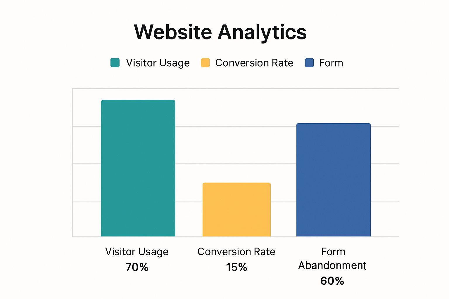
While 70% of visitors use the contact page, the conversion rate is only 15%, with a 60% form abandonment rate. This highlights the need for contact page design that minimizes friction and maximizes conversions. One effective strategy is using multi-step forms. For instance, BrokerNotes saw conversions increase by up to 743% after implementing a multi-step form. This approach creates a better user experience and reduces form abandonment. Learn more about multi-step forms and contact page optimization.
Form Design Psychology: Guiding Users to Completion
Your contact form's design plays a crucial role in driving completions. Think carefully about field placement, labels, and overall flow. Progressive disclosure, where fields appear gradually, simplifies the process and prevents users from feeling overwhelmed. Features like pre-filled country codes also reduce friction.
Validation and Microcopy: The Art of Helpful Feedback
Form validation should be clear and instructive, not negative. Error messages should guide users, not frustrate them. Thoughtful microcopy—the small bits of text within the form—enhances the user experience. For example, instead of a generic error message, use a helpful phrase that explains the correct format. This subtle change can greatly impact user perception and encourage form completion.
To further illustrate the importance of various contact page elements, let's examine the following comparison table:
Essential Contact Page Elements Comparison: A comparison of must-have elements versus optional elements for contact pages across different industry types.
| Element | B2B Importance | E-commerce Importance | Service Business Importance | Impact on Conversion |
|---|---|---|---|---|
| Clear Contact Form | High | High | High | Significant Positive |
| Multiple Contact Methods (Email, Phone, Chat) | High | Medium | High | Positive |
| Physical Address (for brick and mortar locations) | Medium | Low (unless offering in-store pickup) | High | Can increase trust |
| Social Media Links | Medium | High | Medium | Can extend reach |
| Detailed Business Hours | Low | Medium (for customer service) | High | Can improve customer service |
| FAQ Section | Medium | High | High | Can reduce support inquiries |
This table highlights how different elements hold varying importance across different business types. While a clear contact form is universally crucial, the importance of a physical address, for example, varies significantly between e-commerce and service businesses.
By strategically incorporating these elements and understanding their impact on conversion, businesses can create contact pages that effectively connect with their target audience and drive meaningful engagement.
Form Design Psychology That Drives Completion
The difference between a completed contact form and an abandoned one often lies in the details. Form design psychology plays a vital role in optimizing your contact page. By understanding how users interact with forms, you can create a more user-friendly and encouraging experience.
The Impact of Field Count
Research shows a clear link between the number of form fields and completion rates. While it’s tempting to gather as much information as possible, longer forms can be overwhelming. One study found that reducing form fields from 11 to 4 increased conversions by 120%. This underscores the importance of balancing the need for information with user experience.
-
Shorten Forms: Request only essential information to keep forms concise.
-
Progressive Disclosure: Break down long forms into shorter, easier steps. This technique, progressive disclosure, makes the process less intimidating and improves completion rates.
Smart Defaults and Validation
Imagine filling out a long form, only to be met with frustrating errors at the end. This can discourage users from completing the form. Here's how to avoid that:
-
Smart Defaults: Use smart defaults, like pre-filling country codes based on IP address, to minimize user effort.
-
Helpful Validation: Implement real-time validation with clear, instructive feedback instead of generic error messages.
For instance, instead of saying "Invalid email," a message like "Please enter an email address in the format yourname@example.com" is much more helpful. Small changes like this can have a big impact.
Microcopy and Visual Cues
The language used in your forms matters. Carefully crafted microcopy can guide users, answer questions, and build trust.
-
Clear Labels: Use short, descriptive labels for each field.
-
Reinforce Benefits: Remind users of the advantages of submitting the form with phrases like "We'll respond within 24 hours."
Visual cues, such as arrows and progress bars, can further improve the experience. These elements guide the user through the form, making the process feel more manageable. The following table illustrates how microcopy influences user behavior:
| Microcopy Example | Impact |
|---|---|
| "Submit" | Generic, lacks specific action |
| "Send Message" | More descriptive, clarifies the action |
| "Get in Touch" | Friendly and inviting |
By implementing these principles of form design psychology, you can transform your contact page into a seamless and engaging experience that boosts conversions.
Mobile-First Contact Page Strategies That Convert

More and more people are using their mobile devices to browse the web. This makes a mobile-first approach to contact page design essential. A poorly designed mobile contact page can easily lead to frustration and missed opportunities. This is especially important considering that smartphones now account for 59.16% of global website traffic.
Furthermore, 73.1% of visitors will abandon a website if it isn't mobile-friendly. This highlights the critical need to prioritize mobile responsiveness in contact page design for maximizing conversions. Learn more about the impact of mobile responsiveness on web design from these insightful mobile responsiveness statistics.
Optimizing For Thumb-Driven Navigation
Mobile users primarily use their thumbs for navigation. Your contact page design needs to reflect this reality. Touch targets, the areas users tap on, should be large and well-spaced. Think about designing buttons on a remote control – each one needs to be easily pressed without accidentally hitting others.
-
Ample Spacing: Make sure there's enough space between buttons and links to prevent misclicks.
-
Minimum Touch Target Size: Aim for a minimum touch target size of 44 x 44 pixels. This accommodates various thumb sizes and improves the overall usability.
Streamlining Forms Without Sacrificing Data
Simplifying contact forms is crucial on mobile. You still need to collect necessary information, however. Strategic design helps achieve this balance. For example, using drop-down menus for options like country or inquiry type reduces typing and simplifies the user experience.
Effective Form Validation and Error Messaging
Form validation and error messaging should be optimized for smaller screens. Inline validation, providing feedback as users complete each field, is an excellent approach. This prevents form submission errors and provides immediate clarification. Clear and concise error messages are also vital, guiding users toward correction without adding to their frustration.
Ensuring Cross-Device Compatibility
Thorough testing is key. Your contact page needs to perform consistently across various devices and operating systems. This includes testing on different screen sizes, browsers like Chrome, Firefox, and Safari, and operating systems like Android and iOS to identify and resolve any compatibility issues.
Responsive Design Patterns for Enhanced Conversions
Responsive design allows your contact page to adapt seamlessly to various screen sizes. Using flexible layouts and images ensures content displays correctly on smartphones, tablets, and desktops. This maintains both functionality and conversion rates across all devices, creating a consistent and positive user experience.
Trust Elements That Transform Contact Page Performance

A well-designed contact form is essential for any website. But truly effective contact pages go beyond simple forms. Strategic trust elements can significantly improve your submission rates by reassuring visitors and addressing any hesitations they might have. This can turn your contact page into a powerful lead generation tool.
Building Confidence With Social Proof
Social proof is one of the most effective ways to build trust. It's like having word-of-mouth referrals directly on your contact page. Showing positive experiences from previous customers can encourage new visitors to get in touch.
-
Testimonials: Short, impactful quotes from satisfied customers can demonstrate the value you offer.
-
Client Logos: Displaying logos of recognizable clients or partners instantly boosts your credibility.
-
Case Study Snippets: Brief summaries of successful projects showcase your expertise and build visitor confidence.
Addressing Data Concerns Through Transparency
Many visitors are hesitant to submit personal information online. Addressing these concerns is key to improving your conversion rates.
-
Privacy Assurances: Clearly explain how you handle and protect user data. Consider including a link to your privacy policy next to the submit button.
-
Security Indicators: Visual cues, like SSL certificates or security badges, can reassure visitors that their information is safe.
Providing alternative contact methods can also be helpful. Consider features like maps to help visitors find your physical location, and social media links to connect on other platforms. This can enhance the user experience by offering multiple communication channels. Effective contact page design incorporates these elements thoughtfully.
Setting Expectations for a Positive Experience
Managing expectations is crucial for a positive contact experience. Be clear about how and when visitors can expect a response.
-
Response Time Indicators: Telling users how long it typically takes to reply sets realistic expectations and reduces anxiety.
-
Contact Method Preferences: While offering options, indicate your preferred communication channels. This streamlines your workflow and accommodates user preferences.
By incorporating these trust elements, you'll create a more welcoming and reassuring contact page. These changes can significantly boost your submission rates and foster stronger customer relationships.
Contact Page Innovations Worth Implementing
Contact page design is constantly evolving. Staying ahead means embracing new technologies and design trends to create truly engaging contact experiences. This means going beyond static forms and using dynamic interactions that cater to today's users.
Conversational Forms: A More Human Approach
Traditional contact forms can feel impersonal. Conversational forms, however, mimic human interaction, guiding users through questions in a more engaging way. This approach feels less like filling out a form and more like a conversation. It's like a choose-your-own-adventure, where each answer leads to the next relevant question. This personalized approach creates a positive user experience and can lead to higher completion rates.
- Improved User Experience: Conversational forms make the process more intuitive.
- Increased Engagement: The interactive nature keeps users engaged.
- Personalized Interactions: Tailored questions cater to individual needs.
AI-Powered Assistance: Better Customer Interaction
Integrating AI-powered chatbots into your contact page can significantly improve customer service. These bots can handle common inquiries, provide instant support, and guide users to the right resources. This allows your human team to focus on more complex issues. Contact pages are increasingly integrating innovative features; for example, consider the available technologies for building a chatbot.
- 24/7 Availability: AI chatbots provide instant support at any time.
- Reduced Response Times: Immediate answers eliminate waiting.
- Improved Efficiency: Automating routine inquiries frees up human resources.
Micro-Animations and Interactive Elements: Engaging Users
Using micro-animations can transform a static contact page into a dynamic experience. Subtle animations can guide users, provide visual feedback, and create a more engaging interaction. Imagine a button that subtly pulses or a form field that highlights upon selection. These small details enhance user experience.
- Visual Feedback: Micro-animations provide immediate confirmation of user actions.
- Improved Navigation: Animations can guide users through complex forms.
- Enhanced Aesthetics: Subtle animations add visual interest and polish.
Measuring the Impact of Innovations
Implementing innovations is important, but tracking their impact is crucial for determining effectiveness and optimizing design. The following table provides a breakdown of how various design innovations can impact your contact page.
To help understand the relative impact of various design choices, let’s take a look at the following table:
| Design Innovation | Implementation Complexity | User Experience Impact | Conversion Impact | Best For Industry Types |
|---|---|---|---|---|
| Conversational Forms | Medium | High | Potential for significant increase | E-commerce, Service Businesses |
| AI-Powered Chatbots | High | High | Can improve efficiency and reduce support costs | All Industries |
| Micro-animations | Low to Medium | Medium | Can improve engagement and completion rates | All Industries |
This table illustrates the potential impact of these innovations on key metrics. Some, like conversational forms, have higher implementation complexity, but the potential benefits in user experience and conversion rates can be significant. Others, like micro-animations, are easier to implement and still offer noticeable improvements. Understanding these trade-offs lets you prioritize the innovations that best suit your business. The goal is to enhance the submission experience, delivering real ROI and a seamless contact experience.
Data-Driven Contact Page Optimization Framework

Even the most visually appealing contact page can benefit from data-driven optimization. This involves systematically testing and refining different elements to get more people to contact you. This section provides a practical framework to help you prioritize which elements to test based on their potential impact.
Identifying High-Impact Elements for Testing
Not every element on your contact page is equally important. Some, like your call to action or form fields, directly impact whether people submit the form. Others, like the page's background image, might have a less significant impact. Prioritizing high-impact elements ensures your testing is effective and yields real results. Think about these elements:
-
Form Length: Shorter forms often lead to higher completion rates. People are more likely to fill out a short form than a long one.
-
Call to Action: A clear, concise, and enticing CTA is key. It's the final nudge encouraging visitors to reach out.
-
Form Fields: The specific fields you include, and the order in which they appear, can influence user behavior.
-
Trust Signals: Things like testimonials, security badges, and privacy policies can build user trust and encourage submissions.
A/B Testing for Contact Form Optimization
A/B testing is a valuable method for improving your contact page. You create two versions (A and B) with one key difference between them. Then, you send traffic to both and see which performs better. For contact forms, you could test:
-
CTA Button Text: Experiment with variations like "Submit" versus "Get in Touch." Small changes can have big results.
-
Form Layouts: Compare a single-column layout to a multi-column one. See which is easier for users to navigate.
-
Field Labels: Clearly mark required versus optional fields. This can reduce confusion.
-
Number of Form Fields: Try reducing the number of fields and compare results against your original form. Less can be more.
Even with lower traffic, A/B testing can still be beneficial. Keep in mind:
-
Sample Size: Ensure enough visitors see each version to get statistically significant results.
-
Significance Threshold: Set a level of confidence you need to declare a version the winner.
Analyzing Form Analytics Beyond Submission Rates
Looking only at submission rates doesn't tell the whole story. Deeper analytics give a more complete picture. For example:
-
Field Abandonment: Which fields do users frequently leave blank? This might highlight confusing labels or unnecessary requests.
-
Completion Time: How long does it take users to complete the form? Longer times can indicate problems.
-
Error Rates: Track which fields cause the most errors. This helps pinpoint areas for improvement.
Leveraging Qualitative Insights
While quantitative data (like submission rates) is important, qualitative insights provide a different perspective. Tools like heatmaps and session recording can reveal hidden problems.
-
Heat Maps: These visually show where users click and scroll. They highlight areas of interest and potential usability issues.
-
Session Recordings: Watch real user sessions to understand how they interact with your contact page. See their behavior firsthand.
Contact pages are getting more advanced. For example, many are using chatbots. Learn more about building a chatbot.
By combining quantitative data with qualitative observations, you get a complete understanding of your contact page's performance, enabling you to make smart decisions and continuously improve. This data-driven approach helps ensure you're always maximizing your potential.
Your Complete Contact Page Implementation Roadmap
This roadmap breaks down the core principles of contact page design into practical steps. It guides you through creating or improving your contact page for optimal performance. We'll cover technical aspects, design, and content, helping you build a contact page that turns visitors into leads.
Technical Considerations: Ensuring Functionality and Security
A contact page that works well and is secure is essential for building trust with your users. This involves several key areas:
-
Form Validation: Set up strong validation. Use both client-side (in the user's browser) and server-side validation to make sure the data is accurate and to stop malicious submissions.
-
Accessibility: Follow accessibility guidelines (WCAG). Make sure your form is easy to use for everyone, including people with disabilities. This means using proper labels, keyboard navigation, and alternative text for images.
-
Security: Implement security measures. Use things like SSL encryption and CAPTCHA to protect user data and prevent spam. This helps users feel confident that their information is safe.
Design Elements: Guiding the User Experience
Good design is crucial for guiding users through the contact process. Think of it as a visual pathway, leading visitors to submit their questions. Here are a few key elements:
-
Visual Hierarchy: Use headings, subheadings, and other visual cues to guide the user's eye around the page. Clearly separate the form, contact information, and other parts of the page, like FAQs.
-
Spacing and Typography: Use whitespace effectively to avoid a cluttered appearance. Choose a font that’s easy to read and use appropriate font sizes.
-
Color Psychology: Use colors strategically. A contrasting color for the call-to-action button, for example, can draw attention and encourage clicks. The goal is to make the form appealing and user-friendly.
Content Considerations: Crafting Compelling Microcopy
The words you use on your contact page are just as important as its design. They inform, reassure, and encourage interaction.
-
Microcopy: Pay attention to every word, from the form labels to the button text. Use short, concise language.
-
Call to Action: Your call to action should be clear and compelling. Instead of a generic "Submit," use more action-oriented phrases like “Send Message” or “Get in Touch.”
-
Error Message Formulation: Write clear and helpful error messages. Guide users to correct mistakes, rather than just telling them something is wrong. A friendly tone can help maintain a positive experience.
Post-Implementation Measurement: Tracking and Optimizing
After making changes, track their effect and continue to refine your contact page.
-
Key Metrics: Track important metrics. These might include submission rates, abandonment rates, and how long it takes users to complete the form. This data helps you see what's working and what's not.
-
A/B Testing: Use A/B testing to try out different design and content options. Compare the results and make decisions based on the data you collect.
-
Continuous Improvement: Regularly review your data, identify areas for improvement, and make adjustments to maximize your contact page’s effectiveness.
OneNine can help you use these strategies and create a high-performing contact page that meets your business needs. Learn more about contact page design and development with OneNine.


