

Why Most Website User Guides Collect Digital Dust
Let's be honest, that beautifully designed user guide your team poured their heart and soul into? It's probably not getting much love. I've seen this happen countless times – users rarely make it past the first few pages. Why? Because most guides are built on outdated ideas about how people actually use them.
Think about it. When you're wrestling with a website, are you really going to sit down and read a novel-length manual? Of course not. You're likely frustrated, juggling multiple tasks, and just want a quick fix. Traditional user guides, with their focus on exhaustive documentation, miss this entirely. They bury the crucial info users need under a mountain of unnecessary detail.
This is where user experience (UX) becomes absolutely critical. A user-friendly guide is a cornerstone of good UX. In fact, solid website design builds credibility, which is essential for any online business. Want some data to back that up? Check out these UX statistics. Users are far more likely to abandon a slow or confusing site. This highlights the need for smooth functionality and intuitive design – precisely what a well-designed website user guide template helps you achieve.
This approach transforms your user guide from a dusty relic into a vital onboarding tool. This shift in perspective is key to creating guides that people actually use.
Essential Elements Every Effective Website User Guide Template Needs
Creating a truly effective website user guide template isn't about just listing instructions. It's about understanding how people actually use help docs. Instead of forcing users into rigid formats, the best guides are built around how people naturally behave. This means considering things like content hierarchy, accessibility, and navigation to encourage engagement without overwhelming the user.
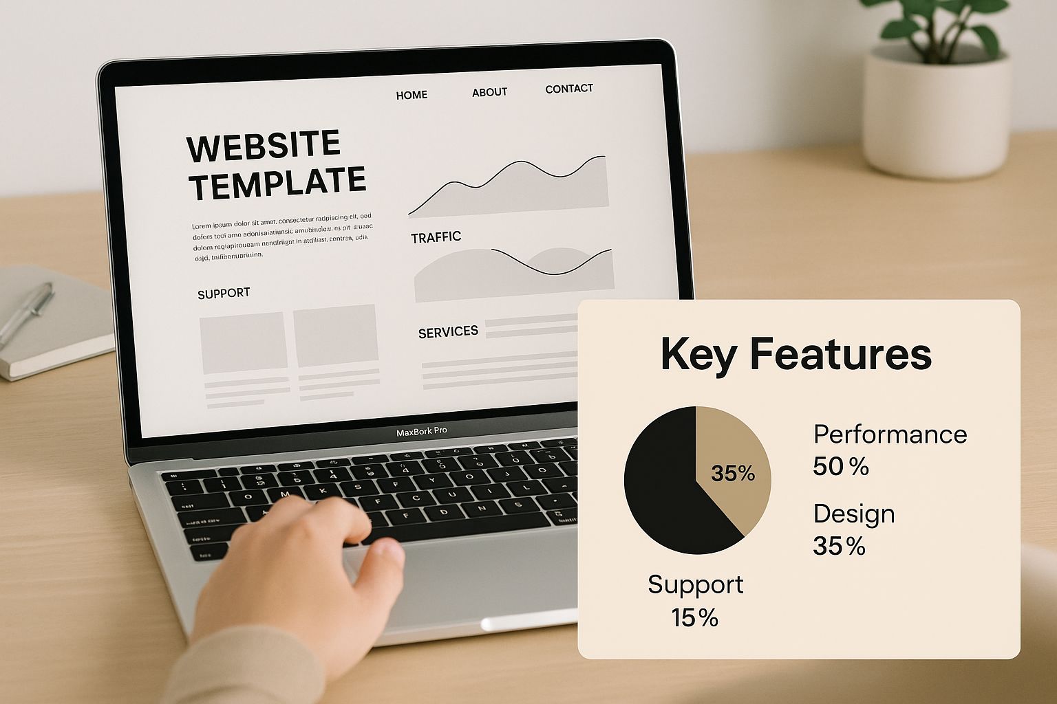
The infographic above shows the core features of an effective user guide template, highlighting clear visuals and a focus on key functionality. Notice how it presents essential elements concisely and visually, helping users quickly grasp key takeaways without information overload. Plus, pre-built templates like user manual templates are becoming increasingly popular as businesses recognize the importance of streamlined documentation. They offer significant time and resource savings, ensuring clear instructions. For example, e-commerce platforms, expecting a projected $4.3 trillion in sales by 2025, hugely benefit from user-friendly guides to improve customer navigation. You might also find this helpful: Website Content Strategy Template.
Key Considerations for Template Design
Let's dive into the design choices that make a template truly intuitive. Think of it like building a house—a solid foundation is key. These behind-the-scenes decisions are just as important as the content itself.
-
Progressive Disclosure: Imagine learning everything about complex software at once. Overwhelming, right? Progressive disclosure reveals information gradually, based on the user's current needs, preventing information overload.
-
Visual Cues: Think of these as signposts guiding users through your documentation. Clear headings, bullet points, and visuals help users quickly scan and find what they need, which is great for users short on time.
-
Navigation Patterns: A good navigation system is a roadmap for your guide. It should be easy to navigate, regardless of entry point. Consider a table of contents, search functionality, and clear links between related sections.
To help you further visualize the key components, take a look at the comparison table below:
To help visualize these elements, I've put together a comparison table:
Essential User Guide Template Components Comparison
A breakdown of must-have elements versus nice-to-have features for different types of websites
| Component | Essential Level | Best For | Implementation Effort |
|---|---|---|---|
| Table of Contents | Essential | All websites | Low |
| Search Functionality | High | Complex websites with lots of content | Medium |
| FAQ Section | Essential | All websites | Low |
| Glossary of Terms | Medium | Websites with technical terminology | Medium |
| Visuals (screenshots, diagrams) | Essential | All websites, especially software or product guides | Medium |
| Interactive elements (e.g., tutorials) | Medium | Software or product guides | High |
| Mobile responsiveness | Essential | All websites | Medium |
| Accessibility features (e.g., alt text for images) | Essential | All websites | Low |
This table highlights the varying levels of importance for different components, allowing you to prioritize based on your website’s specific needs. While a table of contents is crucial for all sites, interactive elements might be more beneficial for software guides. Remember, accessibility should always be a priority.
Designing For Distracted, Impatient, Real-World Users
Let's be honest, nobody sits down and reads a website user guide from beginning to end. Most users are juggling multiple tasks, feeling the pressure, and just want a quick fix to their problem. They skim, they skip around, and they're probably already frustrated before they even get to your guide. This means your website user guide template needs to be built for this kind of reality.
So, forget the image of the attentive reader and embrace the beautiful chaos of real users. Think about your own online behavior. Do you pore over every single word of a help document? Not likely. You scan for keywords, headings, and anything visual that jumps out and gets you to the answer. That's exactly what your users are doing with your guides.
This calls for a different approach to guide design. We need a scannable content architecture, a clear visual hierarchy, and progressive information disclosure. Think of it as creating layers of information. This way, users can quickly get what they need, whether it's a fast answer or a deep dive into a complex topic.
For example, using clear headings, bullet points, and short paragraphs makes information easy to digest for those who are just skimming. Collapsible sections or accordions are great too. They can tuck away detailed information behind concise summaries, so you cater to both the quick-answer seekers and those who need more detail. For a good overview, check out this resource: User Guides.

This is where user research becomes incredibly valuable. Understanding user behavior is more important than ever. In fact, a recent report showed that about 55% of respondents saw an increase in the demand for user insights over the past year, which really highlights the importance of user-centered design. Discover more insights on UX research. It’s about designing guides that anticipate user shortcuts and offer different ways to find what they need – meeting them where they are, not where we wish they were. This approach changes your guide from a static document into a dynamic, user-friendly resource.
Writing Guide Content That Actually Makes Sense To Users
Let's be honest, technical writing can sometimes be…dry. Super accurate, sure, but so dense that it's like trying to read another language. And what's the point of perfect information if no one understands it? In my experience working with website user guide templates, the best ones are clear, concise, and actually helpful. It's all about striking the right balance between detail and simplicity.
Finding the Right Tone and Voice
Think of it like explaining something tricky to a friend. You wouldn't use stiff, formal language, would you? You'd keep it conversational. That’s the key. The best companies understand this and adjust their tone based on who they’re talking to. A troubleshooting guide for a frustrated user needs to be calming and reassuring, while a new user onboarding guide can be more upbeat and welcoming. It's all about context.
Handling Complexity and Varying Skill Levels
One of the biggest challenges with user guides is dealing with users who have wildly different technical skills. You’ve got newbies and seasoned pros all trying to use the same resource. A great trick I've used is progressive disclosure. Start with the basics everyone needs to know. Then, tuck away the more advanced details in expandable sections or link out to separate, in-depth pages. This keeps things simple for beginners without limiting the experts. Think of it as creating layers of information, making your website user guide template flexible and adaptable.
Testing your content with real users is invaluable. I've seen even the most experienced writers accidentally slip into jargon. User testing shines a light on those confusing bits and gives you the chance to fix them before they frustrate your users. Surveys or short user interviews are great for gathering this kind of feedback. Honestly, small changes based on real user experiences can make a huge difference. And remember, a happy user means fewer support tickets – a win-win!
Seamless Integration That Feels Natural, Not Forced
The best user guides aren't separate PDFs gathering dust in some forgotten corner of your website. They're woven into the fabric of the user experience. Instead of making users hunt for help, bring the assistance to them – right when and where they need it. In my experience, this proactive approach drastically cuts down on support tickets and builds user confidence. It's all about striking that perfect balance between being helpful and being annoying. Think of it like a good GPS – always there when you need directions, but never interrupting your journey with unnecessary information.
Contextual Help Strategies
So how do you actually do this seamless integration thing? Well, there are a few tricks of the trade. Smart tooltip systems are great for offering bite-sized guidance on specific features. Think little pop-ups that appear when a user hovers over an element. Then there's embedded guidance, which puts help directly within the interface to clarify complex processes without pulling users away from their current task. And for more complex applications, contextual sidebars can provide in-depth assistance while remaining easily accessible. It’s about making help feel intuitive, not intrusive.
Google Support really nails this. Check out this screenshot:

They've cleverly combined a search bar with clearly defined categories. This lets users either browse through common issues or quickly find specific answers using keywords. It anticipates what users might need and provides multiple avenues for finding solutions.
If you're looking to dive deeper into the world of user-friendly documentation, you might find this resource helpful: Documenting a Website.
Progressive Disclosure for Deeper Help
Progressive disclosure is another key ingredient in the recipe for seamless integration. The idea is to start with just the basic help readily available. Then, offer more detailed information only when a user clicks or hovers to indicate they need it. This prevents information overload and keeps things clean and uncluttered. You can achieve this with expandable sections, tooltips that reveal more detail on hover, or links to more comprehensive documentation. Think of it like a well-organized suitcase – you only take out what you need at that moment. This layered approach keeps your interface streamlined while still providing thorough support. It's all about finding that sweet spot between accessibility and clarity.
Testing and Refining Your Website User Guide Template
Creating your initial website user guide template is just the beginning. The real magic happens when you refine it based on how actual users interact with it. You don't need expensive research tools or extensive studies—practical testing provides incredibly valuable insights. From my own experience, I can tell you that even small tweaks based on user feedback can have a huge impact.
Gathering Actionable Feedback
So, how do you get this feedback? Try short user interviews or quick surveys. Ask users to perform specific tasks using your guide and then tell you what worked well, what didn't, and where they got stuck. The key is to gather specific, actionable feedback. For example, instead of asking "Did you like the guide?", ask "What was the most confusing part of the setup instructions?". This targeted approach helps pinpoint areas for improvement. Also, make sure your website user guide template integrates smoothly with other systems. You can learn more about integrations here.
Measuring Guide Effectiveness
Forget vanity metrics like page views. Instead, focus on what truly matters: user success. Are people able to complete the tasks they set out to do? Track metrics like task completion rates, time spent on each section, and support ticket volume related to guide content. A drop in support tickets related to documented processes is a fantastic sign that your guide is working. You can track these metrics using website analytics tools like Google Analytics and your support system. For more on optimizing website performance, check out our guide on website performance optimization.
To give you a clearer picture of what to track, let's look at some key metrics:
User Guide Performance Metrics That Matter
Key metrics to track for measuring user guide effectiveness and user satisfaction
| Metric | What It Measures | Target Range | Collection Method |
|---|---|---|---|
| Task Completion Rate | Percentage of users who successfully complete a task using the guide | 80-95% | Website analytics |
| Time Spent on Each Section | How long users spend on different parts of the guide | Varies depending on complexity | Website analytics |
| Support Ticket Volume | Number of support tickets related to guide content | Decrease over time | Support system |
| User Satisfaction Score | User's overall satisfaction with the guide | 4-5 out of 5 | User surveys |
As you can see, focusing on these metrics gives you a much better understanding of how well your guide is performing and where you can improve it.
Iterative Improvement
Your guide should evolve alongside your website. Regularly review user feedback, support ticket patterns, and usage metrics. Look for content gaps and areas where users are struggling. Then, make targeted improvements based on the data you've gathered. This iterative approach ensures your documentation stays valuable and relevant as your website grows and changes.
Your Implementation Roadmap For Guide Success
So, you've got the core principles down. Great! Now let's talk about actually building your website user guide template. Think of this as your personalized action plan—a roadmap to get you from a basic idea to a truly helpful resource for your users. We’ll cover everything, from prioritizing tasks for busy teams to making the most of a limited budget. Trust me, I've been there, and a well-planned implementation makes all the difference.
Prioritize for Maximum Impact
Let's be honest, most teams are juggling multiple projects and deadlines. Time and budget are precious commodities. That's why it's crucial to focus on the most important parts of your user guide first. Ask yourself: what are the biggest headaches my users are facing? Which features are causing the most confusion? Start by creating content that tackles those specific areas. It's like triage—addressing the most urgent needs before moving on to less critical ones. This approach allows you to deliver quick wins and builds momentum for the rest of the project.
Choose The Right Tools and Processes
Having the right tools can seriously streamline your workflow. A collaborative documentation platform like Google Docs lets multiple team members work on the template simultaneously. This boosts efficiency and keeps everyone on the same page. Also, consider a version control system—this helps track changes and ensures everyone is working with the most up-to-date version. These practical choices save time and prevent headaches later on.
Tackle Common Implementation Challenges
Every project has its bumps in the road. Knowing what to expect can be half the battle. For example, getting buy-in from the higher-ups can be tough. In my experience, showing the potential return on investment of a well-designed user guide—like lower support costs and happier users—can help convince stakeholders. Another common challenge? Keeping your user guide up to date. Create a clear process for updating content as your website changes. This keeps your documentation relevant and valuable over the long haul.
Scale as You Grow
Your user guide shouldn’t be a static document gathering dust. It needs to evolve alongside your website and user base. As you grow, build in a user feedback mechanism to get insights on how your guide is performing. This feedback loop is vital for continuous improvement. You can use surveys, in-app feedback forms, or even monitor social media to collect valuable data. This data-driven approach ensures your website user guide template remains a helpful resource, even as your business expands.
Ready to create a website that works as hard as you do? OneNine is your partner for building exceptional online experiences. We'll help you develop a website that engages your audience and drives results. Contact us today to learn more about our website management and development services.


