

Responsive web design and accessibility go hand-in-hand to make websites user-friendly for everyone, including those with disabilities. Here’s what you need to know:
- Responsive Design: Adjusts layouts to fit different screen sizes, ensuring usability on all devices.
- Accessibility: Ensures websites work with assistive technologies and meet WCAG 2.1 standards for inclusivity.
Key Features of Accessible Responsive Design:
- Fluid Layouts: Content adjusts naturally to screen sizes, avoiding horizontal scrolling.
- Zoom Support: Websites must support up to 200% zoom without breaking functionality.
- Relative Sizing: Use flexible units (em, rem) so text and layouts scale proportionally.
- Tap Targets: Buttons and links need to be large enough for easy touch interaction.
By combining responsive design with accessibility principles, you create websites that are easier to navigate, readable at any size, and inclusive for all users. Services like OneNine help implement these practices while ensuring compliance with accessibility standards.
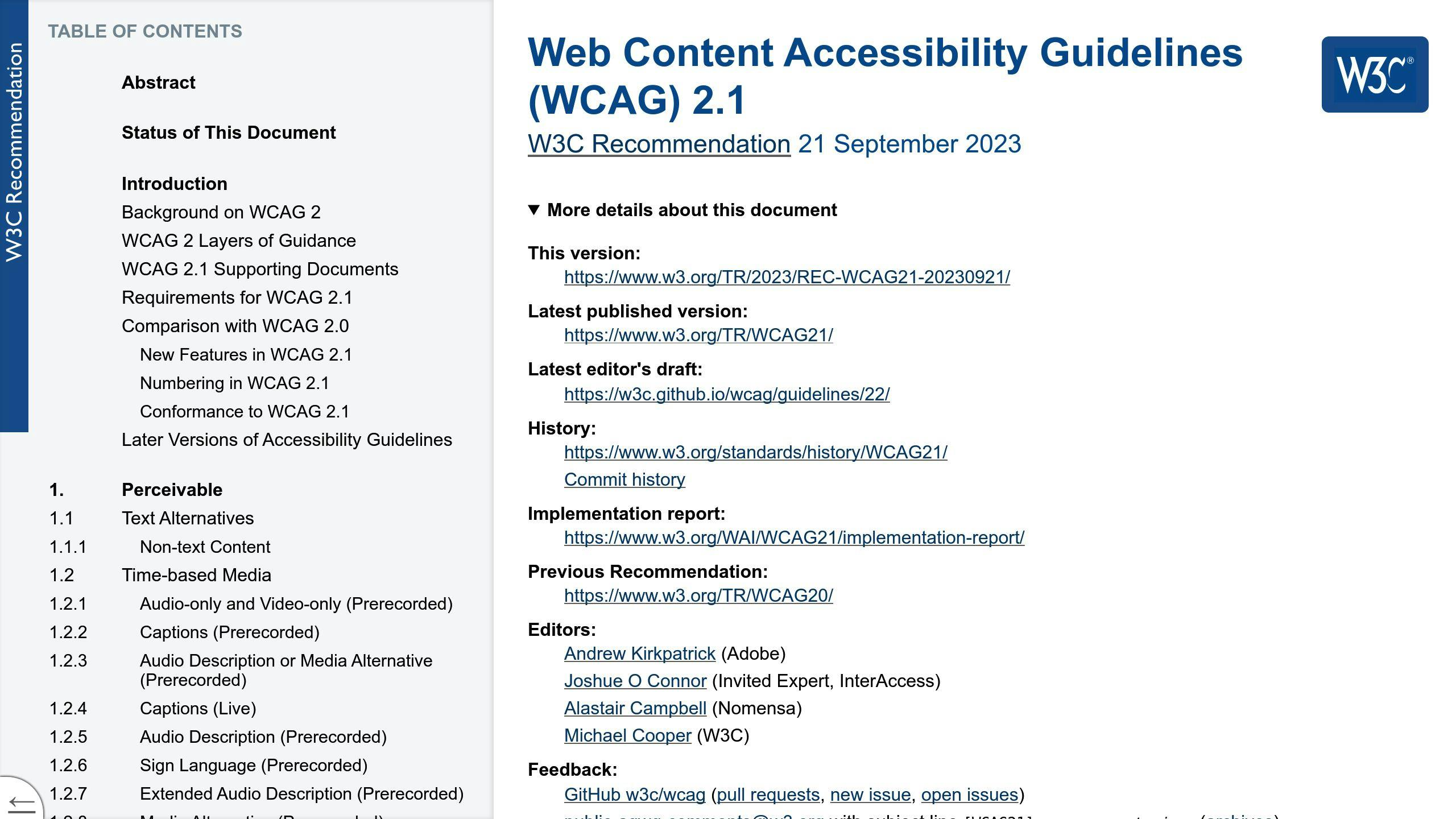
What is WCAG? 1.4 Distinguishable
Principles of Responsive Design Accessibility
Responsive design accessibility is built on three key principles that ensure websites are functional across various devices and user needs. These principles work together to create a user-friendly experience that adjusts to different requirements while maintaining usability.
Fluid Layouts
Fluid layouts are the backbone of responsive design, allowing content to adjust naturally to different screen sizes. Instead of forcing users to scroll horizontally or zoom out, fluid layouts automatically fit the viewport while keeping the content’s structure intact.
| Feature | Advantage |
|---|---|
| Dynamic Content Flow | Maintains logical reading order |
| Flexible Containers | Eliminates horizontal scrolling |
| Proportional Spacing | Keeps content relationships intact |
| Adaptive Navigation | Ensures menus are usable on all devices |
While fluid layouts handle screen size adjustments, zoom functionality plays a key role in making content accessible for users with visual impairments.
Zoom Functionality
Zoom functionality is essential for users who rely on magnification to read content. According to WCAG 2.1 Level AA standards, websites must support up to 200% zoom without breaking functionality [1]. To meet this requirement:
- Text should remain clear and readable at larger sizes.
- Content and interface elements must stay functional and visible when zoomed.
- Navigation should remain fully accessible.
Avoid disabling zoom with meta tags like maximum-scale=1, as this violates WCAG 2.1 standards [2].
To complement zooming, using relative sizing ensures layouts remain consistent and visually balanced.
Relative Sizing
Relative sizing utilizes flexible units like em and rem instead of fixed pixels, allowing content to scale proportionally across different screen sizes and zoom levels. This ensures that when users adjust browser settings or zoom, everything adapts while staying readable and functional.
Best practices for implementing relative sizing include:
- Use rem units for font sizes to ensure consistent scaling based on the root element.
- Apply em/rem units for margins, padding, and container widths to maintain proportional layouts.
Considerations for Accessible Responsive Design
Creating accessible responsive designs involves thoughtful planning to ensure websites work well on various devices while meeting accessibility requirements. These guidelines help achieve usability for everyone.
Viewport Settings
The viewport meta tag is essential for proper content scaling on different devices:
<meta name="viewport" content="width=device-width, initial-scale=1.0">
This setup ensures content adjusts correctly and supports user zooming, aligning with WCAG 2.1 Level AA standards [2].
Flexible Grids
Flexible grids are a cornerstone of responsive layouts, allowing content to adjust fluidly across screen sizes. Key elements include:
| Grid Feature | Implementation | Purpose |
|---|---|---|
| Percentage widths | width: 100% |
Fills available space |
| Max-width | max-width |
Limits oversized content |
| Relative units | em/rem |
Ensures scalable layouts |
Source Order
Ensuring the HTML structure aligns with the visual design improves compatibility with assistive tools. CSS options like Flexbox and Grid help maintain layout flexibility [2]. Best practices include:
- Structuring HTML in a logical reading order for assistive technologies.
- Using CSS for styling and layout adjustments.
- Testing keyboard navigation at various screen sizes.
Spatial Clarity
Clear instructions are vital, regardless of screen size or orientation. Here are some examples of better phrasing:
| Avoid | Use Instead |
|---|---|
| "Click the button on the right" | "Select the submit button" |
| "Navigation on your left" | "Main navigation menu" |
| "See sidebar" | "Additional resources" |
"Responsive design ensures that content remains readable and usable on any device." – Level Access [1]
sbb-itb-608da6a
Practices for Accessible Responsive Design
Creating accessible responsive designs involves using technical methods that ensure usability for everyone. These strategies focus on building layouts that adjust smoothly across devices while staying accessible to all users.
Relative Units
Opt for em or rem units instead of fixed pixels to create scalable designs:
| Element | Suggested Unit | Advantages |
|---|---|---|
| Font sizes | rem | Ensures consistent scaling across devices |
| Margins/Padding | em | Provides proportional spacing with text |
| Container widths | % or viewport width (vw) | Enables fluid layouts that adjust to screen size |
When using relative units, ensure text remains legible at 200% zoom, as required by WCAG 2.1 Level AA standards [1]. This is especially helpful for users with visual impairments who rely on resizing content without disrupting the layout. While scalability is crucial, organizing content effectively is just as important.
Content Order
The order of content is key to delivering an accessible responsive design. The HTML structure should follow a logical reading flow, even if CSS visually repositions elements. Here are some important points:
- Use proper heading levels (h1-h6) to structure content hierarchically.
- Keep primary content organized and ensure navigation remains consistent across all devices.
Tap Targets
Interactive elements, like buttons and links, must be designed to work well for touch users and those with motor impairments. Follow these size guidelines for tap targets:
| Target Type | Minimum Size |
|---|---|
| Buttons | 48x48px (8px spacing) |
| Navigation links | 48px height (12px spacing) |
| Form controls | 48px touch area (16px spacing) |
Use CSS properties such as min-height and min-width to maintain these dimensions while allowing for flexible content. This ensures that interactive elements remain functional even when text sizes are increased.
Professional Services for Web Design Accessibility
Creating accessible, responsive web designs involves technical know-how, but professional services can make the process easier and help meet ever-changing standards.
Why Choose OneNine?
Professional web design services with a focus on accessibility bring several advantages:
| Benefit | Description | Impact |
|---|---|---|
| Technical Expertise | Skilled in WCAG and responsive design | Reduces legal risks and ensures compliance |
| Ongoing Maintenance | Regular updates and accessibility checks | Keeps accessibility consistent over time |
| Performance Optimization | Prioritizes mobile-friendly speed and usability | Improves user experience on all devices |
These advantages help ensure websites remain both accessible and responsive as standards evolve.
What OneNine Offers
OneNine specializes in web accessibility solutions that seamlessly integrate with responsive design principles:
- Content Management: Ensures content remains structured and accessible across all devices.
- Performance Optimization: Focuses on speed enhancements without sacrificing accessibility.
- Security Monitoring: Protects accessibility features from vulnerabilities.
- Mobile Optimization: Guarantees mobile features like zoom and tap targets work smoothly.
Professional services like these tackle common challenges in accessible responsive design:
| Challenge | How Professionals Solve It |
|---|---|
| Complex Navigation | Designs device-friendly, accessible menus |
| Content Scaling | Adjusts layouts for proper scaling and readability |
| Touch Interface | Improves interactive elements for usability |
These solutions create a strong foundation for websites that cater to a wide range of users while staying responsive and accessible.
Conclusion
Making responsive design accessible is key to building digital experiences that work for everyone. Addressing accessibility early not only improves usability but also helps meet important compliance standards.
Here’s how focusing on accessibility benefits both users and businesses:
| Aspect | Advantage |
|---|---|
| Technical Standards | Meets WCAG compliance guidelines |
| User Experience | Improves readability and usability |
| Device Compatibility | Ensures consistent performance |
By following the practices discussed earlier, websites can strike the right balance between accessibility and responsive design. Collaborating with experts like OneNine can simplify this process, helping businesses stay up to date with changing standards.
The future of accessible web design lies in blending responsive design with features that support all users. Prioritizing elements like clear navigation, easy readability, and keyboard-friendly functionality [3] ensures that digital platforms are inclusive, regardless of abilities or devices.
Staying accessible requires ongoing effort. Regular testing across devices and sticking to trusted guidelines will keep websites user-friendly and accessible for everyone.
FAQs
Here are answers to two common questions about how responsive design relates to accessibility.
How does responsive design affect website accessibility?
Responsive design improves accessibility by ensuring websites work smoothly on various devices and allowing features like text scaling up to 200%. This is especially helpful for users with visual impairments. According to WCAG guidelines, text must be scalable up to 200% without breaking functionality [1]. This approach ensures content is easy to use on different devices while keeping the experience consistent.
Is responsive design part of accessibility?
Yes, responsive design plays a role in accessibility, but it’s not the whole picture. While it helps by maintaining content flow, readability, and consistent navigation across devices, it doesn’t cover all aspects of accessibility.
To achieve full accessibility, designers need more than just responsive design. Features like screen reader support, keyboard-friendly navigation, and proper contrast ratios are equally important. Combining responsive design with WCAG standards ensures websites meet accessibility needs [4].


