

Need your site to rank higher on Google? Start with mobile SEO. Over 60% of searches happen on mobile, and Google prioritizes mobile-friendly sites. Here’s how to ensure your site is mobile SEO compliant:
-
Key Mobile SEO Standards:
- Load in 2-3 seconds on 4G.
- Use responsive design for all screen sizes.
- Buttons/links: Minimum size 44×44 pixels.
- Font size: At least 16px for readability.
-
Testing Tools:
- Google Mobile-Friendly Test: Checks usability, text size, and tap target spacing.
- PageSpeed Insights: Measures speed and Core Web Vitals like LCP, FID, and CLS.
- Search Console: Tracks mobile usability issues like viewport errors or overlapping content.
-
Common Fixes:
- Add
<meta name="viewport" content="width=device-width, initial-scale=1.0">. - Optimize images with lazy loading and WebP format.
- Minify CSS/JS and defer non-critical scripts.
- Space clickable elements at least 8px apart.
- Add
-
Action Plan:
- Test monthly and after updates.
- Use real devices and browser tools like Chrome DevTools.
- Monitor results in Search Console and fix flagged issues.
Want better rankings and user engagement? Start testing and optimizing your mobile SEO now.
Mobile Friendly Test: A Beginner’s Guide
Google Mobile-Friendly Test Guide
Google’s Mobile-Friendly Test helps you check how well your website performs on mobile devices. Here’s a quick guide to using it effectively.
Getting Started with the Tool
Head over to Google’s Mobile-Friendly Test at search.google.com/test/mobile-friendly. Enter your website’s URL and hit "Test URL." The tool will load your page as if viewed on a mobile browser.
For better accuracy:
- Test more than just your homepage.
- Clear your browser cache before running the test.
- If your site has AMP pages, test both standard and AMP versions.
Understanding Test Results
The tool gives a simple pass or fail result, along with additional details such as:
- A screenshot of how your page looks on mobile.
- Any technical issues found.
- Information about resources that failed to load.
- Suggestions for improving your HTML.
Some common mobile usability issues flagged by the tool are:
- Text that’s too small to read.
- Content that doesn’t fit within the screen.
- Buttons or links placed too close together.
- Missing or improperly set viewport settings.
Fixing Common Problems
If the test highlights issues, here are some quick fixes:
- Set the Viewport Correctly
Make sure your website’s viewport is configured for mobile devices by adding this to your HTML:
<meta name="viewport" content="width=device-width, initial-scale=1.0">
- Adjust Touch Element Spacing
- Buttons and links should be at least 44×44 pixels.
- Keep at least 8px of space between clickable elements.
- Use clear visual boundaries to separate them.
- Ensure Content Scales Properly
- Use
max-width: 100%for images to prevent overflow. - Stick to relative units like %, em, or rem for layout and font sizes.
- Add responsive breakpoints to adapt your design to various screen sizes.
Mobile Speed Testing
Speed plays a crucial role in mobile SEO, alongside having a mobile-friendly design. Here’s how to measure and improve your site’s mobile loading performance.
Using PageSpeed Insights
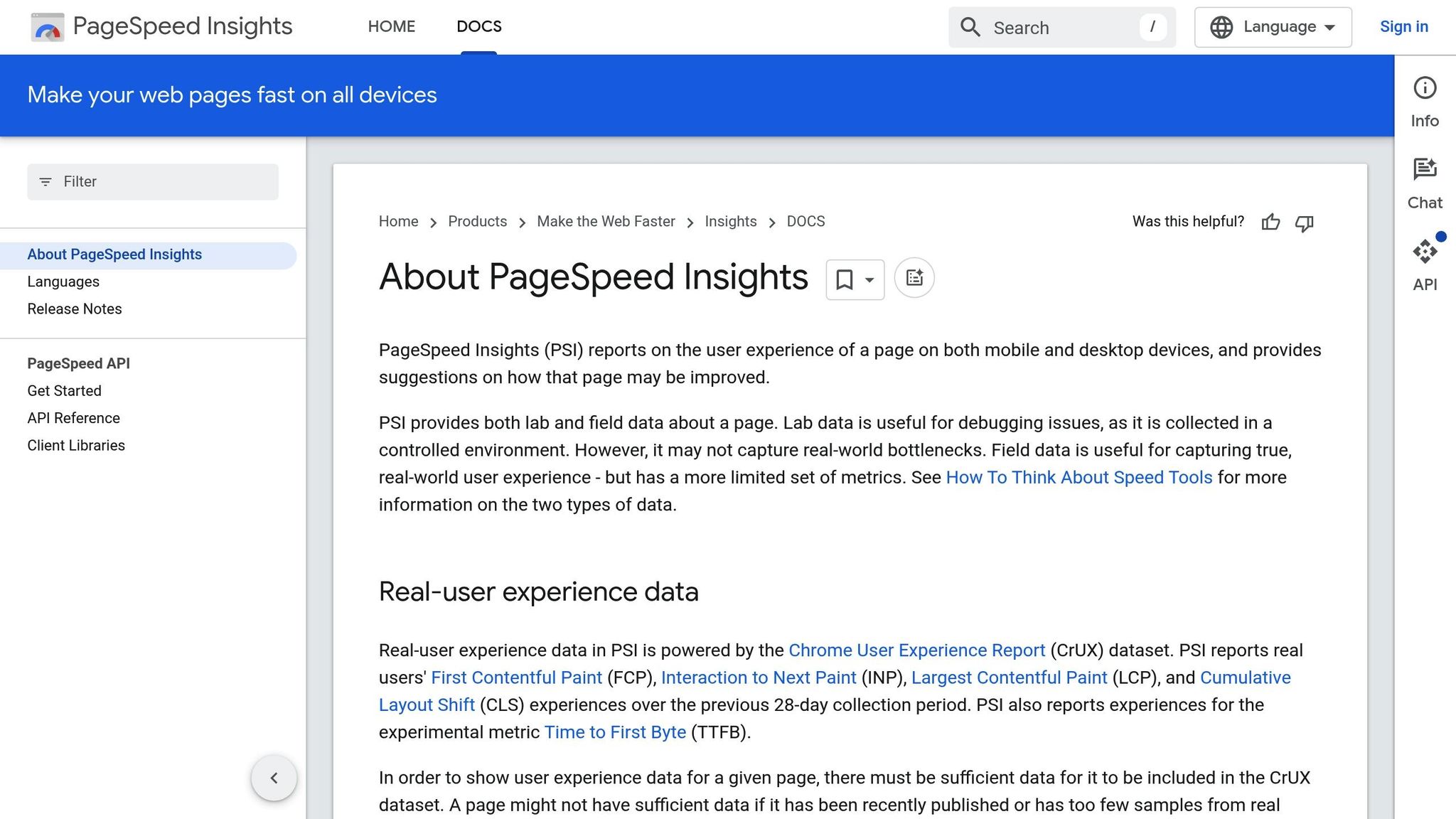
Head to pagespeed.web.dev. Enter your website’s URL, choose the Mobile option, and analyze the results. You’ll see both lab and field data, including Core Web Vitals scores.
Key metrics to pay attention to:
- First Contentful Paint (FCP): Measures how quickly the first piece of content is visible.
- Largest Contentful Paint (LCP): Tracks when the largest visible content loads.
- Cumulative Layout Shift (CLS): Monitors visual stability.
- First Input Delay (FID): Measures how fast your site responds to user interactions.
These metrics directly impact your site’s mobile search visibility.
Understanding Speed Metrics
Here’s a quick overview of the key metrics and their benchmarks:
| Metric | Ideal Score | What It Measures |
|---|---|---|
| LCP | ≤ 2.5s | Time for the largest visible content to load |
| FID | ≤ 100ms | Time it takes for the page to respond to user input |
| CLS | ≤ 0.1 | Ensures the page layout doesn’t shift unexpectedly |
| TTI | ≤ 3.8s | Time it takes for the page to become fully interactive |
When testing, consider factors like network speed (e.g., 3G/4G), CPU performance, cache status (first-time vs. returning visitors), and real user data.
Steps to Improve Speed
-
Optimize Images
- Use responsive images with
srcsetandsizes. - Convert images to WebP format but provide backups for unsupported browsers.
- Enable lazy loading for images that appear below the fold.
- Compress images to reduce file size without compromising quality.
- Use responsive images with
-
Streamline Code
- Minify CSS, JavaScript, and HTML to remove unnecessary characters.
- Eliminate unused code to improve efficiency.
- Use critical CSS to prioritize above-the-fold styling.
- Defer loading for non-essential JavaScript.
-
Implement Caching
- Set browser caching headers to store assets locally.
- Use service workers for offline functionality.
- Leverage a CDN to serve content faster.
- Preload key assets to speed up loading times.
-
Optimize Server Settings
- Enable HTTP/2 or HTTP/3 for faster data transfer.
- Use GZIP compression to reduce file sizes.
- Minimize Time to First Byte (TTFB) for quicker server responses.
- Use DNS prefetching to speed up external resource loading.
Regular testing across different devices and networks is essential to keep your site running smoothly. Use tools like Search Console Mobile Tests to monitor and maintain performance over time.
sbb-itb-608da6a
Search Console Mobile Tests
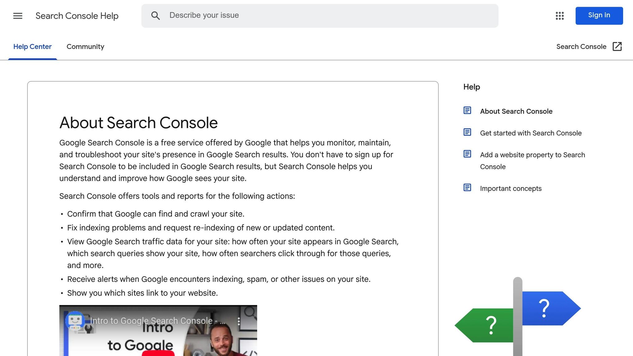
Search Console works alongside tools like Google’s Mobile-Friendly Test and PageSpeed Insights to give you detailed, real-time insights into how your site performs on mobile devices. It also keeps track of mobile usability issues across your website, helping you stay on top of any problems.
Mobile Report Location
To access the Mobile Usability report, head to the Experience section in Search Console. This report provides an overview of mobile usability issues, trends over time, specific page problems, and real-time validation updates.
Common Mobile Display Issues
Search Console highlights several key mobile display problems that can negatively affect your site’s SEO:
| Issue | Description | Impact on SEO |
|---|---|---|
| Viewport Configuration | Missing or incorrect viewport meta tag | High – Prevents proper scaling on mobile devices |
| Text Size | Fonts are too small to read on mobile screens | Medium – Can lead to higher bounce rates |
| Clickable Elements | Buttons or links are too close together | High – Makes user interaction difficult |
| Content Width | Content exceeds screen width, requiring horizontal scrolling | High – Hurts user experience |
| Flash Usage | Flash content that mobile devices can’t display | Critical – Content won’t appear at all |
Once issues are identified, take the following steps to address them.
Steps to Resolve Issues
-
Review and Fix
- Open the Mobile Usability report to see which pages are affected.
- Issues are categorized by severity, with sample URLs provided for reference.
- Adjust the viewport settings as needed (refer to earlier guidelines).
- Make sure touch targets like buttons and links are spaced appropriately for mobile users.
- Use flexible width values like percentages or "vw" instead of fixed pixel sizes.
- Replace any outdated Flash content with HTML5 alternatives.
-
Validate and Monitor
- Use the "Validate Fix" button in Search Console to recheck your updates. Results typically appear within 1-2 weeks.
- Keep an eye on the number of "Valid" pages in the report.
- Check your mobile traffic metrics to see if user engagement improves.
Extra Testing Methods
In addition to using tools like Google’s Mobile-Friendly Test and Search Console, other testing methods can help you fine-tune your website’s mobile SEO. These methods give you a broader understanding of how your site performs on different devices and under varying conditions.
Device Testing
Testing on actual devices is one of the best ways to check your site’s mobile performance. Use a mix of devices to cover:
- Various screen sizes
- iOS and Android operating systems
- Browsers like Chrome, Safari, and Firefox
Focus on key areas such as:
- Text readability and image scaling
- Accessibility of touch targets
- Navigation ease
- Usability of form fields
- Ensuring layouts don’t overflow or break
Browser Testing Tools
Many desktop browsers include built-in tools for testing mobile performance. Here’s a quick look at some popular ones:
| Browser | Tool Name | Features |
|---|---|---|
| Chrome | DevTools Device Mode | Simulates screen sizes, throttles networks and CPUs |
| Firefox | Responsive Design Mode | Custom viewports, touch simulation, rotation testing |
| Safari | Responsive Design Mode | Preset iOS devices, orientation changes, user agent switching |
How to Use Chrome DevTools
- Press F12 or right-click and select "Inspect."
- Click the mobile device icon or press Ctrl + Shift + M.
- Choose a device preset or enter custom dimensions.
- Enable network throttling to simulate different connection speeds.
These tools are a great way to test how your site behaves in different user scenarios, complementing physical device testing.
Other Testing Options
For more thorough testing, consider these additional methods:
1. Cross-browser Testing
Test your site on multiple browsers at the same time using remote device labs. This helps uncover any browser-specific display or functionality issues.
2. Automated Testing
Use automated tools to monitor mobile compatibility. These tools can check for:
- Media query breakpoints
- Proper handling of touch events
- Optimized resource loading
3. Progressive Enhancement Testing
Ensure your site remains functional even under less-than-ideal conditions, such as:
- When JavaScript is turned off
- If images fail to load
- When custom fonts are unavailable
- If certain CSS features aren’t supported
These methods help create a more reliable and user-friendly mobile experience.
OneNine Mobile SEO Services

OneNine uses thorough testing and advanced website management to ensure success in mobile SEO. Their mobile optimization services help websites align with today’s mobile SEO standards.
Website Management Features
OneNine monitors and optimizes performance through:
- Daily speed tests with automatic adjustments
- Screenshot monitoring every 3 hours
- Load time optimization using AWS hosting and CloudFront CDN
- Mobile-first responsive design for seamless functionality
Client Ernest Chapman shared:
After OneNine took over one of my client’s website portfolios, we’ve seen each site’s speed increase by over 700%. Load times are now around a second
Business Solutions
OneNine tailors mobile SEO services for platforms like WordPress, Shopify, Laravel, and Webflow.
| Feature | Advantage |
|---|---|
| Speed Optimization | Faster, smoother mobile experiences |
| Responsive Design | Consistent performance across devices |
| Lead Generation | Higher conversion rates |
| Security Monitoring | Safer transactions and data protection |
Jake Loeffler highlighted:
OneNine has done a fabulous job re-creating and designing our out-of-date website. It is now performing great on mobile, while generating and converting leads
Ongoing SEO Support
OneNine provides continuous support with:
- Real-time performance tracking
- Dedicated account management
- Technical assistance
- Mobile compliance checks
Shawn Hussain noted:
OneNine manages our entire portfolio of websites across our physical and e-commerce businesses. We’ve been impressed by their responsiveness, attention to detail, and commitment to our success
Carolyn Boubekeur added:
OneNine offers outstanding website management with a focus on efficiency and attention to detail. Their timely responses and precision lead to high-quality results, allowing us to concentrate on our key operations
Summary
Main Points
To evaluate your mobile SEO effectively, rely on these tools:
- Mobile-Friendly Test: Assesses responsive design, text readability, and tap target spacing.
- Speed Testing: Evaluates load times, server response, and resource use.
- Search Console: Identifies mobile usability issues and tracks crawling behavior.
These tools provide actionable insights to improve your mobile SEO strategy.
Action Items
-
Establish a Testing Routine
Regularly test your site for mobile-friendliness, page speed, and crawl status. -
Focus on Technical Improvements
Optimize images, use proper viewport tags, simplify CSS/JS, and ensure touch targets are easy to use. -
Create a Monitoring Plan
- Use Search Console to check mobile usability regularly.
- Conduct full-site mobile crawls at intervals.
- Perform quarterly mobile SEO audits.
Consistent testing and updates will help maintain strong mobile performance across devices.


