

Picking the best image formats for web performance isn't about finding a single magic bullet. It's really a balancing act. You have to weigh modern, high-speed options like WebP and AVIF against the old reliable formats like JPEG and PNG, which work everywhere. The right choice always comes down to what the image actually is and what you need it to do.
Why Your Image Format Choice Matters
Choosing the right image format is a surprisingly big deal. It has a direct impact on your site's speed, how users feel when they browse it, and even your SEO. Every single image, from a big, splashy hero photo down to a tiny logo, needs a bit of thought. The format dictates its file size, visual quality, and whether you can use cool features like transparency or animation.
It all comes down to a classic trade-off: looks versus speed. A huge, crystal-clear photo might be gorgeous, but if it makes your page take forever to load, people will get frustrated and click away. In fact, data shows that just a one-second delay in page load can slash conversions by 7%. A smart image strategy is non-negotiable for keeping users happy and engaged.
Understanding the Key Players
Web image formats basically fall into a few groups, and each has its own strengths. Knowing when to use which one is the key to making the right call.
- JPEG (Joint Photographic Experts Group): This has been the king for photographs and other complex images for decades. Its "lossy" compression is fantastic for shrinking file sizes on realistic pictures with millions of colors.
- PNG (Portable Network Graphics): When you need a transparent background for things like logos, icons, or charts, PNG is your go-to. Its "lossless" compression keeps sharp lines and text perfectly crisp without any quality drop.
- WebP: Developed by Google, this is a modern powerhouse. It offers much better compression than both JPEG and PNG, meaning you get smaller files at the same visual quality. It also supports transparency and animation.
- SVG (Scalable Vector Graphics): Unlike the others, SVGs aren't made of pixels. They're based on code, making them perfect for logos and icons. You can scale them to any size imaginable without them ever getting blurry, and the file sizes are usually tiny.
This chart really drives home just how much smaller the file sizes can get when you compare the most common formats.
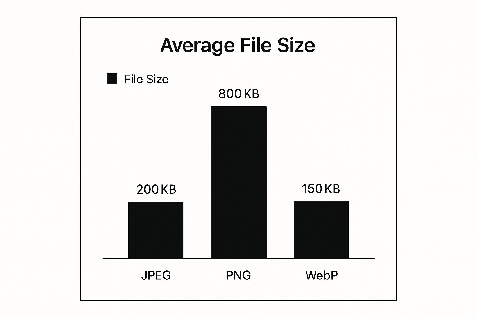
You can see right away that WebP offers some serious savings over JPEG, and the difference with PNG is even more dramatic.
A Quick Comparison of Web Image Formats
To help you decide at a glance, here’s a simple table breaking down where each format truly excels.
| Format | Best For | Key Feature |
|---|---|---|
| JPEG | Photographs and complex, realistic images. | Universal browser support. |
| PNG | Logos, icons, and graphics with sharp lines. | Lossless quality & transparency. |
| WebP | A modern replacement for JPEG and PNG. | Superior compression. |
| SVG | Logos, icons, and simple illustrations. | Infinitely scalable (vector). |
This gives you a solid starting point for picking the right tool for the job.
If you're a WordPress user, getting a handle on how to manage your media library can make a huge difference in site performance. For a deeper dive, check out these WordPress image optimization best practices to really make your images fly.
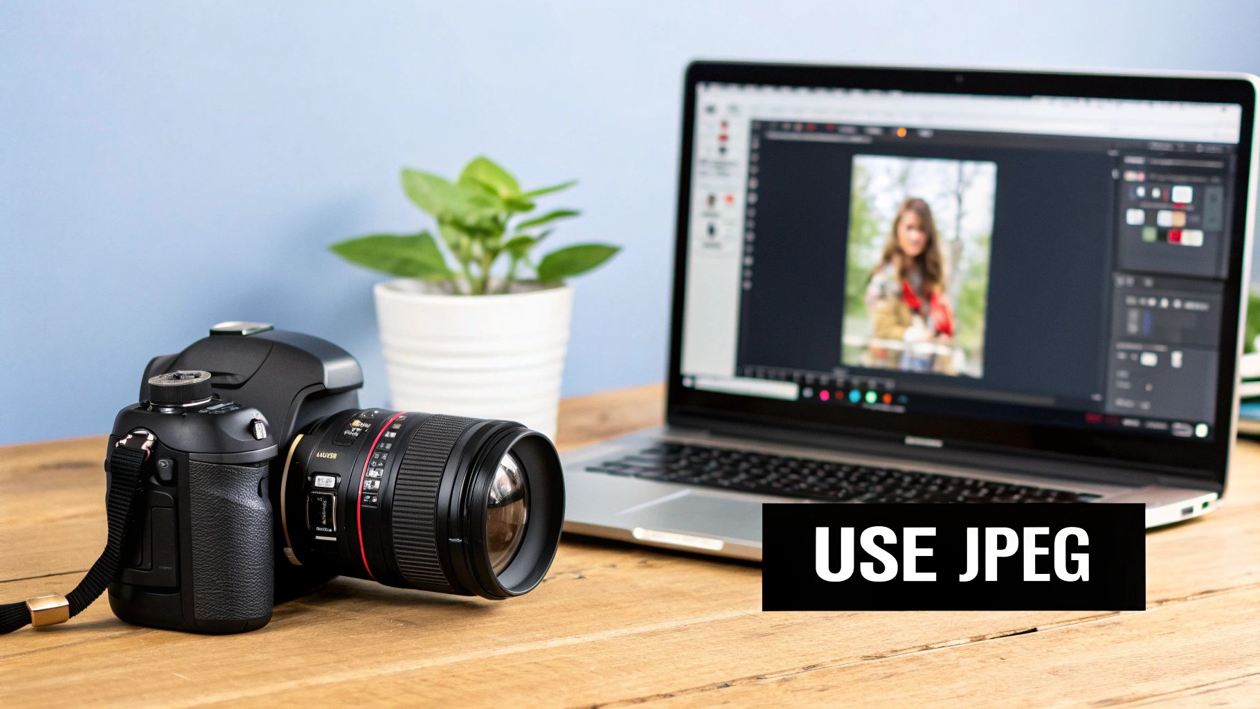
JPEG: The Unquestioned King of Web Photos
Even with a constant stream of new image formats, JPEG is still the bedrock of the web. Its incredible longevity isn't by chance. It was designed from the ground up for one specific job: handling the complex, colorful world of photographs. From a jaw-dropping hero image to a gallery of product shots, JPEG is almost always the most sensible and dependable option.
The magic behind it is lossy compression. A digital photo is just a massive grid of millions of tiny, colored pixels. JPEG’s clever algorithm looks at this grid, finds subtle shifts in color and brightness that our eyes can’t really detect, and throws that non-essential data away. The result is a much, much smaller file that downloads in a snap.
This smart compression is why JPEG is one of the best image formats for websites filled with photos. While newer formats might squeeze files down even more, JPEG’s universal browser support is its killer feature. Literally every browser, from the latest Chrome to ancient relics like Internet Explorer, knows how to display a JPEG. That guarantees everyone sees your images exactly as you intended.
The Trade-Off: Quality vs. File Size
Of course, that powerful lossy compression comes with a catch. Since it permanently discards image data, you're always making a trade-off between file size and image quality. If you compress it too much, you’ll get a tiny file, but you'll also start seeing ugly compression "artifacts"—things like blotchy colors or blocky-looking textures, especially around sharp lines.
The key is finding the sweet spot. Your goal isn't to crush the file down as small as it can go. It's about reducing the size just enough that the quality loss is completely invisible to the average person looking at it on their screen.
This is exactly why JPEG is a terrible choice for graphics with sharp lines, like logos or diagrams with text. The compression will make those crisp edges look soft and blurry. JPEGs also don't support transparency, so you can't use them for images that need to sit on top of different colored backgrounds. You can get a deeper dive into how lossy and lossless compression affect website speed in our other guide.
When Should You Use JPEG?
So, when is JPEG the right tool for the job? It really shines in a few key areas.
- Photographs and Realistic Images: This is JPEG's home turf. For anything with rich color gradients and complex textures—portraits, landscapes, product photos—it delivers fantastic results at a great file size.
- Hero Banners and Big Backgrounds: When you need a massive, eye-catching image to lead your page, JPEG's compression keeps it from slowing down the initial load time.
- Image Galleries: If you run an e-commerce store or a portfolio, you're displaying tons of images. Using well-optimized JPEGs is critical for keeping the page light and fast.
Even with newer formats on the scene, JPEG's reign continues. As of 2025, an astounding 74% of all websites use JPEGs, proving just how reliable and effective it is. Its deep-rooted legacy and universal support mean it’s not going anywhere anytime soon.
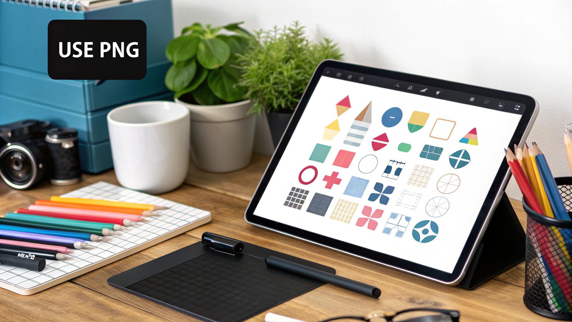
When to Use PNG for Flawless Transparency
While JPEGs are fantastic for photos, PNG (Portable Network Graphics) is the undeniable champion for images that need perfect clarity and, most importantly, a transparent background. The format is built on lossless compression, which means it holds onto every single pixel from the original file. No data is ever thrown away, no matter how many times you edit and save the image.
This makes PNG one of the best image formats for web content where every detail counts. We’re talking about things like logos, icons, user interface elements, and detailed charts or diagrams. With a PNG, sharp lines stay perfectly sharp, and solid colors remain flat and uniform without the splotchy artifacts that JPEG compression can create.
But the real magic of PNG is its sophisticated handling of transparency. It's not just a simple on-or-off switch like you get with GIFs. PNGs support alpha channel transparency, giving you 256 different levels of opacity. This ranges from completely see-through to completely solid, allowing for beautifully smooth edges and realistic semi-transparent effects like soft drop shadows.
Key Insight: Alpha transparency is the secret sauce that lets a logo with rounded corners or intricate cutouts blend seamlessly into any website background—whether it's a solid color, a gradient, or even a photograph.
PNG-8 vs. PNG-24: The Vital Difference
When you save a PNG, you’ll often see two main options: PNG-8 and PNG-24. Knowing which one to pick is key to striking the right balance between image quality and file size.
-
PNG-8: Think of this as the lightweight version. It’s limited to a palette of just 256 colors (much like a GIF) and only supports basic, 1-bit transparency, where a pixel is either fully transparent or fully opaque. This makes it a great choice for simple graphics with a limited color range because the files are much smaller.
-
PNG-24: This is the heavyweight. It can display a massive 16.7 million colors and supports the full alpha channel transparency we just discussed. For high-quality logos, icons with drop shadows, or any graphic needing smooth, semi-transparent edges, PNG-24 is what you want. The only downside is a significantly larger file size.
Here’s a quick breakdown of how they stack up:
| Feature | PNG-8 | PNG-24 |
|---|---|---|
| Color Support | Limited (256 colors) | Full (16.7 million colors) |
| Transparency | Basic (On/Off) | Full Alpha Channel |
| File Size | Smaller | Larger |
| Best For | Simple graphics, basic icons | High-quality logos, complex graphics |
Clear Scenarios for Choosing PNG
The decision to use PNG usually comes down to situations where pristine quality and transparency are non-negotiable—even if it means a slightly larger file.
Here are the perfect times to use a PNG:
- Logos and Icons on Your Website: Your company logo needs to look sharp and clean everywhere. PNG ensures it renders perfectly, especially when placed over different colored backgrounds.
- Graphics Containing Text: For any image that includes text, like a promotional banner or part of an infographic, PNG's lossless nature keeps the lettering crisp and readable.
- Detailed Diagrams and Screenshots: When you need to show software screenshots or complex technical illustrations, PNG preserves all the fine details without introducing any blur.
Ultimately, PNG is the format you reach for when image fidelity can't be compromised. While its files are often heavier than JPEGs or modern formats like WebP, the pristine quality and seamless transparency it offers are absolutely worth it for the right job.
Adopting WebP for Modern Web Optimization
As the web pushes for ever-faster speeds and better performance, WebP has really come into its own. Developed by Google, WebP isn't just another image format on the pile; it’s a huge leap forward in optimization, essentially blending the best parts of JPEG and PNG into one powerhouse format.
WebP’s biggest win is its ridiculously efficient compression. It handles both lossy and lossless methods, giving you the flexibility to tackle any kind of image you throw at it. For photos, its lossy compression can create files much smaller than comparable JPEGs without any obvious quality loss. For graphics, its lossless compression keeps every pixel perfect just like a PNG, but at a fraction of the file size.
This dual-threat capability makes WebP a fantastic all-in-one solution for any site trying to slash load times and cut down on data usage.
The Best of Both Worlds
What makes WebP so compelling is its support for features that used to force you into using separate, less efficient formats. Unlike a standard JPEG, WebP can handle alpha channel transparency, letting you create images with complex, semi-transparent backgrounds—something previously reserved for PNG-24 files.
On top of that, WebP supports animation. This makes it a high-quality, lightweight replacement for the ancient GIF format. A single WebP file can do the job of a JPEG photo, a transparent PNG logo, and an animated GIF, which really simplifies your asset workflow. This versatility is a huge reason why it’s often called one of the best image formats for web development.
Key Takeaway: Think of WebP less as a replacement for a single format and more as a potential replacement for most of them. Its ability to handle lossy, lossless, transparent, and animated images makes it an incredibly efficient choice for streamlining a website's assets.
By 2025, WebP had firmly established itself as a top-tier format, thanks mostly to its superior compression. Data from early 2025 shows that WebP images deliver a file size reduction of roughly 25-34% compared to JPEGs or PNGs of similar quality. That’s a game-changer for site performance. Smaller files mean faster page loads and less bandwidth eaten up, a critical advantage for users on slower mobile connections. You can dig deeper into these impressive image optimization findings from Tiny-img.com.
Overcoming Browser Support Hurdles
For a long time, the biggest roadblock to adopting WebP was spotty browser support. Thankfully, those days are pretty much behind us. Today, all major modern browsers—Chrome, Firefox, Safari, and Edge—fully support WebP right out of the box. Compatibility is really only a concern for ancient, unsupported browser versions that make up a tiny sliver of web traffic.
Even so, it's still smart to provide a fallback for the few users on those older systems. The best and most SEO-friendly way to handle this is with the HTML <picture> element. This tag lets you list multiple image sources, and the browser simply picks the first one it can display.
Here’s what that looks like in practice, providing a JPEG as a fallback:

With this code, modern browsers grab the much smaller image.webp file. Older browsers that don't understand WebP will just skip that line and load the image.jpg source instead. It’s a clean, simple way to give everyone the fastest experience possible without leaving anyone behind.
Using SVG for Infinitely Scalable Graphics
Unlike the other formats we've looked at, SVG (Scalable Vector Graphics) is in a completely different league. It's not a raster format built from a grid of pixels. Instead, an SVG is a vector-based image constructed entirely with XML code. This core difference gives it a unique superpower.
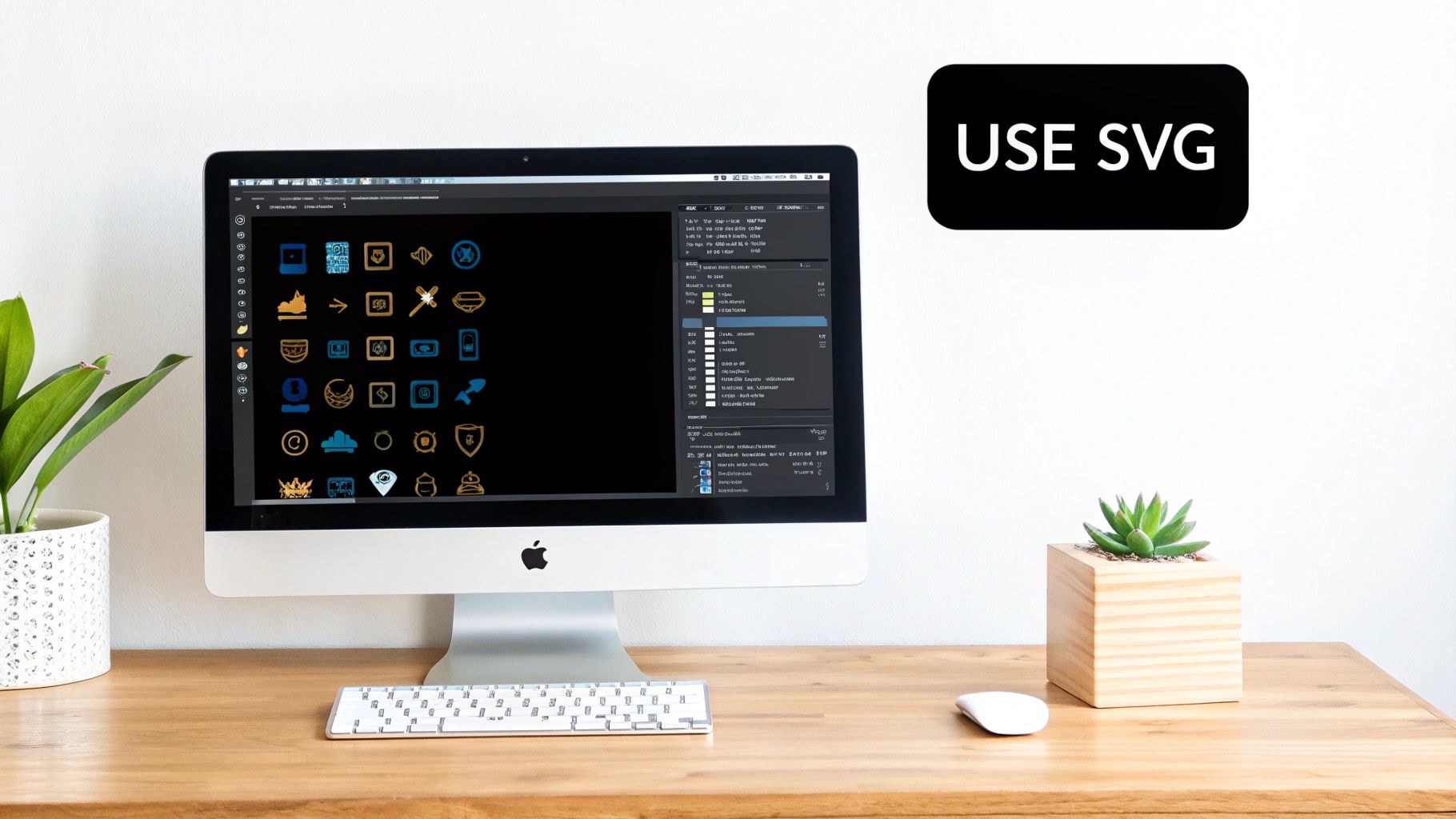
Because an SVG is just code that describes shapes, lines, and colors, you can scale it to any size imaginable—from a tiny icon to a giant billboard—without losing an ounce of quality. There are no pixels, so nothing can get blurry or blocky. This makes it the go-to choice for logos, icons, and any graphic that needs to stay perfectly crisp on every single screen, especially high-resolution ones.
Beyond Scalability: The Power of Code
The fact that SVGs are code-based opens up a world of possibilities that pixel formats like JPEG or PNG simply can't match. For simple graphics, the file sizes are often incredibly small, which helps your pages load faster.
Even better, SVGs are interactive and accessible right out of the box. Any text inside an SVG is real text, meaning it can be selected, copied, and indexed by search engines. It’s also readable by screen readers, which is a massive win for both SEO and web accessibility.
Key Advantage: SVGs can be directly styled and manipulated with CSS and JavaScript. You can change colors on the fly, animate different parts, or make them respond to user actions like clicks and hovers—all without swapping out image files.
This unlocks a level of dynamic design that's just not possible with a static image. Think about an icon that changes color when you hover over it or a diagram that animates as you scroll down the page. With SVG, that’s all handled directly in the browser with a bit of code.
When Is SVG the Right Choice?
Deciding to use an SVG is usually a straightforward call. It’s not the right tool for detailed photographs, but for certain jobs, it's absolutely unbeatable.
Here are the ideal scenarios for using SVG:
- Logos and Brand Marks: Your logo has to look sharp everywhere. An SVG guarantees it will be pristine on a tiny mobile screen, a 4K monitor, and everything in between.
- Website Icons: For interface elements like menu icons, search magnifiers, or social media links, SVGs provide flawless rendering at incredibly small file sizes.
- Simple Illustrations and Diagrams: When you need to display charts, graphs, or line-art illustrations, SVGs offer perfect clarity and can even be made interactive.
SVG is supported by all modern browsers, making it a reliable and future-proof format for your most important visual assets. By choosing SVGs for your logos and icons, you ensure they stay sharp and scalable while keeping your site fast and accessible.
Exploring Next-Generation and Niche Formats
While JPEG, PNG, and WebP are the workhorses of the web, a few other formats fill some important gaps. Think of them as specialized tools. They solve very specific problems or are pushing the boundaries of what's possible with image compression, giving you more options for creating fast and beautiful websites. Knowing when to pull these out of your toolbox is a sign of a savvy web creator.
One of the most famous niche formats is the GIF (Graphics Interchange Format). It's ancient by web standards, but it's still king for one very specific job: short, looping animations. For the simple, silent clips and memes that populate the internet, its rock-solid, universal browser support is unbeatable.
Introduced way back in 1987, the GIF is limited to a palette of just 256 colors, which is why it looks so grainy and pixelated for photos. But for simple graphics with flat colors and, of course, animations, its lossless compression and small palette do the trick. If you're curious about the history of these formats, WebdesignerDepot has a great overview.
AVIF: The Next Frontier in Compression
Looking to the future, AVIF (AV1 Image File Format) is quickly becoming the heir to WebP’s throne. It's backed by a powerhouse alliance of tech companies like Google, Apple, and Netflix, and for good reason: it offers a massive leap forward in compression. In practice, AVIF can produce files that are significantly smaller than WebP at the same visual quality, sometimes shaving off 50% or more compared to a standard JPEG.
This incredible efficiency makes AVIF a game-changer for performance-critical websites, especially those serving tons of images. Slicing image sizes in half directly translates to faster page loads and lower bandwidth usage, which can seriously improve website loading speed and make a huge difference for users on mobile connections.
Key Takeaway: AVIF delivers the best compression you can get today. Its main hurdle is that browser support, while growing fast, isn't quite as universal as WebP yet. This means you'll need to use a fallback (like WebP or JPEG) inside a
<picture>element for older browsers.
APNG: A High-Quality GIF Alternative
Before WebP and AVIF came along with their fancy animation features, another format tried to fix the GIF’s biggest flaw: its terrible color limitation. APNG (Animated Portable Network Graphics) does exactly what you'd think—it adds animation capabilities to the standard PNG format.
Here's why you might choose APNG over a GIF:
- Full Color Support: It supports 24-bit color, meaning 16.7 million colors, just like a normal PNG. This lets you create rich, high-fidelity animations without the ugly color banding you often see in GIFs.
- Alpha Transparency: APNG also handles 8-bit alpha transparency, which allows for smooth, semi-transparent overlays in your animations—something GIFs just can't do.
The big trade-off is file size. APNG files are usually much larger than their GIF counterparts. And with modern formats like animated WebP and AVIF offering far better compression, APNG has been relegated to a niche role. Still, if you absolutely need lossless animated quality with full transparency, it remains a solid choice.
This table breaks down when to use these specialized formats.
| Format | Primary Use Case | Key Strength | Main Weakness |
|---|---|---|---|
| GIF | Simple, looping animations (memes) | Universal browser support | Limited to 256 colors |
| AVIF | High-performance photo delivery | Superior compression over WebP | Less mature browser support |
| APNG | High-quality lossless animations | Full color and alpha transparency | Larger file sizes |
By knowing when and where to deploy these specialized and emerging formats, you can fine-tune your site’s performance and visual appeal, making sure you’re always using the best tool for the job.
Answering Your Image Format Questions
When you're trying to build a fast, beautiful website, it's easy to get tangled up in questions about image formats. It's one of those areas where the technical details really matter for both performance and visual quality. Let's clear up some of the most common questions I hear from people.
A big one is: "Can't I just use one image format for everything?" You could, but you absolutely shouldn't. If you saved everything as a JPEG, your logos and graphics would look fuzzy and unprofessional. If you used only PNG, your photos would have massive file sizes, bringing your site to a crawl.
The secret is to use a mix of formats. Think of it like a toolkit—you need the right tool for the right job. Use JPEGs for photos, PNGs for graphics with transparency, and SVGs for crisp logos and icons. This strategy is the foundation of good image optimization.
How to Use WebP or AVIF Without Breaking My Site
Adopting newer formats like WebP or AVIF sounds intimidating, but it's actually pretty simple to do it safely. You don't have to risk showing a broken image to someone on an older browser.
The best way to handle this is with the HTML <picture> element. It's designed for this exact scenario. You basically give the browser a list of image options, and it picks the first one it knows how to display.
Here’s how you’d set it up:
- Offer AVIF first, since it gives you the biggest file size savings.
- Next, list WebP as a great fallback for browsers that support it but not AVIF.
- Finally, include a classic JPEG or PNG. This is your safety net, guaranteeing that no matter what, the image will show up for every single visitor.
The good news? Most modern content management systems (CMS) and image optimization plugins can do all this for you automatically. They handle the conversion and generate the right code, so you get all the performance benefits without the manual work.
Is Converting JPEGs and PNGs to WebP Worth It?
For almost every website out there, the answer is a resounding yes. This is especially true for your most visited pages. The main payoff is a huge cut in page load times, which makes for a much better user experience and can even give your SEO a nice little boost.
It might sound like a huge project, but you can make it manageable. Start with the images that have the biggest impact—the ones on your homepage, service pages, or most popular blog posts. Bulk conversion tools and plugins can make quick work of the process.
The bandwidth savings and the snappier feel of your site are well worth the effort. For a complete walkthrough, you can learn more about how to optimize website images for peak performance in our detailed guide. It's a small change that can make a massive difference.


