

Creating your brand guidelines is a three-part journey. First, you dig deep to define your brand’s soul—its mission, vision, and core values. Next, you build its visual identity with logos, colors, and fonts. Finally, you shape its verbal identity through voice, tone, and key messaging. This whole process turns abstract feelings into a concrete playbook, making sure every single interaction with your brand feels intentional and consistent.
What Are Brand Guidelines and Why Do They Actually Matter?
Think of your brand guidelines as your company's personality captured on paper. It's so much more than a stuffy rulebook; it’s a strategic tool that defines your brand’s identity, character, and how it shows up in the world. This document becomes the single source of truth for everyone, from your in-house marketing team to freelance designers and external partners, ensuring you're all telling the same story.
Without this guide, your brand can quickly become a mess. The voice on social media might sound completely different from your website copy, and your colors might get used inconsistently. It all leads to a fractured and confusing experience for your audience.
Consistency is how you build trust. When people see the same logo, colors, and tone of voice everywhere—on your site, your socials, your packaging—they start to form a connection. This familiarity builds recognition, and recognition eventually turns into loyalty. For creators especially, this is the foundation for building a business that truly reflects your brand and creating a true community, not just a follower count.
The Business Case for Brand Consistency
Getting your brand guidelines right has a real impact on your bottom line. Consistent branding can seriously lift revenue, and a huge part of that is because 81% of consumers say they need to trust a brand before they even think about buying from them. You build that trust through reliable, predictable interactions—which are pretty much impossible without a clear guide.
Let's just look at the visuals. A signature color can boost brand recognition by up to 80%. Something as simple as using your logo the same way every time has been linked to a 23% revenue increase. But here's the catch: while 95% of companies have guidelines, only about a quarter of them actually stick to them, leaving a ton of potential growth untapped. This shows that just having the document isn't enough; you have to live and breathe it to see results. You can find more stats like these in the latest 2025 branding statistics on ExplodingTopics.com.
Brand guidelines aren't about restriction; they're about empowerment. They give your team a solid framework so they can be creative and innovative within a world that is consistently and recognizably yours.
Investing the time to create a thorough brand guide is truly an investment in your company’s future. It’s not just a "nice-to-have" document.
Before we dive deeper, here's a quick look at the core elements you'll be building.
| Key Components of Effective Brand Guidelines |
| :— | :— | :— |
| Component | Purpose | Example |
| Brand Foundation | Defines the "why" behind your brand. | Mission, vision, core values, brand personality. |
| Visual Identity | Establishes the look and feel of your brand. | Logo usage, color palette, typography, imagery style. |
| Verbal Identity | Sets the tone and style of all written communication. | Brand voice, tone, messaging pillars, grammar rules. |
| Application Rules | Shows how to apply the guidelines in real-world scenarios. | Social media templates, presentation decks, ad layouts. |
This table covers the essentials, and a solid guide will touch on all of these to create a truly cohesive brand experience.
Ultimately, your guidelines accomplish a few critical things:
- Ensures Cohesion: It aligns everything from a quick social media post to a major ad campaign under one unified identity.
- Builds Trust and Recognition: Consistency makes your brand memorable and reliable, which helps you build stronger relationships with your audience.
- Increases Efficiency: It gives clear answers to designers, writers, and marketers, which means less guesswork and a faster creative process.
- Protects Brand Integrity: It stops people from using the wrong logo, writing off-brand messages, and other small mistakes that can slowly weaken your brand's value.
Defining Your Brand Core Before You Design

It’s tempting to jump straight into the fun stuff—logos, colors, fonts. But before you touch a single pixel, you have to look inward. The best, most enduring brand guidelines are always built on a solid foundation of purpose and identity.
Skipping this step is like trying to build a house without a blueprint. Sure, you might end up with four walls and a roof, but it’s probably not going to be stable or make much sense. This foundational work is what separates a brand that just exists from one that truly means something. It's the "why" that fuels everything else.
Uncovering Your Brand's Mission and Vision
Think of your mission and vision statements as your brand’s North Star. They aren’t just corporate fluff for an "About Us" page; they're the principles that should steer every single decision you make.
Your mission statement is all about the here and now. It clearly states what your company does, who you do it for, and what sets you apart today. It’s your purpose, boiled down to its essence.
On the flip side, your vision statement is your future-cast. It’s the big, audacious goal. It describes the world you’re trying to create and what you hope to become.
A powerful mission keeps you grounded in your daily purpose, while a compelling vision pulls you toward what's possible. You absolutely need both to build brand guidelines that last.
Get your team together and start hashing out the answers to these questions:
- For your Mission: What problem are we solving right now? Who are we really helping? And how are we doing it differently than anyone else?
- For your Vision: If we knock it out of the park, what does the world look like in 5-10 years? What’s the ultimate impact we want to leave behind?
Defining Your Guiding Core Values
Once you know your destination, you need to define the principles that guide your journey. These are your core values—the non-negotiable beliefs that shape your brand's personality and actions.
Don’t settle for generic words like "integrity" or "innovation." Push deeper. Translate those ideas into actual behaviors. For example, instead of just "Customer-Focused," you might define it as: "We listen more than we talk and always seek to understand what our customers truly need before we offer a solution."
Try this simple exercise with your team:
- Brainstorm: Get a ton of ideas out there. What values feel true to who you are as a company?
- Group and Refine: Start clustering similar ideas and finding common themes.
- Prioritize: Now for the hard part. Whittle that list down to the 3-5 core values that are absolutely essential to your identity.
- Define: For each value, write a short, clear sentence explaining what it looks like in action at your company.
This makes your values real and tangible, embedding them into your culture and, ultimately, into your brand.
Creating Detailed Audience Personas
You can’t build a brand that people love if you don’t actually know those people. That’s where audience personas come in. A persona is a semi-fictional profile of your ideal customer, pieced together from real-world data and research.
Go beyond the basics like age and location. The real gold is in the psychographics:
- What are their deepest goals and aspirations?
- What are their biggest headaches and frustrations?
- What truly motivates them to make a choice?
- Where do they hang out online?
Developing 2-3 detailed personas helps you build real empathy. As you create your guidelines, you can constantly ask, "Would Sarah, the busy project manager, connect with this tone of voice?" or "Does this image speak to David's struggle to find reliable tools?" This keeps your brand relevant and personal. For a deeper dive, check out our guide on how to create a brand identity that truly connects.
Crystallizing Your Brand Personality and Value Proposition
Okay, let's tie all of this together into two final, critical statements that will directly shape your design and messaging.
First is your brand personality. If your brand walked into a room, who would it be? The wise mentor? The witty best friend? The sophisticated expert? Pick a few key adjectives—like "Bold, Witty, and Empathetic"—to nail down this character.
Next is your value proposition. This is a crystal-clear statement explaining the real-world benefit someone gets from choosing you. It has to quickly answer the question, "Why should I care?" A great value proposition is specific, focused on a customer’s pain, and shines a spotlight on what makes you different.
Once you’ve defined your mission, vision, values, personas, personality, and value proposition, you’ve built your strategic foundation. This is the soul of your brand. Now, and only now, are you ready to start building the visual and verbal identity that will bring it to life.
Building Your Visual Identity System
Once you’ve nailed down your brand's soul—its purpose and values—it’s time to give it a face. This is the fun part: translating all those ideas into tangible, visual assets that people will see, recognize, and ultimately, connect with. Every logo, color, and photo you choose has to work together to tell the same consistent story.
This isn't just about making things look pretty. It's about creating a coherent visual language. When you get this right, your visual identity becomes an instant shortcut for your audience, telling them who you are and what you're about without you having to say a word.
Your Logo and Its Variations
Think of your logo as the anchor of your entire visual identity. It's the single most recognizable piece of the puzzle, so it needs to be memorable, simple, and incredibly versatile. A truly great logo looks just as sharp on a massive billboard as it does as a tiny favicon in a browser tab.
But in reality, one logo is never enough. To work effectively across different platforms and contexts, you need a full logo system.
- Primary Logo: This is your main event, the go-to version you'll use most often. It’s typically the full lockup, with both an icon and your brand name.
- Secondary Logo: Think of this as a stacked or horizontal alternative to your primary logo. It gives you flexibility when the main version just doesn't fit right.
- Submark or Icon: This is the most distilled version of your logo, often just a symbol or monogram. It's perfect for things like social media profile pictures, app icons, or as a subtle design element in a pattern.
By clearly defining these variations in your brand guidelines, you empower your team to apply your branding correctly in any situation. No more awkward stretching or bad resizing that waters down your brand's impact.
The Psychology of Your Color Palette
Color is one of the most potent tools in your branding arsenal because it hits people on a subconscious, emotional level. The right palette can instantly set a mood and reinforce your brand's personality. A serious financial firm might lean on a stable, trustworthy blue, while a new wellness brand would likely go for calming, natural greens.
Your brand guidelines need to make this official by documenting the exact color codes to ensure consistency absolutely everywhere.
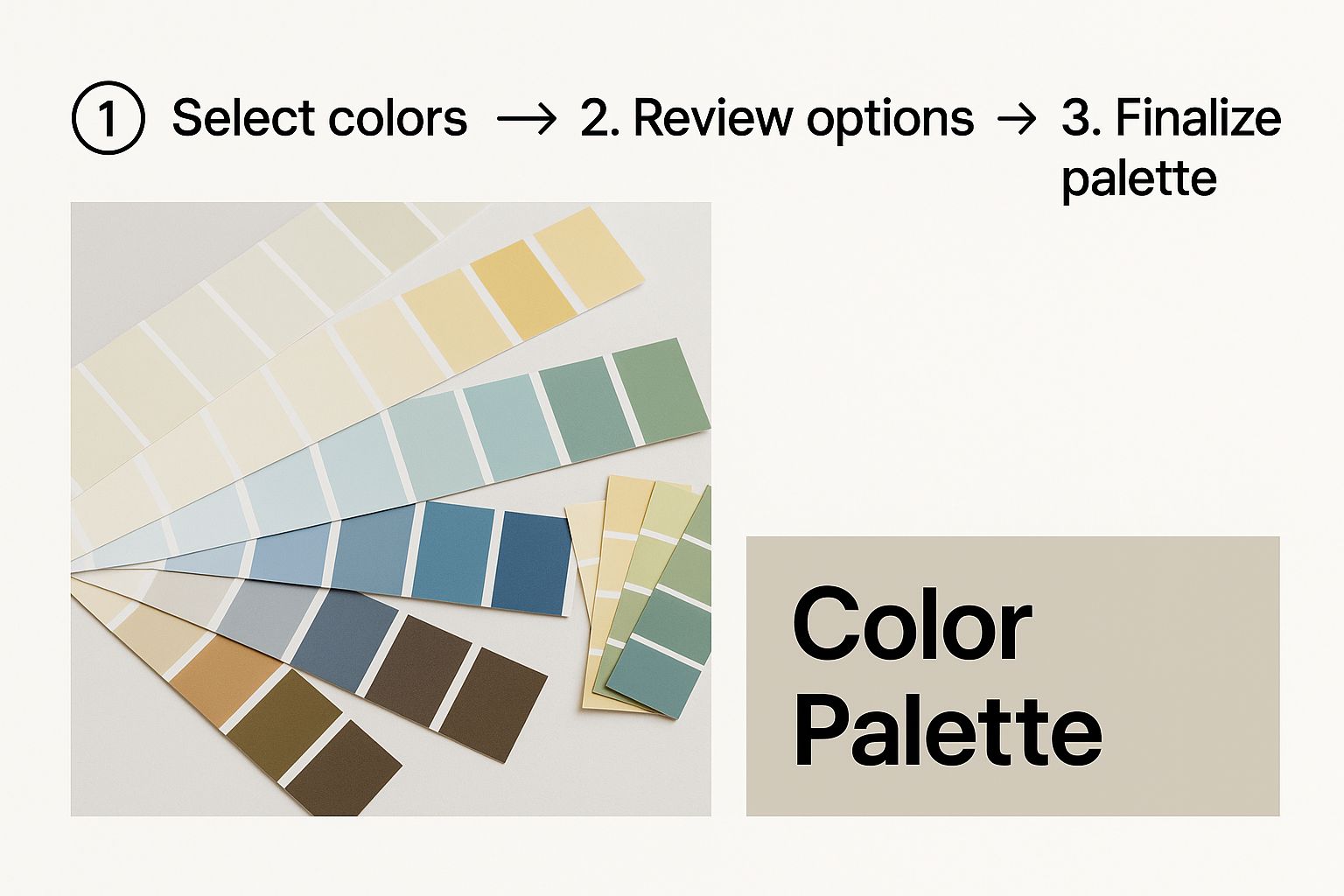
Documenting these specific shades is non-negotiable. It’s how you guarantee that the blue on your website is the exact same blue on your printed brochures.
A well-rounded palette usually includes:
- Primary Colors: 1-3 core colors that people will most associate with your brand.
- Secondary Colors: 2-4 complementary colors you can use for accents, calls-to-action, or to highlight key information.
- Neutrals: Your workhorse shades like white, black, grey, or beige that create balance and make your content easy to read.
Key Takeaway: For every single color, your guidelines must specify the exact codes for different uses: HEX for web, RGB for screens, and CMYK for anything printed. This eliminates all guesswork and guarantees absolute consistency.
Before we move on, let's put this into a practical checklist. It's a simple tool I use to make sure nothing gets missed when defining a brand's visual world.
Visual Identity Checklist
| Visual Element | Key Considerations | Status (To Do / Complete) |
|---|---|---|
| Logo System | Are primary, secondary, and submark versions defined? | |
| Color Palette | Are HEX, RGB, and CMYK codes specified for all colors? | |
| Typography | Is there a clear hierarchy for headings and body text? | |
| Imagery Style | Is the mood, subject, and composition clearly described? | |
| Iconography | Is there a consistent style for all icons? | |
| Brand Patterns | Are there any official patterns or textures to be used? |
This simple table helps keep the process organized and ensures you've covered all your bases before finalizing the guidelines.
Establishing Your Typography Hierarchy
The fonts you choose say a whole lot about your brand. A classic serif font can communicate tradition and authority, while a clean sans-serif font often feels modern and much more approachable. As you learn how to create brand guidelines, getting your typography right is a critical piece of the puzzle that truly shapes your brand’s voice.
Your guide should establish a crystal-clear hierarchy for text:
- Headings (H1, H2, H3): Usually a distinct, bold font that grabs attention and gives your content structure.
- Body Text: A highly readable font chosen for longer blocks of text. Clarity, not flair, is the priority here.
- Accent Font (Optional): You might want a third font to use sparingly for things like pull quotes or special callouts.
By clearly defining font families, sizes, weights (like bold or regular), and line spacing, you ensure all your written communications—from your website to a PowerPoint deck—look and feel like they came from the same brand. And don't forget the technical side; your team needs to understand how to choose the right website hosting to make sure your custom fonts and other assets actually load correctly for visitors.
Defining Your Imagery Style
Finally, your guidelines need to set the standard for all photography, illustrations, and graphics. Are you a brand that uses bright, vibrant photos of people collaborating? Or do you prefer moody, atmospheric shots of landscapes? Are your illustrations minimalist and line-based, or are they bold and colorful?
This section should be full of visual examples showing what to do and—just as importantly—what to avoid. Define the mood, subject matter, composition, and even the lighting style. This is how you make sure every single image reinforces your brand’s personality. As you build out your asset library, knowing the technical specs, like the best Pinterest Image Dimensions, will ensure everything you post looks professional and is optimized for each platform.
Crafting Your Brand Voice and Messaging

If your brand’s visuals are the clothes it wears, its voice is its personality. You can have a killer logo and a stunning website, but if the words you use feel generic or, worse, out of sync with your visuals, the whole experience falls apart.
This is where your brand voice and messaging come in. Without a clear voice, your communication becomes a mess of contradictions. One tweet might sound playful and casual, while a blog post published the same day is stiff and formal. This kind of inconsistency is jarring for your audience and quietly chips away at the trust you’re trying to build.
Your brand voice isn't just about what you say. It’s about how you say it—the distinct, consistent personality that people hear in every headline, email, and customer support chat.
Defining Your Unique Brand Voice
Let's start by nailing down your brand's verbal identity. A good place to begin is by looking back at the brand personality you’ve already defined. Is your brand a wise mentor? A quirky best friend? A no-nonsense expert? Your voice should be a direct extension of that character.
One of the most effective ways I've found to make this tangible is using a simple "This, Not That" framework. It's brilliant because it removes all the guesswork and gives your team a clear set of guardrails.
For instance, a project management software company might define its voice like this:
- Confident, not arrogant.
- Helpful, not condescending.
- Clear and direct, not robotic or overly technical.
- Witty, not silly.
This approach works wonders because it provides clear boundaries. It tells your writers what to aim for and, just as importantly, what to steer clear of.
A consistent brand voice makes your company feel more human. It transforms your brand from a faceless entity into a personality that customers can recognize and connect with on an emotional level.
Once you’ve locked in these characteristics, the next step is to show them in action. Your brand guidelines need real-world examples. Show what the voice looks like in a welcome email, a social media caption, and even a boring old error message. This practical application is what makes the difference between a guide that collects dust and one that people actually use.
Distinguishing Between Voice and Tone
People often use voice and tone interchangeably, but they're two different things. Getting this distinction right is crucial for effective communication.
Think of it this way: your brand voice is your fixed personality. It’s who you are at your core, and it doesn't change day-to-day. If your voice is witty and confident, it will always be witty and confident.
Tone, on the other hand, is the emotional inflection you apply to that voice in different situations. It adapts to the context, just like how your own personality remains the same, but your tone shifts when you're celebrating with a friend versus offering condolences.
Here’s a practical look at how a brand’s tone might adapt:
| Situation | Tone to Apply | Example |
|---|---|---|
| Celebrating a customer's success story on social media | Enthusiastic and celebratory | "We're blown away by what you've accomplished! Let's give a huge round of applause for an amazing milestone!" |
| Writing a technical support article | Clear, direct, and patient | "To resolve this issue, follow these three steps. First, navigate to your account settings." |
| Apologizing for a service outage | Empathetic and sincere | "We understand how frustrating this is and sincerely apologize for the disruption. Our team is working to fix it now." |
By defining both voice and tone in your guidelines, you’re giving your team the tools to navigate any communication challenge with consistency and a bit of emotional intelligence.
Building Your Core Messaging Pillars
Beyond how you sound, your guidelines need to solidify what you say. This means documenting your core messaging pillars—the key talking points that everyone in the company should know backward and forward.
These pillars are the foundation of your brand story, ensuring your sales team, marketers, and support specialists are all on the same page.
Here are the essential messaging elements to lock down:
- Company Boilerplate: This is your go-to, one-paragraph summary of what your company does, who you help, and what makes you different. It's a must-have for press releases, company profiles, and event bios.
- Tagline: A short, memorable phrase that captures the soul of your brand promise. Think Nike's "Just Do It." or Apple's "Think Different." It's your brand's battle cry.
- Value Propositions: These are clear, powerful statements explaining the benefits of your products or services. You'll want one for your overall brand and then specific ones for each of your key offerings.
Documenting these pillars ensures that everyone is aligned on how to talk about your brand’s most critical messages. This alignment is a huge part of creating brand guidelines that truly work and deliver real results.
Putting Your Guidelines into Practice
So, you’ve captured your brand’s personality and designed its look and feel. Now for the make-or-break part: creating the rulebook that keeps everything consistent. This is where your brand guide goes from being a collection of cool assets to a practical playbook your whole company can actually use.
Without clear, easy-to-follow rules, even the most beautiful logo or perfect color palette can get butchered in the wild. That leads right back to the inconsistency you’re trying to eliminate. The goal here is to take the guesswork out of the equation so your team, freelancers, and partners can represent the brand with confidence every single time.
Setting Clear Rules for Your Logo
Your logo is your brand's most recognizable handshake, so you have to protect its integrity. It’s not enough to just dump the files in a folder and call it a day. You need to spell out exactly how it should—and, more importantly, should not—be used.
Get the basics down first:
- Minimum Size: What's the absolute smallest your logo can appear before it becomes an unreadable blur? Define this for both digital (in pixels) and print (in inches or millimeters).
- Clear Space: Think of this as a protective, invisible bubble around your logo. You need to mandate a specific amount of empty space on all sides to keep it from getting crowded by other text or graphics. Let it breathe.
- Color Variations: Show which logo version to use on light, dark, and busy photo backgrounds. Make sure you provide approved black, white, and full-color options.
But here’s the pro tip: show, don’t just tell. This is where a visual gallery of "don'ts" becomes your best friend.
Visual Examples Are Non-Negotiable: A single page showing a stretched, squashed, recolored, or rotated logo is infinitely more powerful than a paragraph of text explaining the same rules. It gives people instant clarity and leaves no room for interpretation.
Demonstrating Color and Typography in Action
You’ve already picked your colors and fonts, but how do they look when they’re actually doing their job? This section of your guidelines needs to bring them to life with real-world mockups.
Create a few simple examples showing how your primary, secondary, and neutral colors play together. Mock up a website hero section, a social media post, or a business card. This helps designers immediately grasp the intended balance and feel of your color system without having to guess.
The same idea applies to your typography. Don't just list font names and sizes. Put them in context:
- Show what an H1 headline looks like layered over a typical background image.
- Mock up a short paragraph of body text to demonstrate its readability and spacing.
- Create a sample call-to-action button to show how an accent font or color should be used.
These mockups are the difference between a guide that gets used and one that collects dust. They turn abstract rules into tangible, easy-to-copy examples, which is a game-changer when you're figuring out how to create brand guidelines that people will actually follow.
The Strategic Value of Enforcement and Accessibility
Crafting these rules is only half the job. Their real power is unlocked through consistent use and making them easy for everyone to find. A well-enforced brand guide cuts down on endless back-and-forth, speeds up project timelines, and frankly, saves a ton of money.
It takes 5-7 impressions for someone to even begin to remember a brand, and consistency is what makes each of those impressions count. In fact, companies with consistent brand presentation see an average revenue increase of up to 20%. These guidelines also become a huge asset for onboarding new hires, getting them up to speed from day one. It all builds trust, which is non-negotiable when 81% of consumers say they need to trust a brand before they'll buy from it. You can see more on the impact of branding statistics on Shapo.io.
For your guidelines to be a living tool, they need to be managed properly. Looking into some essential document management best practices will ensure your guide is always up-to-date and accessible to the people who need it.
Ultimately, making your guidelines an active part of your company culture is how you ensure all that hard work pays off. Strong website management and proven tactics for success are also part of this, ensuring your brand's most important digital storefront is always perfectly on-point.
Common Questions About Brand Guidelines
https://www.youtube.com/embed/xJBAHJjb6Pk
Once you’ve put together a draft of your guidelines, the real-world questions start popping up. How do you actually share this thing? How often does it need a refresh? Getting these practical details right is just as crucial as nailing down your colors and brand voice.
Turning your guide from a static document into a living, breathing tool that actively shapes your brand means tackling these challenges head-on. Let's dig into some of the most common questions that come up when creating and implementing brand guidelines.
PDF vs. Live Web Page: Which Is Better?
This is the classic debate, and honestly, the right answer really depends on your team's size and how you work. A traditional PDF is simple, self-contained, and easy to fire off in an email. For a small team or a one-time project with an external partner, a PDF can work just fine.
But a live web page or a dedicated digital brand hub has some serious advantages, especially as you grow. It becomes the single source of truth—no more digging through emails trying to figure out if you have version 3.2 or 4.0 of the logo pack. Digital guides can also be interactive, letting people copy color codes with a single click or download the exact file they need right then and there.
For any growing brand that needs to stay flexible and share assets without a fuss, a digital brand guideline is the way to go. It kills the problem of outdated assets and makes sure everyone, everywhere, has the most current information.
For most modern companies, a digital-first approach is just more scalable and way more user-friendly in the long run.
How Often Should We Update Our Guidelines?
Your brand guidelines should never be a "set it and forget it" project. It’s better to think of them as a dynamic part of your business, something that needs to evolve as your company grows and the market shifts.
While there’s no magic number, a good rule of thumb is to schedule a formal review at least annually. This is the perfect time to ask the big questions: Does our messaging still connect? Does our visual style feel fresh or dated? Do we need to add guidelines for new channels, like TikTok or a company podcast?
Beyond that yearly check-up, you’ll also want to revisit the guidelines whenever:
- Your company makes a major strategic pivot, like expanding into a new market.
- You launch a big new product or service.
- You start hearing consistent feedback that parts of the brand just feel "off" or outdated.
When you treat your guidelines as an evolving resource, you ensure your brand stays relevant and effective.
How Do We Get the Team to Actually Use Them?
Ah, the million-dollar question. You can have the most beautiful brand guidelines in the world, but they're completely useless if they just collect digital dust. Getting people on board is all about communication, accessibility, and buy-in from the top.
First off, give your guidelines an official launch. Don't just quietly email a link. Make an event out of it, even if it's just a quick company-wide meeting. Explain the why behind the guide and show people how it makes their jobs easier, not harder.
Next, you have to make the guidelines impossible to miss.
- Centralize Everything: Put them somewhere obvious and easy to find, like your company intranet homepage or a pinned channel in Slack.
- Integrate Them: Link to the guidelines directly from project briefs, new-hire onboarding checklists, and creative kickoff meeting agendas.
- Appoint Champions: Find a few "brand champions" on different teams. These are the go-to people who can answer questions and gently nudge colleagues in the right direction when they see a logo being stretched.
Ultimately, when the team sees leadership consistently referencing and following the guidelines, it sends a clear message. It shows that brand consistency isn't just a marketing task—it's everyone's responsibility.
At OneNine, we know a powerful brand is built on a solid digital foundation. If you need help bringing your brand to life with a stunning website and a seamless management strategy, we’re here to be your partner. Learn more about our website design and development services.


