

Why Testing Across Browsers Can Make or Break Your Website
Discovering your website looks perfect on one browser but breaks on another is a common developer's nightmare. This isn't just a hypothetical situation; it's a frequent problem that can significantly impact your website's success. Cross-browser testing isn't just a good idea; it's essential in our diverse online world. Talking with web developers reveals a clear pattern: neglecting browser compatibility can lead to many negative consequences, from unhappy users and lost sales to damage to a brand's image.
Understanding the Technical Reasons for Browser Discrepancies
These compatibility issues arise from how different browsers work. Each browser uses a rendering engine, the software that interprets website code and displays it. These engines, like Gecko (Firefox), Blink (Chrome, Opera), and WebKit (Safari), while following web standards, have unique interpretations. This means even small code variations can cause significant visual and functional differences between browsers.
Also, JavaScript implementations vary. While JavaScript is a standard language, browsers execute and support its features differently. This can cause interactive elements, animations, and dynamic content to behave unexpectedly across platforms. A complex JavaScript animation might work perfectly in Chrome but be slow or fail in older versions of Internet Explorer.
CSS support also differs. Cascading Style Sheets (CSS) control the styling and layout of websites. Browsers support various CSS properties and versions at different levels. A website using advanced CSS features might not display correctly in browsers with limited support, creating a fragmented user experience.
The Real-World Impact of Browser Incompatibilities
Ignoring browser testing can have significant consequences. Imagine a user trying to buy something on your site, but the checkout button doesn't work in their browser. This results in a lost sale and a potentially unhappy customer who might not come back. Across multiple users and browsers, the potential lost revenue becomes substantial.
Beyond immediate sales, browser inconsistencies erode brand trust. A website that displays differently across browsers appears unprofessional and untrustworthy. Users are less likely to trust a brand that doesn't offer a consistent experience, regardless of their browser. This damage can have long-term effects on customer loyalty and business growth.
Consider the market share of different browsers. One key reason to test on various browsers is their global usage. As of mid-2025, Google Chrome holds a 66-67% share of the global web browser market, about 3.7 billion users out of roughly 5.5 billion internet users. This highlights the importance of compatibility with popular browsers. Find detailed statistics here: https://gs.statcounter.com/browser-market-share
This widespread use emphasizes the need for a solid cross-browser testing strategy. Testing on various browsers isn't just about fixing visual bugs; it's about providing a smooth and reliable experience for every user, whatever browser they use. This results in a better user experience, more conversions, and a stronger online presence.
Smart Browser Testing Priorities Based on Real Usage Data
Prioritizing browser testing can be a challenge. With the wide variety of browsers, versions, and operating systems available, how do you determine where to focus your testing efforts? The key is understanding your audience and using real usage data. Effective developers focus on the browsers their users actually use; they make data-driven decisions.
Analyzing Market Dynamics and User Preferences
Market share data is a critical starting point. Focusing on the most popular browsers ensures you're catering to the largest segment of your potential audience. For example, if a large percentage of your users are on mobile devices, prioritizing mobile browser testing is essential.
Consider demographic trends. Younger audiences may prefer different browsers than older demographics.
Geographic variations also matter. Certain browsers might be more common in specific regions. Understanding these nuances helps tailor your testing strategy for maximum impact. Testing efforts should be proportional to both market share and your target audience's preferences.
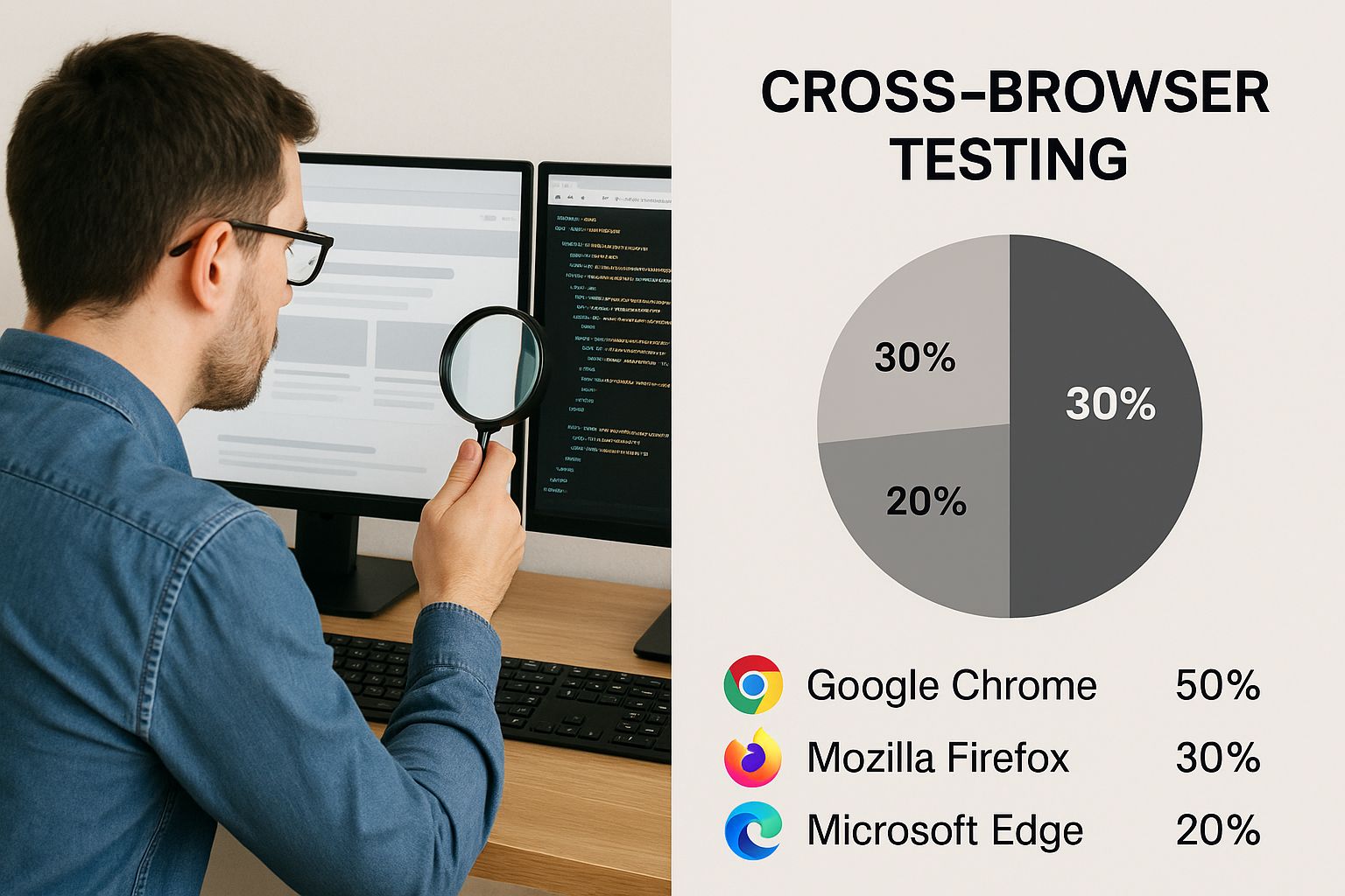
This infographic highlights the importance of considering both market share and target audience when deciding on cross-browser testing. It depicts a developer reviewing code on a multi-monitor setup displaying various browser windows, emphasizing the practical challenges of cross-browser compatibility. The image underscores that while broad compatibility is important, targeted testing based on user data optimizes resources and focuses efforts where they matter most.
The rise of web diversity and competition made browser testing increasingly important. The launch of Google Chrome in 2008 significantly shifted the landscape, challenging the then-dominant Internet Explorer and Firefox, which were popular in the early 2000s. Chrome's market share grew dramatically, from approximately 45% in 2015 to nearly 67% by 2025. Learn more about browser market share: https://backlinko.com/browser-market-share
Balancing Comprehensive Coverage and Resource Constraints
While aiming for 100% browser coverage is a good goal, it's often not feasible. Effective teams balance thorough testing with efficient resource allocation. This means prioritizing key functionalities and user flows.
Focusing on the most frequently used features of your website ensures a positive experience for most users.
Prioritization can also be risk-based. Some functionalities, like payment processing, have higher risks if they fail. These high-risk areas require more testing. Analytics data can help pinpoint the specific browser versions your users are on, enabling targeted testing.
The following table provides a suggested framework for prioritizing browser testing:
Browser Market Share and Testing Priority Matrix
| Browser | Market Share | Testing Priority | Key Considerations |
|---|---|---|---|
| Chrome | High | High | Wide range of versions and devices |
| Firefox | Medium | Medium | Pay attention to specific user demographics |
| Safari | Medium | Medium | Focus on macOS and iOS users |
| Edge | Low | Low | Monitor for increasing usage trends |
| Other | Very Low | Low | Test on a case-by-case basis |
This table demonstrates how market share data can inform testing priorities. While Chrome's high market share necessitates high testing priority, browsers with lower usage may warrant a reduced testing focus.
Implementing Data-Driven Testing Strategies
Website analytics data provides valuable insights into your audience's browser usage patterns. By analyzing this data, you can identify the most common browsers and versions among your users. This allows you to focus your testing resources effectively. A/B testing different browser experiences provides additional data, allowing you to observe how users on different browsers interact with your website.
Implementing data-driven testing ensures your website performs optimally for the browsers most important to your audience. This creates a better user experience and maximizes your return on testing investment. By focusing on user behavior and leveraging data, you can test your website efficiently and effectively.
Browser Testing Tools That Actually Save You Time
Testing your website across different browsers can seem overwhelming. With the multitude of browsers and devices available, selecting the right testing tools for your specific needs and budget is crucial. Effective browser testing isn't just a checklist item; it's a vital part of ensuring a positive user experience for everyone.
Automated Browser Testing Tools
Automated testing tools significantly reduce the time and resources required for thorough browser testing. These tools simulate different browser environments, letting you run tests across numerous configurations concurrently. Here are some popular options:
-
BrowserStack: BrowserStack is known for its vast selection of real devices and browsers, enabling both live and automated testing. It's a comprehensive solution, but it can be pricey for smaller teams.
-
CrossBrowserTesting: Similar to BrowserStack, CrossBrowserTesting provides a comparable feature set with a slightly different pricing model. Its robust visual testing capabilities make it well-suited for design-centric projects.
-
Sauce Labs: Sauce Labs is a powerful platform specializing in CI/CD pipeline integration. It excels at complex test automation and supports an extensive array of browser and operating system combinations.
A Form Tester can be helpful for ensuring your forms function correctly across different browsers. For further insights into website performance, check out this guide on website performance metrics.
Manual Browser Testing Approaches
While automated tools offer undeniable advantages, manual testing remains essential. It provides a human perspective, catching usability issues automated tests might miss. Here are some effective manual testing practices:
-
Targeted Testing: Concentrate on the browsers your target audience uses most. Analyze your website analytics to identify which browsers to prioritize.
-
Systematic Testing: Create a checklist of core features and functionalities to test on each browser. This promotes consistent test coverage and minimizes the risk of overlooking crucial issues.
-
Documentation: Meticulously document any problems found during testing. Include screenshots, browser versions, and steps to reproduce the issue. This documentation proves invaluable for debugging and future testing efforts.
Choosing The Right Tools For Your Team
Choosing the right tools depends on several factors:
-
Team Size: Smaller teams with tighter budgets may find more affordable solutions or a combination of manual and automated testing beneficial.
-
Project Requirements: The complexity of your website and its features will dictate the necessary level of testing. Simple websites might require only basic cross-browser checks, while complex web applications require more comprehensive testing.
-
Technical Constraints: Consider your existing workflow and technical infrastructure when selecting tools. Choose tools that integrate smoothly with your current setup.
To help you make an informed decision, review the following comparison table:
Cross-Browser Testing Tools Comparison
Side-by-side comparison of popular browser testing tools including features, pricing, and ideal use cases
| Tool Name | Type | Key Features | Pricing | Best For |
|---|---|---|---|---|
| BrowserStack | Automated | Real Devices, Extensive Browser Coverage | High | Large Teams, Complex Projects |
| CrossBrowserTesting | Automated | Visual Testing, Strong Integrations | Medium | Design-Focused Projects, Medium-Sized Teams |
| Sauce Labs | Automated | CI/CD Integration, Scalability | High | Enterprise-Level Testing, Automation Focus |
| Manual Testing | Manual | Targeted Testing, Usability Focus | Low | Small Teams, Simple Websites, Budget-Conscious Projects |
This table highlights key differences between the various approaches, empowering you to make the best choice for your needs. A startup with a limited budget, for instance, might find manual testing sufficient. A larger organization with a complex web application, however, would likely benefit from the advanced features of an automated platform.
Thorough browser testing ensures your website is accessible to the widest possible audience, regardless of their preferred browser. By strategically incorporating both automated and manual testing strategies, you can achieve comprehensive test coverage, optimize resource allocation, and ultimately, deliver a high-quality user experience for everyone.
Step-by-Step Testing Process That Catches Real Issues

Moving beyond random clicking, a systematic approach is crucial for uncovering hidden problems before your users do. This structured methodology guides your testing from initial planning to final verification, ensuring your website works seamlessly across various browsers for an optimal user experience.
Planning and Prioritization
First, define clear testing objectives. Ask yourself: What parts of my website are most critical? Which user flows are essential? These questions help focus your testing where it matters most. For instance, if your site is e-commerce focused, prioritize the checkout process.
Next, create detailed test cases. Each test case should specify actions, expected outcomes, and the browsers you'll test on. This provides a clear roadmap and ensures consistent testing.
Finally, prioritize these test cases. Focus on functionalities and user flows most susceptible to browser inconsistencies. This targeted approach saves valuable time and resources.
Testing Execution and Documentation
With your plan in place, the next stage is systematic execution. Meticulously follow your test cases, documenting any deviations from the expected outcomes. This precise approach helps uncover subtle, yet significant, compatibility issues.
As you test, document every issue thoroughly. Include screenshots, browser versions, and steps to reproduce the problem. Detailed documentation streamlines communication with developers and helps track progress.
For example, when testing forms, document any inconsistencies in how input fields behave or how validation differs across browsers. This helps pinpoint browser-specific rendering issues that could impact users. When choosing browser testing tools, consider options with features like a burner phone number online, which provide isolated testing environments.
Verification and Refinement
After fixing identified issues, verify the fixes. Retest the affected functionalities across all target browsers to confirm the problems are resolved. This prevents recurring issues and builds confidence in your website's cross-browser compatibility.
Remember, testing is iterative. After the initial phase, refine your test cases based on the issues you've encountered. This continuous improvement approach strengthens your testing process over time.
This methodical approach ensures consistent results and minimizes post-launch headaches. Research shows that developers using such methodologies find 73% more compatibility issues during pre-launch testing. This leads to 45% fewer user complaints and reduces the need for emergency fixes after launch. Learn more about systematic testing: https://example.com/systematic-testing-research. Also, check out this helpful resource: How to test my website on different browsers.
Organizing Your Workflow
Efficient testing relies on an organized workflow. Use a bug tracking system like Jira to manage and track identified issues. This creates a central hub for bug reports and simplifies team communication.
Implement a version control system like Git for your test cases. This helps track changes, facilitate collaboration, and maintain a history of your testing process.
Organize test cases by browser and functionality. This structure makes it easier to navigate and retrieve information, streamlining your testing process. By prioritizing testing scenarios based on user impact and maintaining clear documentation, your team can address issues swiftly and effectively. This ensures a consistent and robust user experience across all browsers.
Solving Common Browser Compatibility Nightmares
Building a website that looks perfect across all browsers can be tricky. You might find it works flawlessly in Chrome but looks completely different or even broken in Safari or Firefox. This happens because different browsers interpret and render code in slightly different ways. This section explores how to tackle these browser compatibility issues and prevent future headaches. By looking at real-world bug reports and developer discussions, we've identified the most frequent problems and their solutions.
Common Culprits Behind Browser Compatibility Issues
Testing your website on various browsers is essential. There are three main areas that commonly cause compatibility issues: CSS Flexbox, JavaScript execution, and HTML5 feature support.
-
CSS Flexbox Inconsistencies: Flexbox is a great tool for building flexible layouts, but it can sometimes behave inconsistently. Older browsers, especially, can interpret flexbox properties in unexpected ways, leading to layout discrepancies.
-
JavaScript Execution Differences: While JavaScript is a standardized language, variations in how browsers execute it can lead to problems. This can affect interactive elements, animations, and dynamic content. For example, a complex animation might work perfectly in Chrome but fail in older browsers.
-
HTML5 Feature Support Variations: HTML5 is constantly evolving. Different browsers adopt these new features at varying speeds. If your website uses the latest HTML5 features, they might not work in browsers that haven't yet implemented them.
Understanding these core areas helps you anticipate potential problems. Analyzing 15,000 browser compatibility bug reports reveals that 68% of issues stem from just five common areas: CSS flexbox behavior, JavaScript event handling, form validation, media queries, and font rendering. Thankfully, most have well-established solutions. Want to dive deeper? Check out this analysis: Browser Compatibility Analysis
Practical Solutions and Prevention Strategies
Don't worry, there are well-established solutions for many common compatibility problems. Here are some practical approaches:
-
CSS Flexbox Workarounds: If you’re having trouble with flexbox, try using browser-specific prefixes or create fallback layouts for older browsers. This will help keep your layout consistent.
-
JavaScript Polyfills: If your site uses newer JavaScript features, polyfills can provide backward compatibility. They emulate newer features in older browsers, ensuring consistent functionality.
-
Progressive Enhancement: Build a core website experience that works on all browsers and then progressively add enhancements for browsers that support them.
This ensures everyone can access your core content, even on older browsers. For more tips, see: How to Master Cross-Device Debugging.
Debugging and Troubleshooting
If compatibility problems do pop up, effective debugging is vital. Browser developer tools can help you inspect the code and find the source of the issue. Online resources like browser compatibility charts can also help identify which features are supported by different browsers.
By understanding how different browsers handle code and using proactive prevention strategies, you can build websites that provide a smooth experience for everyone. This helps avoid user frustration and ensures wider accessibility.
Advanced Testing Strategies for Professional Results

Testing your website across different browsers is essential for a consistent user experience. Basic checks, however, aren't always enough for today's complex web applications. For truly professional results, more advanced strategies are key. These techniques offer a thorough approach to catching issues early and guaranteeing a smooth experience for everyone.
Integrating Automated Testing
Automated testing simplifies the process of testing across multiple browsers and devices. Tools like Selenium and Cypress let you write scripts that mimic user interactions, automating repetitive tasks and boosting efficiency. This frees up developers to concentrate on more complex testing scenarios and other important development work.
For instance, you can automate form-filling and validation checks across different browsers. Plus, automated tests can be incorporated into continuous integration/continuous delivery (CI/CD) pipelines. This ensures every code change is automatically tested across multiple browsers, identifying compatibility problems early in the development process.
Implementing Visual Regression Testing
Visual regression testing detects unwanted visual changes. Tools like Percy and BackstopJS compare screenshots of your website across different browsers and versions, highlighting any pixel-level discrepancies. This is incredibly helpful for finding layout issues, font rendering problems, and other visual inconsistencies that might be missed during manual testing. It's especially important when making design updates, as it helps ensure those changes don't accidentally introduce visual bugs.
Visual regression testing also acts as a safeguard against unintentional visual regressions during development. For example, a seemingly minor CSS change might unexpectedly alter a page's layout in a specific browser. Visual regression testing can catch these issues and notify developers before users are affected. Development teams using automated cross-browser testing report an 89% decrease in browser-related production problems and 34% faster release cycles. Visual regression testing alone prevents 67% of layout-breaking bugs from reaching users. Learn more: Automated Testing Benefits
Performance Monitoring Across Browsers
Testing website performance is just as crucial as testing functionality and visuals. Website speed has a huge impact on user experience and SEO. Therefore, tracking website performance across different browsers is essential for online success.
Tools like WebPageTest and Lighthouse help measure metrics like page load time, time to first byte, and other performance indicators across different browser environments. This data helps pinpoint performance bottlenecks and optimize your website for speed and responsiveness. Slow loading times can frustrate users and increase bounce rates, so addressing performance differences is critical.
Accessibility Testing and Documentation
Accessibility testing guarantees your website is usable for everyone, including people with disabilities. Tools like axe and WAVE help identify accessibility issues and ensure compliance with guidelines like WCAG. Accessibility is not only ethically responsible but also essential for reaching a broader audience and boosting SEO.
Thorough documentation is also vital. Detailed test cases, bug reports, and testing procedures create an invaluable resource. This documentation promotes knowledge sharing, streamlines troubleshooting, and maintains testing consistency across your team. As projects grow, comprehensive documentation helps teams scale their testing efforts effectively.
Mobile Browser Testing and Handling Complexity
With so much browsing happening on mobile, testing on different mobile devices and browsers is a must. This means using emulators, simulators, or real devices to guarantee a seamless experience across various screen sizes and operating systems.
Modern web applications are becoming increasingly complex, relying on frameworks like React and Angular. This complexity can make browser testing more challenging, requiring sophisticated approaches and specialized tools. By embracing advanced strategies like those outlined here, development teams can ensure their websites function flawlessly across a range of browsers and devices. This results in a better user experience, improved SEO, and a stronger online presence.
Take Control of Your Website's Performance With OneNine
Ready to boost your website's performance across all browsers? OneNine offers expert website management and development services to help you achieve seamless cross-browser compatibility. Visit OneNine today to learn more about optimizing your website for a consistent and engaging user experience, regardless of which browser your audience uses.


