

Unlocking Seamless Navigation: Exploring the Power of Information Architecture
Effective information architecture (IA) is crucial for positive user experiences. This listicle showcases seven information architecture examples from leading companies like Spotify, Apple, Amazon, Google Maps, BBC, Netflix, and GOV.UK. You'll learn how these organizations structure their websites and apps for effortless navigation, and discover practical takeaways to improve your own designs. Good IA helps users find information quickly and achieve their goals, directly impacting your bottom line.
1. Spotify's Music Navigation System
Spotify, a leading music streaming platform, provides a compelling information architecture (IA) example. With a massive library of millions of songs, podcasts, and audiobooks, Spotify's IA is crucial for enabling users to easily discover and enjoy audio content. It achieves this through a sophisticated system that blends hierarchical structure, personalized recommendations, and flexible navigation paths. This approach allows users to both explore new content and quickly access their favorites, making it a prime example of effective information architecture.
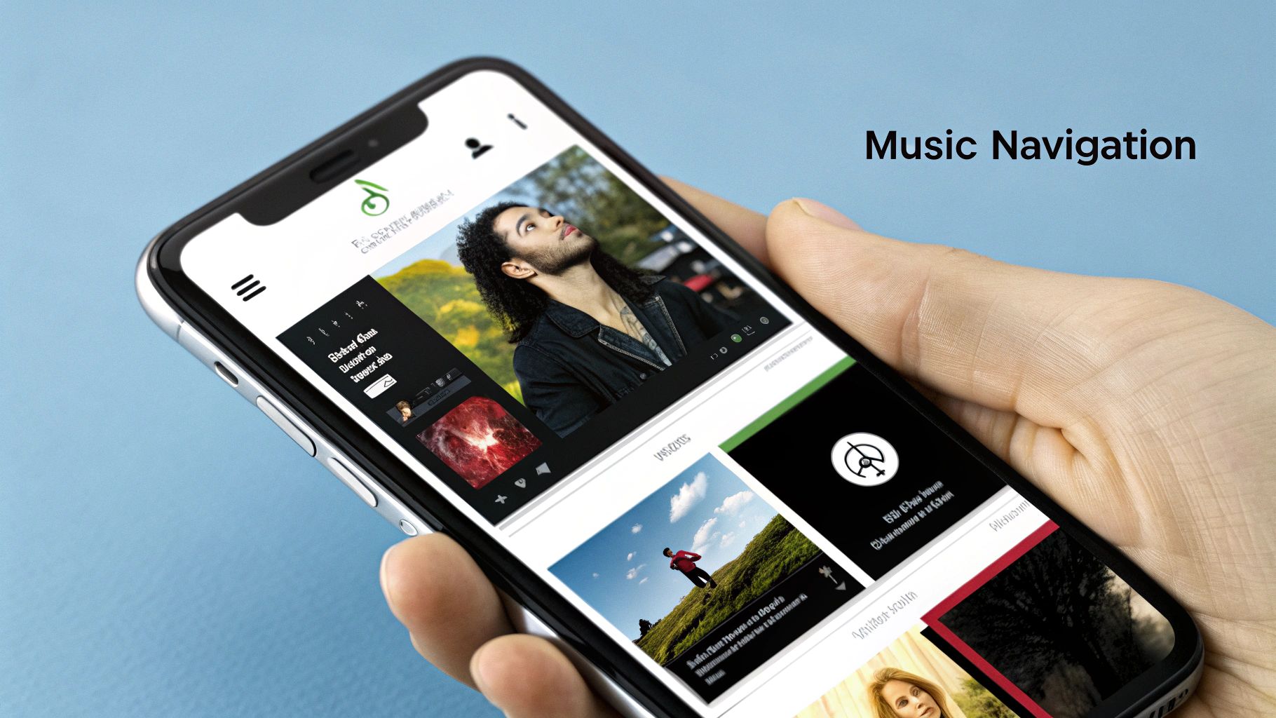
Spotify organizes its massive content library hierarchically, categorizing music by genre, artist, and album. This allows for a logical browsing experience, enabling users to drill down from broad categories like "Rock" to specific subgenres, artists, and finally individual songs. Complementing this structure is a personalized home screen that adapts to individual user listening habits. Features like "Made For You" playlists provide curated recommendations based on listening history, offering a tailored experience that promotes discovery and engagement. Furthermore, Spotify offers multiple navigation paths to reach the same content. Users can search directly for specific artists or songs, browse curated playlists, or explore genre-based categories. This flexibility caters to different user intents, whether they're looking for something specific or simply browsing for new music. The robust search functionality, including faceted search with filters for songs, artists, playlists, and podcasts, further enhances the user experience.
Why Spotify's IA deserves a place on this list: It expertly manages a massive and ever-growing dataset, demonstrating scalability and adaptability crucial for any business dealing with large amounts of information. Its personalized yet structured approach can inspire businesses across various sectors to improve their own information architecture.
Benefits of this approach:
- Scalability: The hierarchical structure efficiently handles millions of content items.
- Dual Functionality: Supports both casual browsing and directed searching.
- Personalization: Tailored recommendations increase user engagement and discovery.
- Clarity: A clear visual hierarchy aids understanding of content relationships.
Pros:
- Effectively scales to handle millions of content items.
- Supports both casual browsing and directed searching.
- Personalization increases user engagement.
- Clear visual hierarchy helps users understand relationships between content.
Cons:
- Can be overwhelming for new users due to the density of features.
- Algorithmic recommendations may create filter bubbles, limiting exposure to diverse content.
- Navigation structure changes frequently, requiring users to relearn.
Examples of Implementation:
- Personalized Playlists: Spotify's 'Made For You' playlists offer personalized recommendations.
- Browse Section: Provides hierarchical genre classification for easy exploration.
- Search Functionality: Offers category filters and suggestions for precise searching.
Tips for Application:
- Study how Spotify balances personalization with opportunities for broader exploration.
- Analyze how content relationships are visually represented and how this clarifies the user journey.
- Observe how Spotify integrates increasing content types (music, podcasts, audiobooks) within a single system. This is valuable for any platform looking to expand its offerings.
Popularized By: Spotify Design Team, influenced by Material Design principles championed by designers like Matias Duarte.
When to Use This Approach: This model is ideal for businesses with large and complex datasets that need to be easily searchable and browsable. This is particularly relevant for e-commerce sites, media libraries, learning platforms, and any platform offering a diverse range of content. Visit Spotify to experience their information architecture firsthand.
2. Apple's iOS Settings Information Architecture
Apple's iOS Settings app is a prime example of a complex hierarchical information architecture in action. It expertly organizes hundreds of system and app settings into a logical, user-friendly structure, making it a valuable information architecture example. This is achieved through a combination of categorization, progressive disclosure, and consistent design patterns, allowing users to easily navigate, locate, and adjust settings without feeling overwhelmed. This approach makes it a strong model for anyone designing systems with a large amount of configurable options.

The iOS Settings app uses a hierarchical structure with clear parent-child relationships between categories. This means settings are grouped under broader categories, and these categories can have subcategories, creating a tiered system. For example, the "Privacy" category contains subcategories like "Location Services," "Camera," and "Microphone." Within each subcategory, you'll find individual settings related to that specific function. This structure allows for scalability, accommodating thousands of settings without sacrificing usability. The consistent pattern of main category → subcategory → individual settings, combined with visual cues like arrows, makes navigation predictable and intuitive. A robust search functionality also allows users to bypass the hierarchy and directly access specific settings.
Features:
- Hierarchical organization with clear parent-child relationships
- Consistent pattern of main category → subcategory → individual settings
- Search functionality for direct access
- Visual indicators (arrows) showing deeper levels
- Grouping of related settings within categories
Pros:
- Scalability: Handles a vast number of settings effectively.
- Prevents Cognitive Overload: Progressive disclosure reveals information gradually, preventing users from being overwhelmed.
- Predictability: Consistent interaction patterns enhance user experience.
- Direct Access: Search empowers users to quickly find specific settings.
Cons:
- Hidden Settings: Deep hierarchies can sometimes bury important settings.
- Navigation Confusion: Multiple navigation paths to the same setting can disorient users.
- Unintuitive Categorization: Some settings might be categorized in unexpected places.
- Scrolling: Lengthy scrolling can be necessary within some categories.
Examples of Implementation:
- The main categorization structure of the iOS Settings app (General, Control Center, Display & Brightness, etc.)
- The organization of individual app permissions within the Privacy section.
- The implementation of the Settings search functionality.
Tips for Implementing this Approach:
- Use the iOS Settings app as a model for organizing complex system configurations.
- Implement a search function to provide direct access when the hierarchy is deep.
- Group related settings together and use clear visual separators between groups.
- Consider providing breadcrumbs or clear navigation paths to prevent user disorientation.
When and Why to Use This Approach:
This hierarchical approach is ideal for managing complex systems with numerous configurable options. It's particularly beneficial for settings menus, administrative dashboards, and any platform requiring organization of a large volume of data or controls. For SMBs, entrepreneurs, marketers, and business owners, adopting this structure for internal tools and platforms can significantly improve team efficiency and reduce confusion. Agencies, CEOs, CMOs, and heads of marketing can leverage this approach to create user-friendly client dashboards or internal management systems. The hierarchical structure, combined with search functionality, caters to both novice and power users, ensuring everyone can easily access and manage settings according to their needs. This approach was popularized by Apple's Human Interface Design Team, including Jony Ive (former Chief Design Officer at Apple), and has become a standard for well-designed settings interfaces.
3. Amazon's E-commerce Taxonomy
Amazon's product taxonomy is a prime example of sophisticated information architecture in the e-commerce world, showcasing how to organize massive amounts of data effectively. It serves as a blueprint for businesses looking to improve their online product discoverability and user experience. This system expertly organizes hundreds of millions of products into a navigable hierarchy, catering to both casual browsing and targeted product searches. This is achieved through a powerful combination of faceted navigation, hierarchical categories, and dynamic filtering, enabling users to pinpoint desired products within a vast inventory.
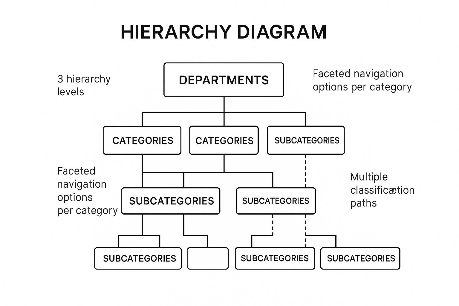
The infographic above visualizes a simplified version of Amazon's product taxonomy. It demonstrates the hierarchical structure, starting with broad departments (e.g., "Electronics") that branch into increasingly specific categories and subcategories (e.g., "Televisions" -> "Smart TVs"). This hierarchical structure facilitates both browsing and targeted searching, allowing users to either drill down from broad categories or jump directly to specific product types. The visualization also highlights the importance of faceted navigation, shown by the filter options alongside the product listings. These facets allow users to refine their search based on specific product attributes like brand, size, or features.
How it Works: Amazon's system uses a hierarchical structure, similar to a tree. Think of it as a series of nested categories. At the highest level are broad departments like "Clothing, Shoes & Jewelry" or "Electronics." Each department branches into narrower categories, and these further divide into subcategories, ultimately leading to individual product pages. This structured approach enables Amazon to manage its vast catalog while allowing users to easily navigate from general areas of interest to specific products. Crucially, Amazon understands that users might approach product discovery in different ways. Some prefer to browse, while others know exactly what they want. Amazon caters to both by allowing users to explore the hierarchical categories or utilize the powerful search function, often in conjunction with dynamic filters.
Features and Benefits:
- Deep Hierarchical Categorization: This allows for logical grouping of products and facilitates browsing.
- Faceted Navigation with Dynamic Filters: Users can refine search results based on relevant attributes like brand, size, color, or features, reducing the time spent sifting through irrelevant results.
- Multiple Classification Paths: Products can belong to multiple categories, ensuring they can be discovered through various browsing and search pathways.
- Breadcrumb Navigation: Users always know where they are within the hierarchy and can easily navigate back up.
- Hybrid Search-Browse Experience: Autocomplete suggestions and refined search results combine browsing and searching into a fluid process.
Pros:
- Scalability: Handles millions of products effectively.
- Supports Both Browsing and Searching: Caters to different user preferences.
- Dynamic Filtering Reduces Cognitive Load: Simplifies complex product selections.
- Category-Specific Attributes: Enhances the relevance of filtering options.
Cons:
- Complexity: Can lead to duplicate product listings and require multiple clicks to reach specific items.
- Product Miscategorization: Third-party sellers can occasionally miscategorize products.
- Overwhelming for New Users: The sheer volume of choices and filters can be daunting initially.
Examples:
- Visit Amazon (www.amazon.com) and navigate through its department structure. Pay attention to the breadcrumb navigation and how it reflects your position within the hierarchy.
- Conduct a search for a specific product. Observe how dynamic filtering options appear and change based on the chosen category.
- Explore a product detail page. Note the categorical information displayed and the "related items" suggestions.
Tips for Implementation:
- Balance Breadth and Depth: Avoid excessively deep hierarchies, which can frustrate users.
- Handle Cross-Categorization: Establish clear rules for assigning products to multiple categories.
- Integrate Search and Browsing: Provide a seamless transition between browsing and searching.
- Implement Category-Specific Attributes: Ensure filtering options are relevant to the current product category.
Popularized By: Jeff Bezos (founder of Amazon) and Amazon's A9 search and discovery team.
Amazon's e-commerce taxonomy deserves its place on this list as a shining example of how effective information architecture can transform user experience within a complex online environment. It empowers users to easily navigate a vast product catalog, enhancing discoverability and ultimately driving sales. This approach is invaluable for any business aiming to optimize its online presence, particularly in the highly competitive e-commerce landscape.
4. Google Maps' Layered Information Architecture
Google Maps is a prime information architecture example, showcasing a sophisticated spatial approach to organizing vast amounts of data. It masterfully layers geographical data, business information, transportation options, and user-generated content into an intuitive and interactive experience. This allows users to access a wealth of location-based data while focusing on only what they need through selective layer visibility and contextual information displays. This makes it an excellent case study for anyone looking to design systems that manage complex data effectively.

This layered approach works by presenting a base map and allowing users to overlay additional information layers as needed. These layers can include traffic conditions, public transit routes, terrain details, bicycle paths, and more. As users zoom in or out, the level of detail and the information presented dynamically adjusts to provide relevant context. For instance, zooming in reveals individual businesses, points of interest, and street names, while zooming out shows broader geographical features like highways and regions. This dynamic adjustment of information density is key to Google Maps' success, as it avoids overwhelming users with excessive data.
Features that make Google Maps' information architecture stand out:
- Layered Information Display: Users can toggle layers like traffic, transit, terrain, satellite view, and more, allowing them to customize their view.
- Contextual Information Density: The level of detail displayed changes based on the zoom level, providing only relevant information.
- Multiple Data Types: Roads, businesses, reviews, photos, and other data types are seamlessly integrated into a unified interface.
- Location-Aware Contextual Recommendations: Google Maps suggests nearby businesses, restaurants, and attractions based on the user's location and search history.
- Integration of Temporal Data: Real-time traffic updates, business hours, and public transit schedules are incorporated, enhancing user experience.
Pros:
- Progressive Disclosure of Information: Information is revealed as needed based on relevance and zoom level, preventing information overload.
- High Usability Despite Enormous Dataset: The layered approach keeps the interface clean and manageable even with a massive amount of data.
- Contextual Filtering: Location and user history are used to filter information and provide relevant recommendations.
- Effective Integration of Multiple Information Types: Users can access various information types within a single view.
Cons:
- Potential Information Overload: Too many active layers can clutter the display.
- Visual Hierarchy Trade-offs: The simplified visual hierarchy can sometimes sacrifice detail for usability.
- Mobile Constraints: Limited screen space on mobile devices can restrict the amount of information displayed.
- Sponsored Results: Search results sometimes prioritize sponsored businesses, potentially affecting relevance.
Examples of Google Maps' Information Architecture in Action:
- Zoom-Dependent Information Display: Zooming in reveals more details like street names and businesses, while zooming out shows larger regions.
- Layer Toggle System: Users can easily toggle layers for traffic, transit, satellite view, etc.
- Place Details with Hierarchical Information: Business listings offer organized information about hours, reviews, photos, and more.
Tips for Implementing a Similar Layered Approach:
- Progressive Disclosure: Reveal complex spatial data gradually as users interact with the interface.
- Zoom Level-Based Information Density: Adjust the amount of information displayed based on the zoom level.
- Clear Visual Hierarchy: Distinguish primary information from secondary information using visual cues like size, color, and contrast.
- Independent Layer Toggles: Allow users to control the visibility of individual information layers.
When to Use This Approach:
A layered information architecture, like the one employed by Google Maps, is particularly valuable when dealing with large amounts of spatial or location-based data. It's also beneficial when users need to access different types of information within a single interface. This approach is particularly well-suited for applications in navigation, urban planning, tourism, real estate, and logistics. For SMBs, entrepreneurs, marketers, and agency heads, understanding this model can inspire the creation of more user-friendly interfaces for data visualization and location-based services.
Google Maps' layered information architecture, popularized by the Google Maps team, including Lars and Jens Rasmussen (the original creators) and Jen Fitzpatrick (VP, Google Maps), provides a powerful model for organizing and presenting complex data in an accessible and intuitive way. Its success demonstrates the power of information architecture in transforming complex data into valuable user experiences.
5. BBC Website's Responsive IA
The BBC website serves as a prime information architecture example, demonstrating how a content-rich platform can effectively implement responsive IA. This approach adapts the website's structure and navigation across various devices (desktops, tablets, smartphones) while maintaining a consistent user experience. For SMBs, entrepreneurs, marketers, and agencies, understanding the BBC's model can provide valuable insights into organizing and delivering large volumes of information effectively. Even for CEOs, CMOs, and heads of marketing, grasping these principles is crucial for overseeing successful digital strategies. This is why it deserves a place in this list of information architecture examples.
The BBC website tackles the challenge of organizing vast amounts of news, entertainment, sports, and educational content. Its responsive IA ensures a coherent structure that scales seamlessly, preserving navigational consistency and content relationships regardless of screen size. This is crucial for providing a positive user experience and encouraging engagement.
How it Works:
The BBC uses a combination of techniques to achieve its responsive IA:
- Topic-based global navigation: Consistent placement of main navigation categories across devices provides familiarity and ease of use. Users can always find core sections like News, Sport, or iPlayer regardless of how they access the site.
- Adaptive navigation patterns: The navigation adjusts to different screen sizes. On desktops, you might see a full horizontal menu, while on mobile, it collapses into a hamburger menu or utilizes a tabbed interface.
- Coherent content relationships: Articles and other content pieces maintain their connections across different devices through consistent internal linking and categorization. This allows users to explore related topics easily.
- Cross-linking between related content categories: This encourages deeper engagement and content discovery, guiding users to relevant information across different sections of the website.
- Balanced hierarchy: The IA balances the need to surface timely, breaking news while maintaining the integrity of established sections. This ensures users can quickly find what they're looking for, whether it's the latest headlines or in-depth coverage of a specific topic.
Examples of Successful Implementation:
- BBC News responsive navigation system: Observe how the News section's navigation adapts from a broad horizontal menu on desktop to a condensed mobile-friendly format.
- BBC Sport section's information hierarchy: Analyze how the Sport section organizes content by sport, league, and team, maintaining a clear hierarchy even on smaller screens.
- BBC iPlayer's cross-device content organization: See how iPlayer provides a consistent experience for browsing and accessing TV programs and films across different devices.
Pros:
- Consistent mental model across different devices and screen sizes, making it easy for users to navigate.
- Clear pathways between related content types, encouraging exploration and discovery.
- Effective handling of time-sensitive content alongside evergreen resources.
- Strong categorical organization supports both browsing and targeted searching.
Cons:
- Maintaining such a complex navigation across all breakpoints requires ongoing effort and testing.
- The mobile experience necessitates significant navigation compression, which can sometimes feel restrictive.
- Global navigation can consume valuable screen real estate, particularly on mobile.
- The interplay of global, local, and contextual navigation systems can occasionally lead to confusion.
Tips for Implementation:
- Design navigation systems that transform smoothly across different screen sizes (breakpoints).
- Maintain consistent labeling and categorization across all devices to avoid confusion.
- Prioritize the most important navigation paths on smaller screens.
- Consider how "information scent"—the cues that suggest where information is located—can guide users through a more compressed navigation structure.
Popularized By:
The success of the BBC's responsive IA is attributed to the BBC UX&D (User Experience & Design) team, with notable contributions from individuals like Mike Bracken (former Chief Digital Officer) and Titus Sharpe (who influenced the BBC's digital transformation).
This example highlights the importance of responsive information architecture in today's multi-device world. By carefully considering the user experience across various platforms, businesses can create websites and apps that are both user-friendly and effective in delivering information. Taking inspiration from the BBC’s approach can help organizations of all sizes, from startups to large corporations, improve their online presence and achieve their digital goals.
6. Netflix's Content Discovery Architecture
Netflix's content discovery architecture serves as a prime information architecture example, demonstrating how a hybrid approach can effectively navigate vast amounts of content. This architecture expertly blends algorithmic recommendations with traditional genre-based categorization, creating a personalized yet explorable experience for its millions of users. Its success makes it a valuable model for businesses looking to improve their own information architecture, especially those dealing with large content libraries. This approach is particularly relevant for SMBs, entrepreneurs, marketers, business owners, agencies, CEOs, CMOs, and heads of marketing seeking to enhance user engagement and content discoverability.
Netflix's system works by employing several key features:
- Personalized Home Screen: Algorithmic content grouping tailors the home screen experience to individual viewing habits, displaying rows like "Because you watched [Show Title]" or "Trending Now." This reduces the cognitive load on users and immediately presents relevant options.
- Genre-Based Categorization: Traditional genre categories provide familiar navigation points, while dynamically generated categories like "Critically Acclaimed Dramas" or "Feel-Good Comedies" offer more specific and evolving exploration paths.
- Multiple Organizational Schemes: Beyond genre, content is organized by mood, popularity, similarity to previously watched content, and more. This multifaceted approach caters to diverse browsing behaviors.
- Content Relationship Mapping: Netflix identifies and leverages relationships between titles, surfacing recommendations like "More Like This" on content detail pages, encouraging further exploration.
- Hybrid Browsing-Recommendation System: This system adapts to viewing habits, learning from user interactions to refine both algorithmic recommendations and the prominence of different browsing categories.
Examples of Successful Implementation:
- Netflix Home Screen Personalized Content Rows: These rows are the first thing users see, offering curated selections based on their viewing history.
- Category-Based Browsing Interface: The standard genre categories are readily accessible, allowing users to navigate familiarly.
- Content Detail Pages with 'More Like This' Recommendations: This feature leverages content relationships to suggest related titles, extending viewing sessions and promoting discovery.
Pros:
- Personalizes Navigation Paths: The system tailors the experience to individual preferences, making it easier to find relevant content.
- Reduces Choice Overload: Curated content rows and personalized recommendations help users navigate the vast library without feeling overwhelmed.
- Surfaces Content Through Multiple Discovery Vectors: Users can find content through various methods, catering to different browsing styles.
- Balances Familiar Categorization with Surprising Recommendations: The hybrid approach combines the comfort of familiar categories with the excitement of discovering new content.
Cons:
- Algorithm-Driven Architecture Can Create Filter Bubbles: Users might be exposed to a limited range of content, potentially missing out on diverse perspectives and genres.
- Limited Visibility into Complete Content Library: The emphasis on recommendations can obscure the full breadth of available content.
- Horizontal Scrolling Can Hide Available Content: Users might miss content located further down the horizontal rows.
- Categorization Sometimes Feels Arbitrary or Overlapping: Dynamically generated categories can occasionally lack clarity or overlap with existing categories.
Tips for Implementing a Similar Approach:
- Balance Algorithmic and Categorical Organization: Use both methods to offer personalized experiences and familiar navigation points.
- Consider How to Handle 'Cold Start' Problems with New Users: Develop strategies for recommending content to users with limited viewing history.
- Design for Both Intentional Browsing and Serendipitous Discovery: Cater to users actively searching for specific content and those open to exploring new options.
- Implement Multiple Paths to Discover the Same Content: Allow users to find content through various categories, search, and recommendations.
(No website link available for this specific architectural example)
Popularized By: Netflix Design Team, Todd Yellin (VP of Product at Netflix), Carlos Gomez-Uribe (former VP of Product Innovation)
This information architecture example demonstrates the power of combining personalization and exploration. By studying and adapting Netflix's approach, businesses can create engaging and effective content discovery experiences for their users.
7. GOV.UK's User-Centered Information Architecture
GOV.UK (www.gov.uk) provides a stellar information architecture example, particularly for complex organizations. It showcases how a user-centered approach can drastically improve the accessibility of information, serving as a benchmark for government digital services worldwide. This approach prioritizes user needs and tasks over internal governmental structures, making it easier for citizens to find what they need. This is a powerful information architecture example for any business, especially SMBs, entrepreneurs, marketers, and agencies looking to improve their website's usability.
Instead of organizing content based on government departments (e.g., Department of Education, Department of Health), GOV.UK structures its information around the tasks users want to accomplish (e.g., "Renew your driving licence," "Apply for a visa," "Start a business"). This task-based organization drastically simplifies navigation and reduces the cognitive load on users. Imagine trying to navigate a complex government website organized by department – you'd need to know which department handles your specific need before even starting. GOV.UK eliminates this hurdle.
How it Works:
GOV.UK employs several key features to achieve its user-centered IA:
- Task-based organization: Content is grouped around what users want to do, not which department provides the service.
- Plain language navigation labels: Menus and links use clear, concise language that reflects how users talk about their needs. Jargon is avoided.
- Consistent page patterns: A predictable layout and visual hierarchy helps users quickly understand where to find information on any page.
- Breadcrumb navigation: This feature clearly shows users their current location within the site's structure, aiding navigation and preventing disorientation.
- Faceted search: A robust search function with relevant filters helps users quickly narrow down results within the vast amount of government content.
Examples of Successful Implementation:
- GOV.UK main navigation and homepage organization: The main navigation focuses on broad user needs (e.g., "Benefits," "Births, deaths, marriages and care," "Business and self-employed"). The homepage features prominent links to popular tasks.
- Service-specific journey pages: These pages provide step-by-step guidance for completing specific tasks, breaking down complex processes into manageable chunks.
- Topic-based content organization system: Related content is grouped into topics, allowing users to explore information relevant to their broader interests.
Pros:
- Focuses on user tasks: This makes the site intuitive and easy to navigate.
- Creates predictable patterns: Consistency reduces cognitive load and improves user experience.
- Uses evidence-based organization: Extensive user research informs the IA, ensuring it aligns with user needs.
- Simplifies complex governmental processes: Clear information paths make it easier for citizens to interact with the government.
Cons:
- May require users to learn new mental models: Those familiar with department-based organization may need time to adjust.
- Simplification sometimes sacrifices nuance: Complex topics may be simplified to the point where some detail is lost.
- Requires significant user research: Maintaining effectiveness requires ongoing user research.
- Challenging to balance specialized terminology with plain language: Finding the right balance between clarity and accuracy can be difficult.
Tips for Implementing a User-Centered IA:
- Organize content around user tasks: Think about what users want to do on your site.
- Use plain language in navigation: Match user vocabulary, not internal jargon.
- Test information architecture with users from diverse backgrounds: Ensure your IA works for everyone.
- Create consistent patterns that build predictability: Use consistent layouts and visual cues.
Why GOV.UK Deserves Its Place in This List:
GOV.UK demonstrates the transformative power of user-centered design in a complex environment. It provides a concrete example of how to organize vast amounts of information effectively, prioritizing user needs above all else. This approach is highly relevant for SMBs, entrepreneurs, marketers, and agencies seeking to improve website usability and customer satisfaction. CEOs and CMOs can learn from GOV.UK's commitment to user-centricity and its dedication to continuous improvement through user research. This information architecture example offers valuable lessons for anyone striving to create a more user-friendly online experience. It was popularized by the Government Digital Service (GDS) team, with key figures like Ben Terrett, Sarah Richards, and Lou Downe contributing to its success.
Information Architecture: 7 Key Examples Comparison
| Example | Implementation Complexity 🔄 | Resource Requirements ⚡ | Expected Outcomes 📊 | Ideal Use Cases 💡 | Key Advantages ⭐ |
|---|---|---|---|---|---|
| Spotify's Music Navigation System | High – complex hierarchy with personalization | High – requires advanced algorithms and data processing | High engagement through personalization and multi-path navigation | Large streaming platforms needing scalable, personalized music discovery | Scales well, supports browsing/search, strong personalization |
| Apple's iOS Settings IA | Medium – deep hierarchies with progressive disclosure | Medium – structured content with consistent UI patterns | Predictable, scalable system settings access | Operating systems or apps with complex configurations | Handles complexity with progressive disclosure, consistent patterns |
| Amazon's E-commerce Taxonomy | Very High – deep categorization with dynamic filtering | Very High – needs extensive taxonomy maintenance and dynamic UI | Efficient product discovery across massive inventories | Large e-commerce sites with vast product catalogs | Extremely scalable, supports browsing and search, dynamic filters |
| Google Maps' Layered IA | High – integrates multiple data types and contextual layers | High – spatial data and multiple layers require complex data management | Usable, context-sensitive geographic information display | Applications managing large, spatially complex datasets | Progressive disclosure, integrates diverse data types effectively |
| BBC Website's Responsive IA | Medium – adaptive navigation across devices | Medium – requires responsive design and consistent mental models | Consistent cross-device experience with content coherence | Content-heavy news or media sites requiring responsive design | Strong cross-device consistency, good content relationships |
| Netflix's Content Discovery Arch | High – hybrid personalized and categorized navigation | High – needs recommendation algorithms and multiple organization schemes | Enhanced content discovery with personalized and exploratory paths | Streaming platforms aiming for personalized content surfacing | Balances personalization with exploration; multiple discovery paths |
| GOV.UK's User-Centered IA | Medium – task-focused with consistent patterns | Medium – requires user research and plain language implementation | User-friendly access to complex government information | Government or service sites focusing on user tasks | User-task focused, reduces cognitive load, evidence-based design |
Crafting Exceptional User Experiences Through Information Architecture
From Spotify's intuitive music navigation to GOV.UK's user-centered design, these seven information architecture examples demonstrate the power of well-structured content. We've explored how industry leaders leverage IA to create seamless user journeys, highlighting the importance of clear organization, logical hierarchies, and responsive design. The key takeaway here is that thoughtful information architecture is the bedrock of any successful digital platform. By understanding and applying these principles, you can transform your website or application into a truly user-centric experience, driving engagement, boosting conversions, and achieving your business objectives.
Mastering information architecture isn't just about technical expertise; it’s about understanding your audience and crafting an experience tailored to their needs. To create content that resonates and remains valuable over time, consider how information architecture influences long-term success. For further inspiration and practical applications of information architecture, exploring evergreen content examples can provide valuable insights into how structuring information effectively leads to long-term engagement and success. Remember, an intuitive digital experience is an investment in your users and, ultimately, your business's growth.
Ready to take your information architecture to the next level? OneNine specializes in crafting exceptional user experiences through robust information architecture, ensuring your digital presence resonates with your target audience. Connect with OneNine today to discover how their expert design, development, and strategy services can transform your online platform and elevate your business.


