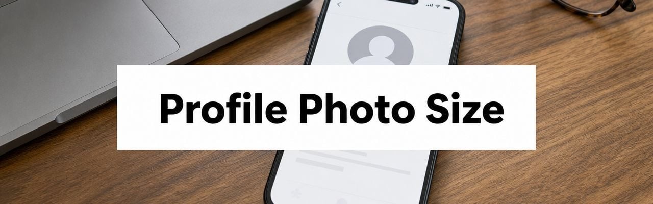
Use a square image at 720 x 720 pixels or higher for your Google profile photo. Google crops profile photos to a 1:1 square, so if you upload anything else, it will be cut down anyway.
That's the detail frequently overlooked. The file can meet the basic requirement and still look wrong once Google resizes it, crops it, and displays it as a circle in different places. You upload a clean headshot or logo, then Gmail, Maps, Search, or another Google surface trims the edges and suddenly the face is too tight, the logo text is clipped, or the image looks softer than it did on your desktop.
If you're fixing a personal account photo, a business logo, or a brand avatar, the job isn't just hitting the right dimensions. It's preparing an image that survives Google's display behavior. That means square framing, centered composition, enough breathing room around the subject, and a file format that fits the image type.
This guide gives you the practical version of google profile photo size. Not just the published specs, but what works when the image goes live.
Your Guide to the Perfect Google Profile Photo
Many users run into the same problem. They upload a photo that looks great in Photos, Canva, Photoshop, or on their phone, then Google trims it in a way that makes it look amateur.
The fastest fix is simple. Start with a true square master file, keep the subject centered, and leave padding around the edges so the visible part still works after Google applies its crop. That one change prevents most of the bad outcomes people blame on “Google compression” or “weird scaling.”
For portraits, logos, and founder headshots, composition matters as much as size. If you're using a face instead of a logo, camera angle, expression, and lighting affect how recognizable the image stays once it shrinks down. If you need help improving the actual source image before you upload it, this guide on lighting and posing for dating photos is useful well beyond dating apps. The same visual rules help profile photos look more polished and readable.
Practical rule: If an image only looks good when viewed large, it's the wrong image for a Google avatar.
A good Google profile photo does three things well:
- Reads small: Your face or brand mark is still recognizable at tiny sizes.
- Survives cropping: Nothing important sits near the edge.
- Stays sharp: The file starts clean enough that Google's resizing doesn't wreck it.
Google Profile Photo Size Quick Reference Chart
Start here if you need the specs fast. The chart gives you the working dimensions, but the bigger point is how Google displays them after upload. A square file is only the starting point. In several Google surfaces, the visible result ends up cropped into a circle and resized down, so edge detail disappears first.
Google Photo Specifications by Service
| Google Service | Photo Type | Recommended Size (Pixels) | Minimum Size (Pixels) | Supported Formats / Max File Size |
|---|---|---|---|---|
| Google Account | Main profile photo | 720 x 720 | 250 x 250 | JPG or PNG, generally 10 KB to 5 MB |
| Google Business Profile | Logo / profile photo | 720 x 720 | 250 x 250 | JPG or PNG, generally 10 KB to 5 MB |
| Google Business Profile | Cover photo | 1024 x 576 | Not specified in verified data | Not specified in verified data |
| Google Business Profile | Post photo | 1200 x 900 | Not specified in verified data | Not specified in verified data |
| Google Business Profile | Video | Up to 30 seconds | Not specified in verified data | Up to 75 MB |
| YouTube | Channel icon / profile picture | Use a square image that keeps the subject centered | Not specified in verified data | Not specified in verified data |
Use the chart as a production reference, not a design brief.
For profile photos, the safe approach is simple. Build a square master file, keep the face or logo centered, and leave clear space around the outer edge. That outer margin is your safe zone. It protects the image when Google trims the corners into a circular display and shrinks the file for small placements.
This is why one exported image rarely works everywhere. A business logo may survive a centered square crop. A cover image depends on a wide composition. A post graphic often needs more room for text and product detail. Treat those as separate assets, even if they come from the same brand system.
File size has a trade-off too. Uploading a larger, cleaner source usually gives Google more image data to work with, which helps sharpness after resizing. Go too large or overcompressed in the wrong way, though, and you can still end up with softness, artifacts, or a file that was heavier than necessary. The practical target is a clean square image with enough resolution to stay crisp, without stuffing tiny text or fine border details near the edge.
Core Specs for Your Main Google Account Photo
Your main Google Account photo is the identity layer that follows you across Google services. If this image is weak, the problem shows up everywhere.
Google's profile photo settings only allow a 1:1 aspect ratio, which means Google crops the image to a square regardless of the original shape. The recommended size is 720 × 720 pixels, with a minimum of 250 × 250 pixels, according to Google's help discussion on profile photo cropping.
What the spec actually means
A rectangular image isn't “almost fine.” Google will still cut it down to a square. If the subject was framed for a wide photo, parts of it disappear.
That creates three common failures:
- Headshots get too tight: Hair, shoulders, or part of the face gets trimmed.
- Logos lose edge detail: Taglines, borders, or icon shapes sit too close to the frame.
- Screenshots or graphics become unreadable: Small text never survives avatar use.
Best setup for a personal Google account
For a personal account photo, the safest workflow is:
- Start with a high-quality source image.
- Crop it yourself to a square before uploading.
- Keep your face or subject in the middle.
- Leave extra space around the outer edge.
- Export a clean square file at the recommended size.
This gives you control before Google applies its own resizing.
The best Google account photo usually feels slightly zoomed out before upload. After Google's crop and small-display rendering, it often ends up looking just right.
What works and what doesn't
A plain background usually works better than a busy one because Google avatars often display at small sizes. Strong contrast between the subject and background also helps.
What doesn't work is trying to “fill the frame” too aggressively. A tightly cropped selfie may look dramatic on your phone, but once it becomes a Google avatar, it often feels cramped and less readable.
If you're uploading a company-facing personal profile, use the same image across Gmail, Calendar, Drive comments, and Meet. The technical spec is one issue. Consistency is the branding issue.
Google Business Profile Photo Requirements
Business owners often think “profile photo” means one image. In Google Business Profile, that's not how it works. Your logo, cover image, and post images each have a different job, and Google renders them in different shapes.
For the logo or profile image, stick to a square asset. For the wider brand visuals, use the dimensions Google Business Profile expects instead of forcing one design into every slot.
Logo versus cover versus post image
Google Business Profile guidance separates major image types by placement. Cover photos are typically recommended at 1024 × 576 pixels in a 16:9 ratio, while post photos are recommended at 1200 × 900 pixels in a 4:3 ratio, as outlined in Rose City Rankings' Google Business Profile photo guide.
That matters because each image serves a different purpose:
- Logo or profile photo: This is your small identity mark. It needs to stay readable when reduced.
- Cover photo: This gives visual context. Think storefront, team, interior, product setup, or hero branding.
- Post image: This supports updates, offers, events, or product highlights in a more flexible content space.
If you run local search campaigns, consistency across those image types supports the rest of your local SEO strategy.
The practical workflow agencies use
Don't build one “universal” image and hope Google handles the rest. Build separate masters for each placement.
A clean workflow looks like this:
- Square master for logo use: Best for profile and brand identity.
- Wide master for cover use: Composed for horizontal viewing.
- Content master for posts: Built around the 4:3 shape so key elements don't get cut.
Often, small businesses lose polish because they upload a horizontal logo lockup as the main profile image, and it becomes unreadable at avatar size. Or they use a portrait photo as a cover image, and Google crops out the actual storefront.
A business profile should feel assembled on purpose. If each image looks like it came from a different system, customers notice.
If you want a broader optimization checklist for the listing itself, not just the images, Silva Marketing's GMB guide is a useful companion read.
YouTube Channel Icon and Profile Picture Sizes
YouTube adds a different pressure to profile photo decisions. The icon doesn't just sit on your channel page. It appears in comments, subscriptions, search results, and alongside your videos in small circular placements. That means legibility matters more than detail.
The safest approach is to treat your YouTube icon like a simplified brand mark, not a miniature poster. Use a square image, keep the focal point centered, and assume viewers will often see it at a very small size.
What YouTube icons need to do well
A good channel icon has one job. It should be recognizable immediately.
That usually means:
- One face, not a group: Group photos become mush at small sizes.
- One mark, not a full lockup: Logos with small text usually fail.
- High contrast: Dark-on-dark or light-on-light gets lost quickly.
If you're a creator using your face, use a headshot with a clear expression and clean framing. If you're a brand, use the icon portion of the logo rather than a full horizontal wordmark unless the wordmark is extremely simple.
Design choices that hold up on YouTube
What works on a website header often fails as a channel icon. Thin lines, small words, and edge-heavy graphics disappear.
Try this standard:
- Use the simplified logo mark, not the full brand system.
- Avoid tiny taglines or decorative detail.
- Test the image at a very small preview size before upload.
- Keep visual weight in the center of the square.
A YouTube icon also has to coexist with thumbnails. If your channel uses bold, busy thumbnails, the icon should be even simpler so it still stands apart.
Common mistakes creators make
The biggest one is using a photo that relies on background context. That context disappears when the icon shrinks. Another is cramming in too much text.
A YouTube profile picture isn't a flyer. It's a signature. If someone can't identify it instantly in the comment section, simplify it.
Mastering Composition for Google's Circular Crop
Most advice about google profile photo size stops at pixels. That's incomplete. Many users report that Google's circular crop cuts off important parts of the image, which is why composition matters as much as upload dimensions, according to CapCut's overview of Google profile picture cropping.

Centering alone isn't enough
People often hear “just center the subject.” That helps, but it doesn't solve the underlying problem. A centered face can still be too large. A centered logo can still have corners clipped. The issue is the safe zone, meaning the central area that still reads correctly after a square image is displayed inside a circle.
The square file forms your canvas, but the circle is what people notice.
A simple safe zone framework
Use this mental checklist before upload:
- Keep critical elements inside the middle area: Eyes, facial outline, icon marks, initials, and brand symbols should stay away from the square's corners.
- Leave edge padding: Don't let hair, hats, text, or logo borders sit near the outer edge.
- Avoid corner-based design: Corners are the first areas that become visually irrelevant in circular display.
- Check a circular preview: If your editor doesn't show one, crop manually and test before publishing.
If you're working on a site or app where you need the same logic in your own interface, this walkthrough on cropping images with CSS is useful for understanding how visible framing changes across shapes.
How to compose portraits and logos
For portraits, step back slightly from the camera crop you think you want. Leave room above the head and around the shoulders. Tight framing almost always gets tighter after display.
For logos, simplify first. Then center the symbol with breathing room around it. If the logo depends on a long line of text, it probably isn't a good avatar.
If the important part of your image touches the outer edge of the square, assume Google will make it feel cramped.
The best uploads look a little conservative before publication. That's usually the sign you've left enough room for circular cropping.
Choosing the Right File Format and Quality Settings
Image quality problems don't always come from the photo itself. Sometimes the file format is the issue. Other times the image is oversized, and Google compresses it down anyway.
While 720 x 720 pixels is the standard recommendation, some guidance says Google may allow uploads up to 2048 x 2048, which raises the key question: does a larger file improve sharpness, or just add weight before Google downscales it? That trade-off is discussed in this YouTube explanation of larger Google profile image uploads.

JPG versus PNG
Use the format based on the image type, not habit.
| Format | Best for | Strength | Weak spot |
|---|---|---|---|
| JPG | Headshots, team photos, photographic portraits | Smaller file sizes and efficient compression | Compression can soften edges and detail |
| PNG | Logos, icons, graphic marks, flat-color brand assets | Cleaner edges and better detail preservation | Larger files |
For a founder headshot or staff photo, JPG is usually the practical choice. For a logo avatar with sharp edges or transparent-source artwork, PNG is often safer.
Should you upload larger than recommended
Sometimes yes. Sometimes no.
A larger square source can help preserve detail before Google resizes it, especially for quality-sensitive logos or images that need to stay crisp on dense displays. But bigger isn't automatically better. If the image starts poorly composed or overcompressed, making it larger won't rescue it.
A good process is:
- Export a clean square master.
- Keep compression reasonable.
- Test visual sharpness at small size.
- Use a larger export only if the image benefits from it.
If you're preparing images for a site as well as Google surfaces, this guide on optimizing WordPress images helps balance file weight and visual quality.
Upload quality starts with the source file. Google can resize a strong image down. It can't invent missing detail.
How to Change Your Google Profile Photo Step by Step
If the image is ready, the actual upload is quick. The main mistake people make here is rushing through the crop tool without checking how the photo will look once reduced.

The simplest upload process
- Sign in to your Google account. Start from your account avatar in Google, Gmail, or another Google service.
- Open your profile photo settings. Click the current picture or placeholder image, then choose the option to change or manage your photo.
- Upload the prepared square image. Pick the file you already cropped and exported.
- Adjust the crop carefully. Don't zoom in more than necessary. Check that the subject has breathing room.
- Save the change. Then give Google time to refresh the photo across services.
Before you hit save
Do one fast review:
- Check the edges: Nothing important should be near the border.
- Check tiny readability: If it looks weak at a small preview, it will look worse live.
- Check contrast: The subject should stand out from the background.
If the crop tool makes you fight the image, the file probably wasn't prepared correctly. Go back, recrop the master file, and re-upload. That usually works better than trying to fix a bad composition inside Google's editor.
Troubleshooting Common Profile Photo Issues
Most profile photo problems fall into three buckets. The image looks blurry, the wrong part gets cropped, or the new photo doesn't appear everywhere right away.
![]()
If the photo looks blurry
The usual cause is a weak source file. Maybe the image was too small to begin with, maybe it was exported too aggressively, or maybe it was cropped from a larger group shot and lost detail.
A better fix is to start over with a proper square master. Brands should export a true square master asset at 720 x 720 px rather than relying on automatic cropping, because that preserves logo legibility and helps avoid edge truncation across Google Search and Maps, as noted in Humble Help's Google Business Profile image size guide.
Try this checklist:
- Use the original image file: Don't re-save a screenshot or compressed copy.
- Recrop from the source: Don't stretch a small image to make it “fit.”
- Match the image type to the format: Photos tend to work best as JPG, logos often hold up better as PNG.
If Google cropped it badly
This usually isn't a “wrong pixel” issue. It's a framing issue. The image may technically fit, but the composition is too tight.
Fixes that usually work:
- Back the crop out: Give the face or logo more room.
- Remove corner details: Circular display makes corners unreliable.
- Simplify the image: One face or one symbol works better than multiple focal points.
If the new photo isn't showing up
Google sometimes takes time to reflect changes across products. If the update seems stuck, check the image in another browser, another device, or a private window before assuming the upload failed.
Also make sure you changed the correct profile photo. Businesses often confuse the main Google account image with the Google Business Profile logo, and those aren't always the same thing operationally.
When a profile photo “won't update,” the problem is often caching, not the file.
Frequently Asked Questions About Google Photos
Does my Google profile photo have to be square
Yes. For profile photo settings, Google uses a 1:1 aspect ratio for the uploaded image. If you upload a rectangle, Google crops it to a square before display.
What's the best size to upload
For a main Google profile photo or Google Business Profile logo image, use a square file at 720 x 720 pixels or higher if you're working from a clean source and want extra quality headroom. What matters most is that the image is prepared intentionally, not left for auto-crop.
Can I use JPG or PNG
Yes. Those are the supported formats for Google Business Profile profile imagery. In practice, JPG is usually better for photographic headshots, and PNG is often better for logos or graphic marks with clean edges.
Why does my photo look different after upload
Because the upload file isn't the same as the final display. Google may crop, resize, and show the image inside a circular avatar depending on the product. A technically correct square image can still look off if the composition is too tight.
Should I upload the biggest file possible
Not automatically. Larger square images can help in some cases, but once Google downscales and compresses the file, oversized uploads can become unnecessary weight. Use a strong source image and export with care instead of assuming bigger fixes everything.
Can I use the same image for personal and business Google profiles
You can, but you usually shouldn't. A personal account often works best with a clean headshot. A business profile usually needs a logo or brand mark designed to stay readable at small size.
If your team needs help turning image guidelines into a cleaner, more consistent web presence, OneNine helps businesses manage design, development, and ongoing website updates without the usual agency friction. They're a strong fit when you want the site, the brand assets, and the day-to-day execution to stay aligned.


